HOME | DD
 Fearsome-Jabberwock — Corel Painter Basic Brushes Tutorial

Published: 2012-07-31 20:05:08 +0000 UTC; Views: 10188; Favourites: 158; Downloads: 392
Redirect to original
Description
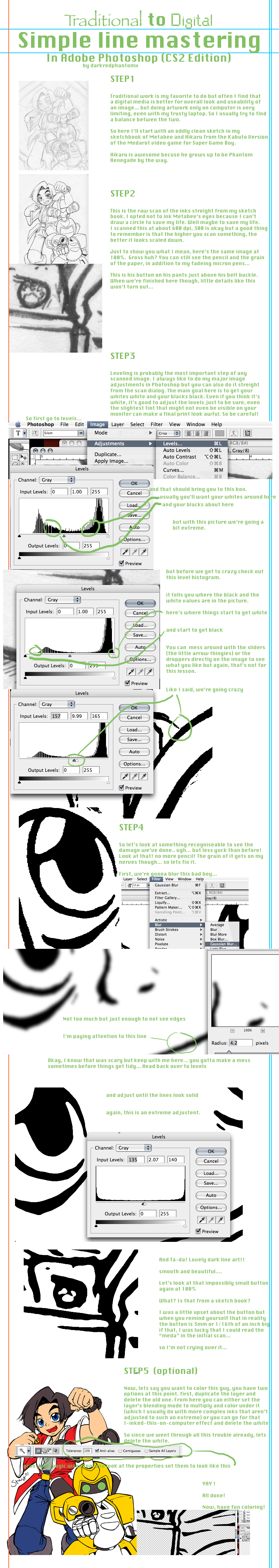
the first of what I hope to be many new Corel painter tutorials, this is my technique and I am self taught with Corel painter. I do not know if the brushes will be the same in older versions or Corel Draw; I only use CorelPainter12. I will likely next cover either brush creation or Corel's layers and their differences from photoshop.(edit; made it better and if this layout works will use it instead)
Related content


Comments: 20

👍: 0 ⏩: 0

 (Smile)")


Thank you so much for this. I really find so little good info regarding Painter 12 out there!! This is great!
👍: 0 ⏩: 0

for the acrylic brushes ruining your canvas. i think you are talking about the impasto effect. you are talking about the texture lines that show up on the canvas right? you can turn them off. i believe their is an icon on the canvas window you can click. there is also an option in the menu at the top of the screen to turn it off. its not a glitch or anything
👍: 0 ⏩: 1

ah, at the time of this writing yeah, twas the impasto effect getting to me... but I still get a glitch where even if that is off it won't erase properly no matter what, it's an issue with my painter that probably doesn't extend to other people's programs
👍: 0 ⏩: 1
thats quite an unusual glitch ")
👍: 0 ⏩: 1
last time I updated it screwed up my operating system, I had to reinstall windows to get it to work again, so alas, I don't know if they fixed it in a later update :c
👍: 0 ⏩: 1
oh yikes! wow ive never had anything do that to me ever! X.x what bad luck
👍: 0 ⏩: 1
aye, luckily I had just put on a new operating system on my computer, so I only had corel to worry about being deleted when I reinstalled
👍: 0 ⏩: 1
i see lol. hopefully it works out
👍: 0 ⏩: 0


you forgot the pointed stump blender ;__; how could you ignore the best blender of them all.*not at all personal choice lol*
A nice starter tutorial, and since I love to make tutorials myself, I'm gonna give you some critique and advice in what to think about the next time:
I suggest that you make better example strokes next time, especially on the blenders. Use the blender on one side of the color and leave the other side unblended so people can fully see the difference they make.
And don't do circular strokes; you should've continued using the same kind of strokes as you did with the pencils. Straight or curved. If you just paint it into a circle, people won't see the biggest differences.
Also, the text font is actually a little bit too big.
Usually, people tend to make it too small. But if it's too big it feels a bit obnoxious to get this big text slammed up in your face.
Another important part with this is that you sort of need "space" in the layout. People think that they have to fill every little corner with stuff in their tutorials, but that's the wrong thinking. If you try to fill up all the space, you'll end up with a cramped up layout. Think minimalism.
And it's better to just write your URL instead of "I am jabberwock at dA". It looks more professional.(+ people will notice it ten times faster since you recognize a "http://" faster than a "I am this person on this website".
Also spell check the text next time as well, spell errors can really turn down the serious tone of a tutorial. Some people don't care about it, while many others will be more bothered by the spelling than of the content.
If you made the tutorial in photoshop, you can easily spell-check it by select all the text and go to Edit>Check Spelling.
A good layout is very important in order to make a tutorial easy to read. If something feels a bit of a bother to go through for the reader, people will skip it and just look at the pictures. trust me, I've learned this through my own tutorials.
Use a layout with simple colors that are comfortable to look at. Take a look at how I form the layout of my tutorials; I use a slightly lighter or darker green color in the background to make sure people know which text is related to which illustration.
Another big protip next time is that you prepare a lot of information and screenshots/pictures before starting the tutorial, and then don't rush through it.
I hope my feedback will come in handy
👍: 0 ⏩: 2
how is the new version?
👍: 0 ⏩: 0
lol I'll probably end up redoing it with a bit more time, but I wanted to get it out right now. do you think you could help me with layout templates and such?
👍: 0 ⏩: 1
The new version looks much better! I like the touch with lined paper. Gives it a little bit of a "theme" ")
Sure I can help you out, having a bit of basic knowledge in graphic design can actually help you out a lot for things like this. And I understand what you mean; you want to finish it so you can show it to people as fast as possible.
I think a good idea is in future tutorials provide examples of illustrations done by different artists in Painter, to show the flexibility of the program. I have shitloads of WIP-screenshots from my works that might come in handy.
👍: 0 ⏩: 1