HOME | DD
 FelisGlacialis — Forces of the Northern Lights
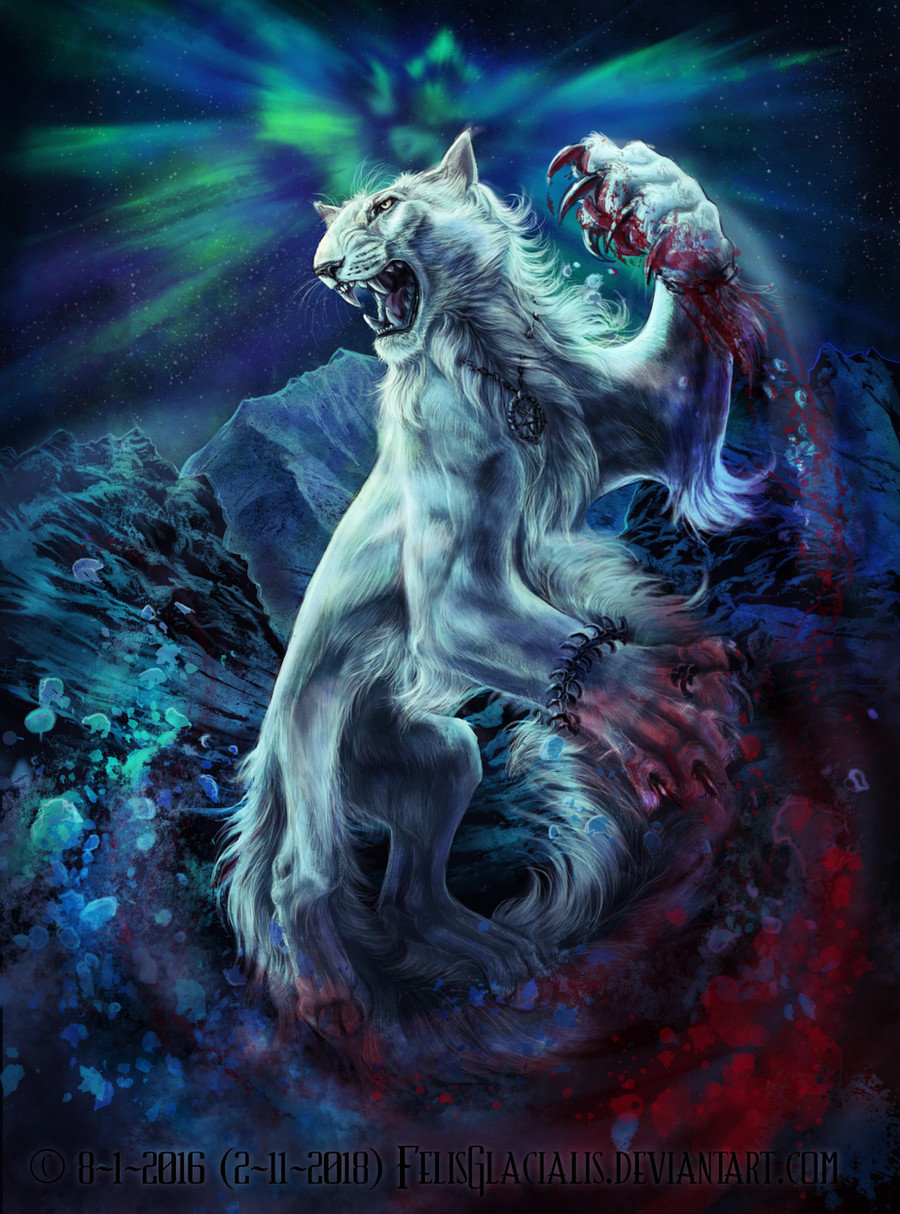
#auroraboralis #siderian #feline #hybrid #mountain #stian #winter #nothernlight
Published: 2016-01-10 23:28:21 +0000 UTC; Views: 6175; Favourites: 340; Downloads: 0
Redirect to original
Description
I have already made this drawing: Forces of the Northern Night (inspired by some lines one of favourite norwegian metal bands Dimmu Borgir), as an art trade with the fantastic artist and I liked this pose and idea so much that I wanted to draw something similar with my own (my big fantasy tiger-oriental cat like felines) siderian character Stian (see more about him here: blackmystica.deviantart.com/ga… .Compared to the version of Rascal (Whiluna's bad ass character) I've changed a bit of the pose, mirrored him, changed the trees into mountains and thought of blue Northern Lights. Oh and I got the idea of blood...because that fits well to Stian.
I have an older version (which I still really love!) - but I thought that it would be cool with a bit of a newer version
 (Smile)")
Art, character and species by me. Please don't copy any of it with my permission
Related content


Comments: 62

You are pretty much welcome my friend. 😁😁😁😁😁😁
👍: 0 ⏩: 0


This is so cool! I love this pose and the bagground fits well by "going around" the character.
👍: 0 ⏩: 1

Thanks! I always try to kinda make the background look in harmony and lead the eyes around - although I don't always succeed XD
👍: 0 ⏩: 0

Ohhh, is it just me or he gets more awesome with time. Nice fur and awesome scenery behind, as always. One tiny thing I'd mention as a flaw - the right hindleg seems a bit small to me. I know, posture, perspective, but that's not very clear so it just strikes me as a bit irregular. May be just me. On the other hand, that pose is so very dynamic, and frankly speaking compared to "Fear and wonder" it looks so much more powerful and.... feline :3
👍: 0 ⏩: 1
Really? I have changed a few very minor details in him though. Mostly in his face and expression - the eyes are less slanting and I manage to capture his cold death glare better lately. Lol, what do you find more feline here actually (that's nice to hear anyway, but I'm just curious XDD )? I'm thinking of making a huge comparative tutorial about feline and canine anatomy, just to sum up the anatomical differences and clarify it for the many canine artists on DA that fail to draw correct and typical felines when they try to...
Anyway thanks for your opinion about the right hind-leg. Although I don't see it as a 'flaw' (that sound like a major mistake, especially how the word is used in science Oo) and I don't agree actually, but I will double check the perspective anyway. I think that, compared to how the knee is bent in 90 degrees, it looks ok. The femurs of both legs are of similar length, as are the metatarsals of both feet. Only the lower-legs very strongly in angle, which makes the right one look much shorter due to the different angles. I hope that that makes sense? But maybe I may see it as a little error later on (When you gaze long enough at a drawing, you can discover really stupid mistakes XD), but for now I thing it's correct.
👍: 0 ⏩: 1
Well his face is more feline.... I guess it's partially because of the expression, still not only. Otherwise the posture seems more natural, also more violent while in the older picture it's more like playful. Though cats like to play of course X3 I don't consider myself an expert on neither cats nor dogs, so I'd like to see that tutorial too.
Oh no no no, that's not exactly what I meant. First, I meant the perspective is fine but it's not so obvious (not always it can be very obvious of course) - and because of that I may be wrong about all this. However, it's not at all the length of the leg and its parts that bother me, it's the width. The femoral part just seems way too thin. I know his legs are like that, but nevertheless, given the *apparent* perspective some part of the biceps femoris behind should be visible, I think. Like this, frankly speaking, it looks to me like his leg is bare bone.
👍: 0 ⏩: 1
Ah ok, not that I find the other one look ‘canine’ but maybe he’s even more typically feline here. But yeah indeed, I agree that he looks more violent here than in the other one. The other one I rather interpret as showing his calm and sadistic side while this one shows his fierceness. And yeah I think this tutorial will clarify a lot since people seem to have some misconceptions about what is canine and feline, and it’s actually not always that clear, depending on the species.
But about the legs here – I see what you mean, but I don’t agree with the fact that the biceps should be visible, especially regarding Stian’s flat and lean anatomy. It is true that in canids, you would indeed have seen biceps femoralis, since that is the widest part of the muscular hindleg upload.wikimedia.org/wikipedia… . On the contrary, in many felids, the vastis lateralis (seen from the front) is the most pronounced muscle. When you see Stian’s hindlegs from the side, you see that this muscle is actually more pronounced than from the front when his big knee-joint takes all attention. Generally Stian has rather bony hindlegs and not very pronounced muscles, especially not from the front view. My cat Jayto had a similar leg anatomy - see here blackmystica.deviantart.com/ar… and blackmystica.deviantart.com/ar… You may see what I mean with vastis lateralis being the widest, most pronounced (and yet Jayto had quite lean hind legs) muscle and that the biceps is hidden completely behind it. Tigers have this to a lesser degree as well rainman65.deviantart.com/art/T… and aussiegal7.deviantart.com/art/… (and Stian has this super narrow shape to the extreme). Another thing that contributes to the impression of narrowness and the feeling of the leg being very bony (which I did on purpose for Stian’s legs) is that the connective skin between hindlegs and belly is reaching all the way to the middle of the knee. So you don’t see the other half (the inside part of his hindleg) of the muscle mass hidden behind the skin. I hope it makes sense?
👍: 0 ⏩: 1
Indeed. Then calm sadism is something rather abstract to depict....
Yeah well, we'll see if I have those misconceptions.
Okay, I may be wrong about the b. femoris, but I still think some part of a muscle should be visible behind what appears to be the bare femur. Besides, I did see the skin thing, but then this brings up another problem - the skin there somehow looks quite thin (I think the somewhat flat arrangement of hairs contributes to that), and it does feel like some part of a muscle should be visible from the inner side, too. On the other hand, see that deeper arch-like shadow that outlines said skin from above? It outlines it quite prominently and that makes you think the leg's relief is somehow.... hollow at the base, so to speak. So it leaves very little space for muscles. I guess you aimed for that, I guess I may not be able to describe properly what exactly bothers me, then again, I'm not an expert of feline anatomy, but it's just that this leg strikes me as somewhat disproportional. Sorry for going so deeply into this, which I didn't intend to do, I've never really succeeded to draw fantasy with super-realistic anatomy (unless drawing it directly from a ref), but I kinda always preferred to give more prominence, shape and relief to muscles than not, even if that makes me stray from accuracy. Maybe that's where my problem stems from.
👍: 0 ⏩: 1
I wasn't speaking of you having misconceptions about felids and canids, I was more generally speaking. And I don't know, but have you looked at Jayto's photos? Showing the muscle on the inside is quite impossible with the skin in front of it, which actually IS quite thin too. That makes sense because Stian's bony hind legs look quite like how I see them. So there may be a preference difference - Stian has no pronounced or bulky muscles on his hind legs, only his front legs. Anyway I;ll to take a closer look at it again and I actually now see another shadow that I could move, but that's on the body itself. And I indeed imagine - from the front view- the upper-leg to be as narrow as the (big) knee joints (the femur itself is much thinner than the joint, so the rest must be -flat- muscle).
👍: 0 ⏩: 1
Oh, I know you didn't mean me, but I'm still curious.
Yeah, I did. I dunno, I'm only saying what it *feels* like to me, and that is not really a reliable source, accuracy-wise, obviously. Maybe the angle is untypical for my eye. Anyway. On another note, I gazed into it so long that I realized - I love the way your fur drawing has evolved :3
👍: 0 ⏩: 1
Wow, now I see how long our conversation has become Oo. Anyway I've been playing around with some shadings - and tried putting my stubbornness aside - and I think that it now looks better - what do you think? Even though I may not always give in so easily - I appreciate it to hear your opinion, also when it's just based on feeling. Feeling can be deceptive but also very honest. Anyway you think my fur technique has improved?? I had the opposite idea...
👍: 0 ⏩: 1
Hmm, not even sure what exactly you've changed, yet it somehow seems better indeed. I cannot tell why. You doin some voodoo there, I'm sure of it X3
Compared to "Fear and wonder" - definitely! Of course, you've had your better and worse furs in the time since I've been watching you, but to me this one here is a step in the right direction. I can try to tell why if you're curious.
P.S. I want to know when you're gonna draw "Perfection and vanity" X3
👍: 0 ⏩: 1
Ha lol, I've actually only played around a bit With the shadings and just did some very minor changes. Interesting how that can change the overall impression XD I'm glad that you pointed it out though. Please do that on all my art (even though my bloody arrogant stubborness sometimes comes through... -_-...just ignore that!)- your opinion is useful improve. As for the fur, I'm curious why you think that! The quality varies indeed a bit - especially when I'm tired and rush a drawing, the fur looks awful. When I have time and think about what I'm doing, the fur looks usually better.
Ohnoes - don't tempt me for for Perfection and Vanity - I have some very clear mental images and scenes with Stian in my mind when listening to that track... some quite gore and brutal. Maybe one day I will draw that too (or progenies of the great apocalypse or puritania mwhahaha).
👍: 0 ⏩: 1
*thunderous voice on* Do not underestimate the Power of the Dark Side - that is to say, of Shading X3 Okay, you asked for it. I'll try to (constructively) criticize more from now on, although your art typically inspires me to ooh and aah rather than criticize.... but I'll try.
Let me compare it to "Fear and wonder", that'd be easier. Here's how this fur here is better: 1) softer contrast makes it look softer and also 2) larger, more prominent shadowy and highlighty spaces as opposed to the more scattered shading of FaW gives a much better sence of form and makes the lighting seem much more awesome (although the fur itself looks less glossy, but this is also an up for me because it was a bit too glossy in sort of an unrealistic way back there); 3) I LOVE it how this time you HAVEN'T tried to draw each and every single hair, which may be stunning detail, but does not have the same artistic impact as this style here - plus it also contributes to fur looking softer; 4) the longer, wavy parts of the fur in the old piece were a bit too curly, and here they seem much more fluent and natural. I'd say you still have what to improve regarding shading, I think at places the color is too saturated in the shadows, for example. The light areas are simply brilliant though. Apart from these two pieces, I especially like a few things about your furs: 1) look dense and soft; 2) visible different length and arrangement of hairs in different parts of the body (quite very realistic); 3) I simply adore how the fur "absorbs" hues from the environment - this is simple and obvious to do, but brutally effective and you do it very well. So keep going in that way
Really? Gory and brutal? Why, it always gives me this feeling of.... Hell, how to even describe this? The dark solemn peace of something Demonic. Fordi er det Ild og den brenner. It's quite inspiring. So you got me curious and I dare you X3
👍: 0 ⏩: 1
Lol - you sound a lot like Darth Vader here haha (srry have been watching a lot of Star Wars lately). But thanks for the feedback here. Sometimes I simply don't see these things in my own art - that's probably why I sometimes leave my art for a few days and then look at it again, to discover a lot of mistakes Oo. But it's good to hear that you find my way of drawing fur better now (ignoring the really rushed drawings of course...). So I will continue in this way. I'm also trying some new things at the moment- like painting everything in one, or at least is little layers as possible. About the shadows- I see the point with the realism I think. Although when I draw in typical 'BlackMysticA-style' I sometimes deliberately over-saturate the shadows -and sometimes highlights too- with some mysterious reflective light sources and colour dynamics to create a more dark, mystic look. But maybe I overdo it a bit? Difficult to tell the difference between an artists typical style and when it could be a mistake. Maybe it depends on what one sees as 'aim'. When I would try to draw photo-realistic (which is far more difficult if you don't have one singly photo you can kinda 'copy')- I would probably not saturate the shadows so deeply. But are there any other things you think I can improve with shadows in general (let alone style-typical things)?
This dark solemn peace of something demonic is exactly how I describe Stian - he can slowly tear his victims apart in a very sadistic way and watch them suffer, without showing any expression or anger - just with this empty, dark, emotionless pokerface. But the piece I have in mind to draw on Perfection or Vanity would be more a kind of raid-scene where he lets his fury go...and just creates a bloody hell. A real HELL.
👍: 0 ⏩: 1
But of course I do, that was intentional. So don't apologize, I'm a bit of a Star Wars nerd myself. And I'm totally a Sith, too X3
Naturally, every artist has to deal with that, that's what feedback is all about. I dunno about the layers though. How many do you use, roughly? (If that's not a master's secret, of course  (Wink)")
Oh, I like this about your style, the colorful light sources, the rich color palette. It really adds magic. But yes, sometimes you overdo saturation a bit, mostly in the dark places - at least for my taste. It also depends on the hues you use and how they change with the change of value - because the change of a single color from lighter to darker is not linear, as you know. Sometimes you can make a color much more saturate in the shadow without making it look unnatural if you just change the hue a bit. But *there* it's a matter of your own personal feel and perception as to what looks natural or *well* and how far you can go before you oversaturate. I admit I'm a bit sensitive about shadows.
Heh, yeah, but photorealism is overrated exactly because of that. Not to mention fantasy is always better than total realism.
Hmmm.... it's hard to tell, you're quite good at using those shadows (and definitely much better than myself). Maybe you should think a bit more globally about shadows and generally values, composition-wise. Don't get me wrong, you have some excellent value compositions (like: "I need you", "Random siderians in random mountains", "Light from beneath" or this newest piece, "Rain of Fire" is also quite good). But in other pieces there's not quite a distinct construction of shadow and, respectively, light spaces. Maybe it's because you concentrate much more on the character in the picture or simply try to make him stand out in the most effective way. Which you do well, but then a strong composition of values makes the entire picture much more powerful, and even if you do it at the expense of some character emphasis it may enhance the overall impact nonetheless. On the other hand this is an aspect where it's definitely worth it to sacrifice some realism for the sake of a stronger artistic composition, especially since you're after a mystical look. So try thinking more about values. Grayscaling a piece helps a lot there. (Color contrast can have similar effect, but it can rarely fully compensate lack of value range.)
Hmmm.... this emotionless description.... so reminds me of someone I know.... Come to think of it, this song would suit him, too. Then that's different perception, again. I'm still curious what you'd make of it though. Furthermore, his bloody portraits are quite good. It's evident you enjoy doing them.
👍: 0 ⏩: 1
Lol - yeah I thought of adding a Star Wars name to my DA XD...Anyway about layers - this varies strongly. Most often I use multiple layers for different bg elements and special effects and overlays. Sometimes I like to draw in just one layer, especially environments - but many of these speedies I've never published... On characters I find it far more difficult to draw in one layer, but I'm now having a series of sketches on which I'm going to try.
About the values - that is exactly what I struggle with - and I'm fully aware of the theory behind it (have watched numbrous videos of Feng Zhu explaining it and even read an entire book on colours & light...). It's easy see it in somebody else's drawing if the value composition is nice or not, but doing it myself is a completely different thing - I simply can't systematically get it. Only in a few cases I manage to succeed a little bit. I've been experimenting in many ways and I always tend to end up being stuck in my BMA style with poor value compositions. Again, on environments I manage to get the value composition much better. But I'm still trying and I think it begins to come - slowly. Let's see what the one-layer paintings (Wolf's rain fan-art and the white wolf from Balto) will give for results.
👍: 0 ⏩: 1
Really?! Aww, and what would that be? Vader, I hope XD
That's up to you, but again I see no problem with multiple layers. And drawing characters in separate layers from the background is a must anyway.
Hmm.... seems like a persistent problem, if you read about it and still cannot overcome it. Though it's my view that reading is overrated as far as art is concerned. Theory helps, there are tricks and tips that can help you a lot, but when it comes to actual drawing the feeling and intuition are the best guides. And then I don't consider myself an expert *at all*, but I wanna try to help you there - if you wish me to, of course - so can you try to describe within a few steps how you draw a piece? How you start and how you proceed? I may be able to toss in an advice or two.
(And seriously?! Balto?!! 
👍: 0 ⏩: 1
I thought of Darth Furious actually haha - which would make sense for the ones who know me personally. And yeah in my eyes layers are not a bad thing. We have digital art and we should use it's possiblities and regard it as a seperate branche in visual art, rather than trying to clamp only to tranditional art with digital media (that's nice too but one shouldn't feel restricted).
Regarding the value compositions - I don't see it as a problem since I sometimes manage to succeed and in the less successful drawings it's still nice. Maybe I exeggerated it a bit. Do you feel a need to 'help'? I'm actually not so fond of that word- but that has to do with my bloody arrogant nature that is sometimes difficult to control- maybe I should call myself Darth Arrogance 
And yep, I've always wanted to Draw that white wolf, but never really done it. I've the value and colour composition already
And I'm actually still very curious to seeing you drawing Stian!

👍: 0 ⏩: 1
Ah, yes, I saw it now. I like it. So you're quick-tempered?
My thoughts exactly. Media is not supposed to restrict or hinder you, it should ideally give you the freedom to draw as you feel.
I suppose I do.... My bad. I admire your art as it is, and I just imagine improving the value composition would give them an even more powerful impact.... But you're right, and anyway I'm never gonna draw halfway as you do and yet I'm offering advice here.... kinda sounds ridiculous said that way. Sorry.
Yeah, I can tell you don't, I'd never even occur to me you copy photos. Such pieces are quite evident usually.
I'm gonna have to disappoint you, I'm right now besieged by flues and family woes simultaneously and I'm not sure when I'll have any wish to sit down and draw at all (and even when I do I still have my last two commissions to finalize first). I will not give up, not once I've decided and promised to do it, but you will have to be patient. Sorry for that too. I'm not as active as I used to be.
👍: 0 ⏩: 1
Thanks! Yeah- I tend to be, especially when I was younger and now –at the moment- when I’m overloaded with activities or get critique at work. I have always had some kind of fierce snowstorm inside me and I know I that I can be a real fury. Maybe that’s why I practice karate – it’s a very nice way to let go of my fury and aggression and learn to control/canalize it XD.
But anyway, I’m working on the value compositions and I maaaaay have finally found a method. I’m experimenting with it right now- so let’s see what the results will be. I don’t know if advice on how to build up a drawing is going to be new information for me – but I’m still kind of curious to hear what you have to say. Maybe it’s useful in a way. Even if it’s just a reminder or if it just moves the focus to another process/part in the drawing, it can already be good – even though the info may not be ‘new’.
And the way you draw fur (like in this snow leopard portrait) is just stunning and inspiring. I think you are an expert on that, definitely! I can learn from that too. I only think that in some of your drawings you could also try to work a bit on the value compositions. But as I said, seeing and pointing out things in other’s art is much more easy than doing it yourself. I can easily criticize other’s work, and yet make the same mistake. I think that I can be very biased towards my own work – I sometimes simply don’t see things that are obvious or annoying for others. So – I’m still curious to hear your suggestions! I guess that it is useful anyway. Just raising the attention to value compositions again was already good! So no need to appologize
👍: 0 ⏩: 1
The world would be bored to death without a bit of aggression. And red lightsabers. Btw, you mentioned work - what do you do for a living?
Well I know for one thing, there are many different methods. That's why I asked how your drawing process goes, because depending on how you draw different ways may be applicable. Like, values are certainly best seen in monochrome, but I imagine there's artists who just need color to *piece a piece together*. In any case, keep experimenting. I think you just need to focus on the big picture a bit more and you'll get it.
Uhhh, you think? That snow leopard was my first ever attempt to draw fur, at least in digital media. That one along with all other "stunning" digital works of mine are heavily photo referenced so no feat there. You know what I talk about. As for values, I'm well aware of that. I only started thinking about that recently and I can tell there's hardly a piece I've drawn that has any value integrity. I just never had the time to practice that. And yeah, once you go into detail and colors and light sources and all that shit, it's a bit hard to focus on values.... ummm oops, what did I say?
Alright, I'll anyway keep writing. I love giving (meaningful) opinions, just don't be too mad at me if I carry away some time. I have my issues.
👍: 0 ⏩: 1
Yeah indeed - I need aggression to survive in daily life - at karate I sometimes really need to hit punching bags hard or need some sparring match XD Oh about my work: I'm doing a PhD and attempt (I started in June) to study the effect of latitude on seasonal time keeping (mostly on mammals). I will look at gene expression throughout the seasons and maybe manipulate light conditions of lab-kept voles (but I really suck at labwork so far...) What are you working with or studying?
And yeah that is indeed what I try to do – to look at the picture without colours. I also try to look at the total picture by zooming out to mini thumbnail, but I will try to do it more often and keep especially that in mind. My newest experiments with single-layer painting (except for some special effects like blurred snow) give some better results I think. And yeah it is very difficult and as you said that you just discovered the consept of value composistions – I’m curious how it will work out in your art. Probably good. And your opinion is very meaningful to me. I like to hear what people think – usually a feeling about art is quite honest, so I need to be open for that- I sometimes don’t notice things for years… and draw with the same mistake for a long time until either somebody points it out, or I notice it myself. Simply because I don’t see it in my own art, while I would have seen it instantly in other’s work.
I will try not to react so ‘cold’ and harsh again when I feel my pride is touched, but I can’t guarantee it lately. I have issues controlling my coldness and fury at the moment– it’s high avalanche risk where I live and it’s high avalanche risk in my head. But I have the feeling that I go in the right direction again: D So don’t let that stop you from giving nice and constructive critique and asking critical questions – especially the critical questions I tend to react better on at the moment.
👍: 0 ⏩: 1
Aww, so you're an active scientist. This is sweet. As a species who *evolved* in a biologist environment (and a *niche* full of beer haha), I certainly support this. *cough* So I studied ecology and botany, but things are so arranged in my country that you have to be either very persistent or very foolish (or both) to be into science. And since I'm neither, I'm now a level designer for a small and cosy game developing company. It's loads of fun actually.
Btw, what exactly is "seasonal time keeping"? I don't think I've heard the term before.
Yeah, that's the kind of things I would suggest. Also, starting a piece as a very simplified sketch, or not even sketch - just a mass of lighter and darker blotches to only mark where the main light and dark areas will be. But then you gotta stick to that blotchy sketch and I know how this gets ever harder as you work with smaller and tinier detail. And especially on characters.
Hmmm, it sounds kinda logical for your mono-layered technique to work better, value-wise. So I'm curious to see what you'll have to show in a little while. You can rely on me giving an opinion.
Well.... maybe it would improve my art, but that won't happen any time soon. I've kinda almost given up on drawing for the moment.
Ahhh, I see now. I have my issues with comfrontation and being "kicked out in the snow", so to speak, thus my retreat back into the shell. Your kind of reaction is about the worst my mind can imagine. So I'll try my best not to shout in the mountain lest I die the white death, and let's hope I don't fail too often. Besides, constructive criticism is one thing, but I totally detest offending people I like (and even those I don't like, lol), and then I also understand completely why one would be sensitive when it comes to their art, stories and characters. I try to respect that.... sometimes fail, but I try.
👍: 0 ⏩: 1
Yep, well I’m trying to do some research- but science is actually quite a lot of trial and error and making stupid mistakes. But it’s also fascinating to learn new things. Lol - a niche full of beer ahha. It’s a pity that doing science is so difficult in Bulgaria. But I guess the job you have is nice too. I have wondered whether I should continue with science or hop over to art...but I have a too strong urge to learn more in biology and be in the ‘biology’ environment kinda. And I can’t do art all day long either. But anyway seasonal time keeping is a newly invented word from the newly emerged field of chronobiology - the study of biological rhythms. So seasonal time keeping is just the study of how animals keep track of seasonal changes in their environment and adapt accordingly. Quite relevant at the latitude where I live...I try to obey the laws of nature too but keeping my house between 14-15 degrees in winter. My plants and guests don’t really like it though…. but I’m an animal of the North and I hate warmth.
Yeah I think the thing you suggest here is highly effective. I have heard of this method before and played around with it but it never got kinda ‘incorporated’ in my standard drawing procedure. But this one layer experiment comes close to it I think. Maybe I should make some more environmental paintings- then I seem to succeed more often with values. Anyway I would love to see more of your work again
And yeah I always try to be as nice as possible on DA and I used to write much milder reaction than what is actually going on in my mind. I want to keep my reputation positive (that is part of my Machiavellian way of thinking and strategies) and I need to keep my fury under control - I see loss of self control as a weakness and I have a kind of allergy to weaknesses (as has Stian with his immense pride). But I find it nearly scary (but also kinda self-assuring) to know what I could be capable of – also in real life. When my fury is triggered I can really mean the dark things I say - at that moment- and I often regret it later on, when the avalanche has passed by. I do think that that I have a great deal of ‘darkness’ in me that can be unleashed. Doing martial art helps me control and use it only when it’s needed - this is what Stian tries too (he doesn’t always succeed either…). Stian only releases his rage and hate when he finds it justified- and to him revenge justifies everything. When somebody has seriously damaged his pride- they will suffer...hard and die slowly - and Stian then has great satisfaction in watching that... But to most insults or conflicts he reacts very calm, formal or just uncaring. My avalanche risk is actually much higher than Stian’s but once Stian’s avalanche goes...it’s and everything destroying one, much bigger and powerful than mines.
And yeah sometimes people on DA seem to have difficulties understanding the concept of a mature, constructing critique and simply offending, attacking or insulting the artist. And in that case I take my ‘revenge’ and let go of an avalanche. I remember once I’ve heard that saying from religion that if one hits you in the face, you should turn your opponent the other cheek. Faen i helvete - NO. I hit back - twice as hard or I go for the kill (onfortunatily there is something called prison if I ever let go of my full fury in reality).
👍: 0 ⏩: 1
Eh, it is fascinating.... but not quite in the way I had imagined it before I got involved into actual science. Maybe it's a flaw of our educational system (and it has quite a few of those), or maybe not only. Honestly, I think I was never much of a science person.... I do like learning things, but it's creativity that drives me on and my imagination rules me.
Nah, I couldn't do art all day long, 5 days a week, even in my best art periods. But level design is perfect in this respect: there is a lot of creativity involved, but there's also purely technical issues and nearly engineering problems to be solved. All of that makes it variable and interesting enough for me to handle and not overly "stressing" over my creativity, it's not nearly as demanding and exhausting for me as pure art can be. Because you have the elements premade by the artists already and you don't have to invent the whole thing from scratch, which takes up so much creative energy - you just put it together. It's all one big awesome lego actually XD
Yeah, I thought it would be something like that. It's an interesting field indeed, as is the whole of chronobiology, and it's only beginning to grow. Heheh, you are a winter creature, are you? But then you're lucky to come to Bulgaria in March.... you really would hate it here in July or August XD I know I do....
Yes, you do better with values in environmental works because in them there's no character to "distract" you, so to speak. You concentrate much more on the values then, I imagine. But that with the single-layer painting is getting ever more intriguing. I do the "value sketch" on a separate layer.... so that it doesn't get in the way of the actual painting yet I can still always keep an eye on it. I don't even imagine doing it elsewise.
Yeah.... I know (some of) that feeling. Though I doubt I can be as violent. Maybe it's control or maybe (and much more likely) I'm just not as dark inside.... Or maybe I am, my friends have told me I am, but maybe I am in a different way. Anyway. It's very interesting how Stian represents some of your own traits in some ways.... the connection between you and him is very interesting. It seems immensely deep. He is truly more than just a character for you, isn't he.
Having that said, I might start that drawing soon.... but I'm wondering.... The initial idea I had about it has kinda.... forked. Now there's two alternative versions in my mind and I hesitate which one to go for. The newly spawned one is much wilder and more awesome in my head, but I'm not sure how well it will turn out really. Besides, I'm not exactly as sure you'll like it.... What do you think, should I dare it? (But don't ask what it is like, I'm not going to give that away.)
Erm.... and sometimes you do understand what constructive criticism is all about and try to do precisely that, but still end up insulting someone without meaning it at all.... because reasons. Because something you say may be misunderstood by someone or because you touch a touchy subject somehow.... Just whatever may I say, you should know I never meant to insult you. But I'm not.... perfectly tactful, either. History has shown this -.-
I know this saying yeah.... for the record, it's supposed to be said by xst himself, if I remember correctly - and it's totally among the stupidest things I've ever heard in my life. And that's fucking saying something. Of course you hit back. You're not an effing sheep. I mean, and even a sheep would defend itself ffs.
👍: 0 ⏩: 0

Thanks! Yeah I think it's very typically Stian here.
👍: 0 ⏩: 0


Woooo I really like this one *-*
He´s so badass omg!
And it also makes sense because Rascal lives deep in the woods and Stian somewhere up in the mountains ")
I´m working on our collab, will send it to you soon
👍: 0 ⏩: 1
Thankies!! I think this is one of my new Stian-masterpieces. And yeah I somehow thought that this forest-mountain thing would suit our characters. Also the more reddish colours or the Nothern lights fitted best to Rascal while I choose blues for Stian.
Just send me the collab as soon as you're finished with your part - if it get's too big we can use google disk or we-transfer. I'm looking forward to working on it again!
👍: 0 ⏩: 1
Yep
I will, don´t worry ^^
👍: 0 ⏩: 0

Awesome. I love the new version a lot better and love how you could put it next to the picture with rascal. Wonderfull ^^
👍: 0 ⏩: 1
Thanks! Really? I still love the chains version as well - it's also typically Stian. Although this one looks a bit more powerful and the bg is more defined. Yeah, I like the comparison with Rascal - somehow they are opposites and yet they have a lot in common. I feel some kinda connection between the two devils XD
👍: 0 ⏩: 0

Thanks!! I'm sometimes struggling a bit with the perspective though, but otherwise it comes naturally and this kind of perspective fits very well to my oc. Oh nice to hear that you like him as character as well
👍: 0 ⏩: 0

Yeah, communicating with other deviants sometimes brings wonderful new ideas.
👍: 0 ⏩: 1


This is absolutely stunning! The amount of detail is just amazing *-*
👍: 0 ⏩: 1
Thanks! I tried to balance the amount of detail in a way, but when I start drawing fur it always get's detailed. Especially around the head. and I'm addicted to mountains and northern lights ...
👍: 0 ⏩: 0
| Next =>