HOME | DD
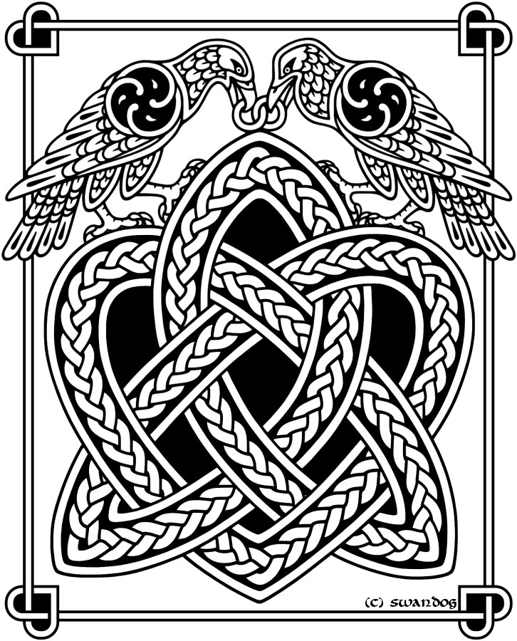
 felixxkatt — Celtic Raven

Published: 2009-02-09 01:36:27 +0000 UTC; Views: 10380; Favourites: 403; Downloads: 0
Redirect to original
Description
Celtic Raven. watercolors with minimal photoshop embellishment- the original has metallic color silver in the knot, which does not scan well.Related content


Comments: 63

Not that bizzarre, i do a lot of art shows!
 (Smile)")
👍: 0 ⏩: 1

I'm sure, just had no idea you had any shows near me!
👍: 0 ⏩: 0


")

I like the shades of blueish black you've managed to blend together
👍: 0 ⏩: 1


Sorry, my ipad ate that last comment. Should have said "thank you"!
👍: 0 ⏩: 0


pretty sure it's a rule somewhere, yeah.
👍: 0 ⏩: 0

Love the irridecence on the feathers.
I think the bright metallic of the knotwork creates a bold contrast against the raven, almost silhouetting it.
👍: 0 ⏩: 1

Very nicely done. I love the subtle colors, especially the purplish-blue in the eyes and on top of the head.
👍: 0 ⏩: 1

Amazing work! I have trouble making myself go this dark with watercolors. It's a shame metallic stuff never scans right though.
👍: 0 ⏩: 1
thanks! I like the tube colors in watercolors, but I mix them with the dry kits to get the colors darker. I think the dry pigments fade a bit over time though.
I wish i could get the same effects in real life as I can with photoshop sometimes... the silver marker looked good, but I like the digital effects a little better now.
👍: 0 ⏩: 1
Ah, see, I'm not sure I have any in tubes anymore... Also I sometimes have to push myself to be bolder with color intensity.
The catch with the different medias is nothing traditional will ever look quite the same in a scan, and nothing digital will ever look quite as good printed. Something always gets lost in the translation.
👍: 0 ⏩: 0

i love how there's so much colour in his feathers apart from black. Good job!
👍: 0 ⏩: 1

Delicious colours 
👍: 0 ⏩: 1
thanks (he's my favorite of them so far)
👍: 0 ⏩: 0


| Next =>