HOME | DD
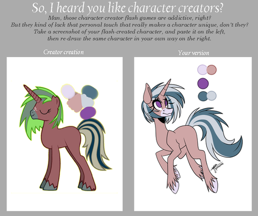
 flipwix — MLP - Interesting Fanfoal Tutorial

#mlp #mylittlepony #nextgen #mlpfim #friendshipismagic #mlptutorial #nextgenmlp
Published: 2018-04-07 03:10:31 +0000 UTC; Views: 6988; Favourites: 162; Downloads: 33
Redirect to original
Description
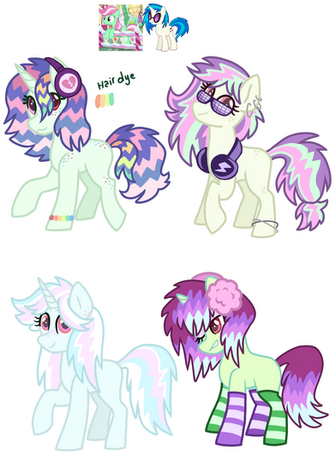
this is a pretty silly tutorial but after seeing five or six different mud/maud kids that all looked like the first one pictured here... i felt like it was kind of necessary ahahahasorry for the messiness, hope it is worth something to someone : P
Related content
Comments: 17

Bless you. I was getting tired of Fanfoals that not only looked like a clone, but somehow keeps the physical scars or injuries the parent has. (Tempest) People gotta realize genes aren't as simple as taking something from both parents and mashing them together as if they are a DIY kit.
👍: 1 ⏩: 1

👍: 0 ⏩: 0

m o t h e r w h y
lmao, this is actually a pretty good tutorial, and i got inspiration for a color scheme on your sequel post, so thanks a lot!
👍: 0 ⏩: 0

What will you be using these fanfoals for? :0 id totally be willing to buy the first one~!
👍: 0 ⏩: 0

I always enjoy seeing fanfoals who get their colors from their extended family.
👍: 0 ⏩: 0

pfft I never realized Zephyr was just Flutter's colors swapped around
👍: 0 ⏩: 0

I second the first commenter, while I totally see where this tutorial is coming from, the first design is more pleasing to the eye to me.
👍: 0 ⏩: 1

hmm, that's fair then, if two different people have a problem with the color scheme, there may be one to fix. i updated the color scheme to hopefully be more appealing to the eye!
👍: 0 ⏩: 1

To be honest, I think I quite like the first design. And the second, but the third just kinda looks... Ugly.
👍: 0 ⏩: 2

i've updated the color scheme to hopefully be more appealing!
👍: 0 ⏩: 0

well, you're entitled to your own opinion! but in mine, the first (which is just 50/50 mixed colors) is rather uninspired & lazy, is all
👍: 0 ⏩: 0

