HOME | DD
 GavinMichelli — Superman Concept
Published: 2011-07-01 23:03:30 +0000 UTC; Views: 15477; Favourites: 386; Downloads: 0
Redirect to original
Description
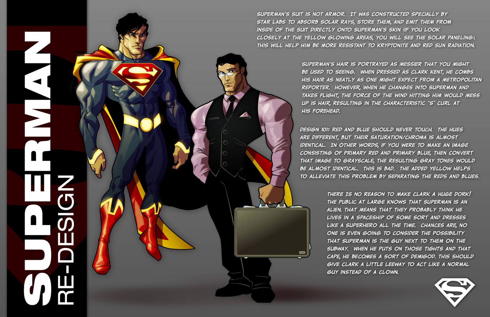
Since everyone else is re-designing the Big Blue, I decided to take a stab at him (Smile)")
EDIT:// fixed a few typos.
Related content


Comments: 198

Thanks! To be honest, I really didn't want to deviate from the classic suit that much. If you screw with it too much, it just doesn't look like Superman. I added some cosmetic stuff and some trim, but at the end of the day, it's pretty much the same.
👍: 0 ⏩: 0


I totally agree with you brother! And I'm glad you found out all these great new characteristics such as making his yellow behind the S shield and around the suit glow. This is a symbol of a higher inner power (Ironman is a good example). I'm also glad you noticed how color should be natural to the eye and attractive without harming it. :J Good good. But try to understand me when I say that although Red and blue should not touch, this instinctively should not completely apply to Superman's cape. Think of his cape as an individual. (: We will always relate to his cape as a solid Red. And adding another color is risky when you are dealing with people who had grown to love Superman's simplicity. My solution was to add a dark blue collar onto the suit itself. I'd be honored if you saw my version of the character. Come check it out. Hope you enjoy.
👍: 0 ⏩: 1
Actually, I more or less took that cue from Supergirl's suit, which I always thought was like a better version of Superman's. The red-blue thing was more of a statement on the nu52 costume, where almost all of the yellow is removed. If that suit had yellow piping instead of red, I think I might like it a lot more.
Your suit is not bad at all, bud. The only problem I have with it is the S. I'm not against messing with the S, but I don't think I would go to that extent. Still, it's an overall nice retooling of the classic suit.
👍: 0 ⏩: 0

Looks great. Part of me still yearns for the red pants, but I love the innovations you've devised for his appearance. Simply superb!
👍: 0 ⏩: 1
You're missing it because it actually served a purpose: it split up the huge gulf of blue that's in the middle. I actually thought long and hard about adding some red around his belt, but I felt like that would contradict the point I was trying to make about blue and red being next to each other, so I opted against it.
👍: 0 ⏩: 0


You missed one typo.
In the paragraph about his hair, the part about when he takes flight. Says is instead of his.
👍: 0 ⏩: 1
Oh, the English language continues to vex me -_- Thanks!
👍: 0 ⏩: 1


Nicely done! The cape strikes as Captain Marvel just cause of the trim on it. Love this
👍: 0 ⏩: 1
I do like me some Captain Marvel. Maybe I'll give his suit a little bit of a redux next.
👍: 0 ⏩: 1

I'm Loving this, and I'm not a huge Superman fan at all. Great work!
👍: 0 ⏩: 1
Thanks, man! Maybe if his costume had a few tweaks, more people would be huge Superman fans! (Probably not, but y'know...)
👍: 0 ⏩: 1
I actually like the "New 52" version. I like the fact that it's more alien in design
👍: 0 ⏩: 1
I just don't like all of the red piping. If it was yellow, I wouldn't hate it so much. I prefer the new movie costume a lot more.
👍: 0 ⏩: 1
Well, I like the yellow in your design. I like how you make it have an actual reason and function. It makes a good point of him patrolling Metropolis at night.
👍: 0 ⏩: 0

Hahahah, I have a ton of them! I love putting a spin on classic costumes.
👍: 0 ⏩: 1

Your stab is waaaay better than what they came up with. [link]
👍: 0 ⏩: 1
Hehehe, thanks! I really don't like the red piping on the new suit. If they made the trim yellow, I actually think I would like it. But then again, I REALLY don't like what DC is doing with the character right now. I really don't care what suit they put him in, as long as they stay true to the core of the character...and that is definitely not happening. Superboy is pretty good, though.
👍: 0 ⏩: 0

I like the STAR Labs concept behind the suit. I was thinking that something along those lines would be cool in an update for the Superman mythos but my guess is it won't happen anytime soon. Still, I like the glowing parts just to show that he is the light to Batman's dark. I also appreciated the explanation about his spit curl, which to me isn't quite as necessary these days as other parts of the Superman visual. Nice thought put into the design.
👍: 0 ⏩: 1
It's really not necessary, but I like it ")
Oh, and I like that bit about him being the light to Batman's dark! Very poetic!
👍: 0 ⏩: 0

Beautiful work, and I appreciate the design notes. This has a lot of the sensibilities John Byrne put into his version of Superman, which I love. If I may, I don't think the yellow/gold trim around the cape is necessary. This instantly makes him into Captain Marvel Junior. Try it with just a solid red cape. Your take on Clark is right on.
👍: 0 ⏩: 1
Thanks for the kind words, and I appreciate the input! The John Byrne version of Supes is the first one for me. I was a little kid, and my folks used to get me those early post-Crisis Superman comics, and I'd watch the Ruby-Spears Superman cartoon. That's probably what formed my opinion of the character, first and foremost.
👍: 0 ⏩: 1
I was a teen and it truly left an impression on me since I was a big fan of Crisis on Infinite Earths. It was true change unfolding. While SUperman has always been a childhood favorite, I felt that i could finally connect with the character and still be awe-inspired.
👍: 0 ⏩: 0

So much thought and consideration in this desgin. And it shows. 

👍: 0 ⏩: 1
Supes is a character that has been really dear to me since I was a little tyke, so I've definitely thought a lot over the years about what my take on him would be. He's such an iconic character, y'know? Any changes that you make, you have to think long and hard about them, so that you respect the character and his history, while keeping him grounded in the present day.
Thanks for looking!
👍: 0 ⏩: 2

I hate the DCNU how about you
👍: 0 ⏩: 1
I haven't read any of them, but a lot of the designs are fugly, including Superman's.
And Bardock rules  (Wink)")
👍: 0 ⏩: 1
Thanks did you read my Chuck Norris thing about him?
👍: 0 ⏩: 1
My pleasure! Keep making awesome things to look at!
👍: 0 ⏩: 0

Nice work!
Def agree about Clarke being normal.
👍: 0 ⏩: 1
Thanks! Hopefully, he's not too much of a nerd in the upcoming movie
👍: 0 ⏩: 0

👍: 0 ⏩: 1
Thanks! That's exactly what I was going for!
👍: 0 ⏩: 1
No problem, you did very well!
👍: 0 ⏩: 0

I love it! Both the costume design and your color are awesome! Congrats, mate!!
👍: 0 ⏩: 1
| Next =>