HOME | DD
 goldomega — Photoshop 3d Anaglyph Tutorial
by-sa
goldomega — Photoshop 3d Anaglyph Tutorial
by-sa
Published: 2010-01-10 02:19:11 +0000 UTC; Views: 35278; Favourites: 276; Downloads: 2237
Redirect to original
Description
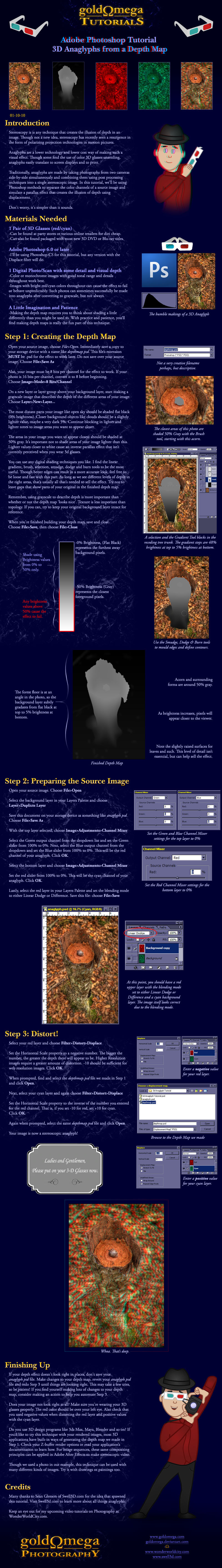
A detailed tutorial on creating a depth map and using it to convert a 2D image to a 3D Anaglyph in Adobe Photoshop. Viewing the end results requires red/cyan 3D Glasses.If you'd like to practice this technique, you can download the source files used in this tutorial.
Source Photo
Depth Map
You can find a few more examples below. Each has links to their depth maps in the artist descriptions.
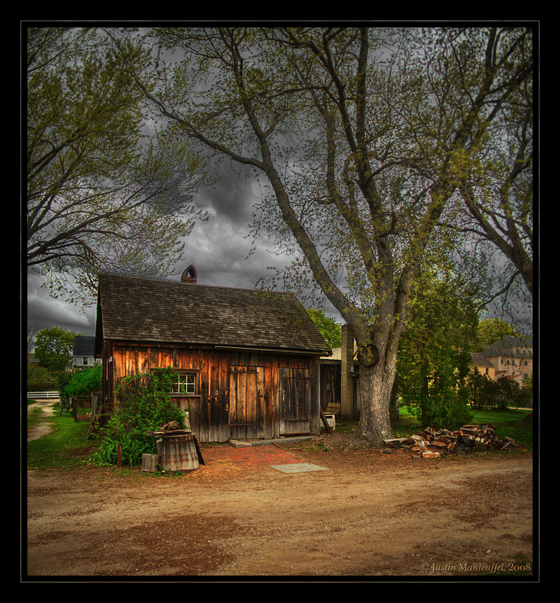
Another Anaglyph made with this technique - featuring a person.
Another Anaglyph made with this technique - featuring a car.
If you make any anaglyphs using this technique and submit them as deviations, feel free to share them here. I'd love to see them!
One last note, you can skip the channel mixer portions of Step 2 if you are looking to generate full-color left eye and right eye views of your scene. You can use these with programs like StereoPhotoMaker to generate stereo MPO files. These full color 3D image files can be viewed on many 3D capable devices like Nintendo 3ds and many 3D TV models.
Is English not your primary language? Please translate my Text Only Tutorial to the language of your choice.
Related content


Comments: 117

I'm writing a tutorial now about how to make anaglyphs that appear to advance beyond the screen depth, the "Pop-up" effect you described. I should be able to submit that soon...
👍: 0 ⏩: 0
My pleasure! 3D is very interesting to me too. I'm glad to share what I know with a fellow enthusiast.
👍: 0 ⏩: 0

Used your tutorial to help make this: [link]
No lie, yours was one of the best tutorials I came across for this.
 (Smile)")
👍: 0 ⏩: 1
Nice result! Glad you found my tutorial useful.
👍: 0 ⏩: 0

well, i have kind of problems :/ i dont know what to do with the deph map
👍: 0 ⏩: 1
My best advice is to follow my tutorial step by step as carefully as possible. If you'd like to practice, there are example files you can download and use in the artist description, but the depth map provided has to be saved as a Photoshop Document (.psd) before you can use it as a displacement map in Step 3.
Let me know if you get stuck or confused with any part of my tutorial and I'll be glad to help in any way I can.
👍: 0 ⏩: 1

[link]
I use -20 and +20 of displace! I think thos in particular looks beter than -10 and+10
👍: 0 ⏩: 1
Wow, looks great! Yeah, sometimes the exact settings take a little playing around with. Nice job.
👍: 0 ⏩: 1
I have a problem! I made this video and youtube convert it on 3D, but... I don't now how to see it, i mean... if right sides must to be red or blue... >_<
[link]
When I put my glasses on my right eye see blue, and my left eye is red,, then, when I see an image... what side must be red and what blue?
👍: 0 ⏩: 1
Hi there! I'll try to answer your question as best I can, though I'm not sure I understand completely...
When using anaglyph 3D glasses, the red color should be over your left eye and the cyan (blue) should be over your right eye. If the 3D content is constructed properly, you should perceive depth in the image.
I had a look at the link you posted. I'm not sure what Youtube is doing to convert your 2D slideshow and video to 3D, but it's not really working, which may be why there's some confusion. Properly converting to 3D a project at that length with that many pictures and videos yourself would be a very big job. You would probably have to use my tutorial on each your photos before you bring them into your slideshow and do some rotoscoping on all the video clips to separate the different layers of depth.
Lastly, to explain how the parallax works: as the red pixels are shifted left, they will appear to recede away from you, as they shift right, they appear to advance toward you. Vice-versa for the cyan pixels. Hope my explanation helps!
👍: 0 ⏩: 0

Dr. Tran. He's a REAL doctor!
👍: 0 ⏩: 1
He's a true American Legend! ...From America!
👍: 0 ⏩: 1
..I've never even BEEN to America! XD
👍: 0 ⏩: 0
I did this... I don't know what I did wrong... =S, but the hands on the background still can see =S, that's normal?
[link]
👍: 0 ⏩: 1
Usually ghosting like that happens around high-contrast parts of your depth map, in places where the 50% grey transitions abruptly to black. If any part of your foreground object (or person) is shaded black in the depth map, the distortion will offset it and cause ghosting. Sometimes blurring your depth map can help before distorting. Filter>Other>Maximize will expand the gray areas of your depth map so there's more overlap. That can help too.
Hope that helps!
👍: 0 ⏩: 1


Love the tutorial, tough I having a problem, in some parts of the image it duplicate/clones certain areas, is there any way to work this out [link]
👍: 0 ⏩: 1
Usually I find that happens in the parts of the depth map with high contrast. It can help to blur and/or expand the values in the depth map around the cloning object a bit.
Admittedly, this tutorial isn't *the* best technique for layered drawings. I'm thinking of putting together a second tutorial meant to deal with those in particular.
👍: 0 ⏩: 1
oic the blurring helped but it still had its problems ")
👍: 0 ⏩: 1
My pleasure. Hope it helps! I'll let you know if I release another anaglyph tutorial. I'm thinking of doing a second one for layered artwork...
👍: 0 ⏩: 1


Will this technique work with black and white images, ala comics? I've been trying my hand at depth maps and displacing the file in the red channel, but, I'm not sure I'm getting the results I want.
Wanna have a look and give me some tips?
[link]
👍: 0 ⏩: 1
Yes indeed, my tutorial should work with drawings as well as photos and paintings. With drawings, it's important not to shade your depth map too tight to your lines. If the depth map has high contrast where they meet your lines, it can cause ghosting. I don't see any of that in your files, so good news there.
I think your attempt at displacement here is pretty good. You can see depth in the places you want to attract attention, which is good. There's not a lot of separation in the table, some of the plates & dishes. If you can describe with your depth map how close or far those things are from each other, it'll help sell your effect even more. If you upload your depth map, I'll have a look at it, if you want.
One last note, it seems that you have most of this drawing broken up into separate layers. If you're using Photoshop CS5, there are some new 3D features that help you make 3D anaglyphs from layers. That's maybe a topic for a new different tutorial, but be aware that anaglyphs from layers is now built into that aspect of Photoshop. To get you started, convert your layers to a 3D Postcard in the 3D tab and change your parallax and focal plane settings. Parallax should be between 15 and 25 and be the same for all layers and focal plane is how you choose whether layers appear closer or further away. Negative numbers are closer, postive numbers are more distant.
Phew! Hope some of that helps!
👍: 0 ⏩: 2
The drawing itself was one layer, I broke up my depth map into layers before flattening it, if that clears anything up.
👍: 0 ⏩: 0
Thanks! I'm a bit confused as to the 3D postcard thing, but, I'll fiddle and work with it.
Thanks so much for your advice, man!
👍: 0 ⏩: 0

Perfect tutorial! Thank you! With your help I'd make my first anaglyph!
👍: 0 ⏩: 1
My pleasure. The technique itself isn't perfect and you can get visual artefacts, but with a bit of practice, it certainly does the trick.
👍: 0 ⏩: 0

This tutorial is really well made but I have questions to do...
I tried it on a drawing of mine but once I had to displace the channels the whole drawing look like "doubled" (3Drunk vision lol)
So I hid one of the channels and I see that the image is really doubled! Instead of seeing a (single) distorted lineart, I see two of them! I tried to blur the depthmapbut I obtain a strange water-ish effect.
So my questions are:
Does the thickness of a lineart influence the displacement? And its colour?
My drawing is quite big (about 2500x1250), does it make problems?
Looks strange for me how your nearest object (the acorn) doesn't seem to be affected by the displacement while mine (a guitar headstock) is affected. Is it normal?
Maybe some questions are kind of stupid, but I'm just curious...
Sorry I cannot submit my drawing now 'cause I've problem with Internet. Once it'll work, I'll link it asap (depthmap included)
👍: 0 ⏩: 1
No problem, I'd be glad to give some detailed help once I can see your drawing and depth map.
In the meantime, I can answer a few of your questions and throw in some advice about doing displacement with lineart:
Image size and line color shouldn't make a difference. Displacement should work on any image size that Photoshop can handle. It is important that the depth map is the same size and dimensions as your original, or the image won't distort properly.
One thing to keep in mind when making depth maps for line art is that you don't always have to be as precise with your depth map shading as with smooth toned artwork. As long as your lines are completely covered with the shades that describe the level of depth you want, it should work as expected. If your shading is too tight to your lines, that can cause doubling.
Foreground lines that overlap background lines can be problematic with displacement, so you might need to handle problem lines on separate layers or be very careful about how those are shaded.
If your guitar neck is shaded at or near 50% grey in your depth map, it shouldn't separate very much during displacement and should appear closest.
👍: 0 ⏩: 1
Drawing ->[link]
Depthmap -> [link]
"If your shading is too tight to your lines, that can cause doubling."
I understand now...
I used the original Psd, duplicated the levels and locked transparency so I could easily do the map.
(Me'n'my lazyness )
The depthmap is a psd with 3 layers: Background, Decoration and guitarist.
Could it be that I need more layers? (Example: Guitarist, Guitar, R Hand, L Hand)
For I'll try doing again the map without locking transparency.
👍: 0 ⏩: 0

I've been looking into this sort of thing for a project and your Tutorial was nice and concise. Thankyou.
👍: 0 ⏩: 1
My pleasure. I'm glad it helped you out. If you happen to post any results, I'd love to see them.
👍: 0 ⏩: 0

every other anaglyph tutorial stinks compared to this one. this actually adds that depth to the image. many thanks!
👍: 0 ⏩: 1
Heh, glad you liked it. Combining photographs taken side-by-side works as well, but this is the best way I've found to add stereoscopy to individual stills and traditional artwork.
If you happen to make any anaglyphs using my tutorial, I'd love to see them!
👍: 0 ⏩: 0

I used your tutorial, it works great on some of my photos but on the others it's not so great. In this photo: [link] you can see ghosting, but not that much, on their dresses and legs. I also didn't displace the cyan layer there, because if I did, more ghosting occurs. Here is the same photo with cyan displaced: [link] Is there some way to minimize the ghosting or just make them less obvious? Or am I doing something wrong? I think I am.
👍: 0 ⏩: 1
Usually, I've found that if you encounter ghosting, it happens in the sharp-edged, high-contrast parts of your depth map. In these cases, the accuracy of your edges becomes more important. Blurring your depth map slightly before distorting your color channels sometimes helps as well.
In the example you gave, I had a look at your depth map. You'll want to consider accounting for the depth of the floor, else the figures will appear to float. Usually, I fill receding floors and walls with a gradient. You'll want to map the values on the floor so they match the figure's values where they stand on the floor. This should help the ghosting as well.
Hope that helps!
👍: 0 ⏩: 1
Okay I'll try your suggestions and see what happens. Thanks!
👍: 0 ⏩: 0

Hi!
This is a great tutorial, I made my first work following it, you can check it here:
[link]
Also, I'm about to create a anaglyph group in DA (haven't seen any), it would be great to submit this to it
👍: 0 ⏩: 1
Thanks for sharing the end result, it looks great. That's a neat idea, giving your photo a magenta tint before the displacement. It reduces the luminosity, but prevents retinal rivalry.
Let me know when you start your group, I'd love to participate.
👍: 0 ⏩: 1
hehe, magenta tint was actually an accident, but I was happy with the result anyway, the only problem is that without the glasses it looks awful!
I already invited you to the group, I hope you will join it!
👍: 0 ⏩: 0

I just made my first attempt at following your method on one of my drawings. ")
👍: 0 ⏩: 1
Yes indeed, very nicely done. Did you use a depth map and distortion, or did you composite the two images you made for your cross-eyed version?
👍: 0 ⏩: 1
My original plan was to use the cross-eyed frames as the basis, but found that would be too difficult, since the Stereo frames have a bunch of added mist that I couldn't find out how to transpose into a proper depth map. I ended up using the original, non-misty frame of the 2D version, and transforming that into a depthmap, albeit a rather crude one!
Afterwards, I tried again, this time using the Stereo frames of [link] to come up with [link] . The result allows you to see the stereo effect, but has the layer over layer effect instead of full 3D.
I think I'll be able to come up with a way to combine the depthmap and distortion method with the added frames for special effects in future experiments. But for now, just seeing the effect with the glasses feels like a big step forward!
👍: 0 ⏩: 1
It's great when you have a composition made of separated layers already. That can make it much easier to build your depth map, as you've found out. The end results are looking really good.
👍: 0 ⏩: 1
| Next =>