HOME | DD
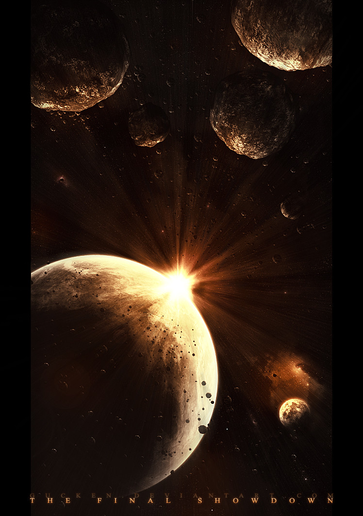
 gucken — The Final Showdown
Published: 2006-12-09 19:10:29 +0000 UTC; Views: 27174; Favourites: 384; Downloads: 702
Redirect to original
Description
 Follow me!
[link]
[link]
_____________________________________
EDIT: 9/14/07
This deviation will be soon one year old.

I like this piece a lot somehow, and so Ive decided to clean it up and retouch it.
Older version looked like this: [link]
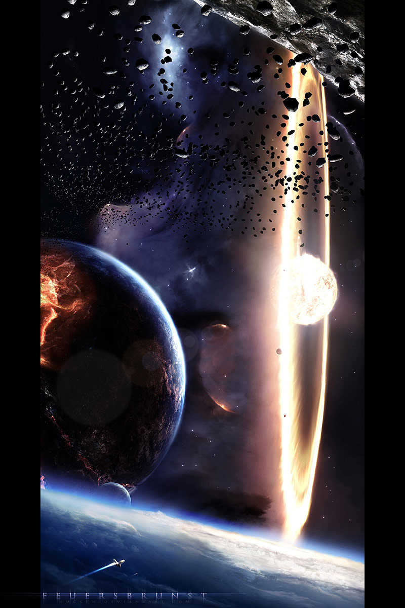
So this is again a simple piece for asteroid-, ring- and suntraining
and it's always the same:
3ds-max for asteroids
photoshop for the rest
time taken: about 10 hours
thanks for the visit and the feedback in advance

 (Smile)")
Related content


Comments: 242

first of all thank you very much for the support
I removed the white lines and tried to use the asteroids for my advantage, but I actually don't know exactly, what you mean by the "dirty look".
Do you mean the high contrast and the exaggerated sharpness?
👍: 0 ⏩: 1

frame looks much better now
when I said dirty look, I wasn't referring only for the asteroids, because sometimes they really need to look this way to be realistic (even If Nameless-Designer can do it so clean and so well).
I don't mean about removing every kind of small sharp asteroid, but thinking about where should you use them. The sharpness of space (the stars) and the constrast of small asteroids might not give a good result, and trying to make you understand what I say, I would give you an example of my own but the Deviation Storage Tool isn't working right now, so I'll give you an example of good use of asteroids, with some formations similar to yours: [link]
If you permit me another recomendation, try reducing the brightness and the contrast of some of the asteroids that may be pulling too much attention for it.
And let me know what you think of it all!
👍: 0 ⏩: 1
ah ok, I understand now, what you mean.
Thank you for your help
no offense - but I don't have so much motivation left, to change that right now.. normally I never change my works after submission
and I am not quite sure right now which asteroids to change now..
but I really appreciate your help and will remind your hints for the future
👍: 0 ⏩: 1
i never meant you should change something here
I believe every thing you create is somekind of personal growth, and you don't have to keep changing them along the time, trying to make that look better.
ok, you already know it. I just had to say something lol
👍: 0 ⏩: 1
haha ok ")
well I take support very serious, since I'm almost never satisfied with my work. I tend to change them after getting some recommendations, that's my bad habit
👍: 0 ⏩: 1
being never completly satisfied with your work is just great
dont even stop taking those things so serious!
that's the way
👍: 0 ⏩: 0

Awesome new work my friend, has a great sense of imminent destruction. In my opinion it is your best work yet, absolutely outstanding.
👍: 0 ⏩: 1
thank you, I appreciate it
and thanks for the fav
👍: 0 ⏩: 0

I really really like the sun! Also, the nebula thingy looks really well but in my oppinion a little out of place in both a good and bad perspective. It looks awesome in the sence that it looks like a peekwhole too another universe kind of, but at the same time looks abit to 'deep' or something. But all in all, good job. I'm so amazed by how you get your planets so detailed!
👍: 0 ⏩: 1

hehe, I understand the pun
thank you
👍: 0 ⏩: 0

")
")


Another impressive art. Great work!
👍: 0 ⏩: 1
thank you for the feedback
and thanks a lot for the fav
👍: 0 ⏩: 0

thank you
and for the fav too
👍: 0 ⏩: 1

oah geil!
dein bestes wie ich finde.... hast den fav verdient  (Wink)")
klasse ding....

👍: 0 ⏩: 1
wow, ein seltenes Gut, danke für den fav
👍: 0 ⏩: 0

another nice spacescape
👍: 0 ⏩: 1
thank you
and for the fav too
👍: 0 ⏩: 1

Hey, Thats what I'm here for!

👍: 0 ⏩: 0

thank you very very very much
and of course for the fav too
👍: 0 ⏩: 0

dankeschön
und danke für den fav
👍: 0 ⏩: 0

Meine Fresse, das ist nicht negativ gemeint, aber du könntest vielleicht etwas mehr Respekt vor deiner eigenen Kunst gebrauchen :b Ein so geil aussehendes Teil mit 10 Stunden Arbeit ist eine beeindruckende Sache ^^ Ich liebe solche All-Kunst, und find's total geil, dass ein deutscher genau so viel oder vielleicht sogar mehr drauf hat, als ein Ami der das gleiche macht. Deine Kunst ist sehr wertvoll =3 10 Stunden sind doch alles andere als wenig, wenn man das für so eine Sache aufwendet XD Echt, geniale Arbeit =3
👍: 0 ⏩: 1
hehe, danke für deinen Kommentar
Naja, das ist bei mir so eine Angewohnheit, immer selbstkritisch zu sein;
Meiner Meinung nach bleibt man genau in dem Moment im Strom des Fortschritts stehen, wenn man an seiner Arbeit nichts mehr auszusetzen hat.
Sicher ist es oft schwierig, Kritikpunkte am eigenen Werk zu finden, aber nach einiger Zeit öffnet sich dieser objektive Blick schon noch. Und das ist mir bei dem Bild dann auch passiert, auch wenn es meist subjektive Gesichtspunkte sind, die peinlich genau ins Detail gehen, aber zu schwer zum Umsetzen sind.
Deswegen der Verlust von Respekt vor meinem eigenen Bild hier
Und bevor ich es noch vergesse: danke für den fav
👍: 0 ⏩: 0

sieht richtig schick aus
weiter so
👍: 0 ⏩: 1

I like it, although it could've been more varied, both in objects as in colours.
👍: 0 ⏩: 1

thank you
and thanks for the fav
👍: 0 ⏩: 0
<= Prev |