HOME | DD
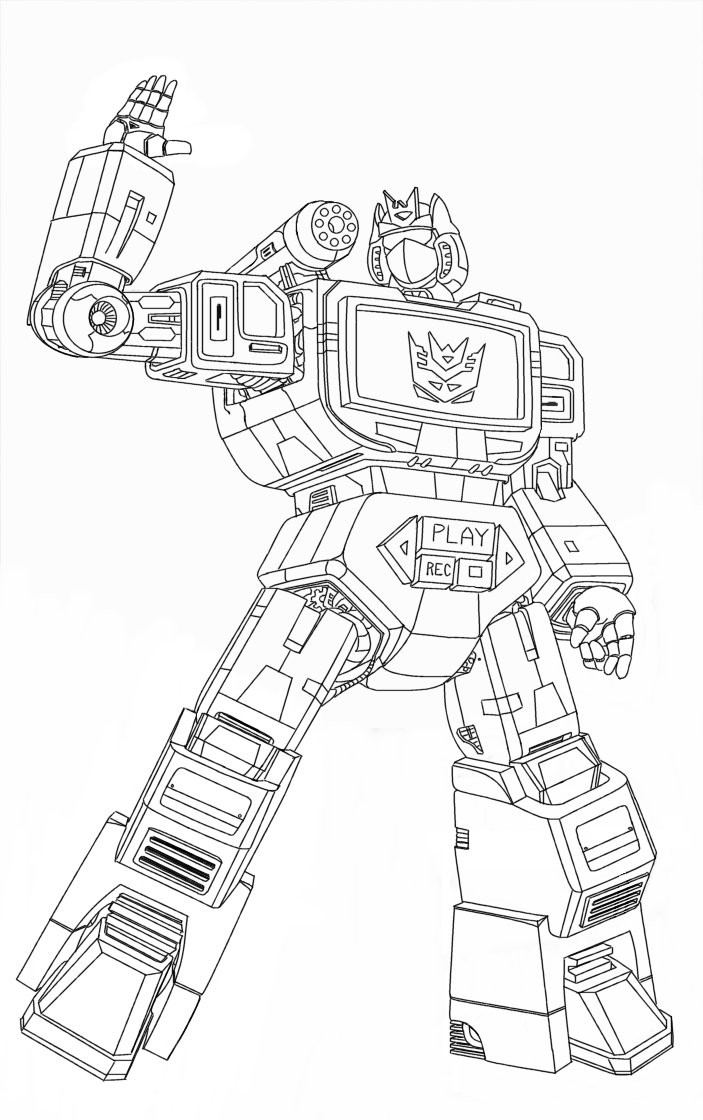
 hansime — Soundwave Lineart
Published: 2003-05-27 19:06:12 +0000 UTC; Views: 5144; Favourites: 26; Downloads: 213
Redirect to original
Description
My sketch has now been promoted to a lineart! ^^ *yay* I might do some retouching on it, but for now let's call it final.Hans
Related content


Comments: 25

👍: 0 ⏩: 1

👍: 0 ⏩: 1
👍: 0 ⏩: 0

Hello! ")
It was fun, hope you'll like it.

👍: 0 ⏩: 1
Hey, just saw it, looks good!
Thanks for colouring as well as telling me you coloured it!
 (Smile)")
👍: 0 ⏩: 1
You're welcome and thanks. I'm glad you like it.
👍: 0 ⏩: 0


actually you are right
your other one is better
but still 10000% better then i could ever do
👍: 0 ⏩: 0


soundwave is my fav deceticon, good job! only the legs semm to be a bit too short?!

👍: 0 ⏩: 0

Man, nice Soundwave pic. Only thing that could make this better is if this baby got colored. +fav
👍: 0 ⏩: 1
It would have been nice if someone colored it, I believe someone was meant to once but he never did it.
Thanks for the fave though
")
👍: 0 ⏩: 1
That's a shame, this thing just begs to be colored. And no need to thank me, YOU'RE the one who drew it, heh.
👍: 0 ⏩: 1
")


Man, it must have took you some time to do all those details, looks awesome.
👍: 0 ⏩: 0

Ooh! This is awesome! I love the detail you've put into this. Aside from the legs being a bit too chubby this is nigh perfection. I don't suppose you'd ever consider doing Blaster, would you? *puppy dog eyes*
👍: 0 ⏩: 0

this is excellent, clean work, very crisp and sharp. although i noticed some of the lines should be thicker to establish a sense of depth and shadow. anyways, do u wanna have a look at a chunky robot i drew? there- [link]
👍: 0 ⏩: 0
Thanks people! ^__^ Hmm yeah, I think the arm looks too long due to the extension part, which is a little longer then the one on his other arm, I've allready resized the legs a bit, but indeed they might look better a little more longer, but I really appreciate yer comments/crits ^^ *deals out cookies and stuff*
THANKIES!
Hans
👍: 0 ⏩: 0

Hey, that's pretty sharp work. Like what was said before, there are some Proportion probs. But not much I think. Just in the arm and the legs. a bit to long in the arm and bit to short for the legs. I think the feet look really cool, how they look like they can fold.
👍: 0 ⏩: 0

very clean
proportions are a bit wonky in my personal opinion but the detail is awesome!
👍: 0 ⏩: 0

Go hans, go hans..hes da homie with the great skillums of the TF art! dude very nice...i love how fuken clean that is...who got skillz u got skillz...+fav...now if some one would color it!
👍: 0 ⏩: 0

ola,
instant fav, much better than the previous version,
and even that one was tres cool!!
keep up the great work and ehhh where my Prowl??
hehehehehe
adios,
waywatcher
👍: 0 ⏩: 0

holy /shit/. excellent work. cleanest line art i've seen in a while. now if it were colored.... heh, may I? ^_^
👍: 0 ⏩: 0