HOME | DD
 HapticMimesis — Knowledge

Published: 2010-07-20 06:32:38 +0000 UTC; Views: 5482; Favourites: 133; Downloads: 68
Redirect to original
Description
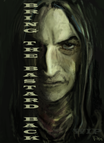
The obligatory colored and textured iteration of [link] (Sorry to spam you guys with repeats. I have a really hard time deciding which version of a picture I like best. What do you guys think?)texture:
Related content


Comments: 42

There are merits to both. A sharp, starkness to the pencil-only sketch. (and indeed it could make a good wallpaper, as someone mentioned). But there's a richness and depth you've added to this one with the coloring etc.
👍: 0 ⏩: 0


I don't know why I never commented on this. It's so much like I imagined Snape.I love the hair, and how he looks tired yet youthful. Very well done!!
👍: 0 ⏩: 0

You're welcome!
👍: 0 ⏩: 0

yes, I love all his story and how he plays a very important role since the beginning :]
👍: 0 ⏩: 0

What is it? Smile? I can't believe it!
I like your style and your Severus. It's first Snape who is ugly and I like him.
Wow! His hair is dirty! BRAVO!
Yea, I know, it's stupid, but it's real...
👍: 0 ⏩: 1

It's not stupid to be drawn to the realistic, gritty character of Snape - as you see, I am too.  (Smile)")
👍: 0 ⏩: 0


Wonderfully atmospheric. Great picture.
Will be rec'd Sunday evening on the HGSS Digest [link]
👍: 0 ⏩: 1

I love him! Especially the smirk and the jewel clasp at his neck.
👍: 0 ⏩: 1
Thank you!
👍: 0 ⏩: 1
You're welcome! I like it... it's subtle but it adds a lot to the piece.
👍: 0 ⏩: 0


I like this one more because it makes his expression look more snarky and smug. I always like it more when Snape is portrayed as overly pompous.
I also like the background you chose. I have no idea what it is supposed to be, but it looks very ghoulish to me.
His cloak with the pendant was nicely executed as well. I always have trouble drawing flowing cloth. Basically I like it all
👍: 0 ⏩: 1
No shame, my fellow rambler.
The background is a montage of sketches. The skull is one of my earlier pieces, and the snake and lilies are just simple line drawings that I whipped up to make it feel more complete. So, all together it's supposed to represent the Dark Mark, and Snape's own personal allegiance. I tried to make it really fade into the background, much like Snape's well-kept secrets.
👍: 0 ⏩: 0

I also like this version more. The colors and especially the texture add a lot of atmosphere. Great work!

👍: 0 ⏩: 1
Thank you!
👍: 0 ⏩: 1
Ah, yes I see what you mean... scanners are annoying...
But if you don't mention it, no one will notice ^^
👍: 0 ⏩: 1
La la, too late! lol
👍: 0 ⏩: 0

I like both. They both show you have great control with your pencil.
Also I don't mean to be a bother but I got the note send. Get back to me when you can no rush. ^-^
👍: 0 ⏩: 0

Hmmm...I personally prefer this coloured one, but that's just me. It's so subtly done I can't help but like it.
👍: 0 ⏩: 1
Thank you! 
👍: 0 ⏩: 1
Haha, definitely--you put work into them; they're your babies! ")
 (Wink)")
👍: 0 ⏩: 1
Psh, ha ha, thanks. It wasn't any easier when I couldn't draw worth a lick. Plus, I'm of the opinion that content trumps execution, every time. So, no worries! Your babies are beautiful too. (Plus, aren't babies all just really red and wrinkly? Yet we love them so.... now I'm just rambling. ")
👍: 0 ⏩: 1
True, true. Haha, I'm never going to tone a piece red again...

👍: 0 ⏩: 1

