HOME | DD
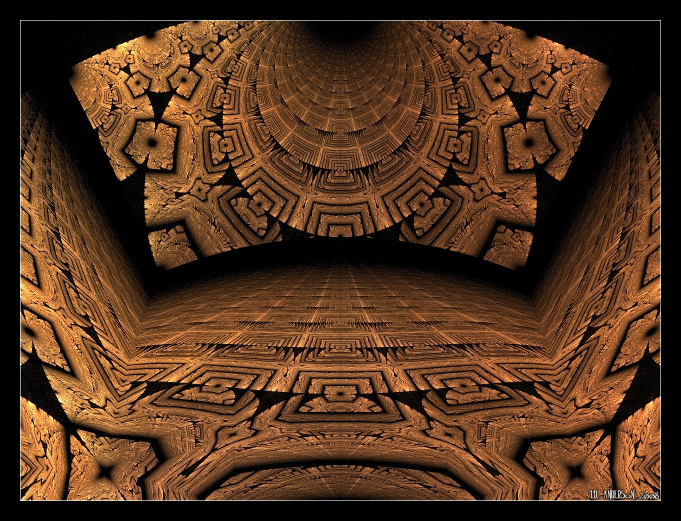
 IDeviant — Marbled Sierpinski

Published: 2008-04-19 14:39:16 +0000 UTC; Views: 997; Favourites: 19; Downloads: 0
Redirect to original
Description
Despite a persistent creative block, I managed to find this fresh twist to one of the great fractal icons.Related content


Comments: 33

I include this in my fav feature in the journal [link] if you don't mind
")
👍: 0 ⏩: 0

If I had a huge house I would love this on my floor.

👍: 0 ⏩: 1

Now that's a cool idea! I can imagine, though, getting paranoid about 'falling through the holes' or tripping over the raised parts
 (Wink)")
👍: 0 ⏩: 1
Ha, not a real Sierpinksi, if this was printed on marble.
Though if the room was under a rift in time and space.

👍: 0 ⏩: 0

I go along with Anna Kirstens comment here... reminds me a little of translucent filaments used in fly-tying interwined with fine cloth or parchment.
Top marks for the choice of gradient for this piece and the wonderfully subtle texturing
👍: 0 ⏩: 1

👍: 0 ⏩: 1
 (Smile)")
👍: 0 ⏩: 0

Another beautiful piece from you. Always so delicate, yet highly detailed.
👍: 0 ⏩: 1
Thanks! It's often the light backgrounds that bring out delicacy of structure

👍: 0 ⏩: 0
Fabulous Ian. This looks like it had been drawn/painted on parchment
I will feature this in my journal next week.

👍: 0 ⏩: 1

👍: 0 ⏩: 1


Wonderful work, Ian! The gradient is amazing too
👍: 0 ⏩: 1
Thanks Gill! I think this one had more test-renders than any I remember. The reception persuades me that it wasn't time wasted
👍: 0 ⏩: 0


👍: 0 ⏩: 1


Very beautiful, and gorgeous glints of metallic colouring!
👍: 0 ⏩: 1
Yes, I suppose the stripes do look quite metallic - thank you indeed
👍: 0 ⏩: 0

Beautiful modern take on this Sierpinski. The delicate gradient enhances the fine detail perfectly.
👍: 0 ⏩: 1
👍: 0 ⏩: 0

