HOME | DD
 inspiredcreativity — Typography Basics andReference
Published: 2009-11-20 22:53:03 +0000 UTC; Views: 4599; Favourites: 64; Downloads: 467
Redirect to original
Description
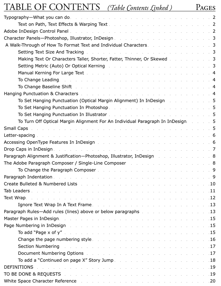
Typography Basics & Reference GuideThis is a 20 page PDF Document. Click on the DOWNLOAD Button to Read it or Download it.
Update 08-28-15: I found a mistake on Page 9, where the example for 'Adobe Single-line Composer' was mislabeled as 'Adobe Paragraph Composer.' I also updated and added some external links.
This is both a Tutorial and a Reference Guide for beginner Typographers. It covers basic text formatting for Adobe Photoshop, Illustrator, and InDesign, walking you through the most basic steps of working with text tools in Adobe software.
Every item in the Table of Contents is Hot-Linked to that item, and each Page is Hot-Linked back to the Table of Contents. You can easily jump back and forth from items to the TOC.
This makes the document ideal as a Quick Reference Guide to quickly look up how to do a Drop Cap or to turn off Optical Margin Alignment for a bulleted area, or how to turn off text-wrapping in a particular frame.
Most of the rest of the material is primarily for Adobe InDesign.
This was a bigger project than I imagined. I am going to be adding more to this, like how to do hyperlinking, sometime in the future. Please feel free to offer suggestions of what to add to it. And yes it is crammed, so it is not pristine looking.
Related content


Comments: 44

Hi, On my Typography Basics andReference page, I mentioned that there was more that I would like to add in the future, such as hyperlinks, plus new features added in CS 6 and beyond. Alas, I just have not had the time to do it.
The following might be helpful to you:
Bidirectional text in inDesign
Middle Eastern Scripting Guide - Adobe
👍: 0 ⏩: 1

You see the world through Adobe eyes, don’t you?
👍: 0 ⏩: 1
The deviation you commented on is centered around Adobe products, although the basic concepts outlined are universal. Not all products out there have the capabilities to do all the things covered. It would be a huge project to include Quark, Word and all of the other possibilities out there. In the world of print production (digital and press), the world is dominated by Adobe, Quark and Word, in that order. I had Graphic Design Company and experience even in old fashioned lead typesetting, layouts done in acetate, making printing plates, etc. Web design can be different, due to how most formatting is done through html, but the Typographical concepts I outlined are the same. Sorry that my offered help was unhelpful.
👍: 0 ⏩: 1
And there you have the problem in a nutshell: that knowing how to use a feature in one GUI application is of little or no help to figuring out how to use it in another GUI application. As opposed to learning in general what font features are, so that, presented with a new application, you can hunt around for the options to turn it on, because you have a pretty good idea what you are looking for.
👍: 0 ⏩: 1
I see typesetting as an art form. Understanding typesetting and front features should be learned before using applications that manipulate these features. If you want good-looking typesetting, it is necessary to understand fundamentals. For example, if you use a font at higher or lower point sizes than designed for, adjusting kerning and tracking is necessary to make the font optically pleasing to the eye. Fonts are designed with a narrow point size range as its target, so leading, tracking and learning are set by the designer to look its best at those sizes. Blow it up from 12 point to 80 point, and the spacing looks all wrong. You can pretty much create a very different looking font, just by how you manipulate it applications like Photoshop, illustrator and InDesign, if you understand the basics.
In my experience, while GUI's differ, the fundamentals are all the same, along with the application of them. For example, the key features of Photoshop are mirrored in GIMP (Free), Graphic Converter, and other image editing applications I have played with. The same is true of InDesign and Quark for page Layout and typesetting. There are very few applications that allow you to utilize the fill feature sets of OpenType fonts. OpenType features stay the same no matter the application, so it is only a matter of the GUI to apply them.
InDesign and Quark, as an example, have some features that are handled differently, like how text frames are threaded, but there are a lot of similarities and you can move from one application to other without having to relearn everything. You can get a cheat-sheet on the differences between InDesign and Quark, for the who have to make the switch from one application to the other. Otherwise, all of the fundamentals of how to handle font features stay the same, such as leading, kerning and tracking. Obviously your speed and efficiency will be the highest in applications you are most familiar with, because you don't have to hunt around menus.
While GUIs differ between applications, this is necessary to encourage the market to find the best GUI for the given function, such as Page Layout, via competition.
Someone creating a new image manipulation application, needs a claim to fame to entice new users. They due this though new GUI concepts for making the user interface more user friendly, or to deliver certain features at a reduced cost compared to its competitors. This means there are a lot of different GUIs out there, but if the developer makes the GUI too far away from the others in the field, people will not want to switch, cease the learning curve is too steep.
I am sorry but I am not sure what your complaint is, if it is about my deviation, type-relalated applications, GUIs etc.
👍: 0 ⏩: 0

U are always so helpfull !!!
I missed u, I hope we could talk, but I know u are busy.
I would love to read that but it seems huge! hahaha anyway, u always know what u can upload that will be interesting to get into... thanks *hugs u*
👍: 0 ⏩: 1
Hi, It has been a while. I hope all is well with you. It is one day at a time for me. Live is becoming more of a challenge, but I am staying positive.
Hugs back to you.
👍: 0 ⏩: 0

")
You are most welcome. Eventually it will become obsolete. I just have not had the time to update it to CS 5, but the basics of typography are the same.
All the best….
👍: 0 ⏩: 0

You are most welcome. I would love to get time to update this and add some more to it.
👍: 0 ⏩: 1

 (Smile)")
Thank You, you are most welcome. I hope I can find some time to add more items, lke how to do a Table of Contents, Index, Object attributes, etc, but time is always pressing.
You might enjoy this example of Type on Paths: [link]
👍: 0 ⏩: 0

you are a god, thank you so much for this - as a new student studying graphic design and communication, finding something like this for free is amazing!
👍: 0 ⏩: 1
I love Typography and see it as a real art form. It is a powerful tool in graphic Design, as I am sure you know. It can affect mood, pacing, ease of reading, control of the eye, and lend beauty. I did the typesetting for some obscure books. It was really enjoyable and a much larger task than you might imagine.
Remember that communication is typically easiest when simplified. I like the challenge of finding creative ways to simplify a message, idea, or concept across in as elegant a way as possible. Anyone can slap together a project, so what sets your work aside from the others? In Graphic Design, you also have to sell yourself too, through how your work offers something better than the competition.
Sometimes you need to research a client's target audience to know how best to connect to them, and then test it with that audience. For example, I designed the cover for my mother's book [link] , but it had some criticisms that did not take into consideration who the target audience was, which was primarily mature women and secondarily younger women (the book is about young women working in Washington DC in the War Department, during WWII). I did a lot of questioning and testing. I also wanted to use a restored photo of my Mother, from that very period of time, on the cover.
I did not particularly want the pilot on the cover, but you also have to negotiate with your client and make your client happy. As artists, we have our own aesthetics and how we would like something to look, but we cannot afford to ignore either our client's aesthetics, or our target audience's aesthetics. To do so would be both foolish and arrogant, and you would not last long in the business. Of course, if you become famous enough, you can do whatever you please and still do well.
I had my own Graphic Design business, Sandpiper Graphics, but became too disabled to continue. I still do odd jobs for old clients and some maintenance work, like a quarterly catalog. Some of the business was drudgery and boring, and some really exciting and fulfilling, which i think is true of any career. Designing and laying out can be a lot of fun, but not the setting of thousand of elements to make it come-out perfect.
I have a central Design Philosophy:Always start with who and what you are designing the project for, and then set your primary goal. In Web Design, it is how fast and efficiently can I get site visitors to where they want to go, or to find what they need to find. In a poster to announce a new Theater production, it is to get viewers of the poster to run out and buy tickets to the show. In an Information brochure, it is to control the reader's eye through the information pathways to get them what they are looking for as easily as possible. In a full page magazine Ad to sell a product, you want to grab the customer's attention and quickly feed them enough information to persuade them to buy, buy, buy. In a political Ad…
Central to my design philosophy is that the viewer's eyes should be led and guided in as easy a fashion as possible. In Graphic Design, you have less than 0.5 second to get noticed, less than 1 second to capture attention, and about 2 seconds to deliver the most important part of your message, and hopefully holding attention long enough to get them to read the rest.
Readability is crucial. There are many ways to do this, but very often designer get caught up in a fancy text design that is not very readable, or making a personal artistic statement, or making it especially beautiful, but in doing so, lose track of the goal and of their client's needs. THEN, the job is to do it as creatively and artistically as possible.
How many web sites have you gone to that are gorgeous or totally COOL, but try to find what you are looking for and you are cursing the designer. Always start with the primary mission of getting customers or reader what they need fast and efficiently, then integrate you wow, bling, etc.
Many companies do their Graphic Arts in-house. To be independent requires a speciality, or something you can offer to bring clients to you.
I started out doing Print Media and worked in a print shop for my High School skills classes. But then I went to a Maritime Academy and then to sea for a living, working on supertanker ships. I retired at age 34 and went into art and volunteer work. I got Photoshop when it first came out in 1990, then PageMaker (which later became InDesign), and then started my own business. Back then, I had to sell people on was a Digital workflow. Being in on the ground floor has advantages and disadvantages. There were not very many people doing it back int he early years, and the technology and software was changing so rapidly it was difficult and expensive to keep-up.
Competition got stiffer rapidly. Clients were coming to me by word-of-mouth, and many times because they were out of time and needed a job done yesterday. If you do well, they come back. I got to charge a lot more in those cases, but it is challenging to create under pressure of time. I have the ability to stay awake for up to 4 days straight of working, although it thankfully rarely went that long.
I also diversified a lot. I loved doing original or commissioned digital art, but those opportunities were not as common as I wished. I did a lot of advertising, catalogs, corporate brochures, marketing materials, book covers, doctor/dentist/chiropractor treatment forms, flyers, corporate packages (logo, stationary, envelopes, business cards, etc), and lots of odds and ends. I also diversified with Photo restoration (which was actually rather lucrative work), photo manipulation and enhancement, etc. Repairing blow-out on photos that are valuable cannot be done well by just anyone. Large missing areas have to be created from nothing. There is no digital information to be manipulated. Sometimes you hand paint in what you need, or you can take digital information form other photos in a shoot. In the case of a Kindergarten class photo from the 1950s, entire faces were missing from cracks and water damage. So I used other photos of the kids to hand paint them in. When done, the entire thing looked original.
I wish you all the best in your career. Try to stay close to what you enjoy doing the most.
Matthew
👍: 0 ⏩: 1
Thank you for taking the time to respond so in depth, the advice is much appreciated and I believe that your life story is one that should be told. You could write an autobiography?
👍: 0 ⏩: 1
I have have written a very short autobiography and am slowly adding to it. I wrote it mostly to help those who struggle with Autism, Depression, Physical and emotional abuse, and growing up Gay. I am autistic, but was diagnosed as Mentally Retarded back in 1959. I was abused for 16 years and was raised in a strict catholic family, growing up gay at a time when the world felt you were better dead than Queer. I started developing arthritis at around age 12, which has crippled me. I first tried to kill myself at age 13 [link] and almost did not survive the attempt at age 34. I went to a Merchant Marine Academy (not military but looks like it) and went to sea on supertanker ships, working my way up to Chief engineer.
I retired for life at age 34, then devoted my life to volunteer work and art. I worked in a soup Kitchen for 8 years and worked to care for those dying of AIDS. I also became a Peer Counselor which is what i still do now.
My story is really one about overcoming great adversity, fear, autism, hate, physical disability and chronic pain. I frankly would not wish my life on anyone, LOL. Most people take all they have for granted and have no idea how very fortunate they really are.
👍: 0 ⏩: 1

Glad you are still with us, and thanks for all your contributions. Congratulations on your MM Engineer work, its heard, and I am barely getting into it... I hope to actually have some work as a wiper come november when WA/AK open up hiring.
Thanks again, and stay awesome.
👍: 0 ⏩: 1
Hi, I am indeed still alive, but my joints and nerves are still degenerating—nothing new.
Have we talked about the Merchant Marine before? You can skip being a wiper and go directly to Oiler and make a lot more money, if you go to a training school first. Going out as an Oiler will make you around $36,200 (Bureau of Labor Statistics), but this can vary a lot, depending on how much overtime you are willing or allowed to work. There are some small Maratime Schools for getting your Oiler's or other unlicensed positions. You can even get a limited Third Assistant Engineers license (limited to lower Horsepower, such as smaller passenger vessels, Ferry's, Tugs, etc).
The Seattle Maritime Academy [link] offers training for QMED Oiler, electrician, pumpman, refrigeration engineer, and junior engineer, and the school includes required sea time, firefighting & first aid training. You should be able to go to work right after school. You are probably eligible for financial aid, etc.
There is another program at the Northeast Maritime Institute [link] .
👍: 0 ⏩: 1
Thanks for the info reply, and the great links. I am seriously considering getting my Heli pilots license... Any idea how applicable that would be to my MMC? I'm assuming its completely irrelevant, but having my experience based in Naval Aviation, I simply don't know.
👍: 0 ⏩: 1
Being able to operate any aircraft would have no direct bearing. However, you plan on a Navy career, it possibly could be helpful, although I doubt it, unless you opt for Navy flight training school. They way it works in the Navy, it does not matter if you have a civilian license to fly.
Now if you wanted to learn how to maintain the engine in Helicopters, that might help. I got training in Aircraft Gas Turbines, because at the time Chevron had Gas turbine ships. However, they found the maintenance cost to be too high and retrofitted their ships to Diesel plants. I don't know of any Merchant Marine applications for Gas Turbines at this time.
I specialized in Steam Plants, but was licensed on diesel plants too. Steam Plants are more knowledge and experience intensive compared to Diesel. Going ashore is more flexible as far as working in power plants (higher paying). However, experience on Diesel plants can also transfer well to offshore Oil platforms (higher pay) and shore Diesel related jobs (usually lower pay).
Marine engineers can also get jobs ashore in Shipyards, with GE and Westinghouse and subcontractors for Turbines, automation, boilers, diesels, etc, as well as Refrigeration and Air Conditioning, and other related trades. I tried to get my local Electricians License, but there are big obstacles in some States. Washington State is pretty corrupt around Plumbing and Electrical Trades, making it hard even for a fully licensed Electrician to move here from another state and get licensed here. But it should be easier in many other states.
Once you come ashore, your pay will probably drop drastically, from half, to two-thirds, or even three-quarters drop. At sea you are paid for your high level of responsibility for ship, cargo and lives aboard.
Therefore, it is very important for you to aggressively save and invest your money once you start sailing, and stay out of debt, especially credit card debt. Most of what I have now is based on my first 5 years of work, at my lowest salary. You would probably be greatly surprised how rapidly your investments and saving rise over time, but it is based on how soon you start. I even avoided buying a car for a few years and then got a cheap used car. I lived fairly frugally for 5 years. In my last years at sea, I was being sucked dryly the guy I was with. I could have retired for life at 10 years instead of 13.5, if not for my mistakes with him (I was Codependent and could not say NO, lol).
My friend Joe was just visiting me for 5 days. He was a Second Mate. He is recently officially retired from the Masters, Mates and Pilots union after about 25 years of sailing, and he only gets about $870/month to live, which is barely enough to survive on. But with him, he only sailed when he needed the money, while I sailed 2 months on (at sea) and 2 months off (paid leave at home), although you might be out for 3 months at times, and 3 at home. I had shipmates who graduated and immediate got expensive cars, big apartments, expensive girlfriends, etc. When I retired on my own money, they were all still in debt up to their eyebrows.
In conclusion, when you go to sea you should be able to make more money than you could ashore. You have a choice of spending that extra money or investing it and maximizing your 401k or IRA (tax-deferred retirement accounts). After 5 years or so, you can then afford to party more, since you now have an investment base that will keep growing.
👍: 0 ⏩: 0

Thank you. I have wanted to update this and more things, like how to do a Table of Contents, Index, etc. Object attributes, etc, but time is always pressing.
You might enjoy this example of Type on Paths: [link]
If you are like me, Typography is an art and has its own intrinsic beauty. I love Typesetting books (except for the tedious part) because you can help the book, you can help set mood and pace, you can ease the eyes and make flow easier, and you can make the text aesthetically pleasing to the eye.
InDesign, Illustrator and Photoshop are amazing tools for manipulating Type.
I learned typesetting in High School, setting lead type for the LA school system newspapers.
👍: 0 ⏩: 0

You are most welcome.
You probably already know this: Make sure you are well founded in Digital Workflow technology for both Web and Press, especially Acrobat. If you will be working in Print Media, learn everything there is to know about Paper, Inks and color space/color matching technology and techniques, and screening.
👍: 0 ⏩: 0

Great job. This'll definitely come in handy... nice resource.
👍: 0 ⏩: 1
Thank you. I would like to add some more to it, Like Hyperlinks, Hyphenation, Table Of contents, Indexes, Tables, and more on custom Text Wraps and Text on Paths, as well as updating it to CS5. Time to do it is an issue...
👍: 0 ⏩: 0

awesome work !!!
a very useful ressource...thanks a lot !
👍: 0 ⏩: 1
Thank You. I would love to add to it an update it to CS5, but time has just not been available.
👍: 0 ⏩: 0

Awesome tutorial! I'm definitely going to have to give it a try!
👍: 0 ⏩: 1
Thank you. A lot of it is geared toward InDesign, but much of it is also common to all Adobe Applications that have Text tools. If you have any questions, let me know, and if you have any cool tips, I just might add it.
👍: 0 ⏩: 0

What a great resource !
Thanks for sharing this, it will be very helpful.
👍: 0 ⏩: 1
You are very welcome. It is also meant to be a handy reference. If there is something you would like added, send it to me and I will add it on the next update.
👍: 0 ⏩: 0

this is great, but do you have something like this, but in AI instead, not in InDesign..
i really need this..
thanks..
👍: 0 ⏩: 1
Thank you,
Much of what you see in the Typography Reference is common to Adobe Illustrator, but Illustrator, like Photoshop, is not designed for compositional typesetting, like with fancy paragraph attributes.
If something is specific to InDesign, and not to Photoshop or Illustrator, I say it is for InDesign. The Character and Paragraph Palettes may look a little different between InDesign, Photoshop, and Illustrator, but they function almost the same, although InDesign has some functions not found in Photoshop or Illustrator.
For example, unlike InDesign, creating a Drop Cap is not a feature in Illustrator's Paragraph palette. So you need to do it the old-fashioned way.
Put your initial Cap in a separate Text Frame that is in front of the rest of your copy. Apply a Wrap to this Frame (Object > Text Wrap > Make) Move the Cap into position. To adjust the Wrap, go to Object > Text Wrap > Text Wrap Options.
You can also create your large cap and convert to outline (Type > Create Outlines) and have your copy wrap the outlined letter. I guess I should add this sometime.
If there are specific things you would like me to add, let me know.
If you have a question about a specific thing in Illustrator, let me know and I will see if I can explain it.
👍: 0 ⏩: 1
waw ..
thanks for your explanation, I think that answered everything.
I am still new in the typography and I only know about photoshop and illustrator .. with your explanations I'd probably also need to have Indesign .. This may be enough for now, but if one day I need some answers, would you mind if I ask you ..
anyway thanks for the answer..
👍: 0 ⏩: 1
You are most Welcome.
Basically, Photoshop is for Raster Art. Illustrator is for Vector Art. InDesign is for page layout and composing.
Ideally, you use InDesign to bring together, photoshop files, Illustrator Files, and text composition, to design Magazine, Books, brochures, postures, flyers, etc. I have typeset two full books in InDesign, which is now the Industry standard. The other main competition is Quark.
The other program used is ACROBAT. The reason for this is that most press houses now use PDF workflows. In other words, I convert all work to PDF to send it for printing. It is also used to create eBooks and other online publications.
The great thing about Adobe is that all of its programs are pretty standardized with common commands, palette design, etc.
If you are Designing Web Pages and Web Sites instead, then you programs like Adobe Dreamweaver. Like Indesign, this is where you bring together Photoshop, Illustrator, text files, and flash files to design and compose web pages.
It is a lot of fun to learn all of the programs, but very expensive to buy them. HOWEVER, if you are a College or Trade School student, you can get an 85% Discount. You can buy Adobe Creative Suites at incredibly low prices.
👍: 0 ⏩: 0

So this is just a preview of what your building?
👍: 0 ⏩: 1
No, a preview would imply a much larger volume to follow. Instead, I will make additions to it. There are functions that you seldom use in InDesign and the other Adobe apps, but when you need them it is handy to have a place for a quick look, like how to turn off optical margin alignment for a bulleted list, how to build a quick Table of Contents or an index, how to do table cell formatting in InDesign. You would not believe how hard it is to expand a singe cell in an InDesign table. Then there are hyphenation rules, how to do internal hyperlinks (not that hard) and external URL hyperlinking.
So i will be adding stuff like that, or anything you think will be handy. It is more work that than you might guess to do something like this. There are over 60 hyperlinks at my last count, and 54 images. It was noted that the guide could use more screenshots too.
What would you like to see? Do you use InDesign, or do much text work in Photoshop or Illustrator? If you want something specific, I will make it a priority.
I have also thought about a chapter on Book typesetting. How to approach chaptering a book, designing headers and foot, bibliographies, unifying using full-set OpenType fonts, etc.
I hyperlinked the Table of Contents and each page so that you can jump around easily to find things. The idea was to make it so that you could open it and quickly find what you are looking for. So, to that end I want to add an alphabetical index in the back. Because I am an idiot, and though I was just going to do a 4 page character formatting tutorial, I did not styles for heads, sub-heads and index items. So, it will be more work.
If you create a style for item-headings or chapter headings, and a style for sub-headings, and so on, then you can build an instant index and Table of Contents (in seconds). You can create a style for hyperlink destinations also.
So much to do, so little time. Time is my problem. So let me know what you want added...
👍: 0 ⏩: 1
Three things:
1. I know you enjoy it, but can you summarize what you are thinking a little bit more, and make your reply's a little bit smaller.
2. I rarely use text in Photoshop. What I need are Photoshop tutorials.
3. You do realize that your book can only be viewed as an image, right? Also, that it can't be clicked or anything?
👍: 0 ⏩: 1
It is a Downloaded PDF. You need to download it and then use Adobe Reader or Apple's Preview to read it. I apparently did not make that clear and will add that to the description now. Thanks for pointing it out.
I recently added the Photoshop Tutorial on How To Avoid Blowout & Burnout During Post-Processing Of Photos: [link]
Do you need a PS Tutorial on anything in particular?
This one of mine covers compositing, layer masks, and alpha channels: [link]
This one includes techniques for darkening the edges or corners of images, and applying Photoshop image adjustments, such as Curves, Hue & Saturation… [link]
An absolute must for anyone serious about Photoshop: Displacement Maps: [link]
This one uses Clipping Groups, Layer Styles, and two types of Gradients: [link]
Clipping Groups: [link]
For short posts, ask when me to keep it short when you post to me, or I will never remember. I am to please...
👍: 0 ⏩: 1
Oh, that makes sense!
Thanks for all the tutorials! I will try a few out, but I'm not looking for anything in particular.
OK, I will remind you when necessary.
👍: 0 ⏩: 0