HOME | DD
 itz-Rascal — W.I.P. Redlines maybe?

Published: 2012-08-03 05:05:37 +0000 UTC; Views: 598; Favourites: 22; Downloads: 7
Redirect to original
Description
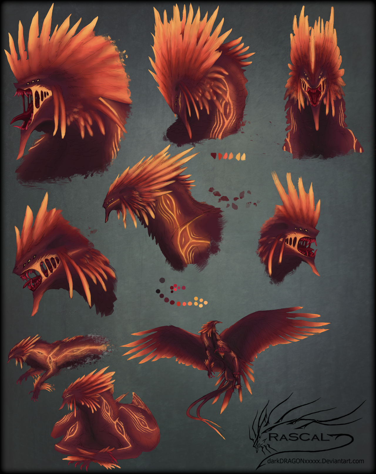
So I'm working on a really crappy but basic ref for Elzatros and I was thinking if someone or anyone can suggest red lines or corrections? In other words, I'm looking for critiques please.Of course, I'm obviously not done with this yet but i'd like corrections before I continue?
(One thing to point out, his body seems thick because of the fur/feathers, whatever, and same goes to the rest of the body, but anatomically wise, I would love help please
 (Smile)") )
)Elzatros (c): ~darkDRAGONxxxxx
Related content


Comments: 20

Here is your requested critique from
Negatives/Improvements
> There's not really a lot I can say considering it is still a WIP, but there seems to be something a little wrong with the way the front leg is 'attached' to the body, this could just be because of the lack of shading or colour though.
> The fur and feathers are superb so far, but looking at references and perhaps tutorials will help them stay as brilliant when you colour and add further details.
> The neck seems a bit too thick compared to the way the back flows. I understand that because of the fur, the neck seems thicker but the back arch doesn't seem to fit with the rest of the shape of the body. Using references of dragons and other creatures, plus adding circles/lines to represent the limbs and stuff will help you see the anatomy.
Positives
> I really love the design of this creature - the fur and feathers look amazing and the way the feathers are spread across the back, feet and head looks wonderful.
> The line-art is so neat and I love how the fur flows and looks so fluffy.
> I also love the contor of the backlegs and the muscle definition on the creature. The fur that spreads across the floor looks fantastic as well and really gives more character to the creature.
I really hope you upload the finished piece of this once it's done because I would love to see it! This is a brilliant creature~
I hope this helps!

👍: 0 ⏩: 1

Thank you so much for taking the time to give me a critique C: It is really much appreciated, I will indeed look into what I can improve :3 Thank you so much again.
👍: 0 ⏩: 1
You're welcome!~ 
👍: 0 ⏩: 0

MMMM looking great so far!!!
Yeah, I agree with Fates, and I feel the back legs should be a lil bit bigger in general to help hold him up.
So glad you uploaded somethings, been waiting for awhile!
👍: 0 ⏩: 1
Thanks
👍: 0 ⏩: 0

I love this sketch!
Don't ask for too many "corrections"
your imagination is perfect the way it is <3
👍: 0 ⏩: 1
Aweee thank you so much <3333 I just want to try to improve anyway I can c:>
👍: 0 ⏩: 1
That's what I love about you! You're very talented but still humble and wanting to learn+improve more and more. See, that's the kind of thing that makes me think you're gonna be an artist to look out for in the future.
& Even though my drawing style and subject matters are completely different from yours, I still enjoy and appreciate every post you put up because your drawings and concepts are so very interesting.
👍: 0 ⏩: 1
Wow that honestly means a lot to me <
And I'm glad you enjoy c: I enjoy knowing the fact xD
👍: 0 ⏩: 1
(go with the flow ")
& you're welcome xD it's my pleasure.
👍: 0 ⏩: 0

You're welcome~ ;D
👍: 0 ⏩: 0

This looks great so far! I absolutely love the design.
As far as critique.. the only thing I can think of is that your hind legs are a bit disproportionate, the length of the "calf" is a little too long if that makes sense, either that or the foot is too short. I'm terrible at explaining things :I sorry if it didn't make much sense.
👍: 0 ⏩: 1
Not terrible at explaining at all
and again, red lines do help a lot more when it comes down to it... But I see what you mean. If anything I'll see if I can make it shorter because now that you point it out, it does seem so...
Lol, I haven't drawn the feet yet

👍: 0 ⏩: 0

hnn maybe make the neck a little skinnier, head seems a little too small, but a fantastic piece already
👍: 0 ⏩: 1
Neck isn't thick, it's his fluff that makes him thick, and his head is supposed to be small to show his mass in fluffy size.. lol
👍: 0 ⏩: 1
and thats why i dont make corrections XD he is very fluffy then
👍: 0 ⏩: 1
Well it is always a fact to consider, so thank you
👍: 0 ⏩: 1