HOME | DD
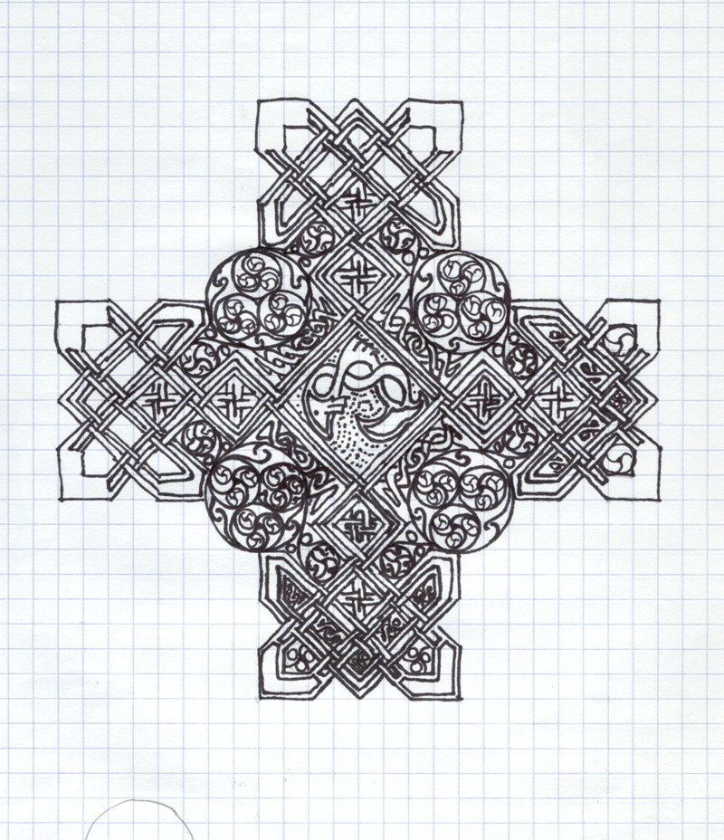
 kaidoh — really rough cross draft
Published: 2004-01-18 14:13:59 +0000 UTC; Views: 149; Favourites: 2; Downloads: 59
Redirect to original
Description
just an idea I roughly inked out, just to see how it would look. I like it, but I don't and I can't quite figure out why I don't. Looks off somehow.. Any help?Related content


Comments: 14

This is a masterpiece! It is so beautifuil  (Smile)")
I love it to death!! can't wait to see it done, it does not look that far off
at all, you could call it done now...its so amazing!
👍: 0 ⏩: 1

Lord.. LOL... i haven't touched that in over a year..
I did a piece for a friend.. actually, he paid me real money for a piece for a gift for someone else. He even provided the parchment paper (he works for a printing company.. nice to have a friend there. Should i ever want business cards or such) and it was a celtic cross with a circular trinity motif done in metallic copper and aqua green acrylic ink, with ogham writing around the circular part. I never thought to scan it, and it's hanging somewhere in Washington state in their hallway.. But this was one of the conceptual ideas for that.
👍: 0 ⏩: 0


YOhohoho this is awesome *staring*
Such an beautiful design !!!!
I would love to see it colored *cheering*
👍: 0 ⏩: 0

this has a wonderful sensativity to pattern ... I've seen books filled with just this sort of thing; as insets or center pieces (like this), as flare, and as corner and border decoration ... they sell quite well: designers use them all the time.
people like me ... we just don't do this kind of intricacy. i've put a couple hundred hours in a piece before (days when i thought maybe i should do photoreal), but the result is more organic ... i can't approach this at all and from an outsider's perspective, there's this instant awe to the crystaline beauty and simplicity of the work.
that said, i've my own idea about the incompleteness. starting at 6 o'clock (bottom) and working counterclockwise ... there is a progression from dense detail to sparser detail in the first three arms. Then, a repitition in that 3rd and the last. these two things work against eachother. The central composition and general uniformity could be overbearing. If everything were the same it would be plain. With the fluid change in that CCW direction, it is more organic and less static ... and that holds the eye longer. But the last two being the same breaks that flow. Just IMHO.
--r
👍: 0 ⏩: 1
That's probably the best analysis I've seen. Never thought of that before and you're absolutely right.. gives it a whole new direction for me and I think I will actually finish this now. But going with the more organic turn instead of the purely symmetrical, which I have a great tendency to do with my knots. Thank you.
👍: 0 ⏩: 0

first might i jsut say 👍: 0 ⏩: 1
Thanks..
👍: 0 ⏩: 0

I really like this, and would love to see it finished. Maybe whats missing is one of those circles through a cross like celtic style crosses have. Maybe the arms could be a bit longer too. With your awesome weave effects, a circle would look amazing.
👍: 0 ⏩: 1
That may be what it is.. I tend toward circular designs, don't i? I hadn't planned on doing anymore with this, but I may now. THanks.
👍: 0 ⏩: 0

It looks really nice overall. It may just be that the center piece isn't as detailed as some of the rest of it that throws it off. Other than that, once again, very nice.
👍: 0 ⏩: 0


Oo! That's gonna be nice.
The right stem and the bottom stem are filled in with designs, but the left and top are not; I think that's what looks off.
👍: 0 ⏩: 1
Well, I hadn't even planned on finishing it. Yeah, I know I didn't fill those areas in because I just kept sitting back and really not liking how it was coming out. I may come back to it. But thank you.
👍: 0 ⏩: 0