HOME | DD
 KaijuSamurai — Anguirus turnaround

Published: 2010-02-13 01:32:19 +0000 UTC; Views: 39145; Favourites: 913; Downloads: 1780
Redirect to original
Description
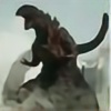
The follow-up to [link]The final piece of art for this time, obviously, is Anguirus.
My notes on the design:
When considering Anguirus, I thought of two things first: face and color. My friends describe Anguirus as having a "Where's My Coffee" look in his 1960's and 1970's incarnations, and I think it's quite apt. I took that face and made it a bit fanglier and craggy, but the body is heavily influenced by the 2004 Anguirus from Final Wars. I also studied many four-legged animals, especially a rhino's, for a general look-and-feel for his body.
Man, these are fun....I'm tempted to make more...NO, BAD MATT. NOT ANOTHER MULTI-YEAR-SPANNING-PROJECT.
Related content


Comments: 92


Very few designs capture what Anguirus is supposed to be: a gigantic Anklyosaur. Matt has portrayed Godzilla's sidekick's dinosaur origins without losing the classic look. The club on the tail looks perfect the spikes look fearsome, and I especially like how you kept the basic look of the head while adding features to make him stand out. Another thing I like is his expression, it Looks more fearsome then the original. The way you arranged his spikes also suits the more realistic design as well. The only complaint I have is that I wish you kept his original colors rather then recoloring him, but that is a very minor complaint. Awesome work as usual. e.deviantart.net/emoticons/s/s… " width="15" height="15" alt="
 (Smile)")
👍: 0 ⏩: 0

Originality
The "Where's My Coffee" look is something I never really thought about whenever I tried drawing Anguirus. Even though I myself have never drawn Anguirus in full, I find this take to be quite inspiring and one of the most realistic takes on Anguirus I've seen yet.
The head, while still retaining the irradiated ankylosaur's basic shape, has an aura of determination which I personally found Anguirus to have through his attitude but never exactly saw in his design. You convey this beautifully.
The small stoney bumps on his cheek, jaw, knees, and elbows shows just how ancient Anguirus really is. It almost reminds me of the barnacles on an old whale, of which there are many.
His limbs make up for their slight "stumpiness" or shortness by being muscular, and the musculature is most apparent to me in the hind legs, where you can see he is raising himself high.
The almost-glyptodont/armadillo-like shell is fitting, as the "armor-nurdles" give a much more viable place for the spikes to start growing out. The spikes in and of themselves are realistically straightened and not overly curved.
The reddened underbelly of Anguirus also shows how muscular he truly is, as the banding of the skin makes it look tight yet flexible, almost as if it can move with greater agility than the bulkiness may make one assume.
The tail actually looks like it has weight to it, which it does with the characteristic club on an ankylosaur's tail, in this case covered in spikes. Same can be said with the neck and head, respectively. Everything looks like it has weight to it, and that is perfect when considering realism in a creature of this sheer size.
Overall, Matt, this is another spectacular work of yours. I cannot wait for more like this!
👍: 0 ⏩: 0

Overall
Vision
Technique
Impact
This is awesome even for matt frank! It's so original and the art style is amazing, I dream of one day leafing how to draw like him, In fact, I try to draw my godzilla in a similar fashion to him! I love his art, and this is one of the best I've seen, it has such a great impact makes him look like a ancient creature (older than godzilla?) I love this and anyone who's never seen his art should check it out! I think his art is inspiring to any fan of the kaiju genre! He should draw concept art for future godzilla films if u ask me! In fact, I think his godzilla neos should be in kaiju combat as playable characters than the original godzillas! I would love that! Keep up the good work matt frank!
👍: 0 ⏩: 0

i will also make a 3d model on blender to look like this creature too
👍: 0 ⏩: 0


well not EXACTLY but still sweet drawing! ;D
👍: 0 ⏩: 0

Awesomely done well detailed,colored and impressive too
👍: 0 ⏩: 0

Already been done. Looks a lot like Showa, just updated and less thin.
👍: 0 ⏩: 0


Excellent job on Anguirus, like his fangs and especially his thagomizer/tail club, he seriously looks like he could do some serious damage! Also like his cranky face and Rhino like hide, totally pinned that "Where's My Coffee" look (I know how Anguirus feels, I look the same if I don't get enough caffeine either XD)
👍: 0 ⏩: 0

Very cool design!! I think I like this Anguirrus best, even compared to the movies!
👍: 0 ⏩: 0

Too bad you don't own him, you could have this image put on coffee mugs with the "Where's My Coffee?!" line just inside the rim of the cup. You'd make a mint on Ebay.
")
👍: 0 ⏩: 0

He seems very very bulky, and if you remember, he originally stood on two legs (how he became a paraplegic I have no idea). Only things I'd say is maybe lengthen him out a bit, make him more streamline in the head and legs, with the back legs a little longer to show he's capable of moving on two legs. That's just me tho...
👍: 0 ⏩: 0

Angy looks pretty pissed. This is what happens when kaiju don't get their caffeine.
👍: 0 ⏩: 0

Anguirus is like the Ankylosaurus from hell. Love all your kaiju art
👍: 0 ⏩: 0

like i said b4 this one make an interesting alternate realiy anguiras. the design is amazing too i overall lov it
👍: 0 ⏩: 0


Man Angy loks aweseom. I have to asked, are you trying to make him look more realistic? I like the colors they blend will well.
👍: 0 ⏩: 0


I like the design it gives it the feel i always though anguris would have. its a slight mix between armadillo and Ankleosaurus which I think was what he was supposed to be based on, my mind is kinda fried from the two tests and 8 page paper I just wrote so if things are a lil muddled sorry. The head looks just a lil squished for the thickness of the neck. other than that I see nothing wrong with the design. it takes me back to when I was a kid watching Him and Godzilla trample through Tokyo.
👍: 0 ⏩: 0
Have you ever done a personal version of the Beast from 20,000 Fathoms? I finally found a copy and I gotta say, it's some of Mr. Harryhausen's best work.
👍: 0 ⏩: 0

I would say it looks fantastic, but I feel the neck should be a little higher and the legs a little further apart but otherwise another great work of art looking forward to more.
👍: 0 ⏩: 0


He looks like he could go toe-to-toe with a gang of Kongs and still have room to finish off the Cloverfield Monster! The rhino influence really makes him look built for pounding through enemies
👍: 0 ⏩: 0


dood
"where's me coffee!!!"
I love it!
I'd always thought anguirus looked grouchy as all hell, but I never thought to describe it that way
i really like your redesign here, except i really prefer his earlier incantations without the club-tail
though i must say you've incorporated it without nagging my old-school obsessiveness
Awesome Work!
👍: 0 ⏩: 0

Awesome! Here he is, badass looking again!
Show meeting Final Wars!
And yeah, we better hurry to give him his coffee.
👍: 0 ⏩: 0


Dude, it looks super awesome, but Anguirus facing forward his fangs look slightly weird, giving him a kinda old man look to him!
👍: 0 ⏩: 0

you should do more but not as a multi-year-spinning project you should just do your fave kaiju instead and leave it at that.
awesome piccy by the way! but then again when do you do a pic that isn't awesome?
👍: 0 ⏩: 0

Cool!
"that's ok Anguirus, I'll give your coffee....boss"
👍: 0 ⏩: 0

Head looks a little to much like Bowser for me but, other than that it's a good redesign.
👍: 0 ⏩: 0


Well if you enjoy doing them and we enjoy viewing them there's no harm in doing, like, the MAIN PLAYERS in the Godzilla series... like a MechaGodzilla, Mothra, King Ghidorah, Rodan, etc...
It's when you start doing a turnaround for Ookondoru that you know you MIGHT have gone to far.
👍: 0 ⏩: 0

Looks awesome. You should do some more, though you don't have to.
👍: 0 ⏩: 0


Nice. really like the look of the spikes, very menacing looking.
👍: 0 ⏩: 0


I've read a lot of flak concerning your take on Anguirus; particularly the Neo version. Apparently making Anguirus an ankylosaur type kaiju complete with ceratopsian beak and massive club tail somehow didn't fit the character anymore, according to some. It spurred a similar wave of redesigns that took the idea a tad too literally to the point where the defining aspects of the character aside from his spines disappeared. I'm glad we ultimately avoided that with this one.
I think this take on Anguirus is a good balance of old and new that ultimately cements the feeling of the original character and gives him a body that best displays that character with his defining features all accounted for. The snout, like with the head shot from earlier, has always been one of his major things and its good to see it back. It allows a lot of expression and keeps his tusks logically implimented. Final Wars downplayed the nasal horn so its good to see that remedied. The carapace looks tough as ever but also has some turtle elements that give him flexibility in his limbs. The tail club is something a lot people feel they need to add but I like it in this case as it's well supported and looks like it belongs with the rest of the tail, it doesn't look so heavy that he'd end up dragging it either. The color, is a rather interesting change. We normally associate red and blue in the series with SpaceG in all his flashiness but it oddly enough works rather well in this subdued palatte for Anguirus. Most would want him gray or earthy again but from an evolutionary standpoint, earth tones are used to blend in. Creatures like Anguirus have no need to hide and his red underbelly could actually be used as a threat display when he occasionally rears up.
Overall I think you did a smashing job, its more true to the original character than the Neo was (as joyfully cranky and bullheaded as that creature was). YOU COULD, take a copy of this and play with the colors to see how it would look in those earth tones again. I can see the reasoning behind it but some others might find it garish compared to the original. Another neat feature I forgot to mention are the chin and joint osiderms. When Anguirus is at rest he would be putting pressure on those points so it's nice to see that level of foresight in a design.
-RenDragonClaw
👍: 0 ⏩: 1

why does this picture remind me of turtle
👍: 0 ⏩: 1
I think you mean 'you' and the reason I see turtle is the neck area and the way the carapace settles around his limbs. With the Neo, the carapace was like a normal back armor or hide and the shoulders were kept seperate pieces. Here, its all one piece again.
-RenDragonClaw
👍: 0 ⏩: 1
ah so when it come up it looks more proper
👍: 0 ⏩: 0

Awesome Anguirus, dude! One of the best I have ever seen! I love it man! Oh, and by the way, I just came back from The WolfMan, and it was awesome!!! If Universal can do this with The WolfMan, just think what can be done with the GillMan!
👍: 0 ⏩: 0

This coloration really suits Anguirus quite well actually. He looks like a mean, lean unstoppable machine 
👍: 0 ⏩: 0

| Next =>