HOME | DD
 kobaltkween — Possession

Published: 2012-08-12 03:11:43 +0000 UTC; Views: 1302; Favourites: 11; Downloads: 19
Redirect to original
Description
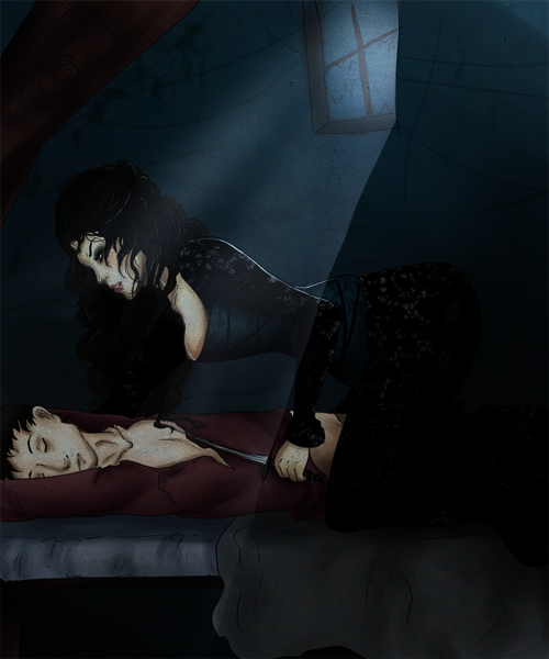
This is my submission to the Epic Championship, for the Supernatural round that has the theme word "ghost." For those of you surprised to see me posting pure 2D work, I'm actually on a vacation right now and away from my typical computer. I made the piece as a sort of play on the possessive pose of the ghost and the concept of ghostly possession.Related content


Comments: 18


I don't think there's anything wrong with the transparency of the ghost, but because of Hollywood, some people have an expectation of how an apparition should look. But I look forward to seeing the other updates you have made.
My biggest challenge with Painter is making it look and feel like I'm creating a painting with real media. I've seen it done, by this guy [link] for example, so I know it is possible. I'm probably just too resistant to digital-looking media, if you know what I mean, and maybe just need to allow myself to experiment instead of wanting things to look like acrylic and oil at all costs. Painter's compatibility with Photoshop is a must for me right now, which is why I haven't tried MyPaint, although I hadn't heard of Krita until just now...
👍: 0 ⏩: 1

Oh, I know what you mean. That's why I like MyPaint so far. I've always found Painter's emulation of media beautiful but clunky. You can get great results with it. I've been impressed by what I could do with it. But I personally haven't found working with its media very natural. I immediately found MyPaint much more like actually working with charcoal, pencil, and watercolor. Which isn't to say I expected it to be just like the real thing. I definitely don't. You might find it frustratingly unlike real media. Also, I was absolutely awful in acrylic the one time I tried and I've never used oil, so I can't speak about either of those emulations. But I can say I find smudging, adding water, painting with water based media, using pencil, using charcoal, etc. easier and more natural than I have in years of trying to get used to Painter.
My initial impression of Krita is that I don't think I'd need PS to do much more than polish a Krita image, and I might not need it at all. I could totally be wrong, but that's how it seemed. It didn't work well on the Windows system I was using for this, so I didn't get to do much more than poke around the interface. MyPaint, on the other hand, is optimized for concept art. So no masks, no filters, no brushes with raster shapes, no importing other images, no canvas limits even. To scale the image, you zoom out and work larger. It's very much a tool for immediate work. At least so far. It's really great for working fast and loose, letting you discover the boundaries of what you want to depict as you paint. And it's good for me because it forces me to _paint_, not edit. But more and more people are using it for polished works. I think it may grow into something a little more versatile than it is now.
I'm pretty sure it won't get PS integration, though. I'm really curious as to how you're using Photoshop in your process now. I used PS for this image, but very much after painting. I exported the ghost as a separate layer, but everything else was one piece. I used PS mainly for level and curve and tint type stuff. PS integration would have been convenient for me, but not a necessity. The way you say it, it sounds like you're doing _much_ more interesting stuff with PS. And that makes me curious.
👍: 0 ⏩: 1
Mostly I demand PS integration because I don’t want to have to add yet *another* app to my toolbox. And maybe that makes me lazy, but I might be willing to change things up. When I do get around to real digital paintings, it will be entirely in Painter, hopefully, with no editing in PS unless there needs to be a text effect or filter that only Photoshop can duplicate. And I do need to relax about the brushes, because it just might be awesome to mix watercolor layers and oil, or some other combination that’s not possible outside of the pc.
When I really think about it, there’s probably no absolute reason to choose Painter over the others for PS compatibility yet. I’ve seen tuts where illustrators making a complex scene jump back and forth between Painter and PS, but I’m not nearly at that stage in digital 2D. So maybe I’m also being demanding because of hope. But in using Painter and PS together so far, it’s been for the comic I’ve been slowly making (at about 2 pages a year so far). I use the pencils in Painter (which feel like the real thing) to sketch thumbnails and a composition for the whole page, including drawn word balloons, often using its Golden Proportion guides to help the comp. Then render pics that follow the compositions. Then open the drawn composition in PS to use as a guide to assemble a page from the renders. Then add word balloons and text/text effects, still following the drawings. But I probably could do decent pencil thumbnails with the other apps. And your description of MyPaint makes it sound like it’s worth exploring, since all I’m doing for the comic so far is concept work. I might end up missing Painter’s guides, though.
👍: 0 ⏩: 0
Sweet! I remember you once saying that you have done full-blown paintings. Great to see an example of your talent.
That ghost is creepy, defying me to come near the woman, or to do anything about his very presence. I love those sheets and the painting of the wrinkles (bane of my painting existence). While noticing the overall whiteness of the sheets, I was thinking it might help if they reflected some of the other blues/browns/purples in the room. Of course it could be difficult (for me, at least) to do so without detailed photo or render reference, and I don’t know how well the light and colors of your source material match your painting. The figures are handled very nicely, although the ghost’s thumb looks maybe a little too bent? And the woman’s hair is impressively painted, but maybe looks stark compared to the pastel appearance of everything else.
I’m really glad you shared this. You and a few others are inspiring me to make some digital paintings, as soon as I can create some brushes in Painter that actually feel like real-life brushes to me.
👍: 0 ⏩: 1
Oh, thanks so much from the feedback! Yeah, the colors are very much my own, and really should affect the sheet more. I now have a revamped version (heavily cropped, differently tinted, color adjusted, change in the ghost's blending options, etc.), and I should add that to the changes.
Yeah, the thumb looks crazy, but it's directly based on an image (I really need to link the dA references). I think part of that is poor shading, and part of that is not making it look right instead of accurate.
You know, I didn't really think about the hair in that sense. That is, I think I _meant_ it to be stark, without really thinking about what that would do or mean. The color isn't really related to the reference. I'm kind of inclined to make more of it, but again, that's more of an instinctual choice than a logical one.
I love Painter in terms of its possibilities, but I've never really gotten fluid with it. And I've tried it off and on since '98. It's a lot more powerful than MyPaint, and probably more powerful than Krita (hard to say since I don't really know Krita), but I immediately got the experience in MyPaint I'd always wanted in Painter. I know someone who's had the immediate reward from using Krita. I can't suggest giving up on Painter, because it's awesome (I used it to make the skies in Painted Sky), but the only two aspects of it I miss using the combo of MyPaint and PS are the sweet rendering of a 1px line (smooth as silk in Painter, OK in PS, not so good in MyPaint), and the ability to have a pattern (like lace trim) follow a curve. Not a brush that strokes a curve, but a resampling that actually bends the original along the curve. Most texture artists live without the latter, and working large in MyPaint works to fix the former. I'm sure if I got into Painter, I'd find tons of things lacking from other solutions, but I just haven't been able to get myself into it.
👍: 0 ⏩: 0

ooh, this is really creepy. Don't like spirits. I didn't know you could draw and paint, Malaika! This is cool. The folds and drapes are very nicely painted. That's the hardest part. The lace is really well done too. I've drawn lace before and it takes awhile. I do a lot of pencil art but because I don't have a scanner I don't post any and to take a picture with a phone doesn't really work. Although Masha has figured out a way that I can take my laptop anywhere and draw in it. She gave me her old Graphire Wacom which is really small. I can plug it in and draw out in the fields. I've done some nature paintings but I'm still refining my technique but I may do some paintings when we go on vacation tomorrow. Your ghost is really creepy and effective. Brrr.")


This is a really effective painting with the ghost and his threatening possessive pose over the innocent sleeper. It has a lot of metpahorical meaning between good and evil, chastity and lust, sweetness and aggression. It's scary in a subtle way without going over the top. His expression is quite effective. And the fact you just whipped this out on your vacation for a contest is amazing. This is not just a simple painting, it has a lot of undertones and meaning. Masha helped a lot with this critique and we pretty much agreed on every point simultaneously.


👍: 0 ⏩: 1
Thanks so much for the detailed feedback!
Answering in order:
Yes, this is in layers, and he's on top and transparent. I actually painted him at full opacity and then changed his layers' properties. The drape is much larger than you can see because I painted it in its own layer and extended it past where it would be covered just to be safe. I generally have several groups of layers, even in 3d work. This I did with MyPaint, which has a lot of tools specifically for painting without Painter's usability problems, so no groups of layers here. I tried to use Krita as well, but that fell victim to the technical problems I experienced. It also has lots of digital painting tools. In general, it looks exactly as it should to me, with the drape showing through him, but I think people each have their own expectations when it comes to transparent and incorporeal people.
I'd actually like to try the Pepper's ghost technique in 3d some time. That's tricky, though, as the real-life technique requires specific lighting.
On the blanket, I guess it depends. Most of the blankets I've seen people under haven't been excessively folded over on themselves. At the edges, they just had small wrinkles like that. But I could have looked for references that were more uneven. The issue with her legs is actually that the blanket obscures their shape too much. Her proportions are right, but hidden more than they should be and therefore distorted.
I think you're right about the sheet being better with more shading. It's actually the front and bottom I need to shade more. I'd have spent more time on that, but I just didn't have it. Same goes for the blanket, really.
Photoshop has lots of ways to shade (or select, for that matter, since lasso gives a hard edge or a uniformly feathered one), but MyPaint is more limited in terms of everything you can do besides paint. It's optimized for concept art more than finished works, so it's mostly really robust painting tools. I'm really hoping I can eventually get Krita 2.4 working, because it's more of a balance of painting and editing tools. MyPaint is great though. I got about 3/4 done and thought I could switch to Photoshop then, but I just didn't have the time to paint with Photoshop. I could get so much better blending in MyPaint. I actually could have used watercolor or a more textured brush, but I went for smoother strokes this time.
Still, I don't know if I'll be doing much pure 2d work in the future. I let my references determine too much of my image. Working in 3d gives me a more control over the starting point. But it was a good experience. I learned more about working with MyPaint, how best to use a reference (at the very end), and how much I could do quickly. I enjoyed it a lot, too.
Thanks so much for the encouragement!
👍: 0 ⏩: 1
It's 10:30 here in California.

Today was a long day. It was really hot and I had to pack after procrastinating all week. I just wanted to curl up and sleep.  (Smile)")

👍: 0 ⏩: 1
Oh, it was great feedback and really helpful. I really appreciate it. I've already done an edit and am considering whether to spam people with it. Just writing a reply and analyzing it prompted me to revisit my original sketch (real world, in a sketchbook), and crop it to what I think is a better framing. Like I said, I let my references determine too much of the image. But it was also _really_ rushed due to those technical problems. I ended up with less than half the time I planned to have.
Again, thank you very much for taking the time to give me such detailed feedback.
I hope you try out MyPaint at some point. It's free and open source, and has a lot of great real media brushes (pencil, watercolor, charcoal, etc.), and the ability to _really_ edit those brushes if you want to customize them. You can't exactly port its layers to Photoshop (PS is helpful for finishing and certain types of editing), but you can save the layers out as individual images. They just aren't automatically in the right positions, so you have to position stuff again in PS if you go that route. You can also just export a single flattened image. I kind of did a combo with this piece.
👍: 0 ⏩: 1
I downloaded it last night and installed it in my laptop to use on vacation when we're driving. I can plug my wacom into it and draw. I like the pencil mediums. It really acts like a pencil.
We're still waiting in the airport. We were here punctually at 7:00 and got through security pretty fast, about an hour and half. So we've been sitting here waiting for our flight stress-free. Grown ups are smart. At first I was like why so early but now I get it.
OK, I'll talk to you later when I get settled but I might not be here for awhile too. I'll be really busy playing!!!
 (Wink)")
👍: 0 ⏩: 0

