HOME | DD
 LarryWilson — Lighting And Painting Tutorial - The Impish Imp

Published: 2014-10-08 16:41:45 +0000 UTC; Views: 7717; Favourites: 336; Downloads: 178
Redirect to original
Description
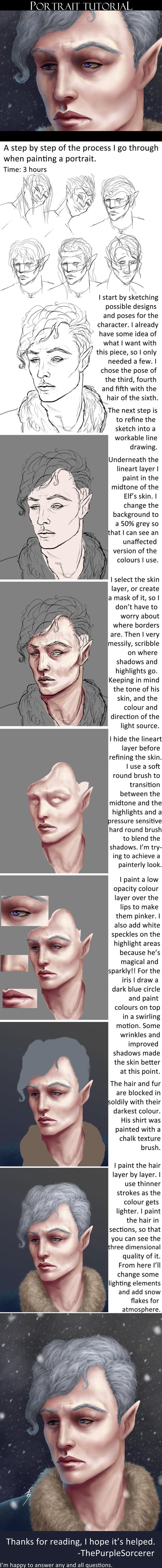
A brief look at how I approach some of my paintings and my thoughts as I work through the process.Download for Full Rez.
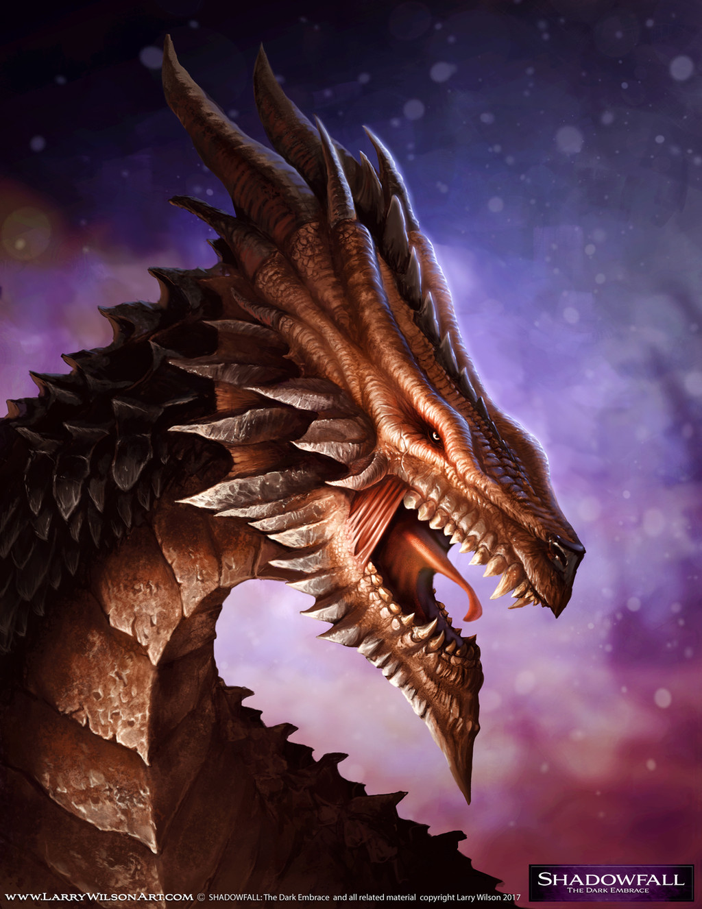
This is for a recent painting The Impish Imp. Hi Rez here:
Please feel free to ask any questions and let me know if there are any other guides or tutorials you would like to see.
All C & C Welcome.
Related content


Comments: 25

OH! This is amazing!!!!")
👍: 0 ⏩: 1

Hiya, Thanks for the cool feedback  (Smile)")
👍: 0 ⏩: 1

Great tutorial! Thanks for the info; goes to show you can accomplish a great deal using just a few brushes!
👍: 0 ⏩: 1
Hiya, Thanks for the feedback
👍: 0 ⏩: 0


Anytime
👍: 0 ⏩: 0

Hey! Really interesting process, love the end result. A quick question about the final stages, where it says you add a grain screen at 20% what does that mean, is it a texture or a noise filter or something like that? Thanks!
👍: 0 ⏩: 1
Hi there. You are correct on both counts. The 'grain screen' is there to simply add a little 'noise' to the final finish as opposed to a more noticeable texture overlay (like brushwork or the canvas showing through).
My grain screens are usually set up like this. Take any image, blur it out and desaturate to get some interesting B&W shapes. This just gives a little bit more visual interest. You can also start with a simple black layer or paint in your own shapes or gradients. Add noise via the PS Filters. Set the layer to Overlay or multiply depending on your needs and drop the opacity down to around 10-20%. You can also duplicate and sharpen this layer(to make the effect more noticeable, then erase some areas where you want less focus.
👍: 0 ⏩: 1
Thanks for the reply! Yes that makes a lot of sense, Id always presumed the grain was just simple noise and there was a stock way to do it everybody used but like you say using other images for different shapes in the grain will be a lot more interesting. Really good work Ill be sure to look out for your future tutorials and paintings
👍: 0 ⏩: 0

awesome! But It's a very difficult tutorial for beginners >_< I hope I can learn faster!
👍: 0 ⏩: 2

Hi thanks for the feedback. Yup this was def meant for more intermediate level. If there is something you are needing help with let me know and i will look at doing something aimed more at beginner levels.
👍: 0 ⏩: 0

My pleasure, thanks for the feedback
👍: 0 ⏩: 0

AWESOME! I'll definitely be referencing this tutorial in the future!
👍: 0 ⏩: 1
Good to hear
👍: 0 ⏩: 0

Ahh, this is a wonderful tutorial. I'm still trying to practice light drop-offs and realistic light gradients (and failing, mostly) but I'll try testing out some of the techniques here to see if that helps. Thank you for making this tutorial! ^^
👍: 0 ⏩: 1
Thanks for the feedback. Hope it helps you in some small way. Let me know if you have any questions.
👍: 0 ⏩: 1
You're welcome!
If it isn't too much trouble, could you please critique a WIP of mine? I'll understand completely if you don't have time or you don't want to, though. But if you're okay with critiquing it, I'll send you a link to what I have now.
To put it simply, I've been practicing my lighting, but I seem to make the same lighting mistakes over and over again. Here's a quick example of what's wrong with my work in general:
sta.sh/01ubuowyviny
I want my work to look dynamic like example A, but it always seems to turn out looking like example B for some reason? So... yeah. If you have any tips on avoiding that, that would be awesome.
👍: 0 ⏩: 1
Hiya. Always happy to help out with crits/paintovers.
The issue you are having with your lighting is a quick fix. You should be able to paint those spheres in 3-5 brush strokes. I'll give you some pointers later.
Send me the links to the piece you want critiqued & I will go over everything this evening.
👍: 0 ⏩: 1
Thank you so much! You're so awesome for doing this for me.
I sent you the link in a note if that's okay. That way I'll be able to easily find it again, since it can be a pain to dig up old comments on DA once they've been removed from your inbox.
Thanks again!
👍: 0 ⏩: 1
Heyo, Sent you back a lil paintover and crit
👍: 0 ⏩: 0