HOME | DD
 LeonaWindrider — Silent Reflection

Published: 2007-02-07 13:45:33 +0000 UTC; Views: 1832; Favourites: 34; Downloads: 40
Redirect to original
Description
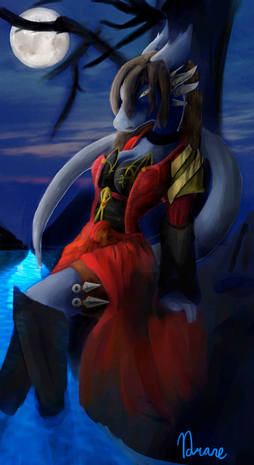
When I first looked into her eyes, I lost my breath. They were, in themselves, no different than the blue eyes of a common woman, but they hid something indescribable in the limited tongue of mortals. If the eyes are windows into a person’s soul, then I saw a woman capable of great sadness and great joy, a woman who truly deserves the majesty her name is synonymous with. She showed little emotion the entire time we spoke, but each feeling that came to me seemed to exist simply from her presence. I soon forgot the business that brought me to her chamber and basked in the exchange of each word.
-- Excerpt from Revealing the Three Nations, “High Mistress Veia, The Miracle”
-------------------------------------------------------------------------
Ok, I'm asking for an advanced critique on this one partially because this may end up just being the color sketch of a larger painting, and I'm wondering what you guys think of it so far. What do you think of the quality, specifically, putting aside the nature of the picture itself and focusing just on it's construction and painting/inking?
This is another speed paint -- actually a speed picture if you will. From blank page to sketch to inking to painting to finish this took me 4 hours. It was a challenge laid down to see what I could turn out, and overall considering the time frame I'm very happy with it. I of course could pick at it all day, and again I'll probably turn this into a more detailed pic later, but I wanted to get everyone's view on it as if this was the finished piece.
Line art and final lighting in Adobe -- everything else in Painter. God bless that program. *hugs*
Related content


Comments: 13


Love her head... Very cute!
Critiques? The most obvious. Some proportion mishaps in the chest and whaist areas.
")
👍: 0 ⏩: 0

Ok!
First, I agree with Anna on the inking and the "too much pop out". Thinner or lighter lines would be better. This said, although it doesn't fit this picture, I like this shading a lot, so it may be good to keep that technic for some pictures where the background will be done in a more similar way.
I'll also agree with pretty much everybody and say the background is great. Moody, and well done. A mirror surface, for one, is tough to do. Good job on it!
This said, there is a trouble with the reflection in the mirror. It can't be the exact inversion of the character, because the mirror is in bias for the viewer, so we should see a slightly different angle of her. See this picture for reference : [link] ; ...yeah, I know it's most probably a huge burden to do an accurate reflection.
To niptick, a few things on anatomy, too :
- Her arms may be too short, although maybe the sleeves give that effect. It's mostly on the arm that touch the mirror. The way you drew the dress suggest the clothe it's made of is thin and light, so it should follow all of her armline, including the crease of the elbow. Here it doesn't completely, so we have the feel the arm is too short.
- Her shoulders seem to be raised... That add a stiffness to the pose. I mean, From what I understand, this is a moment for herself, of tiredness or sadness, so it would be natural for her not to have tension in her body, since she's letting herself go. raised shoulders imply tension. I don't know if I explain myself well, I suppose the main way to see that is to imagine yourself in the same mood and pose and see if you'd raise your shoulders - chances are you wouldn't.
- Her waist is very thin as compared to her chest, and she doesn't have much hips. I understand how changing a little the proportions is necesary - it gives her a royal posture, and also make it look like she's sighing, something that fit the character and mood of the picture. But it may be a bit too much for the overall anatomical correctness.
I said the background was great, well, all of the painting here I like, I must say. It has a kind of roughness to it, but it gives a life to the picture that sometimes, too detailled paintings eventually kill.
I hope that helps
 (Smile)")
👍: 0 ⏩: 1

Thank you for taking the time to do such a detailed critique, Juju! I was wondering when someone would catch the exact reflection of the line art
 (Wink)")
👍: 0 ⏩: 0

this is really awesome Leona, good job with the shading and stuff!
👍: 0 ⏩: 0

I love this! Your style is awesome. I like how the black lines 'pop' gives it a feel as though it is a stain glass, and that's just cool.
I only have one tip...her breasts are too high on her chest and they are at full view rather than 3/4 view like the rest of her body. Makes them look like they don't want to be with her.

👍: 0 ⏩: 0

This is yet another great work of yours! I personally like the darker lines that you used, you did a great job with the reflection, and the coloring is spot on. My only gripe is that her waist seems to be too thin in comparison to the rest of her body.
Overall, great job
👍: 0 ⏩: 0

Alright… advanced critique it is!
The lines you used on her are very, very thick and dark. I personally would make them thinner and maybe a dark brown instead. The background is very soft, because you don’t use any dark lines like that in the back, and the lines you have on her now are such a contrast that it distracts you from the actual picture. Her pose itself is also very gentle and elegent, so the lines kind of contrast that. I understand that you need her to pop out so that she doesn’t get sucked into the curtain behind her, but it’s just too much pop right now. Hopefully you understand what I’m saying. 
👍: 0 ⏩: 1
Thanks for the critique -- I'm trying to find a balance between the thickness of the lines and the painted background.
👍: 0 ⏩: 1
No problem. I'm sure you'll get it
👍: 0 ⏩: 0

o.o Wow! She's beautiful! The emotion in this is incredible. Her eyes and face are filled with such sadness and longing; and yet she exudes such strength of character that some of it seems hidden.
I'm not an artist, so my opinion may be a little on the "uneducated" side, but I think this is very good. Strictly from a qualitative standpoint, the colors (and the way it was painted) flow very smoothly together. The heavy inking and rough shading in some portions add particularly well to the implied lighting and general setting of the piece.
Now from my own standpoint, I feel the... roughness (for lack of a better word) adds to the overall emotion of the piece. To me, the character seems to normally show great resolve around others, hiding her true thoughts and feelings from the public eye. In this piece, she's away from any prying eyes and can let down some of those defences, allowing her true emotions show through. The rough shading and coloring add to this piece, bringing those emotions out more fully to the viewer. That's the way I see it anyway. ^.^;
👍: 0 ⏩: 1
Wow did you totally nail Veia's character! Thank you very much for your detailed critique of the piece

👍: 0 ⏩: 1