HOME | DD
 Light-Tricks — Warhammer 40k Officio Medicae Variant 1

Published: 2012-11-12 18:26:31 +0000 UTC; Views: 3391; Favourites: 47; Downloads: 95
Redirect to original
Description
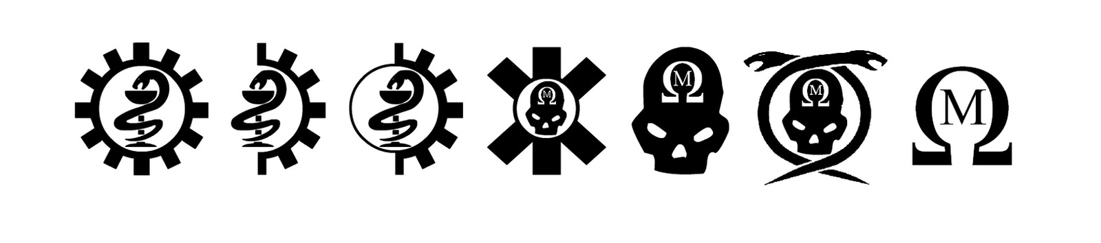
Some time ago I created a graphic for the Officio Medicae - [link] - to go with the new 40k medical fluff I was working on, but later realised I needed a simpler variant that was clear, distinct and regonisable even at low sizes (and also to be turned into transfers for objective items and vehicles... watch this space).So I had a tinker around and came up with some variants. This one was intended to mirror the standard design for various Imperial organisations and offices ("I with Circle"). I wanted to try and keep the skull in there but also incorporate the snake. I had the idea of utilising the ouroboros symbol as the circle, which has similar connotations to the phoenix in terms of myth/symbols - so in some ways quite apt for a medical logo. The downside is this is not immediately recognisable as a "medical" symbol, and it does remind me a little of the old genestealer icon. I still rather like it though.
It's still only a rough version, so feedback is welcome
Full folder of symbol versions and variants here: [link]
More info on my wargaming blog here - [link]
Related content


Comments: 3


My second in row to choose. For this one i would change only proportions between I and a circle ( snake ) try to make it larger - compare to Daemonhunters logo.
Still i think these two are really great.
👍: 0 ⏩: 1

Thanks very much, I made the circle the exact same size as the existing Adeptus logos, the white space is just to have a bit of clarity when smaller
 (Smile)")
👍: 0 ⏩: 0