HOME | DD
 liquidshade — Fist of Innocence
Published: 2006-09-23 22:21:47 +0000 UTC; Views: 4419; Favourites: 101; Downloads: 25
Redirect to original
Description
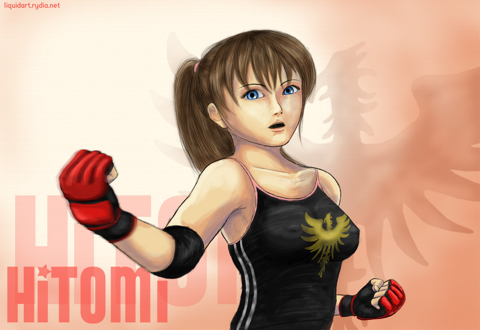
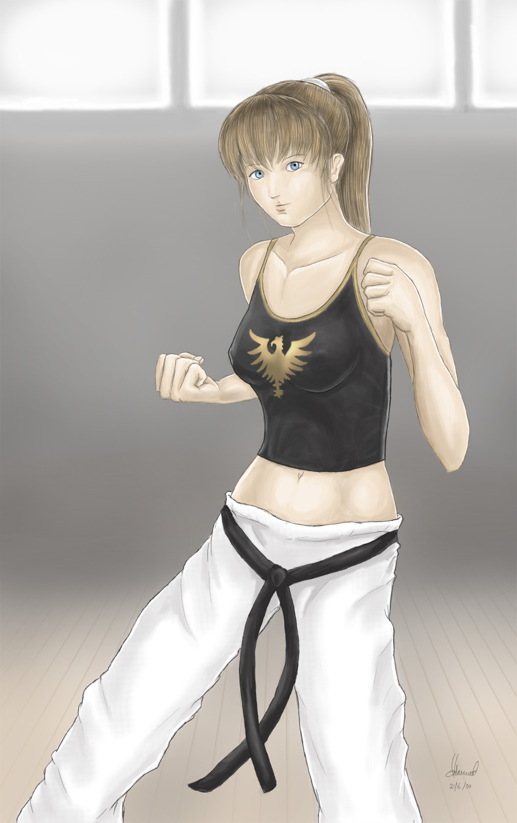
This is one of two Hitomi pics I've made, largely originating from a spur of the moment idea, and I thought I'd combine the two into one pic, kind of a two in one deal. I found it hard to see how they could be placed alongside each other though, and as I began to colour them, they were developing styles that were too different from each other, so in the end they became two seperate pics. The second will be coming up shortly after this one. Hitomi is from the Dead or Alive series of course, and in this case, DOA4 specifically.Spurred on by Kez's demands for stuff that she can at least look at comfortably, I decided to leave the sexy or ecchi pics aside for a moment and concentrate on a somewhat more respectful representation of my dream girl. Not that I consider nudity disrespectful, but yanno, you can still be beautiful with your clothes on. Especially if you're 'Tomi. I also drew this during the long month just after I moved house in which I didn't have internet access, so that's why she's not been insipred by the flurry of DOAX2 screenshots and movies that have surfaced recently (have you SEEN the CG trailer?.. man, you know I've got ideas for a pic based on that ice cream scene, don't you?
 ). Anyway, here she is doing what she does best, and that's kicking ass. The "Fist of Innocence" name is something she was given for her DOA4 profile, and when thinking of a title, it just struck me as being very appropriate. Kinda sums up both sides of her in three words.
Anyway, on to the pic itself. As you can see, it's alot rougher around the edges than my usual, fully refined works, and I'm always banging on about wanting to try something that breaks those boundaries a bit. I like this rough colouring style, using hard brushes and contrasts, and the thicker, less smooth outlines complement this. Not something I'm thinking about fully changing to, but it's nice to have options. The key point with this pic is that it's the first to be coloured using my new laptop, which as I've mentioned in my most recent journal, has a monitor that tends to display things much lighter and clearer than the monitor for my home PC, which I've always used up until now. It's not TFT, so it is hard to get colours just right, as they look different depending on the tilt of the screen. I couldn't help but notice that the colours of my previous pics all look different on this, and some of them just look way too dull, even my favourite, "Breakfast Time" from back in March. Therefore, this one should be a good deal more colourful than anything we've previously seen from me before. When I brought it partly finished to my old desktop though, it looked a tad too bright and colourful, so I hope it looks ok on your monitor. This situation has thrown me into a bit of uncertainty with it, but hopefully feedback will settle my concerns about it.
Well, too colourful or not, I'm rather happy with the face and the pose itself is very similar to a couple of Hitomi screenshots in my collection, so it wasn't too much of a challenge to draw. She's back in her ponytail, yet despite that, it still really really looks like her, I think. The phoenix top is a dead giveaway at least. Maybe she'll get to have different hairstyles (and I'm not talking about that dyed blonde travesty from DOA4) in DOAX2, at last. Regarding the phoenix, for this one I actually traced around it from a screenshot and used that, whereas before I would always draw from scratch. Getting it to twist around so that it rests nicely against her boobs was a challenge, but it also works well for the background too. Speaking of which, I had no idea what I wanted for that, so it was very rushed at the last minute, I'm afraid. Only thing I'm not that happy with is the creases on her tanktop - very hard to do, for some reason. Oh and the motion blurred fist I think works quite well to add a bit of dynamics to the pose, but I wonder if anything else should be blurred too.
That's about all from me I think. Thought this would be quite short, but I guess I underestimated my waffle-ability. Sorry. Please let me know if the colours look ok for you, particularly. Thanks!
")
Related content


Comments: 21
Hello, are you still active on DA? i want to thank you, because you Hitomi works inspired me a lot. one of my last mod dedicated to her DOA4 look.
👍: 0 ⏩: 0

I wish there was a Pencak Silat fighter in DOA. Karate is too bland IMHO.
👍: 0 ⏩: 1

It depends on what style of karate imo, plus there now is a Silat fighter in DOA 6
👍: 0 ⏩: 1
A blue haired chick named Nico but her move set is mostly used by electricity. She's kinda like a female Heihachi Mishima from Tekken, but her style is Pencak Silat
👍: 0 ⏩: 1


One of my fav DOA characters, and this pic is awesome, nice work
👍: 0 ⏩: 0

i hate giving critique and i dont know if anyone has said this already, but this is just getting me because its what i always do... the shading doesnt seem dark enough, and the purple used is cool, but i think the shadings to light for it... also i think her hair isnt big enough for her head...
but then you are better than me so meh
👍: 0 ⏩: 0

It's great to see some more Hitomi pictures from you! It's been so long!  (Smile)")

👍: 0 ⏩: 1

Glad to hear you're with me on the blonde option.. I've nothing against blondes whatsoever, but Hitomi is a brunette, and it doesn't feel right any other way! Anyway, end rant.. thanks for your kind and articulate comment. Much appreciated. ^^
👍: 0 ⏩: 1
No problem at all! And I agree with you 100% about blondes and Hitomi!
👍: 0 ⏩: 0

"Fist of Innocence"...with her wholesome good-looks, I guess that as long as she puts on an innocent face it is not too hard to forgive her for beating her opponents to bloody pulp. She will definitely make a fine wife for a man who do not fear death...
Your rendition of Hitomi is absloutely stunning! Her fierce yet feminine pose is definitely appreciated, especially with that tight tank top covering her well-endowed(maybe it's in her genes) bosom. Those lovely blue eyes, silky brown hair, and delicately smooth skin can charm most men; it is very scary that women like her could possess such power over guys. And you have drawn her with careful details and with truly impressive cging. Great job as always! ^^

👍: 0 ⏩: 1
Haha! Oh, I know Hitomi would never intentionally hurt anyone that didn't deserve it, or who wasn't challenging her to a match. She'd especially never hurt the man she loves.
Thankyou for your detailed comments, as always. ^^
👍: 0 ⏩: 0

Now, it's not often I give much criticism, but I think Hitomi's head looks a little big and squashed in this, and the shoulder furthest could do with having been a little higher.
The colouring is really nice! Although, the texture isn't very consistent.
I'm going to be mean and say I've seen much better from you ")
👍: 0 ⏩: 1
You're so mean. ;_;
No, I appreciate it, and hear where you're coming from! While I wouldn't say I just slapped this together, it's certainly not a fully refined pic that I invested many hours in, and was never supposed to be. Dunno if I particularly agree with what you say about the face, but the colouring texture is inconsistent, especially on the top. I got frustrated with that, and you know when you're frustrated, you feel less like you want to spend careful time on getting it right, and more like you want it to just be right all by itself.
Thankyou very much for your helpful comment, as I know you usually favour your fangirl rants. ^^
👍: 0 ⏩: 0

First off, you did a really good job capturing the spirit of Hitomi - the pose and expression really defines her character (at least for the fighting games). I like the style you've used here - the brushwork is great and the sort of rough shading/coloring style only make this picture look better. I also like the graphic presentation style - it really makes this work as character illustration (as opposed to a work that has a fully designed/painted background). I'm all for experimenting with different art styles so definitely play around with this some more. Hmm...maybe try some different techniques for hair - her bangs are nicely clumped together, similar to a manga style, but maybe play around with letting her hair flow a bit more freely with some softer edges.
As for your monitor/display issue, I certainly know how you feel. I do all my art on a nice, bright LCD monitor (which is hooked up to my Mac)...but I do almost all of my web surfing (including writing this comment) on my PC which has a 17" CRT monitor. I see a fair amount of difference on my PC monitor compared to the LCD - that's mainly because (I believe) LCD monitors are just a lot brighter than CRT monitors. I've tried adjusting settings on my LCD but still seems noticeably brighter. I was sort of concerned about it at first but I've gotten used to it and try to not let it worry me too much. There's so many different monitors out there (and video cards too!) that there's gonna be differences. Ideally the best thing to do would be to survey how your work looks on a bunch of different monitors and then pick a happy medium...but that's not really a practical solution. If you have any sort of calibration software you can run - either for your laptop display or your image-editing software (Photoshop) - that might help keep your display (and artwork) in a standard range. Other than that, so long as people are seeing blue as blue and not green, I wouldn't worry too much about it.
👍: 0 ⏩: 1
Thankyou for your very indepth comment!
Yeah, you're right. It's true that no matter how unusual the colours in your monitor are, you do get used to them, and colours tend to appear where they should be in terms of the range that the monitor can churn out. I too tried adjusting the brightness of this monitor, but could not get the results I was looking for. Still, I haven't had any complaints yet, and didn't take too long to adjust to the difference when i was making my pics, so I don't think it'll be much of a problem for me now, providing I stick to drawing on this laptop and not my home PC.
What is annoying though is getting the tilt on it just right so that I can try and determine what the "actual" colour is. It looks most like my old monitor when it's held quite far back, but that doesn't tend to look best for this one.
👍: 0 ⏩: 0

I see you are totally obsessed with Hitomi ^_^ and it's a good thing! We will get more fanarts with her from you in the future! Yay! Anyway i think i know why i thought Hitomi on your second picture looks younger . I looked first at this picture and later at "All blue Hitomi". This picture shows Hitomi in action, while on the second one she's sitting and smiling. Another thing is that her face looks more mature here than on the previous picture. I love them both, you have captured the fighting spirit of Hitomi and it doesn't matter than her pose is similiar to the original Tecmo artwork. I bet this stance is a trademark of Hitomi and you should run for your life if you see it! Colors are great!
rita
👍: 0 ⏩: 1
Thankyou once again! Yeah, the two pics are very much two different sides of her. I guess she can't not look mature in that kind of pose and facial expression.
👍: 0 ⏩: 0
