HOME | DD
 LoomingColumn — Vitality Testing Comic 2
#comic #fi #guns #rifles #sci #scifi #soldier #soldiers #stealth #tactical #vitality #drone #field #thermal
Published: 2015-04-28 03:06:24 +0000 UTC; Views: 3695; Favourites: 45; Downloads: 35
Redirect to original
Description
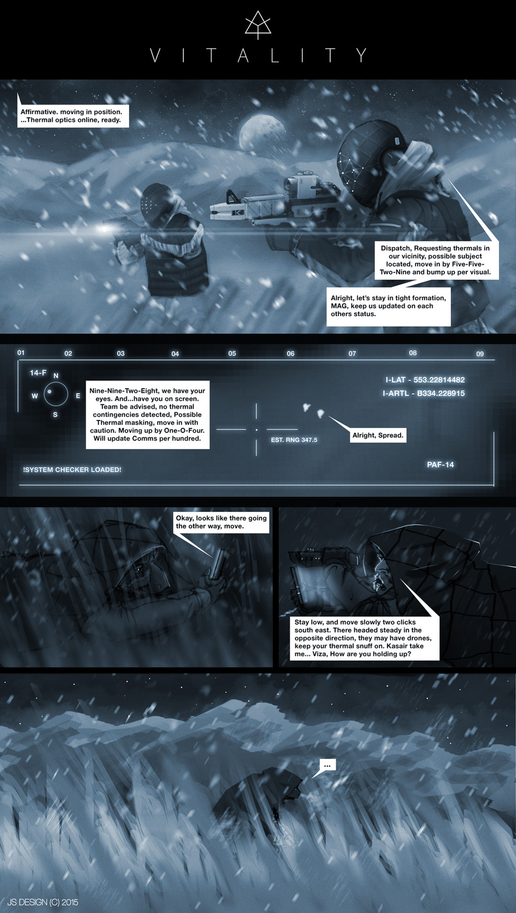
The second testing comic I've done toying around with the idea, this time with better and more organized dialogue!I want to do at least one or two more before i actually start on a legit vitality webcomic and everything. but hopefully this a a much more organized and more tighter, coherent piece then the last one,
"Viza And Gad are being apprehended by TETRA PMC agents, can they sneak there way past the patrolling agents?"
Read The First One!
Related content


Comments: 21


This is much clearer to your previous attempt and very intriguing. Like somebody else commented, the font is the only thing I see needing a change. Perhaps something with more of a futuristic feel? I have the typeface in mind but I cannot describe it sadly.
👍: 0 ⏩: 0

This was fantastic. I think you've got a clear story to work out here. Keep up the good work! I'd love to see more of these
 (Smile)")
👍: 0 ⏩: 1

Thanks! thinking of doing one more and starting a legitamate comic series, thanks for the support man!
👍: 0 ⏩: 0

")

This is a great improvement from the previous comic. The only thing i would change is the style of the type. Typeface and typography are underappreciated by most artists but I can tell you that subtle changes in the text can make all the difference. Just a warning not to got overboard with the type, it shouldn't be crazy or clique in a comic unless it's the focal point of the panel. I would suggest maybe having a more blocky typeface for the soldiers talking to command to give them a more computer like feel. Anyways I hope this helps.
👍: 0 ⏩: 1
thanks for the critique man! yeah a bit new to most of this, I've thought of switching to a few other fonts besides Helvetica, mean. comic sans is nice but I'm not sure if i really want to use it, but using them for different types of dialogue, i haven't thought of it, ill try it out, thanks man!
👍: 0 ⏩: 1
Comic sans is a little too "loose" for what I think your going for, I might recommend Trajan Pro, Letter Gothic, or maybe Calibri (just some typefaces that I looked at real quick).
👍: 0 ⏩: 0

Well, I can said for sure you have a future reader of your webcomic!
👍: 0 ⏩: 1
thanks man! thats, wow, means a lot!
👍: 0 ⏩: 1
Well, the characters look nice, the design too and I'm curious to know more ( because for now I don't fully understand what happen hehe ).
👍: 0 ⏩: 0

Looks great!
(By the way, "Okay, looks like they're going the other way, move."
👍: 0 ⏩: 1
i knew, i just KNEW that i would have gotten something wrong haha, thanks!
👍: 0 ⏩: 0


Certainly an improvement over the last one. Speech bubbles are more understandable. Weather effects and thermal optic panel looks great.
It appears Viza and Gad are on the run from their former buddies. Classic stuff.
 (Wink)")
👍: 0 ⏩: 1
thanks! hopefully it wasn't leaning fully on the effects, hoping the next comic page i do will focus more on story building ad dialogue rather then action,
👍: 0 ⏩: 0