HOME | DD
 manic-goose — Realistic Art Basic Tutorial

Published: 2009-02-22 20:26:03 +0000 UTC; Views: 21486; Favourites: 291; Downloads: 1362
Redirect to original
Description
Ok, I have had these waiting for a long time... and now I am finally putting it together and writing about it, because I figured it was over due time for that.Before you start drawing realistic art... it is important to have good references. If you are experienced and practiced in realistic art, this may not be as must the case... I don't' know, but I do know that I still need references, and if you are just starting, you will need them too.
A few words about referencing:
While referencing is needed, it can be a tricky business... The closer a reference is to what you are aiming to draw, the more detail you can put into it... which is good, but if you are referencing something very closely, people usually want to know what you are referencing... at least that is how it is on the internet... That makes sense of course... but that can be tricky, because often times when you find the perfect picture, you may not know where it came from, or what you remember may not be accurate. I am mentioning this because it is easy to get into trouble for something you did not intend to doing realistic art. That something that you may get in trouble for is art theft. The best way to avoid getting in trouble for that is knowing where something came from, getting permission to reference it, and even altering the image to your own style or changing things in such a way that in the end it no longer resembles the reference... some combination therein is the best bet... but that isn't always possible. I honestly can say that I am not sure of the best procedure for using a reference you don' t know where it came from except to mention that you used a reference and you dont' know where it came from... though it may be tempting to leave that out... because it sounds silly... you might think (duh! I used a reference, you think I memorized what a person looks like that well when I've never done realistic art before? That is how I thought when I first started... but then again, you can never tell if you are offending someone by referencing their work and not saying where it came from... which also makes sense, because if someone referenced what you drew, wouldn't' you at least like to know about it and know that they aren't taking credit for it? I feel I have to write this up, because in my tutorial, I am telling you to reference, but I don't' want you to get into trouble for it... might seem like common sense to most people... but still... better safe than sorry, right?
Getting started:
Find a reference... or several if you need them... and get them set up. Open Photo shop with those references in different windows. You can keep them in different windows or you can make a quickly collage to help compose the picture... for example, if you are using a flower from one shot, a butterfly from another and an eye from a third, you can try putting them together on one picture that shows how they will all fit together so you wont' have to guess about the arrangement in the actual picture. After you have your reference or references set up how you like open a new folder with the size you want it... I suggest a resolution of 300 dpi at least, so you can get the little details right.
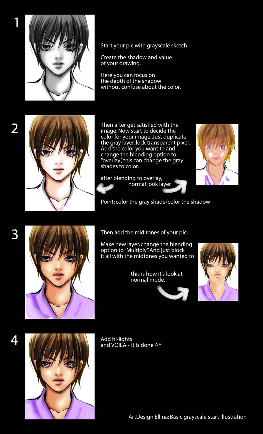
1.
When you are doing realistic art, you end with absolutely no line art... keep that in mind when you draw the line art... make it as accurate as you can, but don't worry about making the lines look refined or anything, sketchy and quick is best, because that way you can get onto the drawing faster.
If you are doing this with a mouse, you might want to trace the image on a separate layer and then copy and paste it on the page you plan to do your art in. I recommend this for mouse users only because I know hoe difficult it is to draw something decent with a mouse... coloring on the other hand is much more doable with a mouse... If you have a tablet, you should resist the temptation to do this because it works much more similar to how real drawing works and so you don't' need that extra help just to get it to look reasonable.
2. put the base colors on a layer under the line art. This is similar to cell shading... only you add more layers of shades than just one or two, and like the line art, you don't' worry about getting everything just perfect. You will be altering it later with the smudge too anyway.
There are multiple methods that one can use for applying the base colors, each with their own strengths and weaknesses. The first method is to use the dropper tool and select colors directly off of the picture you are referencing... this will get you a more accurate color palette... but if you do a good job, you may run the risk of making the image look like a paint over (where someone just paints on the picture itself or something like that... rather than drawing it all by hand) and while paint overs in and of themselves aren't bad (so long as you are not pretending you drew it all and you give credit to photos you used), but if you drew it from scratch, you probably want to get credit for that. The other option is to simply make up your own variation and or eyeball the colors you will need. This may result in a less accurate palette but people are more likely to recognize it as a drawing.
I have used both techniques... and I must say that for the most part a variation of the two approaches works best for me... where I sample a few of the colors to get a range and fill in the blanks on my own... in the end, I think that this is something you should figure out on your own.
3. using a smudge tool of about 25% strength, that is fairly large, start smudging the colors into a smooth looking surface. I suggest using a smudge at 25% because it is soft enough that it won't read every twitch of the finger and to completely alter the line. To get smooth flowing colors, have it weak. Also set the hardness to 0%, this will help with the smoothness as well.
Go over everything with the smudge tool loosely first, and don't worry about the details yet.
4. Hide the line art and look at the picture. Where are the details needed, what still needs more smoothing, what simply doesn't look quite right. Make those adjustments now. It is a good idea to use the dropper to select the color of the area you are modifying, and then with a small brush, draw in what you need and then with a small smudge, carefully blend in that line with the surroundings. If you got the proportions somewhat off or something like that, you can use the liquefy filter to push things into the place you think they should be. Do this in stages if you must, with just a little here and a little there... until it looks just right. It is important that you get this done before adding hair or eyes because liquefy will mess up the shape of the eyes and the flow of the hair.
5. Add the eyes and any details that go with the eyes. ( I will include a realistic eye tutorial int eh future... in the mean time, just do the best you can. When you add the eyes, add anything that is attached to them, like tears or lashes or anything else.
6. Add the hair. Here is a link to realisitc hair making. Hope this helps. [link]
7. Back to the line art for doing clothes. In this case, I drew the clothes on a different layer from the other line art, but that is optional> Personally feel that by doing the line art in stages like this, you don't have to worry about if you alter the picture the line art not matching up any more, and that is why I do it that way.
I often use a green background for something I want to keep layered so that I can tell easily if something is sticking out in a way I don't' want it too, that helps to kept the edges smooth... this is kept on a different layer and made visible every so often throughout the drawing process to get things just right.
8. Base colors again... but with clothes I tend to do things slightly differently. I start with a flat color and then use lighter and darker colors with a pen that is partially transparent so that it has the light up look... Something to keep in mind when doing clothes... the folds are such that the darkest part and the lightest part of a fold often are side by side... I hope that made sense... It is more difficult to find references for clothes... so the best thing to do is to drape a cloth over an object and study that, borrowing some of its folding patters and light and dark pattern to fit the clothes that you drew... because often you will find a face you can use, but the person is not wearing what you want them to wear.
9. Just like before, smooth it out... add details, look at all the payers together without the line art and make sure everything is right.
I hope this helps you if you are interested in trying your hand at realistic art. Good luck, and have fun.
Related content


Comments: 55

good luck with that, I’m rather irreplaceable
👍: 0 ⏩: 1


Is the lighting on the side of the chin too bright, or is it just me..?
👍: 0 ⏩: 0

thank you sooooooooooo muuuuuuuuuccccccccchhhhhhhh. . . .
cool job dude. . .
👍: 0 ⏩: 0

I wish I know digital art like this! This is so nice.
👍: 0 ⏩: 0

I can do most of that until it's time to get rid of the line art and add in hair
👍: 0 ⏩: 1
Than keep a sketch of the hair to guide you and just give ti a try. It is actually easier to do than it looks.
👍: 0 ⏩: 0

I am planning to start drawing realism when I get a tablet... and... this is so useful! It's exactly what I've been looking for!
👍: 0 ⏩: 1
Glad I could help
👍: 0 ⏩: 0

this was so helpful, thank you!! i can't tell you how many tutorials just say "blend" without explaining how
👍: 0 ⏩: 1

have you made any tutorials..?this kind of art style..?im so interested in this^^
👍: 0 ⏩: 1
Not any more than that really... and a hair tutorial.
👍: 0 ⏩: 1
okey..ill check it in your profile..thanks..guru..haha..
👍: 0 ⏩: 0

I.. don't think I've ever seen someone cry like that. Don't they usually just go down one side, one path? (As opposed to five paths...)
Maybe I'm just being hyper-critical :/
👍: 0 ⏩: 1
Nah, you are right, this is old, and I didn't realize that at the time
👍: 0 ⏩: 1
Normally I don't point stuff like that out, it's just that it was titled realistic, which got me >.>;
👍: 0 ⏩: 1
Well at the time, it was the most realistic I could do.
👍: 0 ⏩: 1

No problem, I made it back then because people were asking me to. My newer realistic is still not perfect... but it is considerably better than what I could do then.
👍: 0 ⏩: 0

Have you ever considered making a tear tutorial? Your tears are so good >.< I can never draw them
👍: 0 ⏩: 1
I should sometime, I'll remember that.
👍: 0 ⏩: 1


thanks! this realy helps!
I been looking around for some realistic one but some people draw just horribly lol
👍: 0 ⏩: 1
Well this is the basics of my shading techniques, but still, getting the initial sketch right is crutial, or else it just won't look good no matter the coloring technique.
👍: 0 ⏩: 0

 (Smile)")
 (Wink)")


and great discussion with BlackDelphin
Im a mouse user, n this will really help me
")
👍: 0 ⏩: 1
ah, yes, the good old mouse days. It is hard work, but you can do anything people do with a tablet with a mouse if you are determined to do so. Good luck
👍: 0 ⏩: 1

This tutorial looks very useful. It looks like it's time for me to upgrade my photoshop skills.
👍: 0 ⏩: 1
Glad it helps a little. ^^
👍: 0 ⏩: 0

Where has this been hiding!?
More stuff to try out!

👍: 0 ⏩: 1
All my tutorials are in my scraps, and in the tutorials folder. ^^
👍: 0 ⏩: 1

wow thnx sooo much for the tutorial .. will have to try a few techniques when i find the time lol
👍: 0 ⏩: 1

ooh you do tears BRILLIANTLY 
could you show us some steps pleeeease...i really don't know what to do when it comes to water droplets like stuff and i avoid them ")
i prefer to use stock images or my own to make sure nothing bad happens
and that's a pretty good idea ( in the step before #1) but that type of manipulation can take to long plus you may be changing the look even more...i think the imagination eye works perfectly and pretty much in detail if he has the refs in front of him
#1 i tend not to draw lines at all when trying a realistic painting...lines, ESPECIALLY black feel..limited....and they intimidate me XD forms...blocking in...you can interpret them differently and so you may even come up with a cool new idea
#2 i eyedroped a few pallets at first, with some colours made by me, and afterwords i combined those colours n made new ones n so on ^^
#3 here i am not agreeing with you any more 
#5 yeah, yeah 
#7 you could at least choose a less saturated colour
#8 very true! i studied that
but btw...does it have, like skin a saturated colour in the middle or something specific like that?
ooh i'm at the last step already
nice of you to write this


👍: 0 ⏩: 2
Using stocks for references is good... I might add that... but when I wrote that I was thinking of a broader crowd than just on dA, because not everyone has access to the range of stock images available here.
for 1... the lines are merely a guide line, so you don't forget what goes where... once you got things more or less as you want them, toss the lines... that is my thinking, but they help you to compose arrange, and figure things out before all the work of coloring and that can save you a whole lot of hassle. Still, this is just my technique... and everyone does their work how it works for them... this is just advice, not rules.
2. I do more or less the same thing... eye drop to get started and then figure it from there... usually... but sometimes I am going for a completely different color scheme, in which case I just eyeball it... as is in the case with this image.
3. I would have been surprised if you didn agree, because your technique is not smoothed out... it is rough and painted looking and good that way, I am simply explaining how I do things so if someone wants to try out the same look they know how to. the smudge tool smoothing is a technique I developed from my mouse art days because I lacked the basic control needed to get it right the first time, and without the sudge, nothing looked refined... I carried that over with me into my tablet art... and I am thinking of experimenting with other techniques... but for now, I'm explaining what I am familiar with.
7. The highly saturated eye sour color is actually best... because nothing is that saturated and therefore anything normally colored will stick out like a sour thumb. That way I am guaranteed that no matter what bg I use it with, it will still look great... I only suggest bothering with that color if you are planning on possibly reusing an image... and I always keep things at the ready... just in case I do want to reuse it in a modified state for something else.
8. That depends on the color of the fabric... something that is supposed to be really light or dark... stay away from saturated colors... something that is mid tone, yes, the more saturated int he middle is ideal. The middle is where you tell the viewer the actual color of the clothes... the other colors just add highlight and shadow to it.
Thank you for reading it all, and commenting. It is great to get comments like that because then I can explain my thinking in more depth and tell people that it is perfectly fine to do things differently.
👍: 0 ⏩: 1
well there's always sxc.hu
#1 yeah..but that i think limits your creativity and interpretation of lines and forms
#2 ooh i see
#3 hehe 
#7 yeah...i guess it's true...and at least it's not pink XD
#8 ooh yeah! i tend to forget that sometimes..
ooh you are really welcomed!! and i can't believe you took so much time to answer and to explain things!!!


👍: 0 ⏩: 1
1. Nah... lines are a form of creative expression too... you are after all talking to someone who draws line art for other people to color. 
3. What strength of the smudge tool do you use? That is important. I never use one stronger than 25% because if I do, I am certain to ruin my work. The smudge tool is a very powerful tool to use... but one has to set it right and know how to use it... and that means practicing... and besides, that is what the undo button is for! If you are interested in the smudge tool, what I suggest is finding a picture that you have already finished and don't need to work on any more, open it up, and without saving your work, just play with the smudge... see how things look... with me, I tend to do the major smudging before I add the details and then add the details after the smudging... and maybe only use a teeny tiny smudge to blend the detail with the smudge. The bottom line is that if you are willing to just play with it and figure it out, you could learn a great skill that is helpful in enhancing and creating new kinds of detail, but you would need to try it out without the intent of saving... just to get the hang of it, because most people don't use it correctly... the tool is too strong, the hardness is to great... and so the result is smudgy looking instead of smooth. I'm not going to tell you you have to use the smudge tool... your style doesn't really need one, but I will say that if you are interested in broadening your skills and what you have available to you, it might be fun to try. I like to try as many techniques as I can just to see what I think of them if nothing else, and I usually gain at least a little something more that I can then apply to my own technique to make it stronger.
7. pink...
Answering and talking about and explaining things is where the strength of these tutorials lies... they are just first steps that give people an idea of a direction. That is all they can really be on the internet.
👍: 0 ⏩: 1

but then again it's because of you guys that we are sometimes guided throughout your ideas and skills
ooh i for one don't think i have to draw on that line but it's annoying when you have to blend it in and the colour is just so dark
#3 yup, totally agree with the experimenting and i shall use it...i don't think i normally used it under 25% because i used it as a strong blender
#7 that's the whole idea
spoken like a real teacher

👍: 0 ⏩: 1
Yep, that is true... and as for the line blending, THAT is why it is on a different layer. SO it can be deleted. 
That is the problem with the smudge... its auto setting is way too strong. GAG!
👍: 0 ⏩: 1
ooh just exteriorize yourself
yessss

👍: 0 ⏩: 0
| Next =>