HOME | DD
 MatesLaurentiu — Armor tutorial

Published: 2011-07-12 19:16:46 +0000 UTC; Views: 46293; Favourites: 1745; Downloads: 768
Redirect to original
Description
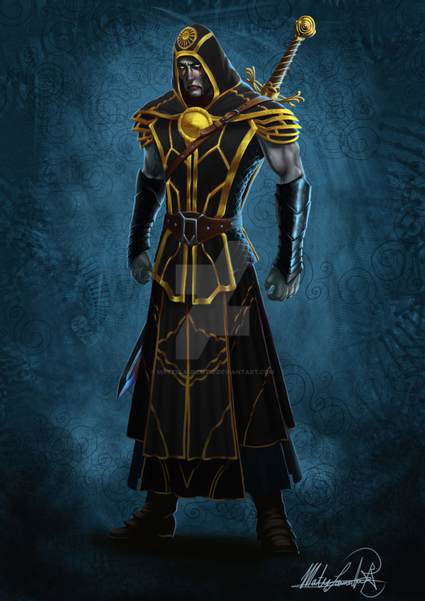
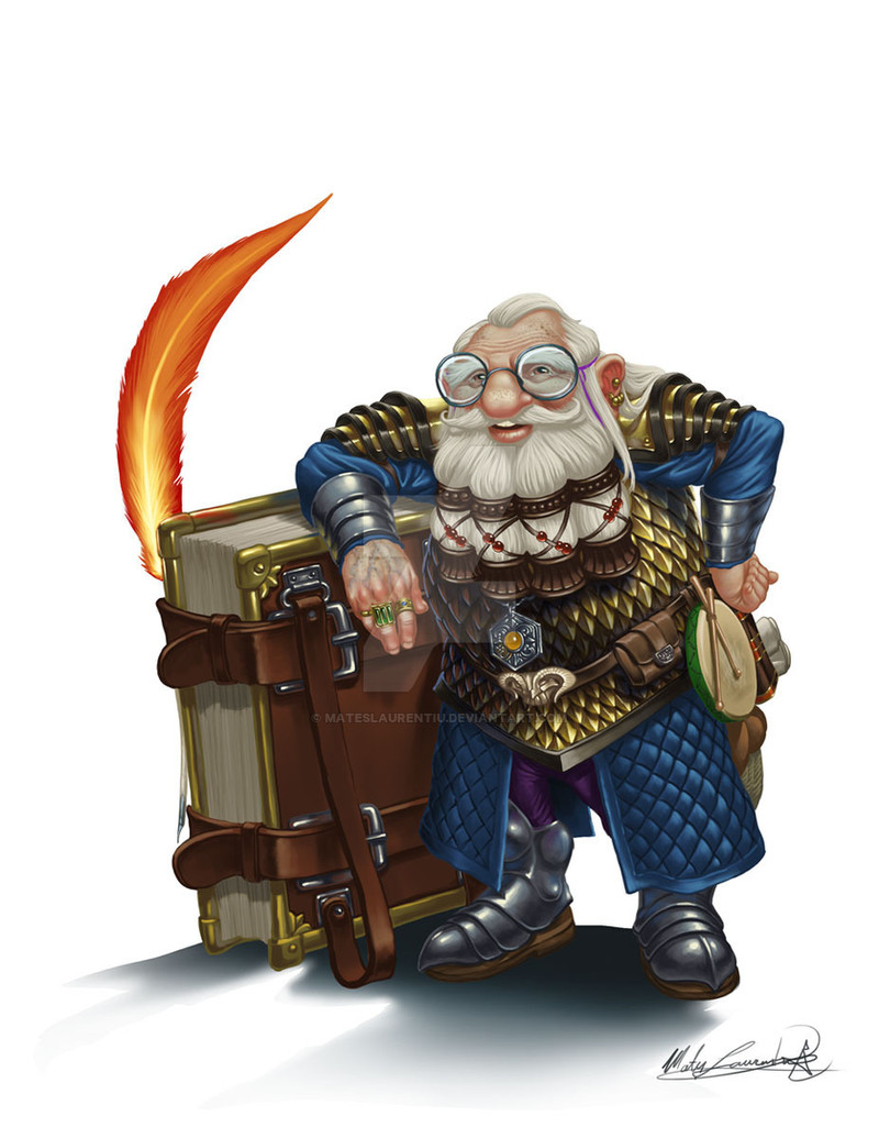
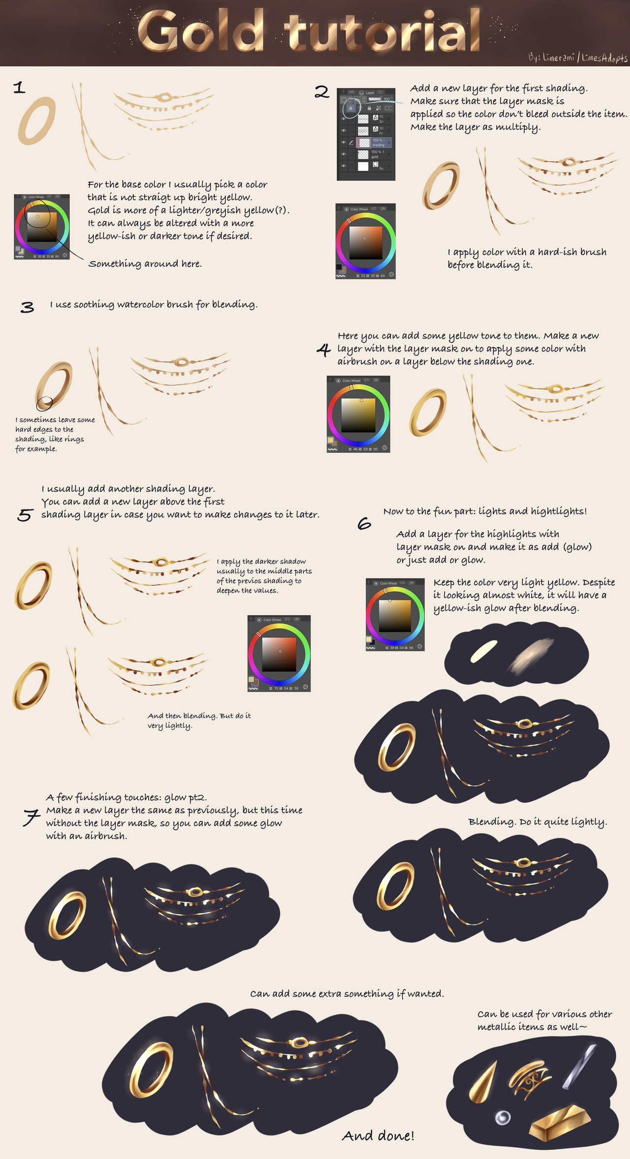
I made this quick tutorial to help along friend over at the Threedy forums but I thought of sharing here too in hopes it might help people. If you use it, maybe post a link to it under your work and I would surely enjoy a link to your image to see how you adapted it to your needs.Related content


Comments: 201

Yeah, alas those are the colours my friend chose for her design but thanks anyway!
👍: 0 ⏩: 1

The colors can be kept but less saturation can do the trick. Also, adding some reflection might help improve the overall look. I do trust you'll keep practicing.
👍: 0 ⏩: 0

thankies ")
👍: 0 ⏩: 1
Thank would be great. Good luck!
👍: 0 ⏩: 1
here's how it looks so far ^-^ destinynoel.deviantart.com/art… I think its fail at the armor part

👍: 0 ⏩: 1
I think overall look very nice. I would say the back leg needs some tweaking and indeed, the metal part need a bit more work. Mainly more highlights and such. Keep at it, I see nothing failed yet.
👍: 0 ⏩: 1
thank you for the feedback ^.^ and yeah,i need some more pract. on armor lol
👍: 0 ⏩: 1
There is no contest, take your time, you'll get better at it.
👍: 0 ⏩: 1
i hope xD with armor and fire i need a lot of pract.
👍: 0 ⏩: 1
Here's the finished product ^^ destinynoel.deviantart.com/art…
👍: 0 ⏩: 1
Looks nice. You could still do tweaks on it but its up to you to call it done. A work isn't really, truly done, we just decide when we give up on it.  (Smile)")
👍: 0 ⏩: 1
Agreed ^.^ And thankies,I'm sure they will ^^
👍: 0 ⏩: 0


Thank you so much for the tutorial! This was exactly what I was looking for
👍: 0 ⏩: 2
Actually your pipe looks pretty good. You can still add more highlights to it, you seem a bit timid in adding too much contrast but it looks great and I'm glad you enjoyed the tutorial and found it useful.
👍: 0 ⏩: 0
Oh and I should add that the sharper the highlights I gave it, the less rounded it looked, so maybe I just needed to go whiter, bigger?
👍: 0 ⏩: 0

Hi there! I used this tutorial for [link] . It was super helpful! Thank you so much!
👍: 0 ⏩: 1
Looking very nice, I'm glad it served you well.
👍: 0 ⏩: 0

My absolute pleasure.
👍: 0 ⏩: 0

Thanks a lot. Took me ages to find a good metal tutorial. Had some trouble with my metal studies.

👍: 0 ⏩: 1
Glad to know its been helpful. I'm still experimenting myself with metals but I'll share whatever knowledge I have.
👍: 0 ⏩: 0

That is simply awesome
👍: 0 ⏩: 1
I'm glad you like it and its good to know you'll give it a try.
👍: 0 ⏩: 1
Most welcome man, and once I find the time I will
 (Wink)")
👍: 0 ⏩: 0

May i ask what program this was done on, and is it possible to do the same on a program called "Paint Tool Sai"?
Btw lovely tutorial, it looks so cool
")
👍: 0 ⏩: 1
This was done in Photoshop CS5 but I'm sure it can be adapted in any painting software and even in classical methods like oils or watercolors. I had guys and girls around here planning to use it in costume making for cosplay so I'm guessing Sai will work just fine if you want to try it. I'm glad you like it 'tho.
👍: 0 ⏩: 1
Ah sweet, looks like i have photoshop! i'll have to start using it then haha. I've recently started drawing on a tablet and this looks like a good start for colouring armor.
Thanks for the reply! ^_^
👍: 0 ⏩: 1

I'm happy to know you think so.
👍: 0 ⏩: 1

Wonderful, clearly taught tutorial. Good job and thanks!
👍: 0 ⏩: 1
Thank you, I'm glad to know you like it.
👍: 0 ⏩: 0

How do you draw the scratches like that? Mine can never look natural. Looks more forced scratches. Help?
👍: 0 ⏩: 1
First you have to know where your light source is. Then you pick a light color and draw a scraggly line (but not to scraggly if its armor, usually the hits would be strong enough to mark straight scratches). Then, next to the light color scratch, paint a darker line. If you imagine the groove you'll understand that the light line is the side where the light hits and the dark side is the side in shadow. Never use pure white or pure black on that 'tho. Let me know if that makes sense for you. If not, I'll try to make a quick tutorial and post it here.
👍: 0 ⏩: 1
I really thank you for this information. But I am little unclear. It would be great if you made a tutorial but no pressure.
👍: 0 ⏩: 1
I'll see what I can do this weekend and I'll post it here.
👍: 0 ⏩: 1
Thank you so much!! 
👍: 0 ⏩: 0

Thank you very much for the tutorial! It was really helpful
I tried to follow it here: [link] Though I think I misunderstood something...
👍: 0 ⏩: 1
It looks good but you should try and avoid that much soft brush and use chalk or any other harder brushes. The highlights on metal are usually stronger and sharper, you don't want to have them blurry and weak.
👍: 0 ⏩: 1
Allright, I'll try to. Thank you.
👍: 0 ⏩: 0

Might I ask how you do the scratches? I've got the general idea but it looks so so.
👍: 0 ⏩: 1
I just follow the direction of the light and do a scraggly line in a bright color (usually the same I used to do the highlights with). Then just opposite to that I follow with a darker line so it seems that the light doesn't hit the inside of it.
👍: 0 ⏩: 1
Ah, thank you. I was basically doing the same thing, but you do it so much better than I
👍: 0 ⏩: 1
You're too kind.
👍: 0 ⏩: 0

| Next =>