HOME | DD
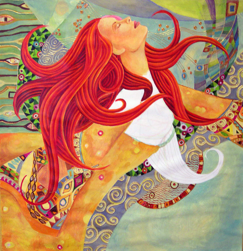
 metamorphosys — diving into surender
Published: 2004-11-09 12:11:35 +0000 UTC; Views: 2355; Favourites: 65; Downloads: 267
Redirect to original
Description
people, i need your help badlly....im stuck here and somehow it looks to me that i have overdid it...i feel that if i go forward i have to keep filling it up with shapes and if i dont it will look so unbalanced and....i don't know what to dooooo...any comment is more than wellcome!!! Thank you!

Related content


Comments: 53


Have you ever heard of an artist named Klimt cause this drawing looks like his style, check him out. P.S. your works are so beautiful!
👍: 0 ⏩: 0

The bottom right hand corner of the image just needs something to balance out the rest perhaps like then pattern in the top left. This would make it kind of symmetrical and work visually I think.
👍: 0 ⏩: 0
What about a really simple tunic style finish to the dress with a simple belt under the breasts. I think it would be a shame to introduce any more colours as it would detract from her hair and the other varied patterns within the image. It is very beautiful and very Kilmt-esque.
👍: 0 ⏩: 0

It is absolutely gorgeous. I think once the white space is colored it will be perfection itself.
👍: 0 ⏩: 0


all the red hair that you paint, it reminds me of twizzlers!!
👍: 0 ⏩: 0


I love her red hair and the way that it flows. It reminds me of Klimt.
👍: 0 ⏩: 0

I note that you have many influences of different talented painters, but you know how to conbined them in a beautiful way. I love that painting and reminds me a lot Gustav Klimt´s work. Great!
👍: 0 ⏩: 1

yeah, that is it.....i never went to school of any kind and somehow all this great artists were teachers and great help in my search for my own identity....im a bit selfcritical about that but i am aware that i have my own interpretation of the style.... every now and then something really "mine" comes out and those paintings are very special to me(like vision of us,river lady or beautiful world)
thanx a lot, i appreciate

👍: 0 ⏩: 0

I have to go with rayvin on this one...I couldn't figure out what was her arms or body, or whether she has three arms, or whether her head is on backwards; it all seems a bit jumbled. Love the use of gold. She's so beautiful...will she ever be complete?
👍: 0 ⏩: 0

Amazing color use and design! A lovely piece indeed.
👍: 0 ⏩: 0


I'd not fill it up with shapes. Assuming you finish colouring the white parts I'd leave the other parts empty, even if this would make the composition unbalanced. It could be more interesting. It's going to be a good painting anyway.
👍: 0 ⏩: 0

Beautiful composition ...
I like the appealing colors. Because the background is so precise with motives, i would have let the hair a little blurred or less precise.
I like this one alot.
👍: 0 ⏩: 0


I am IN LOVE with this "jeweled, Art Nouveau, Byzantine" style you have working ...
Such JOY


👍: 0 ⏩: 0


beautiful. lovely colours and composition here. i think you could do somehting with the bottom right hand corner though to balance it out. but it's very gustav klimt. i like very very much. i wish i had this talent and vision.

👍: 0 ⏩: 0

WOW..... amazing.... really beautiful.... I love the use of color. beautiful work.
👍: 0 ⏩: 0

i think that if you do more work on this, the lower right could be used more to support the rest of it... i think having the lower right open kind of makes a vacuum there. something as simple as a field of small round shapes (as there are around her head) might work. you could be really daring and do a contoured mosaic as if it is a dome of a building. that's what popped in my head at first. it looks wonderful though.
👍: 0 ⏩: 0


don't worry dear ")

so
👍: 0 ⏩: 1
heh,that was a good one..........thanks
👍: 0 ⏩: 1


divno! zaista, sve pohvale!
ne znam da li si imala priliku da se sretnes sa radovima Vesne Balkanski. Bajkovita kao i ti, ali na drugi nacin.
👍: 0 ⏩: 0

no it is perfect !  (Wink)")
lovely surrender, she flowsss !
pozdrav !
👍: 0 ⏩: 0

or just crop it a little... give the head a full attention...
👍: 0 ⏩: 0

you need something in down right corner
everything else is so good

👍: 0 ⏩: 0

like the idea that the head and the body dont belong together...
the background gets kind of levitating feeling above all the layers, shapes and colors;
the whiteness is perfect!
just love your art!
👍: 0 ⏩: 0

wow is all i have to say! glakjgoiathanfkj drools.....
👍: 0 ⏩: 0

I think the problem is that her hair is too vivid next to the pale background but there is definitely enough detailed work there...all I would suggest is changing the background colour but not to something too dark because then it will appear flat
👍: 0 ⏩: 0
I would leave it as it is, too much overdoing it can ruin it
👍: 0 ⏩: 0

Please forgive me for a harsh critique. I am nowhere near the caliber of artist that you are and I see that this picture already has several fav’s but I can see the dilemma that you’re in. This piece seems disjointed. It looks like 3 paintings, the girl, the background, and the orange. I think it’s the orange that’s making it feel out of kilter. It doesn’t seem to be her body, arms or legs, but it’s sort of in their place. She looks like an octopus girl but her limbs are in the wrong place or they taper the wrong way. I would suggest that you keep the head and shoulders and keep the background as much as you can and rework the orange body. I know I’m not qualified to make such recommendations but that’s what I would recommend.
Thanks for listening,
Ray (A Fan)
👍: 0 ⏩: 1
thank you Ray!!!
in your comment you have captured the all the reasons for my unease when i look at it....
it is what i was looking for but couldn't pinpoint!!!I really apriciate it!!!
👍: 0 ⏩: 1
Wow, a three hug thank you. You make me blush...
You're very welcome!!
Ray
👍: 0 ⏩: 0


If you really wanted to add more shapes, I would suggest cutting the one in the bottom right hand into three pieces. However, I think it looks fine the way it is. The colors balance out the lack of shapes in that corner. Well done!
👍: 0 ⏩: 0


I think just finishing in the white will be enough. The simpler space at the bottem right is nice. beautiful!
👍: 0 ⏩: 0

I love this 
👍: 0 ⏩: 0

i think that maybe the body needs more tone and shading, the contrast between the hair and the face and the rest of the picture is too stark, the background seems to blend with foreground too much. IMO
another beauty in the making though.
👍: 0 ⏩: 0

oh, it's exactly enough!
very beautyful, n as sideoutman wrote, the emty and full places has a good balance.
if you do something else on this painting, it may would be crowded....
👍: 0 ⏩: 0
thanx to all......
the white is totaly undone (it is supposed to be the red hait and the dress.....i am talking about the rest....... (Smile)")
👍: 0 ⏩: 0

In my own opinion I think it's nice the way it looks, there is a goodf balance between the "empty" and "full" areas but...hey....it's just my thought and you can agree or not!
Anyway, it reminds me of Klimt works...good job indeed!
👍: 0 ⏩: 0
| Next =>