HOME | DD
 MichaelFaber — Ice Drops
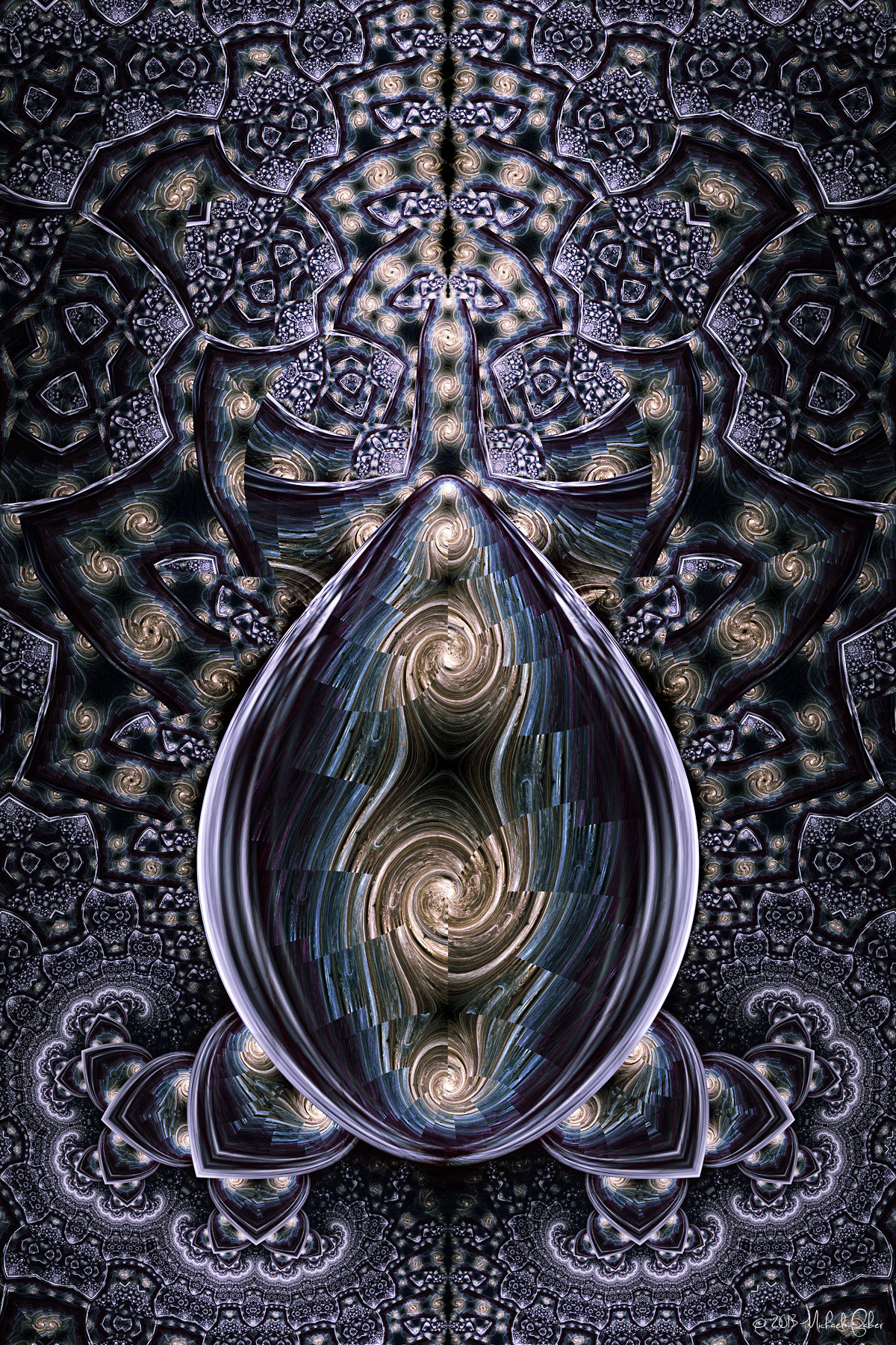

Published: 2006-10-23 21:41:07 +0000 UTC; Views: 991; Favourites: 24; Downloads: 9
Redirect to original
Description
Apophysis 2.05Check out Fire Drops too!
Let me know what you think!
Related content


Comments: 33


Again, stunning work. I love that both these pieces capture the properties of their respective subject...the rigidity and frailty of ice here, the strength and chaos of fire in its sibling. Fantastic!
👍: 0 ⏩: 1

Thank you Karen!
👍: 0 ⏩: 0

this looks like an arched, stained-glass roof. i really like the monocromatic feel, it's got such an emotional feel to it, very empty, cold, abandoned.

👍: 0 ⏩: 0

Once again, I'm truly amazed.
To believe that someone can do that using Apophysis...
Great job, as always!
👍: 0 ⏩: 0


Extraordinary patterns, light and colors. A masterpiece Michael!!
👍: 0 ⏩: 0

I like this cool version of fire drops. They are both great.
👍: 0 ⏩: 0
I like this cool version of fire drops. They are both great.
👍: 0 ⏩: 0

Wow. It's amazing, that this is possible with Apophysis. I'm kind of sad, though, that it hardly retains any of the hallmarks of an Apo fractal. It looks a lot more like UF than Apo.
👍: 0 ⏩: 2
oh, yes. no offense intended
I've been trying to figure out and define exactly what you mean by an apophysis-y flame. My best guess is a pure flame fractal in form. Although i only really edit the colouring and lighting in my fractals, i haven't made a pure flame fractal is quite some time. Even my apophysis renders aren't pure.
Before apophysis 2.04 came out, all the variations could produce fractal patterns. But now, we have some blur and noise variations that do not. They actually destroy our fractal patterns, and encourage smooth, solid forms - something pure flames are not.
The way i see it, the blurs are tools, and nothing more. But oh so much more at the same time. My latest fractals would be nothing more than dots and lines, barely covering the background, if i took all the blur out. These 'non-fractal' variations help show the repetitive nature of the fractal variations like has never been possible before. These repetitive patterns are the true highlight of flame fractals in many people's eyes. In that respect, i like to think that these images I've been making recently are very apophysis-y, despite what built in tools were used to make them. They are not in my mind, however, classic flame fractals.
What do you think?
Man, i feel like the apophysis nerd boy now.
Have a nice night/day R³F!
 (Smile)")

👍: 0 ⏩: 1
I think you're definitely on to something. Maybe "Classic" apophysis is the right word indeed. I agree, your fractals (and others that use the "tools" as you call them) embody the definition of fractal. All your points are valid, mos def. Lol. I think we should define "fractal" and "flame" and make sure that the two words are used appropriately in the future.
👍: 0 ⏩: 0
should apophysis fractals retain the hallmark of apophysis fractals? what is this hallmark anyway? it sounds like a limitation to the flame medium.
is breaking free a bad thing? the paintings i like the most are the ones that don't look like photos. the cg images i like most look so real. the photos i like the best don't look real at all.
I look through the fractal gallery regularly, and i'd have to say that most flames are horrible. i guess i've been striving for un-apophysis flames for a while now to get rid of all the similarities to anything random generated. this random stuff has defined apophysis flames for too long.
Man, i feel like the apophysis bad boy now.
Have a nice night/day R³F!

👍: 0 ⏩: 1
It's just my personal opinion. I'm not saying that your works aren't valid--they very much are so. And I definitely give you props for wanting to be different. I'm just saying, I prefer fractals made in Apo that seem more Apophysis-y than UF-y.
...Lol, I felt all offended, and then saw the ending.
Man, i feel like the apophysis bad boy now.
Have a nice night/day R³F!
So, yeah. Personal preference. And I do think that your fractals are amazing. >.>
👍: 0 ⏩: 0

I think i like the fiery texture in fire drops more but I love the design in the centre of this one, I think it would be great printed on a bookmark.
👍: 0 ⏩: 0

Superb artwork, Michael.
Outstanding work on the BarnsleyM1 serie, this one use the Cos*Sin transform I think. 
 (Wink)")
👍: 0 ⏩: 1

I don't usually fall for symmetries but this one is really exceptional, it's more a statement on composition than a quick way out of the problem. Great colours and design.
👍: 0 ⏩: 1


The symmetry in this picture, along with the color it evokes, is quite astonishing. Great job, Michael.
👍: 0 ⏩: 0

I really like this mosaic look. Very nifty-cool!!
👍: 0 ⏩: 0

Crisp, clean and great looking. You make amazingly good peices.
👍: 0 ⏩: 1
Thanks for the complement!
👍: 0 ⏩: 0

Looks very, very nice, and I have to say I like the symmetry in this one more than the other. However, the other one is fire and this one's ice, so that's not a hard decision for me at all.

👍: 0 ⏩: 0

you really are developing this style beautifully, great job
👍: 0 ⏩: 1
Thanks for the encouragement!
👍: 0 ⏩: 0

woah,great job!
it reminds me of a stereogram and i think small size pic is more impressive.
👍: 0 ⏩: 1
")


Just cool!! I love the geometric shapes along the sides and the icicle in the middle. Terrific colors and I love the clean "broken" lines all throughout. Yay Michael!
👍: 0 ⏩: 0

")