HOME | DD
 MichaelFaber — Repetitions to Happiness

Published: 2006-06-11 05:42:23 +0000 UTC; Views: 3694; Favourites: 36; Downloads: 670
Redirect to original
Description
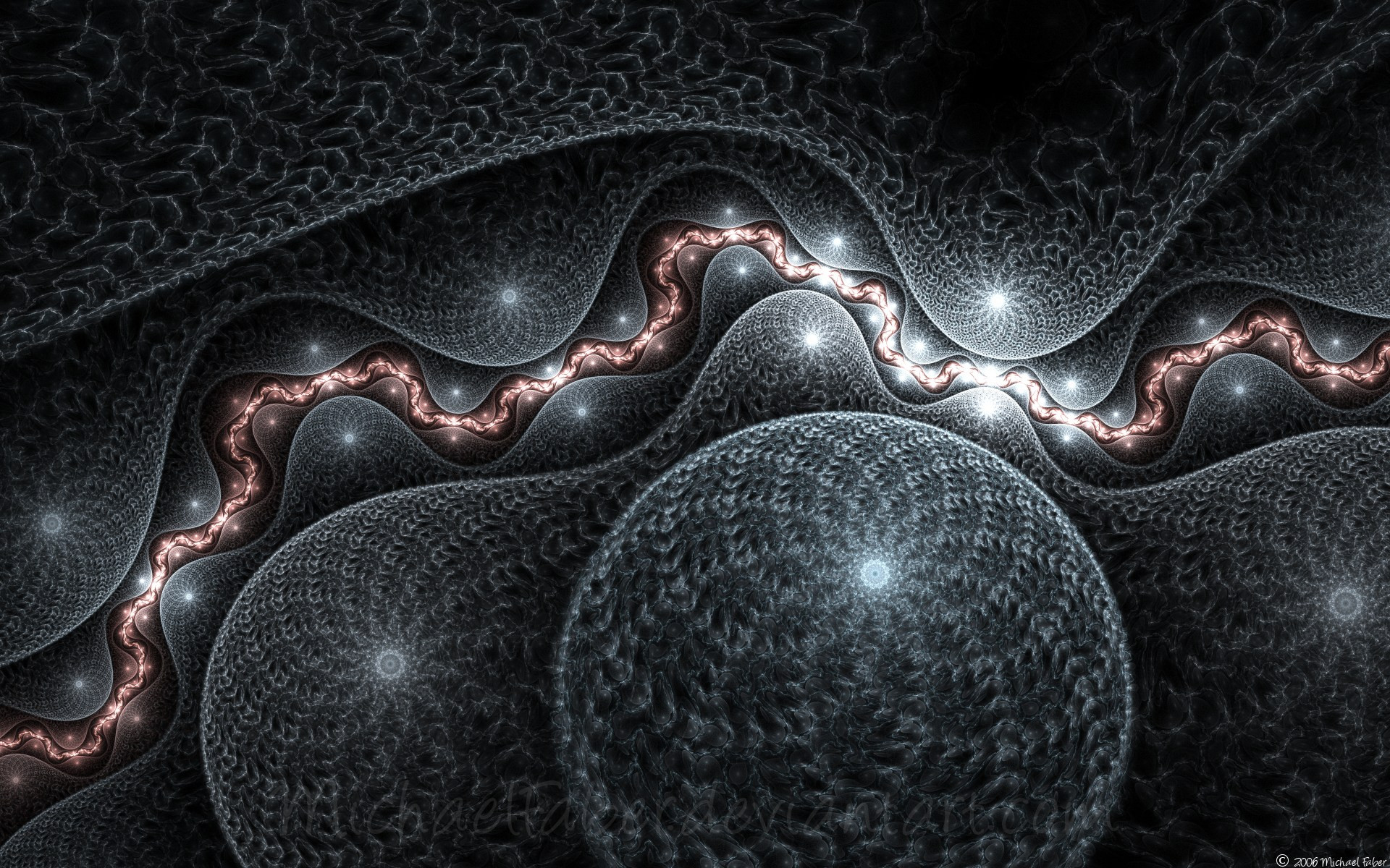
Made with Apophysis 2.04 betaRelated content


Comments: 42


I would like to let you know I am featuring this in my latest journal. If you would like to have it removed, please let me know and I will removed it immediately. [link]
Hugs,
Anj
👍: 0 ⏩: 0

nicely done! it reminded me a little of Cosmos in my own gallery [link]
👍: 0 ⏩: 0

Beautiful use of fractals. Love the red center on the gray foreground.
👍: 0 ⏩: 0


👍: 0 ⏩: 0


The quality of this render is superb, i'm really surprised there is no grain in it.
I think you could have gone with a bit brighter of a red center, just to highlight it, but its still a great fractal.
")
👍: 0 ⏩: 1

Thanks Matt, the quality setting was 3000. in the original png file, which is much larger, there is also no grain, so i was impressed too
👍: 0 ⏩: 1
Wow, I usually have my quality set at 6000. Very impressive.
👍: 0 ⏩: 1
3000 is usually overkill. 6000 is really high!
👍: 0 ⏩: 1
Well, usually I can choose to go with 1024 x 768 and an oversample of 2, or a bigger size with a lower oversample...so I up the quality quite a bit to compensate. Ideally I would render everything at 1600 and 2 oversample, then size it down later, but i've been unable to test that out.
I'll have to play around with render settings this week, as lower quality would improve render times.
👍: 0 ⏩: 1
Hmm. Oversample actually compensates the quality automatically, so you shouldn't have to. unless you run out of memory, and you have to render in slices, the oversampled render time shouldn't be much more than without oversample.
👍: 0 ⏩: 0


Ooh, a tornado with a cherry-flavored center!
Very well done. Ever consider making a tutorial? I want to learn your awesome.
👍: 0 ⏩: 1
Thanks for the support. I'm glad you like it. i have thought about making a tutorial, but have never gotten around to it yet
")
👍: 0 ⏩: 0

 (Smile)")
👍: 0 ⏩: 1

Very nice. Like moving through a wormhole towards the end of the universe
👍: 0 ⏩: 1


... It looks like the greatest slide of all time.
I have no idea why. -_-...
👍: 0 ⏩: 1
")
👍: 0 ⏩: 1
... Is that a good idea?
👍: 0 ⏩: 1
Probably not *pushesyou*

👍: 0 ⏩: 1
O_O
MAKE BETTER SLIIIIIIIIIDES!
👍: 0 ⏩: 0


I like the way your eye is drawn deeper to find the color. Good work!

👍: 0 ⏩: 0


👍: 0 ⏩: 0

Wow, it's lik the tunnel that Cloud goes through at the end of FF7, lol. Love the feeling of falling into the screen that it gives
👍: 0 ⏩: 0

@__@!! GORGEOUS. 
Though. that light at the end of the tunnel doesn't seem so welcoming. XDDD;;
👍: 0 ⏩: 1

👍: 0 ⏩: 0

Interesting title...does that mean that happiness comes around again and again, or that we sometimes need to do the same things over and over before we arrive at happiness...Hmmm...
Regardless of what it means, I like this. It's much more simplistic than your recent images but deeper...if you will. The greys are soft and perhaps a bit bland, even with the highlights. They swirl and fold back on themsleves, ultimately leading my eye to the center...the red heart of this image. I can imagine that this is the happiness you refer to in the title. If I'm not completely mistaken, do I see a face in the center? A small, perfect face...
I'm
👍: 0 ⏩: 1

I'm glad you like it, even if it is only for the title ")
👍: 0 ⏩: 1
It wasn't faved for the title..
Look just at the red spot...it looks like the left eye, nose and mouth of a face...honest!

👍: 0 ⏩: 1

 (Wink)")

This is very nice! I like the how the color is only there in the eye of it and the rest is grey.
👍: 0 ⏩: 0

