HOME | DD
 mikemayhew — SDCC 2009 Print - Night Queen
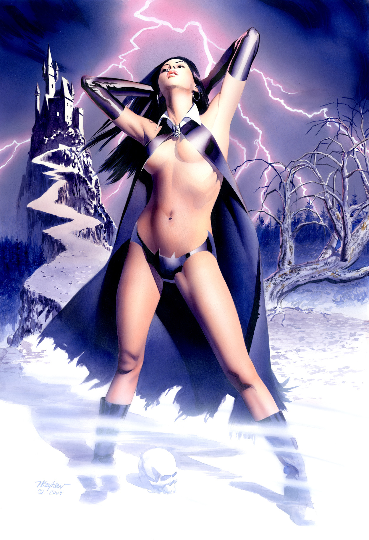
Published: 2009-07-17 00:47:57 +0000 UTC; Views: 25545; Favourites: 586; Downloads: 5182
Redirect to original
Description
15X22 in watercolor. This art will be available as an archival 13X19 print at San Diego Comic Con. My table is #4903. I will have brand new sketchbooks available as well.Related content


Comments: 48

anyway this can be used for a layout? i would love to use it
👍: 0 ⏩: 0


What a wonderful piece! Truly amazing! I'm so in love with this I must ask.. Is this purely a water color print? Or will Night Queen be making her debut in a comic soon enough? I would love to see her in her own comic complete with her origin.
👍: 0 ⏩: 1

very cool idea! Never thought of that, but you never know.
👍: 0 ⏩: 0


no, it was painted in watercolor.
👍: 0 ⏩: 1

Sorry i thought it was pencil crayons probably because of the crappy screen i have (I swear, it totally looks like pencil crayons), still this piece is AMAZING
👍: 0 ⏩: 0


My only question about it (otherwise it's either simply rockin' or so acceptable it might as well be) is whether that is the most fitting way to have established the shadows on her neck, chin, and jawline. You've obviously come to a place where you are comfortable with the freedom you have to suggest something rather than fully render it. That's a very good thing and in most cases I am even inclined to believe it tends to get you the more effective result. What I am noticing is a breakdown in the perception of depth. Although a lot of your work here comes off as more 2D the shading around the neck and jaw is considerably more flat. This has two negative effects. It's very close to being the element that is at the exact center of focus (as all the lines tend to lead your eye there) and is not done in a way that makes the most of that. It's also defying a natural perception of the anatomical surfaces because the chin in this position would be jutted as far out as possible and that conflicts with the flatter rendering.
I hope you don't this commentary badly. You're actually one of my favorite artists and this is really a fantastic piece! I have a tendency to come off as a little mechanical and cold when I'm writing as myself instead of writing for a character. My comment is meant with sincere respect and a genuine hope it might be helpful.
👍: 0 ⏩: 1


It's very beautiful and quite lovely in it's rendering, but I find anatomical issues with her breasts. Her right breast (our left) is very natural looking, resting comfortably as any boob might. Her left breast however, looks like it's shoved up uncomfortably under the cloth to hide the nipple.
I suppose a girl's got to do what a girl's got to do, though! And really, your target audience doesn't have breasts, so it's not something that a lot of people will pay attention to.
I'm definitely not trying to bash the piece or say negative things or anything! I think it's a very beautiful piece and I could never pull of something of this smooth and lovely quality with watercolor or pretty much any media, really. I just thought it a bit odd that one breast should look so natural and the other should look like it's pushed up and taped in place.
 (Wink)")
👍: 0 ⏩: 1
Thanks for your comment. I'm going to look at that and possibly revise it.
👍: 0 ⏩: 0


Mike,if you don´t mind I´ll have this hanged on my wall!
👍: 0 ⏩: 0

well, it's an outstanding pieceof work!The woman and the bg came out beatifully rendered, and in this version the tones and the lighting on the bg are much balanced and well defined.
I hope it sales well!

👍: 0 ⏩: 0

im thinkin what if this was batgirls costume... hmmmm rrrrrrr! ")
👍: 0 ⏩: 0


Wow, that's amazing that you can do that by hand!
And that outfit lol, definitely something I wouldn't wear out in the snow haha but well done
Keep it up.
 (Smile)")
👍: 0 ⏩: 0

I noticed that there were some significant changes between this version and the previous two...
This may not be something you care to indulge -- but, is this a completely redone version or were the changes affected with and electric eraser, Photoshop editing or something of that order?
👍: 0 ⏩: 1
You are correct sir, this is a completely redone version. On my earlier take, I made the mistake of not doing a small color comp. When I got to the painting, I was just guessing. I arrived at some colors I liked, but there was too much muddy color already on the canvas for my liking. I decided to redo it with the purple/blue/magenta colors as the underpainting. I think the main thing it did was link the figure and background so they look like they are in the same space. And, I minimized that pain in the ass tree on the right.
👍: 0 ⏩: 1

"I think the main thing it did was link the figure and background so they look like they are in the same space."
I noticed that, good improvement. The mist over her feet and the skull on the ground are nice additions.
👍: 0 ⏩: 0

WOWOWOWOW!!! amazing!! so hot and amazing girl and paint!!! At the begining i thought is a real photo about Megan Fox!! But when i opened i see is a paint!! amazing!!! so realist colours and all!!!
👍: 0 ⏩: 0

its a mazing you can do that traditionally
i couldn't even do that digitally
👍: 0 ⏩: 0

Very nice! And so interesting to see the evolution from the starting sketch.

👍: 0 ⏩: 0

That outfit seems rather impractical, don'tcha think?
👍: 0 ⏩: 0


I'm sorry for not providing proper critique as I'm very well aware that my following comment does not meet something worthy of your time but...
OMGWTFBBQ!!! THAT IS AWESOOOOMEEEE!!!!!

👍: 0 ⏩: 0


you were right, you WEREN'T done with this one... whoa.
👍: 0 ⏩: 0

What kind of paper did you use? i really enjoy how you did the background : )
👍: 0 ⏩: 1
This is Arches 140lb hot press watercolor paper.
👍: 0 ⏩: 1
That is what I thought~ Thank you : ) I need to give it try.
👍: 0 ⏩: 0


why is there only 191 views? this piece is F*CKING AWESOME mike
👍: 0 ⏩: 0

Good job mike. Her left arm forearm looks better and so does the shape of the trees. I like how you do the fog at her feet. Your airbrushing is top notch. Thanks
👍: 0 ⏩: 0


Absolutely digging this sensationally bright colour palette.
Crit wise I'm not liking the detail on the closest tree on the right, looks a little rushed in comparison to the rest of the picture.
Other than that, aces!
👍: 0 ⏩: 0
