HOME | DD
 mikiko-art — Lettering Tutorial

Published: 2013-12-15 20:20:43 +0000 UTC; Views: 125458; Favourites: 6288; Downloads: 1414
Redirect to original
Description
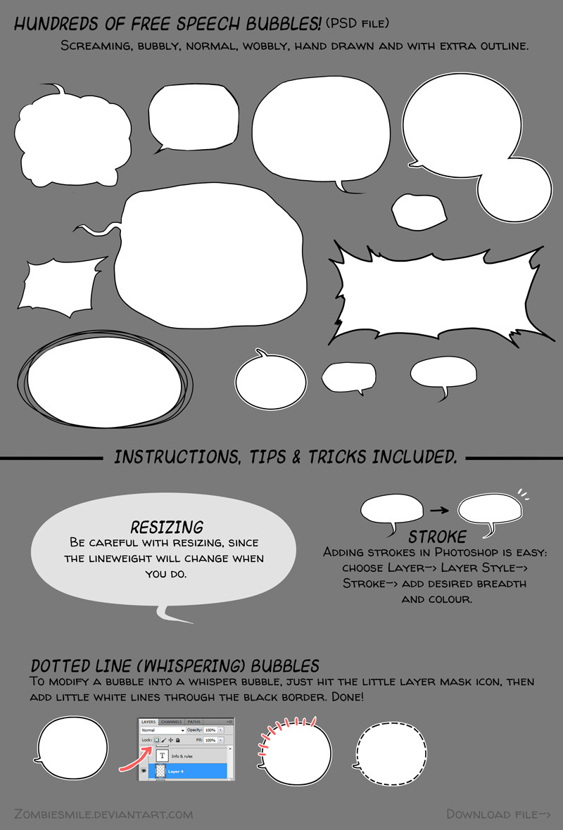
[Update] Since people keep asking "why not use comic sans?", its universally known as a font that mainly amateurs use. (The image of home made flyers comes to mind) It's the Crocs of the design world, and if you want to be taken more seriously, it is advised to use a different font.As promised! This is how I letter my work. Hope this is helpful to someone!
Here's some more useful links:
•Handlettering tutorial by MyNameIsMad
•Download 300 finished speech bubbles
Related content


Comments: 238


It was the only font I had in my computer before I got more.
Personal, I see no harm in using it.
👍: 0 ⏩: 0

it is an amateur mistake to make and is recognised as being unprofessional in all creative professions.
👍: 0 ⏩: 0

sure thing. hope it's useful. :3
👍: 0 ⏩: 0

I really understand this thank you
👍: 0 ⏩: 0

I will cherish this tutorial forever!!! thank you master!!
👍: 0 ⏩: 0

As AngieMyst points out, there is culture and grammar that might make it look silly to a reader fluent in Japanese, but furthermore: Consider who benefit from it. If your readers do not speak Japanese, the actual content is lost for them, and it remains solely a fashion statement, akin to making right-to-left comics even though both you and your readers actually read left-to-right: At best it is pointless, at worst it is annoying the readers and making the comic less appealing and less easy to read. While the latin alphabet does not contain as explosive ciphers as the japanese, with a bit of training, you can make just as visually expressive sound effects with it, or with simple linework.
👍: 0 ⏩: 1

Oh okay, thank you.
I'm making a comic for my original story but it's like Manga where you have to read right-to-left because I plan on translating it into a different language.
That makes sense right?
👍: 0 ⏩: 1
Unless you are from a culture where right-to-left reading is the norm, I would strongly advise against it. I have seen quite a few comics made by Western people who believed that right-to-left is the "proper" way to read a manga. They almost always clash, because the artist is consciously trying to work right-to-left with the major elements while she unconsciously works right-to-left with the details. The rule of "keep it simple, stupid" (KISS) dictates that whenever you want to put something into your work that makes deciphering it harder, there must be a pay-off that is greater than the loss in clarity.
That said, it is YOUR comic, so it is your decision.
👍: 0 ⏩: 1
Hm...yeah, good point...
Thanks for the advise(?). ^^
👍: 0 ⏩: 0

I'd play it safe and not use Translate, maybe enlist the help of a fluent Japanese speaker, as this is more of a cultural thing and Google often gets it wrong

👍: 0 ⏩: 1

I always love the balloons! C: Are so simple but hard to how to put somewhere on (always) each panel, ahah. Thank you for eht tutorial!
👍: 0 ⏩: 0

Thanks for the tutorial, it helps
But, about the template...If I understood well, the red area is the one which you should put text and important things, the blue is an extra and the green is a border...but what about the white area?
👍: 0 ⏩: 1
the template colours mean the following:
green: will definitely be cut off
blue: this area might be cut off, since it's not always accurate.
white & red: this is the entire area you draw on. Some people like drawing panels going all the way off the page or spreads without panels. (I keep it clean and tidy usually)
red: this is the area important bits should be. if speech or faces are outside this, it will be hard to read or look off balance.
👍: 0 ⏩: 1
Ahh I think I got it!! Thanks for explaining!
👍: 0 ⏩: 1

That is fantastic! Thanks for the tutorial
👍: 0 ⏩: 1
you're welcome! hope it'll be of use. C:
👍: 0 ⏩: 0

This is really great, thank you
Are you planning in making a coloring tutorial ? It would help me a lot !
(and sorry if my english is not correct, I'm still in highschool and my level is not really ... developped)
👍: 0 ⏩: 0

Thank you for this! This is incredibly helpful! I'm looking to start work on a comic of my own soon, and this has helped put some of my insecurities to rest.

👍: 0 ⏩: 0

Fantastic tutorial, I'm making my own comic but inexperience in lettering. Tutorial like this are awesome indeed!
👍: 0 ⏩: 0


no problem. :3 thanks for reading it.
👍: 0 ⏩: 0

This is very helpful  (Smile)")
👍: 0 ⏩: 1


You just made my life a ton easier! Thank you so much for this beautiful tutorial!!
👍: 0 ⏩: 1
glad to hear! you're very welcome! ^v^
👍: 0 ⏩: 0


A+ would read again!
-- Really though this is really helpful because I wanted to try and do a large scale comic for a thing and this is hugely helpful for the speech and what not. Now to just figure out good layout properties. /hm.
👍: 0 ⏩: 0


I've got a question, does anyone know how to add that stroke effect in Gimp? I went to Layer but it doesn't have Layer style, I can't find it anywhere.
👍: 0 ⏩: 0

Transimage [2013-12-24 04:29:39 +0000 UTC]
Oh my god, warping the oval made by an elliptical tool... why the hell didn't I ever think of that?! I gotta try that now.
👍: 0 ⏩: 0

I don't do comics, but this is a really good tutorial so I'm faving it!!
👍: 0 ⏩: 0

")

I feel like an idiot for being flustered by the fact that I can't draw good circled speech bubbles by hand. Dur, maybe they don't need to be perfect circles?!?!
👍: 0 ⏩: 0

Nice tutorial. Looks like it could be helpful
👍: 0 ⏩: 1
Thanks! I hope it will be!
👍: 0 ⏩: 1

| Next =>