HOME | DD
 MonoFlax — Symbiote Nightcrawler - Redux

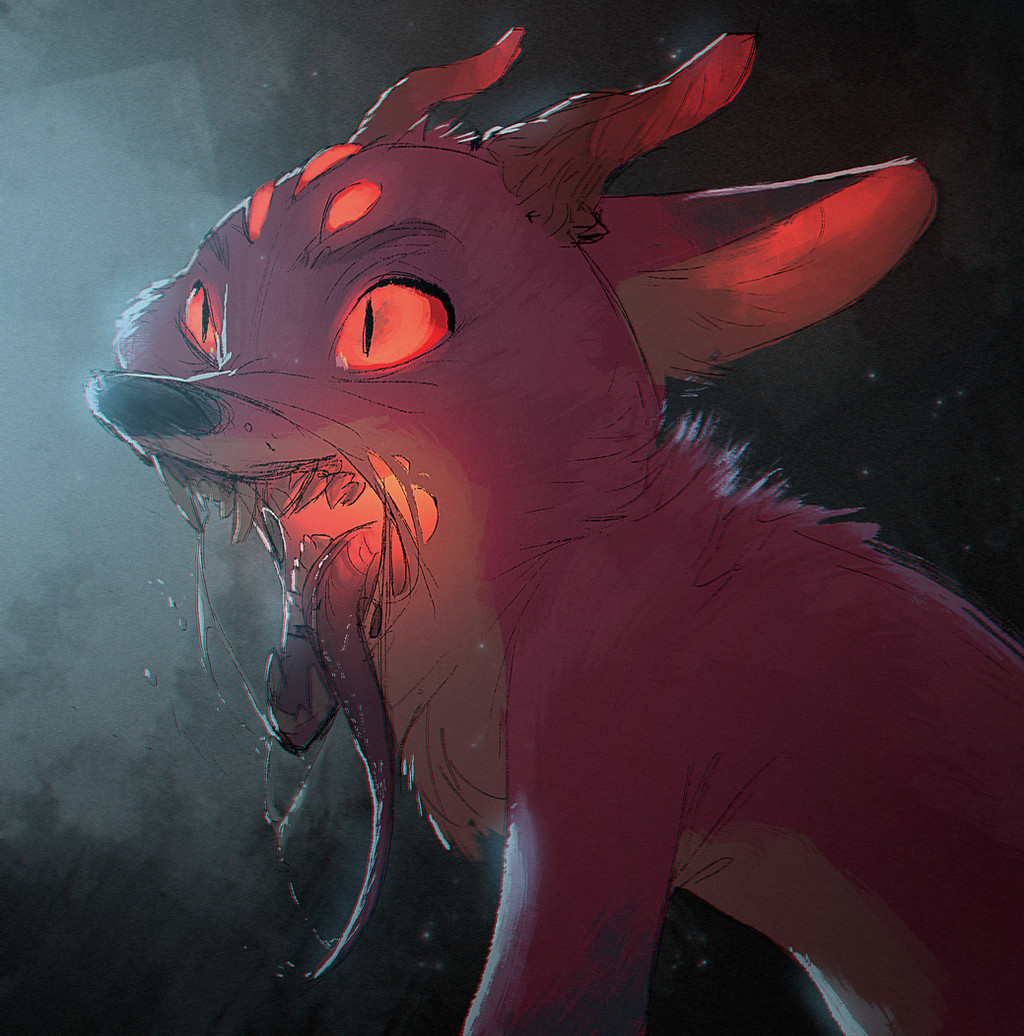
#goo #marvel #tongue #venom #klyntar #nightcrawler #symbiote
Published: 2018-04-24 22:46:47 +0000 UTC; Views: 4457; Favourites: 120; Downloads: 20
Redirect to original
Description
Old: That was back when I was still arting with Krita... damn, I could never get into that program. Then I got photoshop and it immediatelly went uphill for me afterwards. Or at least that's what it feels like in hindsight.Related content


Comments: 13


Hey!! It's Mark... Isn't it?
He still looks fabulous

👍: 0 ⏩: 1

Maybe its mark if he was infected by the venom symbiote! xD
👍: 0 ⏩: 1
Ohhhh... Now I see... I should read the title the next time...
")
👍: 0 ⏩: 1


I think both have their pros and cons, but the most important part is that it seems you're more comfortable drawing in PS.
This piece is really satisfying to look at. Like the lighting add some drama, the messiness (like the shredding bits etc.) adds to the kinda creepy feel.
Over all, very well drawn and I really wanted to say as much ^.^
👍: 0 ⏩: 1
Oh? This is interesting. I do wonder what you have to say about the cons of the new one. Am looking to improve c: And yeah, I am definitely more comfortable with digital drawing now, though I would be even more comfortable drawing on a cintiq.
👍: 0 ⏩: 1
Well, specifically the darkness/sketchiness in the face makes it hard to tell where his mouth "begins" so to speak, and his bottom jaw looks unattached, though I understand the nature of the character it's anatomically wrong and he does typically have a similar anatomy to humans. Mostly what I notice is the off proportions and anatomy, but the dark sketch lines are a bit distracting at times/in places (like on the face). Since the focal point to me is his face/head, it can be a bit distracting to notice how off the anatomy is, and the darker sketchy lines add to the issue of making it hard to tell where his mouth is meant to start opening from. I hope that is helpful to you! Sorry if this is hard to understand or repetitive, I just couldn't think of a good way to explain what I'm talking about since my brain tends to give me pictures instead of words.
👍: 0 ⏩: 1
Thanks for the tips! Yeah, I am trying to include my sketchy style into illustrative work, and its not working out perfectly I think. I just really don't like cleaning up my own mess xD And the anatomy is also correct, the shoulder is super huge and its hard to make out where the torso is facing because of a lack of a clearly defined center-line.
👍: 0 ⏩: 1
Hope it helps you understand your own style a bit more!
Obviously, I love your art style or I wouldn't be a watcher but,
sometimes I see that things really need to be cleaned at least a little more.

👍: 0 ⏩: 1