HOME | DD
 muckSponge — Void - Visual Style Mockup

Published: 2012-01-22 06:49:29 +0000 UTC; Views: 7644; Favourites: 33; Downloads: 0
Redirect to original
Description
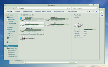
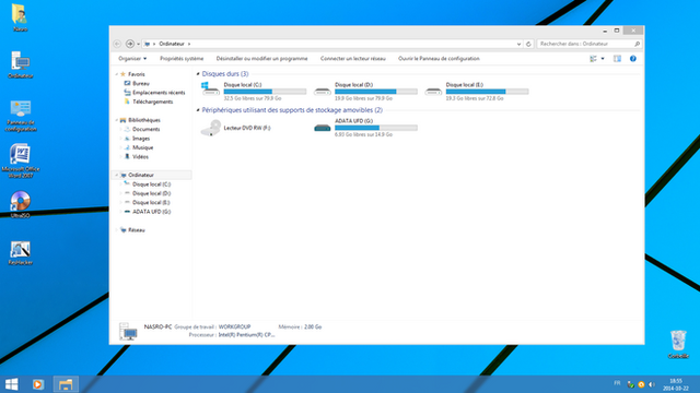
This is basically my "ideal" Windows interface that is accomplishable as a visual style. All of the most commonly used buttons have no icons because, if you need the icons you probably won't be theming your desktop.Everything in there should be 100% possible to do, and most of it has actually been made into a visual style already. The only thing I haven't tried to see if they will work are the progress bars.
At some point this mockup will become a reality (it has already been a WIP for a long time), and I just want to see what reactions I get from it to start with.
I'll probably update it with more elements, like the task bar and whatnot.
Let me know what you think.
Related content
Comments: 66

Thanks! Too bad I never finished it, ahh well
👍: 0 ⏩: 0

Hi, I like the minimalistic idea behind this.
Is this still going to be finalized one day?
Thanks
👍: 0 ⏩: 1

I'd love to, and I did plan to but Windows 8 removed Aero and making a visual style is a big undertaking for me (I'm a perfectionist and have been known to spend a whole day on just the start menu), so I wouldn't want to make it for Windows 7. I'll have to come up with a similar design for Windows 8.
I got about a third of the way through a Void Windows 7 VS but didn't have the time to complete it. I basically only themed what I had designed / mocked up in Photoshop.
👍: 0 ⏩: 1

Please tell me what software would I need in order to create visual styles exactly the way I like them. I hope it's not rockets science though.
👍: 0 ⏩: 1

No rockets, just Photoshop and Windows Style Builder, though visual styles are restrictive by their nature. All you can really do is replace images and tweak colours and make very limited spacing adjustments.
There's also Stardock's WindowBlinds, which replaces the visual style with a different form of theming that requires a program to run in the background. It is far more flexible though.
👍: 0 ⏩: 1

Hi, thank you very much for the pointer!
I have found and downloaded "Windows 7 Style Builder v2.1.520.125, the size is only 1.90MB (unfortunately only in spanish language).
Stardock's WindowBlinds cost $19.99, together with SkinStudio $29.99 and in a pack called ObjectDesktop for $49.99 .. I wonder if I should get that.
By the way, my all-time-favourite VisualStyle is called: "Clearscreen Sharp". Do you think I would be able to change the color of the vertical scrollbar on the right hand side, for example? I ask because I always have great difficulties to find the scrollbar within the light grey color scheme. It just doesn't stand out good enough.
Thanks!
👍: 0 ⏩: 1

It should be reasonably simple with Windows Style Builder. You just need to find the right image and then edit it in Photoshop to add some colour and whatnot and import it back in.
WindowBlinds has a better UI and is more stable but is a bit more complex. I think SkinStudio is actually what you need to use to make the themes, while WindowBlinds lets you use the themes.
👍: 0 ⏩: 1

Hey, that sounds pretty cool!
Thank you very much for the info. Working with software is so much fun.
👍: 0 ⏩: 0

Damn that donut looks tasty
👍: 0 ⏩: 1

How about the ideal of "MultiTap"
Since now every Browser support this function, why not use it in Explorer
👍: 0 ⏩: 1

By tap, do you mean tab? Visual styles can't add any new functionality. They can only modify how the UI looks.
👍: 0 ⏩: 1

Sorry for the spelling.
Then can you make a change of the icon of the HDD.
I think we may be tired of the Default set.
👍: 0 ⏩: 1

Which icon is the HDD icon? Might need a screenshot.
👍: 0 ⏩: 0

Nah, just experimentation with different task item images. Been trying to make it look half decent on hover (without the colour bleeding over the edges too much).
I've mainly been working on Espada instead.
👍: 0 ⏩: 0

i think i've fixed the taskbar group bug. i'll send you a copy sometime.
👍: 0 ⏩: 1

I could fix it, but I haven't worked on it for months due to other projects.
👍: 0 ⏩: 1

mind if i fix it up and you can host it?
👍: 0 ⏩: 1

If you want, but I'll probably redo it in my own time, because I'm a perfectionist and prefer working with my own stuff, etc.
👍: 0 ⏩: 1

as a fellow ocd sufferer, i will make a decent looking one.
👍: 0 ⏩: 1

Hahah, ok 
👍: 0 ⏩: 0

a suggestion: maybe the caption buttons should be a bit smaller and the close button maybe not that long.
👍: 0 ⏩: 0

I can't wait till this is finished and usable as a VS.
👍: 0 ⏩: 0

The min/max/close button seems too protruding. I think you should make it blend into the aero as much as possible.
👍: 0 ⏩: 0

this is really exciting to look forward too.... keep e'm coming...
👍: 0 ⏩: 0

looks awesome, although the forward/back and min/max/close buttons are a little to plain for me, I like the way they look just put some text or something on top
👍: 0 ⏩: 1

I will probably end up doing a version with glyphs.
👍: 0 ⏩: 2

No, I prefer this one... Users are smart enough to understand what those button do without glyphs. I like those back/forward, close, min, max buttons style, I just don't like the background and color scheme...
👍: 0 ⏩: 1

It's all neutral, so the colour scheme is entirely affected by the background.
👍: 0 ⏩: 0

Not a bad idea, but please do color the buttons slightly, perhaps keep the close button red through an option or whatnot. Grayscale themes are getting tiring.
Oh, and i reckon it would be a good thing to have a square cornered one as well for better compatibility with those who prefer small window borders.
👍: 0 ⏩: 1

I kept it all greyscale or "neutral" so that it would fit with any wallpaper or window colour. I prefer to let the user customisable elements be the things that add the colour, because it can then be honed to perfection for every user.
The philosophy behind the window and navigation buttons (and indeed the entire visual style) is to keep them simple. People know where the close button is because it is the biggest. They know where the restore button is because it is in the middle. They know where the back button is because it is round (therefore a navigation button) and it is on the left. Colour just adds to the complication.
The back button does currently have a red hover effect. The others have a blue hover effect. I needed to add colour to them for consistency reasons with the push buttons, as they are often on white backgrounds and therefore you would not be able to see a neutral hover very well.
👍: 0 ⏩: 1

I do understand the concept of neutrality so as to allow greater window color support, but even then, all you get is a blob of a window with one color and several shapes that magically depict what their purpose is. I once found a theme whose every button was a unique shape, and i thought to myself "this looks pretty cool", so i tried it out. Removed it 10 minutes later after my retinas burned themselves to a goopy residue. Interesting concept, but lifeless.
See, the greater customizability you offer for a theme, the better it is, and the more cluttered it gets. Needless to say, skins require an explorer reboot, and trying out everything piece by piece is a rather painful experience, mostly because you have to keep reopening folders.
So my suggestion is this: if you guys are planning to allow individual options for color, shape and whatnot for this new theme, it might be better to make a small application out of it that allows you to outfit several example windows to your taste and save the resulting mix. Hell, if you make such an application universal, i'm sure many theme and skin authors would find a use for it.
👍: 0 ⏩: 1

I drew inspiration from DAS Model S Ultimate Keyboard . It is aimed at users that know where each key is, and therefore do not need the inscriptions. Everyone knows where the window and navigation buttons are in Windows 7. It isn't by magic, it is by memory, and they aren't random shapes, they are the same general shapes as the original buttons, because that is all anyone needs to identify them. Anything else is just extra frills. If you want to get down to the nitty gritty of why this is how I intended it to be, we will have to start talking about modernism and minimalism.
Of course, there will have to be exceptions, like the help button, which will need a glyph to be able to tell it apart. This is where a visual style differs from a keyboard, some elements and layouts change.
There was never any intention of providing some kind of installer that lets you modify aspects of the visual style, as I was only ever intending to do two versions at most. One with glyphs and one without glyphs. I don't have the knowledge or experience to create such an application (although it would be cool).
👍: 0 ⏩: 2

There USED to be an app called StyleSelector, designed for Vista. The people who created it haven't updated it, and apparently disappeared from reality. [ dead link ]
(One of my search trails led to ~psycoB but I don't know if he's the creator or just commonly linked to StyleSelector from his page.)
Anyway, I found something that may work even better: Theme Manager - Windows 7 by ~bickelk
More (3-year-old) info on StyleSelector: [link]
👍: 0 ⏩: 1

The only real issue will be the extra work involved with adding separate visual styles. If I need to update them because of a bug, I've gotta update aaaall of them
And I'm pretty sure I'll constantly be adding to the visual style here and there to make it more complete, so if I did make separate styles, I'd be doing it for what I thought was one of my last releases.
👍: 0 ⏩: 0
| Next =>


