HOME | DD
 muckSponge — Void - Visual Style Mockup

Published: 2012-01-22 06:49:29 +0000 UTC; Views: 7644; Favourites: 33; Downloads: 0
Redirect to original
Description
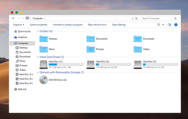
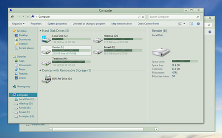
This is basically my "ideal" Windows interface that is accomplishable as a visual style. All of the most commonly used buttons have no icons because, if you need the icons you probably won't be theming your desktop.Everything in there should be 100% possible to do, and most of it has actually been made into a visual style already. The only thing I haven't tried to see if they will work are the progress bars.
At some point this mockup will become a reality (it has already been a WIP for a long time), and I just want to see what reactions I get from it to start with.
I'll probably update it with more elements, like the task bar and whatnot.
Let me know what you think.
Related content
Comments: 66

While i do understand the meaning of minimalism, it's just the impression many authors give when releasing themes that makes you think that they do not put effort into it because there are hardly-any to non-at-all button inscriptions and colors, a lifeless husk of a theme unfilled and incomplete. I've brought myself to think many times that they're using it as an excuse to avoid making things that could end up taking more time to design than the skin itself. Although i wouldn't blame them; i'm pretty lazy myself.
I'm not a fan of dark themes due to the fact that they are impractical for me, and yet i'm having a really hard time finding a light theme that satisfies me and makes me want to say, "this is very nice, i'm sticking with it". I am pretty picky with everything i lay an eye on, and when i do find something that seems amazing, it's pretty disappointing to see problems like the font colors being wrong at places, making them hard to see, or broken transparency at the start menu and the such. So now i'm "stuck" with a theme based on the original of windows 7, only more defined and a tad more squarish. Not much, but beats having a theme that looks half done.
👍: 0 ⏩: 1

Well, I can assure you I made these design decisions because I preferred them, not because I'm lazy (which I am...). I spent probably close to 6 hours on the window base and window controls alone, probably more if you count the many iterations of designs to get to the one vaguely similar to the one I decided to go with.
Obviously we have a different interpretation of our "perfect visual style", which is of course normal. I prefer the OS to appear lifeless when nothing is happening, to avoid distraction, and I prefer the elements that I interact with to jump to life and create a spark of vibrant colour. I leave it up to the wallpaper and window colour for people to get creative with what colour schemes they prefer, and I will know that nothing will clash with the VS.
To each his own.
👍: 0 ⏩: 0

Ooh... very pretty! (Although a lot of the text looks vertically squished for some reason... maybe it's just me...)
👍: 0 ⏩: 1

That's Photoshop's font rendering. Most of the capital letters are 1px shorter than those in Windows 7 for some reason. It is the same font.
👍: 0 ⏩: 1

I love it! It's simple, clean and it doesn't look like a rainbow 
👍: 0 ⏩: 0

COOL!!! Actually, I prefer the light blue color scheme like the default win 7 vs, but this is really awesome... How about Void in Stratiform (of conditional forward button support)...
👍: 0 ⏩: 1

I like to keep it all neutral.
When I release the Void VS, I will work on a style for it in Stratiform.
👍: 0 ⏩: 0


