HOME | DD
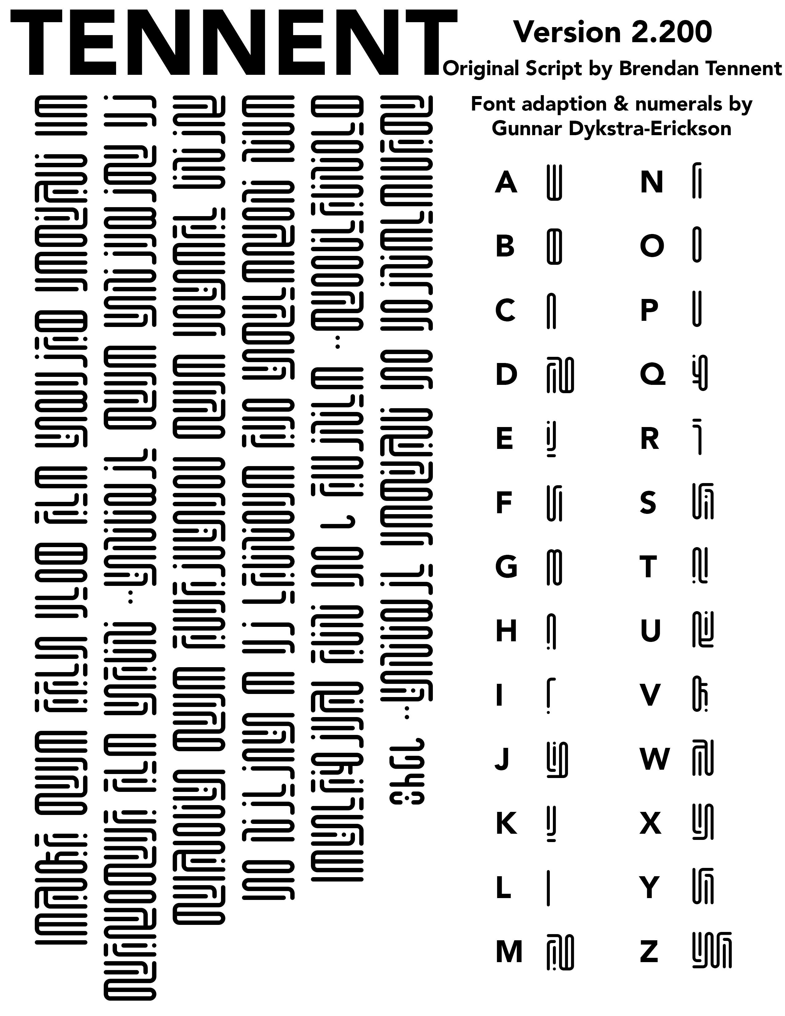
 Naeddyr — Serif Anglo Saxon Rune font
by-nc-sa
Naeddyr — Serif Anglo Saxon Rune font
by-nc-sa

Published: 2009-01-30 15:21:03 +0000 UTC; Views: 27011; Favourites: 121; Downloads: 997
Redirect to original
Description
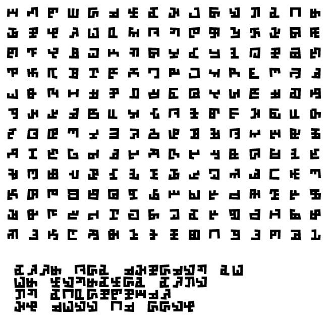
My first actual font. I decided to take the bull by the et cetera, and actually try to make a font... And it was surprisingly easy. *scratches head*Ok, this is basically a simple serif version of Anglo-Saxon runes with majuscules and miniscules, similar to the blackletter futhark I made earlier, but with much less deviation/evolution from the original.
Related content


Comments: 49

👍: 0 ⏩: 0


Cool. Maybe I'll get around to actually making a font now
👍: 0 ⏩: 0


Interesting. Looks a little like Glagolithic.
👍: 0 ⏩: 1

Not enough balls for that.
👍: 0 ⏩: 1

I think these are wonderful runes - just what I was looking for. Featured on my alien spaceship [link]
👍: 0 ⏩: 0

good job on the runes, but I do wonder why dæg is turned 90 degrees is it to save on space? or did you think it looked a bit like the stan rune?
👍: 0 ⏩: 0

very cool. Need to brush up on my futhark/old norse.
👍: 0 ⏩: 0

Beautiful...definitely using this in my next bookbinding project...thanks for sharing!
👍: 0 ⏩: 0

huaaaaa me wants too!!! *searching for a program to make fonts*
👍: 0 ⏩: 0

Try Softy font creator, it's free and is easy to use.
👍: 0 ⏩: 0
I've created a few Serif and Blackletter Furthorc fonts, the horizon stylus is reminiscent of the Cyrillic, Try the 45 degree stylus, also, you can look to other rune sets and even other alphabets for inspiration for the minuscule. ie. Cyrillic ж (zhe) for lower case Calc or Younger Furthark Man Like a decapitated Jear, for lower Man. Just putting it out there.
👍: 0 ⏩: 0

I know nothing about Anglo-Saxon runes but this looks really nice o.o
👍: 0 ⏩: 1
 (Smile)")

not perfect, but close. i need this because im typing "The Dragonology Handbook" by Ernest Drake... so others can read it.
👍: 0 ⏩: 0

Lovely. As if the Latin alphabet never happened to English
👍: 0 ⏩: 0
Mind that it's not a "real" or accurate rendering of any rune-script, it's just a decorative con-script semi-loosely based on runes (but close enough).
👍: 0 ⏩: 1

Yeah, cause I have my little handbook next to me and I'm comparing them. It looks close enough.
👍: 0 ⏩: 0

Well, well, well. What could I say? As a student and ardent lover of anything even remotely connected with Old English and Nordic stuff, I fell in love with this at the first sight. It's only right you made this, for I've been comtemplating getting the poem "Éalá Éarendel engle beorthast" tattoo'd upon myself, and it is only meet that it should be done in the old Runes...
You have some rune-kenning, my friend, are you sure you haven't got Wotan somewhere in your linage?
👍: 0 ⏩: 1
As a Finland-Swede, I can go for the double-deal of Väinämöinen and Odin both. Thanks a bunch for the faves and the watch.
👍: 0 ⏩: 1

I like how you used the Lord's prayer (at least that's what I think it is) to represent the language. I'm taking a course in Medeival lit. So I got a brief taste. It's a really cool font!
👍: 0 ⏩: 1
It was a simple snippet that I had around. It's one Old English version of it. I didn't particularly choose it for any reason, I am atheistic myself.
👍: 0 ⏩: 1
hmm. well it is a beatiful lyric no matter what you believe or don't believe.
👍: 0 ⏩: 0

its very nice. so making your own font eh? do you have it for download. anyway all this anglo-saxon, true old english has always intrigued me. once purchased a book about old english, the grammar in there was so rediculously high-level you pretty much had to be a professor or an old english major to understand the half of it.
👍: 0 ⏩: 1
This is the font, just click on Download.
And hah, Old English is easy as piss for English-speakers, compared to any really foreign language. I'm on a course for it right now, and it's usually just figuring out all the cognates with Swedish and Modern English. Even the morphology isn't that important. Of course, I'm not a native English-speaker, and Finnish has a boatload of stuff English-speakers consider difficult (much of which you can find in Old English), so I may be a bit biased.
👍: 0 ⏩: 1
Yeah, unfortunately nobody knows how to speak it properly today, but there's a lot of people who give it their best. Yes I can understand some old english when i read it, a lot of the grammar reminds me of swedish, and german, as well as a hint of modern day english ")
👍: 0 ⏩: 0

Ver very damn good sir! I've wondered about making some fonts myself, but lacked the final push (i.e. I got lazy
👍: 0 ⏩: 0

Nifty I like them. Don't know if I'll download it but it is pretty spiffy.
👍: 0 ⏩: 0

I read Serif Anglo Saxon Rune font, it pretty much sucked.
👍: 0 ⏩: 2
Ohhhh burrrrrrrrrrn.
But in all seriousness, I like it. How did you create an actual font file though?
👍: 0 ⏩: 1
Using the Font Creator trial, following a few basic tutorials. It was actually pretty damn simple.
First, I made a bitmap "font", which was the design, I didn't actually have plans for a font:
[link]
Then I enlarged this x2, and did some pixelling:
[link]
These I then imported into Font Creator using this tutorial:
[link]
The importing looked like MAJOR ASS because the resolution of the pixel font was so absurdly low (the font is basically 40 times the DP of the original image), and so I had to fix everything in the character editor by hand. The help has a few shortcuts: A adds a node after the selected active node, F turns a node into an "Off curve", which is basically a bezier-puller node.
👍: 0 ⏩: 2
Sidenote, to anyone seeing this in the FAR FUTURE, I didn't delete or move the above: photobucket is just shit, and will wipe you if you aren't active there for three months or so.
👍: 0 ⏩: 0
*Then I enlarged this x2, and did some pixelling:
[link]
👍: 0 ⏩: 0

Interesting interpretation of the runes. The minuscules kind of scare me a little.
The curves in peorth are a little weird, and maybe some of your diagonals could be thinner, particularly in m, ia, k and kk (what, I didn't feel like writing their names).
And is that Lorem Ipsum in the back?
👍: 0 ⏩: 1
:3 What scares you about them in particular?
Yeah, the curves in peorth *are* a bit weird. Come to think of it, I should've just done simple curves there instead of going all fancy.
Yeah, I didn't really keep that much in mind when minding thinness. It's an artifact of the originals, which were very small pixel-by-pixel glyphs. Shoulda thinned them more.
Yes, it's Lorem Ipsum.
👍: 0 ⏩: 1
They scare me because they're unfamiliar to me and hard to read. I like my runes to all be the same height, you know.
I like the fancy curve. They're just kind of pointy on the inside, and they have lumps on the outside.
When I started fonting, I had lots of problems with lines being too thick. I would settle on a consistent size for the heavy lines, but I ignored the thin ones.
👍: 0 ⏩: 1
Well, I didn't set out to make a runic font, I was thinking more of an apriori script like my blackletter Futhark.
👍: 0 ⏩: 0

HM YES I THINK I HAVE TO AGREE WITH YOU ON THAT GOOD SIR *SMOKES PIPE*
👍: 0 ⏩: 0


 (Wink)")