HOME | DD
 nextmario — pico tx WIP 11
by-nc-sa
nextmario — pico tx WIP 11
by-nc-sa

Published: 2007-02-05 18:51:18 +0000 UTC; Views: 21887; Favourites: 26; Downloads: 5685
Redirect to original
Description
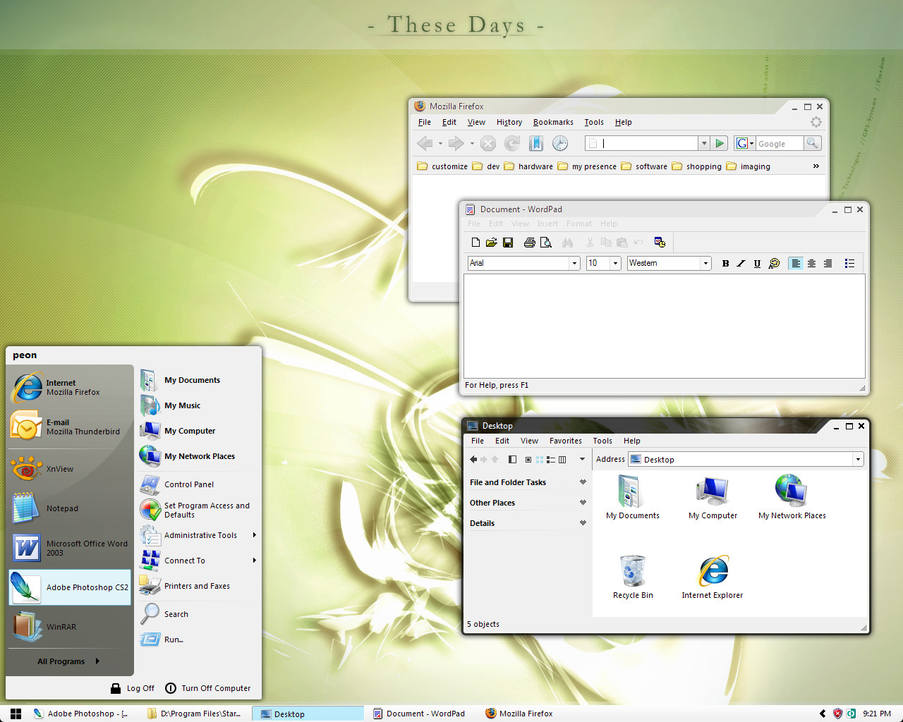
another OPEN ART pico skin ...PLEASE DELETE ANY EXISTING VERSION BEFORE INSTALLING, sometimes file are not replaced correctly
ABOUT SCREEN
default
DESCRIPTION
this skin focuses on usable light, colorful transparency. i'll design this to be as subtle as possible focusing the eye on your beautiful walls/photos instead of my skin.
tx is for transparency. note the readable title, buttons and fully transparent taskbar. i have a ways to go. there will be a full rainbow of subs when i go to beta.
you probably want to run batch files to customize this skin for your wall. the default works well with light wallpapers. use the batch files in skin directory to change font and images. (double click the files to run them). if you have a busy wall use the opaque black or white taskbar. after running the batch files reapply this skin. in some instances you may have to switch to another skin, run the batch files and then apply this skin.
CHANGE TASKBAR FONT/IMAGE COLOR
use-color-black
use-color-white
CHANGE SHELLSTYLE
use-shellstyle-left
use-shellstyle-right
CHANGE START PANEL SIZE
use-startpanel-size-32px
use-startpanel-size-48px
use-startpanel-size-full
CHANGE TASKBAR
use-taskbar-transparent
use-taskbar-black (opaque, auto changes font and images)
use-taskbar-white (opaque, auto changes font and images)
use-taskbar-transparent-flipped (use this if the taskbars on top and left are not rounding to outside)
HISTORY
[11]
+ default sub
+ black sub
+ ubuntu sub
* red close button
* increased progress bar height
i'm still refining the subs. i'm not satisfied with ubuntu sub. the brown is such a beautiful color but it's hard to get good transparency results.
Related content


Comments: 56


Nice like always
Could you include a shellstyle with no menu options in the windows?
👍: 0 ⏩: 1

do you mean hide tasks?
i don't think it's possible to hide the main menu through the stylesheet. i don't remember any sections for that. you'd need to use styler or some utility like that if that is what you meant.
👍: 0 ⏩: 1
Hi,
i mean this thingis ^^
[link]
👍: 0 ⏩: 1
there's a quick way to do that in explorer itself
Tools | Folder Options | Use Windows Classic Folders
👍: 0 ⏩: 1
Ah very nice. Thank you for that
👍: 0 ⏩: 0

Skins amazing, using it now, really like it.
Firstly, I really like the window borders, That they are asymmetrical really gives the windows a nice look.
And secondly, I have the same problem as Shotter, On the taskbar there are a few pixels that are unused, but the quicklaunch highlights use the whole space, its rather annoying as I always put my mouse to the bottom of the screen to bring up a window, lol.
Here's an example.
[link]
👍: 0 ⏩: 1
OK, thanks for the screenshot. The quicklaunch toolbar is causing it. hide the quicklaunch for a workaround. i'll fix it now that i can reproduce it.
👍: 0 ⏩: 1

Is it deliberate that in all your pico skins I have to force the small taskbar in the WB Overrides to get it to look like in the screenshot?
Ordinarily it does this thing where the taskbar is fat, but like 4 or so pixels on the bottom is unused. There is just the space below the taskbar and start buttons doing nothing. So it's not even a true "large taskbar". Anyone else having this problem?
Nice skin otherwise.
👍: 0 ⏩: 2
i think i found it. if you have the quicklaunch toolbar showing, that is the cause. hide it for a workaround for now. i'll fix it.
👍: 0 ⏩: 0
all my screenshots use default settings. is anything overriden in WB config? is segoe UI font installed? if not your system may be trying to use a font with larger metrics and may be the issue.
👍: 0 ⏩: 1
I dunno what's up. My WB is on defaults. When I force it, it looks fine, and I have Segoe UI installed and working fine with other skins which demand it.
Resolution is 1680x1050 on a laptop. Maybe that has something to do with it?
👍: 0 ⏩: 1
i don't set anything to make my skin resolution dependent. not even sure if it's possible.
other users have reported issues which i can't reproduce. most of the time it's issues with the font and/or the WB version. i always use the latest from stardock. i wish i could be of more help, perhaps post something in stardock forums.
👍: 0 ⏩: 0

Any hope of getting the orb as start button??
The rest is great
Ruben
👍: 0 ⏩: 0


looks great
is the version with that black shape in the title bar still in were it's on the right side ? on the side with the min/max/close buttons ? somehow i liked that one better
 (Wink)")
👍: 0 ⏩: 1
i think you're referring to pico black, it's in beta
[link]
that's the one i use for daily work for now
👍: 0 ⏩: 0

I'm concerned about one picture. It's a button with an arrow, when you push it, it shows a drop list or something like that. You can see it in the bat! (a mail client). Normally under Luna (the original XP) its rather thin, some skins display it properly, in many skins it's almost not visible (too thin), and in many (pico too ")
My guesses is that it's a button-push.bmp (same dimension and colors)
If you could fix it...
Anyway, I still love the skin
👍: 0 ⏩: 0

I think I'm the only one who likes the rounded edge
👍: 0 ⏩: 0

your wb themes are awesome as always. been using them for a while.
thanks a lot!!!
👍: 0 ⏩: 0

awesome skin, if you improve the min max close button it will rock!
👍: 0 ⏩: 1
ok ok, i got another hint, min/max close buttons suck  (Smile)")
👍: 0 ⏩: 0

As always, your skins keep getting better and more refined with each iteration. I like the sub colors as of v.11. I will say I'm not wild about the min/max buttons and especially the asymmetric window edges. If it had two round corners somehow I would like it even more. Anyway, it's really starting to shape up.
👍: 0 ⏩: 1
ur the 2nd person to comment on the window shape. i get the hint. i like the asymetry, not sure why. maybe to make it different than the usual shapes. ill try a smaller radius on the right side.
i change the min/max/close buttons, i to be consistent with other buttons, but it's not large enough to see the details. i'll go back to the smoother version of previous version. is the glyphs you dislike or are they too plain?
thanks for the honest comments as usual.
👍: 0 ⏩: 2
Well, my fantasy skin is probably something like the titlebar, window edges, and glyphs from pico gray and the transparency of pico-tx. If I had Skinstudio maybe I'd muck around with it myself. To me, pico-tx kind of looks like a Metacity theme or something. I think it would be an enormously successful port. I'm sure the final design will be something that blows me away regardless.
👍: 0 ⏩: 1
i reduced the borders after p-gray because some users said it was too thick. i also reduced the caption. i think a thicker border works better for transparency. i am adding extra pixels back.
as for the caption area, the design is a functional choice. one of my peeves with transparent skins is the title text blends in with other text. i develop software and i need to be able to read the full path on the title bar. you'll have a tough time convincing me of removing the opaque area there.
i value your input, thanks again
--mario
👍: 0 ⏩: 0
holy cow, my english went south. hope you can fill in the gaps.
👍: 0 ⏩: 0

you don't even like transparency according to your pico black comments. i've seen your transparent stuff in pico tea and pico black, you're good at it!
thanks for making WB worth the purchase
👍: 0 ⏩: 0
this is hands down the prettiest transparent skin. the white gray goes with everything. just beautiful!
that red button is nice little accent.
👍: 0 ⏩: 0
From the first version of p-black I'm astonished, and with every new verison of your skins it's getting better and better. Thank you verry much ")
👍: 0 ⏩: 0

well, gnr as in guns 'n roses...
👍: 0 ⏩: 0
I think there's a bug in tx 10 with "use-taskbar-white-txt." It changes the taskbar to a bright blue with some odd, dark pixelation in the center.
👍: 0 ⏩: 1
you know what? never mind, white-tx is auto generated. i have a build script which creates a taskbar from the active window mockup. i haven't updated the scripts to account for the tab on the left. so, ya that is screwed up right now. use transparent, white or black for now please.
👍: 0 ⏩: 0
looking REALLY good. the shape has grown on me. the hilights work well with the new shape. why i did i doubt you?
i like the new colored tab. it draws attention quickly to the active window.
here's an idea, make the close button red like firefox close tab. give them a little boost.
👍: 0 ⏩: 1
thanks. good idea on the close, i'll try it on next build.
👍: 0 ⏩: 0

Here is a screenshot of both problems, task bar on top and taskbar on left side. no problems with taskbar right or bottom.
[link]
i forgot to point out in the screenshot that when the taskbar is on the top, the selected items are upside down too, so just flip the selected item graphic ^.^
👍: 0 ⏩: 1
i didn't update it yet. i posted a version in my scraps
[link]
please let me know if that works for you, then i'll update the black and white taskbars too. ill include the new stuff in the next build. nice desk by the way. what font did you use to describe the error? very nice
👍: 0 ⏩: 0

Wow! Really nice. It didn't look that great on the screenshot, but I tried it anyway, and it's great!
👍: 0 ⏩: 1
i post dirty screenshots to show how the design elements work with various wallpapers. i could make prettier ones but then it wouldn't show true usage. i'm glad you like it. thanks!
👍: 0 ⏩: 0
Nice but how do i use the taskbar at the top of the screen? Its up-side-down o.O
👍: 0 ⏩: 1
others have reported the same issue for my other skins. i think it's a WB version issue. all taskbars should round to the outside. i'm using the latest version of WB from stardock.
now that i think about it, i can create an alternate set of taskbars with the images flipped for people seeing this issue. you'll have to wait for next version
👍: 0 ⏩: 0

the start panel could use a little more contrast. the transparent area feels washed-out. i like how the border changes with the taskbar. however, the white border fades into any window below it.
👍: 0 ⏩: 0

quickly becoming my favorite transparent skin
i liked the shape of the 05 version. i'm guessing you rounded the left to match the inside border. may i suggest rounding the other corners a small radius like office 2007? the version 05, imho, looks better for squared corners.
👍: 0 ⏩: 0
| Next =>