HOME | DD
 novenarik —
Flesh Tone Tutorialish
novenarik —
Flesh Tone Tutorialish
Published: 2004-04-15 00:55:07 +0000 UTC; Views: 91722; Favourites: 1252; Downloads: 18289
Redirect to original
Description
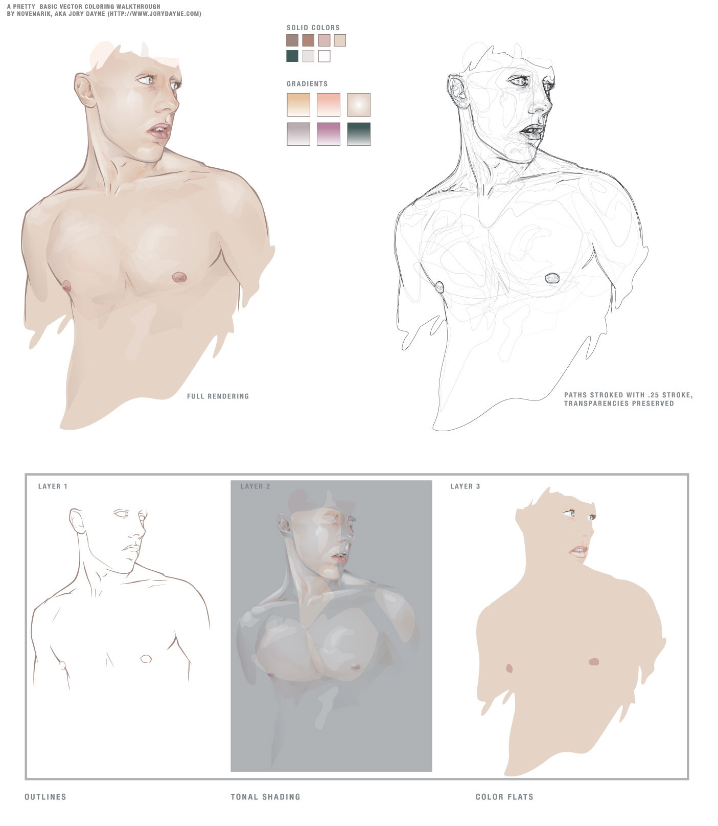
Sometimes when i get really bored, and can't think of anything to draw -- I like to practice things like flesh tones, hair, etc. This is the result of one of those times.The reason though that I upload this, is that when going through a lot of the pieces of vector work in the galleries, I notice a lot of beginners really struggling with shading, coloring, etc.
And I think all it really comes down to is two stumbling blocks:
1. In most drawing applications, there is just SO much you can do, not necessarily things you *should* do, but just so may options. And I think you can get really bogged down with all the options: gradients, gradient meshes, styles, filters, brushes, strokes, etc etc etc. Things that complicate the piece to an unnecessary degree, and quite frankly, make the piece look like shit.
2. A lot of people, when asking me about technique and crap, do not realize just how much the program (at least in illustrator) can do for you when it comes to blending and color management. Most people don't realize that Illustrator has nearly all the same blending options the photoshop offers, although some function a little differently. When drawing a piece, they manually rummage through their palette trying to mix the exact right shade for shadows, the perfect color for highlights -- and it leaves SO much room for error, i.e., flesh shading containing weird amounts of cyan, maybe jaundicey, etc.
SO -- for this piece, I grabbed a pic out of the stock collections here at DA and basically had one goal in mind: render a quality image, simultaneously extremely complicated and ridiculously simple.
-----------------------
The image at left is composed of 13 'colors' - 7 solid colors, and 6 gradients. I did the outline on one layer, the flat colors on one layer below, and the tones on a layer above it. I tried to keep the tones very warm, and very homogenous.
Now, illustrator's 'Screen' blending mode works a little differently than photoshop's (where black is transparent, and everything else basically lightens the color beneath it) -- In illustrator is basically lightens everything all to hell -- black still lightening things as well. For this reason, I find it usually works better, to work with a simple gradient, one color blended to white, and then its transparency adjusted. And also, do the highlights *first* immediately on top of your flat colors. It makes blending so much simpler, the highlight is created by a screened shade of the exact same color beneath it -- so the highlight is precise; you don't have to worry about matching your colors over and over and over again -- since you basically have one color beneath it.
Transparencies is another key issue -- you can fade your shading in and out until you get some extremely subtle shifts -- sooo many people keep going back to that palette and tweak their colors until its just a hint lighter, but its sloppy and slow -- the transparency palette is your friend.
Anyway, next I go in and do all the shading -- typically with gradients, one color to white, blended with the "multiply" mode -- again, the shading will blend perfectly with the colors beneath it -- and you don't get any weird rastery lines on your edges. You can really go nuts at this point -- the multiply mode works exactly like it does in photoshop, so with white as one color in your gradient, you essentially are getting a perfect shade to transparent wash over your flat tones and highlights.
-------------------
The image on the right is just the image on the left, all the colors stripped out, each path stroked with a quarter-width stroke -- I've left the transparencies intact, so you can see which paths had which opacities.
The images underneath are the three layers I mentioned earlier:
Layer 1 (the first layer I created): the outlines
Layer 2 (the third layer): All shading and highlights -- anything that is a gradient, or blended, or not 100% opaque
Layer 3 (the second layer): color flats, basic full opacity washed of color.
Document Info:
454 Paths, 383 of which have are 99% opaque or less, 264 of which are gradients. 0 gradient meshes, 0 brush effects, 0 filters, 0 stylized objects, 0 stroked objects.
So thats a pretty concise, and albeit broad tutorialish walkthrough of shading -- play around with blending modes, transparencies and limited palettes and see what you come up with. It mostly a system of trial and error that you get the hang of the different modes, etc. I hope I didn't sound cocky or authoritarian -- i was going for just helpful.
Related content


Comments: 152

WOW man your gmasta, this is exactly what i been noticing too. i been trying all those bared out ways too, they are a pain in the ass.
👍: 0 ⏩: 0

This is really awesome, would it at all be possible to get an .AI of this as to better understand how this all works?
👍: 0 ⏩: 0


That's a great tutorial, and looks like an awesome result.
I have a few questions...
1. What tool did you use?
2. What version of Illustrator are you using?
3. When making the shading, do you use different layers, making new layers yourself? (Every shade on a different layer.)
4. And what you mean by using the gradients, is that, you make the shape of the shade, and then you set it to gradient and then put a colour fading to white?
5. What layer blends do you usually use?
👍: 0 ⏩: 0


wow you only used 6 different colour gradinets ")
all those paths look like they took forever to make. i think i will download illustrator now to try out gradinets
good job!!!!!!!
👍: 0 ⏩: 0


*sigh*... that IS beautiful... those shadows are just perfect...
👍: 0 ⏩: 0


It's very helpfull. It gives me hope, lol. Hope that I can still learn to make better vectors and vexels.
👍: 0 ⏩: 0


Very informative work ")

👍: 0 ⏩: 0


very informative
I'll get back to this later though


👍: 0 ⏩: 0

thank you muchly x)!!!!!! its awesomely interesting stuff!
👍: 0 ⏩: 0


I really wish I'd found this sooner... It seems to be just the thing I need to expand my abilities in Illustrator.

👍: 0 ⏩: 0


Thank you for posting this. Would consider a tutorial on hair?
👍: 0 ⏩: 0

helping loads with my current piece thx..just need to sort out those damn eyes now
👍: 0 ⏩: 0

Wow. Just...wow. *stares* Yeah, I doubt I could do anything like this. My vectors are so simplistic and craptastic and this. My god, what I wouldn't give to be able to hold the knowledge of vectoring like this. This is just so amazing. Have I said that you're amazing? Yes? Well, I'll say it again.
You, sir, are amazing.
👍: 0 ⏩: 0

Wow. This is just... a very welcome look into the techniques of a master! Your rocess is just unbelievable. Thanks for sharing!
👍: 0 ⏩: 0

Dude, you just totally made my day..thanks for showing and describing in a way so simple..this really really helps..
👍: 0 ⏩: 0

Cool this is so helpful... great turtorial! Oh yeah i love you work.  (Smile)")
👍: 0 ⏩: 0

Wow...thats amazing. You make it sound so easy, but make it look so hard.
If you would, could you also explain about the blending transparency options? Like the screen, colour burn, all that stuff. At least I think those were the things you were talking about...
👍: 0 ⏩: 1
Okay, I figured out that part....but whats the point of using colour to white gradients on top for shading/highlighting? Why not just layer the flat colour over the bottom layer, and use the screen/multiply blends like you said? What does having the white in there do? Just curious and wanting to learn...
-thanks
👍: 0 ⏩: 0

Damn, this tutorial is really fing awesome. I'm thinking I'll check out Illustrator... I've always used CorelDraw. I tried my luck at doing a "painterly" vector for the first time in: [link] and one of the people who saw it: told me about you. I'm glad he did, because your work in vector is impressive to say the least.
👍: 0 ⏩: 0

wow, this is soo cool. I love the wire frame render as well very abstract.
👍: 0 ⏩: 0

Great tutorial (I'm sure I've already said that though). I used it on my latest piece - I'd love for you to see it; though I'm sure you're very busy. [link]
👍: 0 ⏩: 0


i have NO idea why this didn't get fav'ed when i first saw it. i swore i did. seriously.
you may not be aware, but this is an incredibly helpful bit of info you've provided to us here. thanks so much.
👍: 0 ⏩: 0

nice ill be refering to this later
👍: 0 ⏩: 0

is this strictly for vectors or cn it be used on other types of coloring? i color with fotoshop nd really sturuggle wen im tryin to achieve a good flesh tone, and also wen trying to color hair...
👍: 0 ⏩: 0


this is excellent
thanks for the post of this
it inspires new ideas
👍: 0 ⏩: 0

*sigh*
you are so amazing
everyone should take a leaf out of your book.
this is just beautiful
thankyou
👍: 0 ⏩: 0

I'm definately going to practice drawing with these hints in mind. Thank you for taking the time to do this, it is always great to see how other people work and adapt things to your own uses.
👍: 0 ⏩: 0

IT ALL MAKES SENSE NOW!!! ... Well more then before anyway!
👍: 0 ⏩: 0

excellent.. im excited to try this out.. thanks for this dude!
👍: 0 ⏩: 0

i had no idea you drew all of your images prehand!
now i see where the detail is from... awesome!
👍: 0 ⏩: 0

Thanks much for this, was wonderfully informative and inspirational
👍: 0 ⏩: 0

woah, now i see how they do it
👍: 0 ⏩: 0


| Next =>