HOME | DD
 novenarik —
Flesh Tone Tutorialish
novenarik —
Flesh Tone Tutorialish
Published: 2004-04-15 00:55:07 +0000 UTC; Views: 91721; Favourites: 1252; Downloads: 18289
Redirect to original
Description
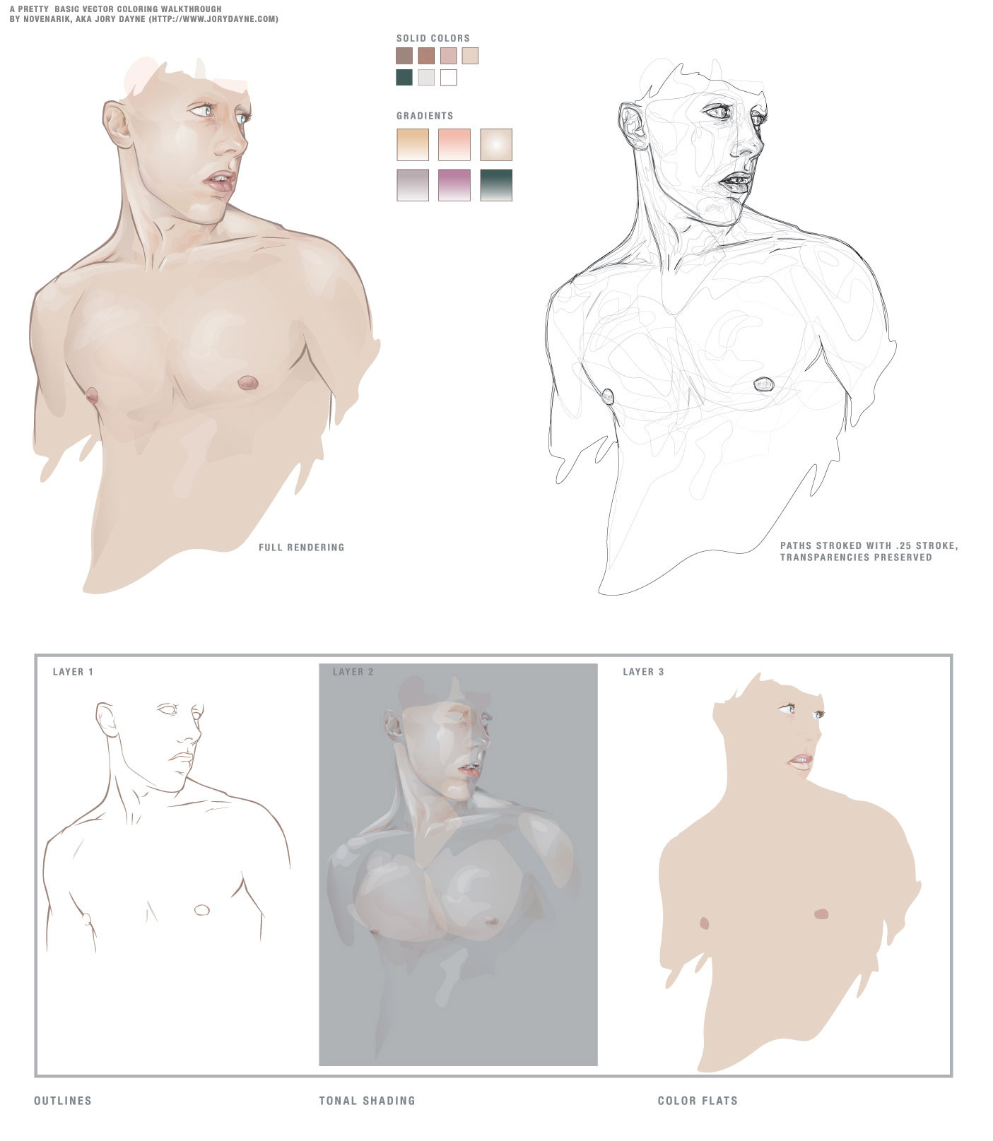
Sometimes when i get really bored, and can't think of anything to draw -- I like to practice things like flesh tones, hair, etc. This is the result of one of those times.The reason though that I upload this, is that when going through a lot of the pieces of vector work in the galleries, I notice a lot of beginners really struggling with shading, coloring, etc.
And I think all it really comes down to is two stumbling blocks:
1. In most drawing applications, there is just SO much you can do, not necessarily things you *should* do, but just so may options. And I think you can get really bogged down with all the options: gradients, gradient meshes, styles, filters, brushes, strokes, etc etc etc. Things that complicate the piece to an unnecessary degree, and quite frankly, make the piece look like shit.
2. A lot of people, when asking me about technique and crap, do not realize just how much the program (at least in illustrator) can do for you when it comes to blending and color management. Most people don't realize that Illustrator has nearly all the same blending options the photoshop offers, although some function a little differently. When drawing a piece, they manually rummage through their palette trying to mix the exact right shade for shadows, the perfect color for highlights -- and it leaves SO much room for error, i.e., flesh shading containing weird amounts of cyan, maybe jaundicey, etc.
SO -- for this piece, I grabbed a pic out of the stock collections here at DA and basically had one goal in mind: render a quality image, simultaneously extremely complicated and ridiculously simple.
-----------------------
The image at left is composed of 13 'colors' - 7 solid colors, and 6 gradients. I did the outline on one layer, the flat colors on one layer below, and the tones on a layer above it. I tried to keep the tones very warm, and very homogenous.
Now, illustrator's 'Screen' blending mode works a little differently than photoshop's (where black is transparent, and everything else basically lightens the color beneath it) -- In illustrator is basically lightens everything all to hell -- black still lightening things as well. For this reason, I find it usually works better, to work with a simple gradient, one color blended to white, and then its transparency adjusted. And also, do the highlights *first* immediately on top of your flat colors. It makes blending so much simpler, the highlight is created by a screened shade of the exact same color beneath it -- so the highlight is precise; you don't have to worry about matching your colors over and over and over again -- since you basically have one color beneath it.
Transparencies is another key issue -- you can fade your shading in and out until you get some extremely subtle shifts -- sooo many people keep going back to that palette and tweak their colors until its just a hint lighter, but its sloppy and slow -- the transparency palette is your friend.
Anyway, next I go in and do all the shading -- typically with gradients, one color to white, blended with the "multiply" mode -- again, the shading will blend perfectly with the colors beneath it -- and you don't get any weird rastery lines on your edges. You can really go nuts at this point -- the multiply mode works exactly like it does in photoshop, so with white as one color in your gradient, you essentially are getting a perfect shade to transparent wash over your flat tones and highlights.
-------------------
The image on the right is just the image on the left, all the colors stripped out, each path stroked with a quarter-width stroke -- I've left the transparencies intact, so you can see which paths had which opacities.
The images underneath are the three layers I mentioned earlier:
Layer 1 (the first layer I created): the outlines
Layer 2 (the third layer): All shading and highlights -- anything that is a gradient, or blended, or not 100% opaque
Layer 3 (the second layer): color flats, basic full opacity washed of color.
Document Info:
454 Paths, 383 of which have are 99% opaque or less, 264 of which are gradients. 0 gradient meshes, 0 brush effects, 0 filters, 0 stylized objects, 0 stroked objects.
So thats a pretty concise, and albeit broad tutorialish walkthrough of shading -- play around with blending modes, transparencies and limited palettes and see what you come up with. It mostly a system of trial and error that you get the hang of the different modes, etc. I hope I didn't sound cocky or authoritarian -- i was going for just helpful.
Related content


Comments: 152

You did sound cocky and authoritarian but in the "listen to me and life will be wonderful" kind of way. This is a great tutorial I think it will help a lot.
How do you go about making your shapes? Do you just freehand them with the mouse?
👍: 0 ⏩: 1

 (Smile)")


Thanx a million. U give me inspiration to move one. Wow. +fav this one.
👍: 0 ⏩: 0

Thanks for the heads up... I've been waiting for some time for you to share your technique.
Cheers!
👍: 0 ⏩: 0

Haven't even read this yet, just about to, but this looks very clean and nice technique!
👍: 0 ⏩: 0

Awesome, thanks for sharing your technique
👍: 0 ⏩: 0

your are really unique! your works are so great! and your sence of color just blowing my imagination. GREAT!
👍: 0 ⏩: 0


This is really a well thought out tutorial esp. since it takes me so long to finish up some works in PS. Thank you.

👍: 0 ⏩: 0


you know, the transparent outlines shot, and the tonal shading shots look REALLY good! far more interesting than the actual peice, in fact. play with that... you could really break into another great style. +fav
👍: 0 ⏩: 0

AMAZING! thank you for sharing and taking the time to make this. A great insight and tool for us who use illustrator
👍: 0 ⏩: 0

I like getting insights like this, i've actually tried to do stuff this way for a while, and it really is a timesaver.
How do you accomplish those clean lines? Using tablets with pressures and all that?
👍: 0 ⏩: 1

ewww no! those are all hand drawn with a mouse and my nose to the screen
👍: 0 ⏩: 1

nose to screen = bad ergo's
especially for those eye
(and he looks better without eyebrows anyways
- it looks like he just got waxed
")
👍: 0 ⏩: 0

you have this down to a SCIENCE. i love the subtle tones you create, in illustrator no less!! illustrator to me is like a big secret, i can't figure it out for the life of me. awesome.
👍: 0 ⏩: 0

Thanks a lot for the lesson 
👍: 0 ⏩: 0

OH MY HOLY HELL! I FORGOT HIS EYEBROWS. That's embarassing
👍: 0 ⏩: 1

it happens to all of us...
 (Wink)")
👍: 0 ⏩: 0

Digging it, the process is often as interesting as the finished piece. I'd love to see more vector tutorials from you.
👍: 0 ⏩: 0

thanks alot! this is awesome, I love seeing how other people work.
👍: 0 ⏩: 0

Wow, thanks!!! I've always wondered how you arrived at your excellent shading effects in your illustrations! Almost a watercolor type look, only better!
I never even thought to mess around with the transparency blending modes so yes I admit I've spent way to much time trying to get that blend, mesh or gradient just right!
Next can you do one on how you achieve such nice line quality?
Then can you send me one of your illustration files so I can study it in detail? hehe, Just kidding...
Thanks again for the tutorial, I have some new things to try!
👍: 0 ⏩: 1
Yeah, well -- i daresay this prolly wasn't aimed at you -- meshes seem to be working just fine for you
👍: 0 ⏩: 0
lilspritebubbles [2004-04-15 15:07:22 +0000 UTC]
loads of respect goes out to you--- your work is so many kinds of amazing. its so awesome to see your stuff coming from scratch, from images inside your head. definitely one of the most talented artists here on DA. thanks a lot for this tutorial, it will inspire others to give their own creativity a try.
julia
👍: 0 ⏩: 0

Thanks alot for this. I've always marveled at the way you handle 'ze flesh.
👍: 0 ⏩: 0

whoa
i used to be impressed by your skills but now im in disbelief
👍: 0 ⏩: 0

wow, i would never imagine that to be a vector. how long did it take for you to do that? i have to find some time to play around with a vector now too.
👍: 0 ⏩: 0

That's just simply amazing it's doenst look vector like at all and to be honest I still can hardly believe it. I'm just staring at it with my mouth and eyes open wide.
Altough I use illustrator to get that vector look and already work with transparancy I use it only to get a bit more realizism in my work but I don't wana loose that vector feeling but this is one step beyond. It's like realism to the extreme dammm man my mouth is still wide open. It a new approach I defenitly gonna try out thanks a lot. Cause I never really tried those blending modes and stuff.
Time to close my mouth and add this thing to my favorites I think so I can check it everytime I want too.
Thanks


👍: 0 ⏩: 0

weee - yeah. I've searched a long time for something like that.
👍: 0 ⏩: 0

I read that whole thing and it was Greek to me.
All I know is that coloring is badass.
K
👍: 0 ⏩: 0


this makes sense! *wahayee*
thankyou for posting this, it's such useful information
+fav

👍: 0 ⏩: 0

need to get to grips with illustrator, and this tutorialish will help me on my way!
👍: 0 ⏩: 0


Helpful, indeed. So altruistic of you to share with us some of your trade tricks. Yoo da man!

👍: 0 ⏩: 0

You should make an option to download in a zip (the pic and text)! So if all the highlights and the shading are in one layer, when did you use screen and when did you use multiply? Don't you need two layers to have two different blend effects? Also, when you say use a gradient, one color to white, what does that mean? Where did you use gradients in the shading/highlights layer? I'm confused. Other than that, this is great! (runs to Illustrator to try)
👍: 0 ⏩: 1
You do *not* need to have two separate layers for each blending mode -- thats what rocks, you can apply a different blending mode to individual objects. I used the screening mode very sparingly in this, decause it was kind of unneccesary -- but I used it to highlight the eyes, the lips and some other spots.
When i say one color to white I mean in your gradient you have one color gradient to white (see the bottom row of gradient squares, they are all one color to white). The reason that is useful is because if you set that gradient to multiply that white becomes transparent -- so lets say you have a color flat of red, and you want to create a nice shadow, you could create a gradient, the same red blended to white, and then set it to multiply; when you lay that down over the red, you get a darker red fading up to the original color; then if you want a deepr shadow, you can keep laying the gradient down over top of it, even itself, and just get a darker and darker shadow, one the blends perfectly with the original hue.
As far as where i used gradients in the shading layer --they are almost all gradients, maybe the most noticeable though (i like to keep the transisitions from color to color very subtle) is the pinkish shadow in the center of the face, the one the runs between the nose and the cheek; and the (screen)left pectoral: you can see how the light wash of skin kind of fades into the purple.
Hope this clarifies things! Sorry it was vague the first time around.
👍: 0 ⏩: 1
I might just be being a little dense here but how exactly does one apply the blending mode side of things? I've done it in photoshop but I'm a little lost looking for it in illustrator.
👍: 0 ⏩: 1
Its in the transparency pallete, its the dropdown menu right next to the opacity slider
👍: 0 ⏩: 0

I really dont know what else to do or say... thank you.
=^.^=
I always said i couldnt colour, maybe there's hope ... *haha* but seriously. Its definitely something I'll try out.
Yinn
👍: 0 ⏩: 0

man these are some mad skillz.. deffinatly going to try this style.. or at leat to shade better this way..
👍: 0 ⏩: 0


may i anoint your feet with oil, dear saint jory....
👍: 0 ⏩: 0


bery intresting sounds pretty complex i will have to play around with these techniques. thanks for posting this.
👍: 0 ⏩: 0

dude, I love you
well not really but i'm so glad you submitted this
")
👍: 0 ⏩: 0
<= Prev | | Next =>