HOME | DD
 Nsio — How Nsio would fix the new deviantART logo
#deviant #deviantart #fixing #logo #update #art
Published: 2014-12-05 18:42:48 +0000 UTC; Views: 67976; Favourites: 1108; Downloads: 444
Redirect to original
Description
I know nothing can stay unchanged to the eternity, but it doesn't mean that we should just accept everything that's brought in front of us. DeviantART is quite a spectacular example of this, but rather than bashing their actions, I wanted to explain myself why I don't like the new dA logo. I'm already in terms with it, but I'm still uneasy with it. Here is my analyze why the logo doesn't work and also an example how it could be fixed. Feel free to call me just typical whiner, but before doing so I kindly ask you to read my arguments")
Similar alterations:
Analysis of the situation etc.
To close, what happens now?Art By yuumei
The logo has been brought up to the staff & also the fact that it's similar to Platzkart will most likely be addressed. It obviously wasn't stolen, but still. If they wanted to try & sue us, lets be real. Lol, it wouldn't be good. We brought it to their attention. & they know about it. Whatever happens from here on? Well it's up to the staff to figure it out.
The balance between staff & the members of this site, has been restored. (or at least more close to being equal)
Overall? I think it all went well.
I'll be honest.
Some of the staff like Ikue, (not a bad dude) even saw this as "rebelling". But I disagree. We're not supposed to just sit here & just agree with every single decision that's made. Like Drones. But, you SHOULD speak up.
Most of the people in this community here were afraid to speak on what they feel & know to be truth.
(If I had premium, I could have linked thumbnails, but these will do for now)
"New DeviantART logo - Why it doesn't work and how to fix it" by Nsio
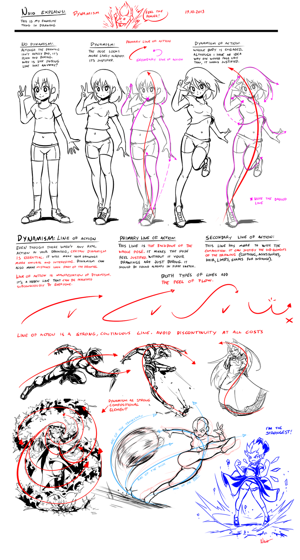
I’m sure people have already noticed the new dA logo. At first I had no idea what I was seeing. Then I figured “of course, it’s an A letter”. Shortly after I also realized there was an upside down A as well. “This one must form some sort of pattern” I thought. I wasn’t very happy about the design though so I went and read the “Our Story” section.
The logo was indeed designed for tesselation. Okay fine, so we have an “A” letter, standing for Art. It’s also upside down. “Challenges perceptions and perspectives”, “by literally turning the art world upside down”. Okay, I can deal with that. But still, I’m not convinced. Something is missing with the new logo. “We love it because, like DA, people might not get it right away”. I find it weird that dA actually wants to make us confused. If you ask me, art should offer the sensation of realization, not confusion. Or if there is initially confusion, it should still offer some way to turn the confusion “upside down” into sensation of realization. Even though I got the message, I’m still confused. I don’t like the new logo but why?
I understood the reason right the moment I saw the youtube video about the story behind the logo. At one point, there was a logo where it says “dA”. The moment the logo is separated, the problem occurs. DeviantART becomes just ART. It’s not the DeviantART we know anymore. It’s just ART with cool tesselation effect.
I thought I would let it go, since I now know that the logo can be thought as if it reads “dA”. But it was still bugging me. Although I can force myself to think it like “dA”, I still see only “A”. I pondered this for a while and then I realized the issue: amodal completion.
Although we are intelligent beings, our brains are rather simple when it comes to visual perception. Our brains have an ability called “amodal completion”, which allows us to “see” the form of partially hidden objects. That’s why we can tell a person peeking behind the corner is a human, even though we see only half of the face. Our brains can construct human figure fairly well even if it’s partially covered, but with everything else, brains just lack the imagination.
If important details of an object is hidden, our brains can’t construct such complex or abstract things. Instead, the brains just rely on the visual cues to parse the image. A lot of data is lost and the image is greatly simplified. I drew few examples about the phenomenon on the left. For example, if there are arcing details, but no visual cues are offered about it, arcs are discarded in favor of continuity of the lines.
This happens even if you knew there were such details. Instead of seeing one complex object, you see only two lines. On second row I show the arcs. However, our brains are more likely to treat the partially hidden object as two separate objects. This behaviour is exaggerated because of the symmetry, since humans are naturally attracted to symmetry.
So basically this is what happens with the dA logo. Even if we know the logo can be thought to be partially covered “dA” logo, our brains fails to comprehend this because the “d” is discarded in favor of “A”. There are not enough visual cues to support this way of thought process, which leaves us just confused and unsure about the logo. It’s cool, but it doesn’t have any bonding with DeviantART.
However, I find that the new logo could still work, if there just were such visual cues present. In fact, the actual logo could be kept intact by just adding shadow images of the d and A. I made a quick test if this could work and I found that it looks pretty cool now. By using dark green for the shadow image, the visual cues are strong enough to make the dA logo visible while still allowing the real logo to stand out clearly. All the benefits of the new logo are retained, no confusion taking place and the bonding with DeviantART has been formed.
If this change was made, I would gladly accept the new logo. Right now the logo doesn’t feel justified. I’m not saying that my proposal is perfect, but it’s one way to fix the issue. Even if there is huge difference in artistic capabilities between dA members, our physiology is the same. We are humans and we function in a way that’s typical to humans, no matter how much we try control ourselves. I believe that even if people don’t agree with the proposed fixing, they at least acknowledge the need of fixing in one way or another.
Nsio
Related content


Comments: 404

Yeah, this logo design would make more sense.
The new design still seems a bit confusing. As if it's missing something. Hopefully, the higher ups on DA will notice what the community thinks of the new design and sees the suggestions on how to improve it.
👍: 0 ⏩: 0

Yes, this logo looks much more like DeviantArt than this strange X or whatever it's supposed to be. But of course, we all know that DA will stick to it no matter what the reactions of the community are. And I mean it is perfectly within their rights to do so, although of course the whole marketing-bullsh*t of how important the community is to them which is used to rationalize every major change on here would then be unmasked as being just that, a whole bunch of marketing-baloney...
Another thing that bothers me about the new logo, though, apart from its rather generic and incomprehensible design, is its color.
The hue is way to bluish in my eyes. It feels cold and doesn't fit to the rest of the side. In fact, it really clashes with the rest of the design on here. Just look at the color of the "Submit Comment" button. Its a warm yellow-greenish tone that is just in line with the old logo design and which also feels rather friendly and inviting. The new logo, however, looks kind of harsh and cold, especially in connection with the new cut-off signature font.
👍: 0 ⏩: 1

Yeah, I also questioned the color choice of the logo. I was planning to make the revised version in warmer tone, but thought that it would be for the best to keep it intact for the time being. I can accept the new colors.
I was also wondering if the "DEVIANTART" text next to the logo could be in some light yellow-greenish tone for the legacy of the old logo. It could look more softer, though I don't mind the sharp, impacting nature of white color.
👍: 0 ⏩: 1
Yeah well, in the end it doesn't really matter what we or "the community" think about these changes. We all know DA, they usually aren't very bothered by criticism, so, I guess it will stay as it is.
And granted, these changes really aren't profound enough for me to say I can't live with them anymore. But if they decide to change the overall look and feel of the site in a way I don't like, however, it is quite possible that I would stop using the site at some point. We'll see
👍: 0 ⏩: 0

i agree with you, its really hard to see the "d" and "a" in the new logo, it just doesnt seem right
👍: 0 ⏩: 0

it also could be like this. but I like your explanation better.
👍: 0 ⏩: 0

Okay, I for one do not like the new logo.
is so much better and original.
Not only that, but is stolen from www.deviantart.com/users/outgo…
However, with your new design I like it a whole lot more c:
It actually says "dA"
Well done ^^
👍: 0 ⏩: 0

I don't even get the new logo but at least this makes sense!!
👍: 0 ⏩: 0

LOVE IT! I can't stand the new logo. I get it too, but I thought the same thing. What happened to Deviant?
👍: 0 ⏩: 0

I think everyone should repost this so DA gets a clue.
👍: 0 ⏩: 0

When I first saw the new logo... I thought it looked like a currency symbol.
I love your analysis of the logo, but I think that it could potentially look nicer if the letters D and A were cut in the same way as the new typography in order to harmonize with it. Just my two cents.
👍: 0 ⏩: 1
Yeah, if it is absolutely necessary to follow the cut out theme, then the shadow image version could be done in similar way. I just recycle the initial logo design from the youtube video in order to keep the logo itself intact while still offering the required visual cues. This is more like a conceptual explanation and solution for the problem, not a completed logo design.
👍: 0 ⏩: 0

Damn you are burning some logo designers out there OOO . I really dislike the new da logo, looks like a plant or something, like, can i eat this??. I think your redesign would be more logical : ^)
👍: 0 ⏩: 0

this is perfect because I was really confused about what it was supposed to represent despite the fact that I watched all the stuff about it. So thank you. I hope dA tries to do something with your proposal
👍: 0 ⏩: 0

As much as I like the new logo and want to accept the new change, I agree with you. The "dA" that the new logo was cut from looks better. If DeviantART decides to keep the new logo, though, I think I can handle it.
👍: 0 ⏩: 0

I like this idea, it honestly does work very well. As much hard work as was put into forming the new logo (which I don't really mind, it's not like it's the most horrible thing in existence and is going to ruin the site or whatever), it doesn't really look like dA much. With the shaded parts added on, the logo looks really cool, and I agree that the problem started once those other two original sections were sliced off. It's as though they were trying to do something clever and innovative and forgot that a logo should tell a person all about the thing it represents WITHOUT them having to explain why it represents that thing.
Your arguments here are totally justified, which is refreshing after seeing some of the blind hate going on over at "Boldly Facing the Future". You've made numerous well constructed points here, I just hope somebody who can fix it will be able to read this post.
👍: 0 ⏩: 1
Exactly. I feel like they are just obsessed about the cut out theme. It's their grand concept after all. That said, everything needs to be cut out the same way to make the site coherent. I agree with that, but sadly the dA logo got severed fatally, making it unidentifiable zombie-green corpse that once was known as DeviantART
")
👍: 0 ⏩: 1
Yes, that is true. It just looks like they got carried away trying to make everything meld in together, and then we end up with the corpse of a logo you described.
👍: 0 ⏩: 0

ties.deviantart.com/journal/St…
👍: 0 ⏩: 1

My only issue with your change is that it's too based on color. Take out the bezel, and add a few pixels between the original idea and your idea, and I think it'd be a literally perfect logo.
👍: 0 ⏩: 0

The only way I'd change what you'd done to it a little more, is to tone down the obnoxious green color into a more tame version of the neutral green we already have. The darker should stay, it's nice.
The stupid about this logo is just amazing though. No one I know personally can look at it and say "that's deviantart!" which is *exactly the opposite* of what you WANT a logo to do. It BRANDS your work, it should RESEMBLE your work. The words "deviantart", or the letters DA, appearing as they had in the original logo - appear in that one mishmash of 'how we did it' images. They're the only RECOGNIZABLY deviantart piece on the entire 'explanation'.
If you have to explain a logo, it is *not* working. I don't think it's even a matter much of not visually being able to insert the D in there - it just doesn't evoke *anything* about this site.
And yea: it's already in use by a russian transportation site. Which is good there: because it looks like a RAILROAD TIE.
👍: 0 ⏩: 0

i love the shadow lettering! it looks really cool
👍: 0 ⏩: 0

This is more solid than "NEW LOGO ZUXKS". All people would back it up with is "It lux weerd"
👍: 0 ⏩: 0

yes this would be much more acceptable.
👍: 0 ⏩: 0

YES. THANK YOU.
Why have a logo that was made to confuse you.. ESPECIALLY since logos are meant to establish, not confuse.
👍: 0 ⏩: 0

I love how you explained it so well! I was feeling confused about the new logo aswell but couldn't explain why it didn't seem to work. I don't feel it's related to dA. In fact at first without having read anything about a logo change I closed the dA tab on chrome because I thought that a spam tab just opened from somewhere with that green logo. Later I realized I didn't have my dA tab, opened it again and ta-da, surprise and confusion.
Also maybe it's just me, but I think that this green is different from the old one and I think that the old one was better.
👍: 0 ⏩: 1
These things are very conceptual, so it's no wonder if people don't get it. And since they don't know what the reason is, they just hate it. We hate confusion, especially when it happens on something we are very familiar with. I could probably accept nearly any kind of logo as long as it can be clearly associated on dA. The current logo won't do that, which is why I wanted to try making it work so that even haters would recognise it as a valid choice of new dA logo.
👍: 0 ⏩: 1
Yep, I don't "hate" the new one, but I was very confused and clearly didn't like it, but since I wasn't able to tell exactly why, I wasn't just pouring useless hate everywhere like I've seen xD
I hope that they read your statements and think about it, it's a very nice addition that would make this new logo shine.
👍: 0 ⏩: 0

damn that makes sense i was wonder what the fuck it was supposed to be
👍: 0 ⏩: 0

Have you seen this: platzkart.ru/
It's in a language I can't translate. And without a copyright date on the page I can't tell if this is recent or not.
Maybe it's purely coincidental that the logos look identical but I remain slightly skeptical...
But addressing what you stated in your deviation, your explanation really is a nice and simple way to 'fix' the logo. And I agree, even if the staff doesn't take this suggestion, they have to be aware that 'something' needs to be fixed. I was just as confused as you were upon seeing the new logo. All I saw was a "Z" with a "/" through it; others saw a "$" sign, and few made the connection of "dA." I do believe it's a poor design for a logo, but it's not a lost cause. It can be approved. But among all else, I do appreciate you taking the time to not only suggest how the logo can be fixed, but to also explain your views and why you dislike it from an artist standpoint. Too many people are quick to bash on something without a legitimate reason as to 'why'; so I (as well as others) find it really refreshing to see other perspectives to a problem in a positive way.
👍: 0 ⏩: 2
Quite a coincidence! For platZkart, the logo can actually work. It feels more complete with the circle around it, but it also represent the site in some degree (although I don't know anything about it).
Thanks  (Smile)")
👍: 0 ⏩: 0


I really like your explanation of the flaws in the newest dA logo and why people seem to dislike it. However, your way of fixing the logo, while creative, has flaws of its own.
I know this because I took a class in high school that taught us how to make good logos, and two key things they mentioned were that good logos should "be visible in one color" and "should be visible from great distances".
The problem with using the shadow technique is it makes the logo require two colors, and also, the shadow is so dark on the background that it vanishes, leaving the unaltered, confusing logo visible. (I tried viewing the logo from a great distance, and indeed, this is what happened!)
My suggestion would be to alter the shape of the newest logo itself, and try to include a visual cue to indicate the presence of the small "d", since that is where the root of the problem is.
👍: 0 ⏩: 2
Hmm, good point actually. Now that I think about it, many logos can be shown in just black and white without compromising the clarity.
But anyway, my point was to come up with an explanation why the current one doesn't work in conceptual level and make proposal which keeps the new design intact. In fact, I just recycled the initial logo design which was shown in the youtube video.
👍: 0 ⏩: 1

"should" does not mean "has to" you can have a good logo without following everything a guideline says.
👍: 0 ⏩: 2
that was constructive criticism
I said. And "should" already translates to "do if possible" in my head, which is what I was saying in this comment.
👍: 0 ⏩: 0

yes... you're right.. those are guidelines of good design, not actual rules of good design.. but a good designer try to fullfill everyone of them, cause they have a why.. the only way of avoiding fullfilling one is having a reason for doing it, if you don't have one... you're a bad designer... design is not art, is not about making things by instinct or becase it look cool, is about study and comprension.
Graphic designers are not random creatives like artist.. we are functional creatives with methodologic and proyectual process.
👍: 0 ⏩: 0

That is waaaaaaaaaaaaaaaaaaaaaaaaaaaaaaaaaaaaaay better
dude you're a genius!
👍: 0 ⏩: 0

To me the new logo seems like the logo for a retro video game, 8-bits and all that stuff and I thougth it was a letter Z at first I didnt understand why a letter Z represents DA until I read the mesage in "our story", let´s see if DA do something about it.
👍: 0 ⏩: 0


I definitely understand where you're coming from, with your design the logo feels more completed.
I don't know you're probably not looking for critique - but the thing is the logo on "works" because of colour use. You'll just need to make a black version for the dA guys to take you more seriously  (Wink)")
👍: 0 ⏩: 1
Yeah, I got another similar comment about designing logos. I didn't take in account how the logo should be visible in black&white, but rather explained concept behind the issue and solution for it.
👍: 0 ⏩: 0

I would gladly like that logo too :3
👍: 0 ⏩: 0

Ditto. Even though my logical part of the brain understands this logo, my aesthetic part of the brain absolutely despises this logo, and you have perfectly explained why.
👍: 0 ⏩: 0

Congratulations on becoming the reason why I now finally understand this new logo. I laud the site's attempt to do something new. But I've always said that just because art can be abstract doesn't mean you should shove it so far up peoples' noses that they can't see what it means.
Wish they had considered you while they were making their new shit.
👍: 0 ⏩: 0

I love what you are saying about this and I feel the same way, I just had not known the science of it before.
I would say the logo needs to be completely revised, but they did actually work hard on it (though they did not consider the info you mentioned at all).
I think the shadow idea is a great idea and would look much nicer!
👍: 0 ⏩: 0

<= Prev | | Next =>