HOME | DD
 Nsio — How Nsio would fix the new deviantART logo
#deviant #deviantart #fixing #logo #update #art
Published: 2014-12-05 18:42:48 +0000 UTC; Views: 67979; Favourites: 1108; Downloads: 444
Redirect to original
Description
I know nothing can stay unchanged to the eternity, but it doesn't mean that we should just accept everything that's brought in front of us. DeviantART is quite a spectacular example of this, but rather than bashing their actions, I wanted to explain myself why I don't like the new dA logo. I'm already in terms with it, but I'm still uneasy with it. Here is my analyze why the logo doesn't work and also an example how it could be fixed. Feel free to call me just typical whiner, but before doing so I kindly ask you to read my arguments")
Similar alterations:
Analysis of the situation etc.
To close, what happens now?Art By yuumei
The logo has been brought up to the staff & also the fact that it's similar to Platzkart will most likely be addressed. It obviously wasn't stolen, but still. If they wanted to try & sue us, lets be real. Lol, it wouldn't be good. We brought it to their attention. & they know about it. Whatever happens from here on? Well it's up to the staff to figure it out.
The balance between staff & the members of this site, has been restored. (or at least more close to being equal)
Overall? I think it all went well.
I'll be honest.
Some of the staff like Ikue, (not a bad dude) even saw this as "rebelling". But I disagree. We're not supposed to just sit here & just agree with every single decision that's made. Like Drones. But, you SHOULD speak up.
Most of the people in this community here were afraid to speak on what they feel & know to be truth.
(If I had premium, I could have linked thumbnails, but these will do for now)
"New DeviantART logo - Why it doesn't work and how to fix it" by Nsio
I’m sure people have already noticed the new dA logo. At first I had no idea what I was seeing. Then I figured “of course, it’s an A letter”. Shortly after I also realized there was an upside down A as well. “This one must form some sort of pattern” I thought. I wasn’t very happy about the design though so I went and read the “Our Story” section.
The logo was indeed designed for tesselation. Okay fine, so we have an “A” letter, standing for Art. It’s also upside down. “Challenges perceptions and perspectives”, “by literally turning the art world upside down”. Okay, I can deal with that. But still, I’m not convinced. Something is missing with the new logo. “We love it because, like DA, people might not get it right away”. I find it weird that dA actually wants to make us confused. If you ask me, art should offer the sensation of realization, not confusion. Or if there is initially confusion, it should still offer some way to turn the confusion “upside down” into sensation of realization. Even though I got the message, I’m still confused. I don’t like the new logo but why?
I understood the reason right the moment I saw the youtube video about the story behind the logo. At one point, there was a logo where it says “dA”. The moment the logo is separated, the problem occurs. DeviantART becomes just ART. It’s not the DeviantART we know anymore. It’s just ART with cool tesselation effect.
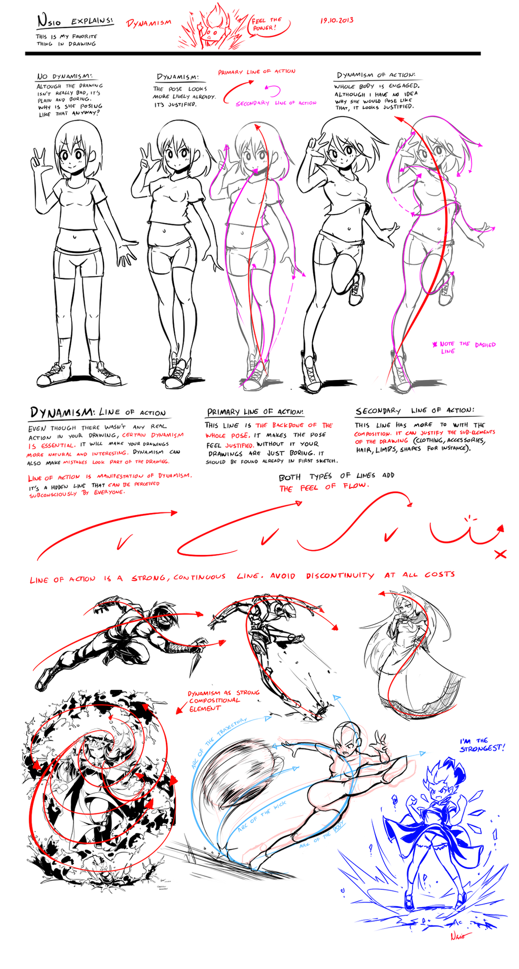
I thought I would let it go, since I now know that the logo can be thought as if it reads “dA”. But it was still bugging me. Although I can force myself to think it like “dA”, I still see only “A”. I pondered this for a while and then I realized the issue: amodal completion.
Although we are intelligent beings, our brains are rather simple when it comes to visual perception. Our brains have an ability called “amodal completion”, which allows us to “see” the form of partially hidden objects. That’s why we can tell a person peeking behind the corner is a human, even though we see only half of the face. Our brains can construct human figure fairly well even if it’s partially covered, but with everything else, brains just lack the imagination.
If important details of an object is hidden, our brains can’t construct such complex or abstract things. Instead, the brains just rely on the visual cues to parse the image. A lot of data is lost and the image is greatly simplified. I drew few examples about the phenomenon on the left. For example, if there are arcing details, but no visual cues are offered about it, arcs are discarded in favor of continuity of the lines.
This happens even if you knew there were such details. Instead of seeing one complex object, you see only two lines. On second row I show the arcs. However, our brains are more likely to treat the partially hidden object as two separate objects. This behaviour is exaggerated because of the symmetry, since humans are naturally attracted to symmetry.
So basically this is what happens with the dA logo. Even if we know the logo can be thought to be partially covered “dA” logo, our brains fails to comprehend this because the “d” is discarded in favor of “A”. There are not enough visual cues to support this way of thought process, which leaves us just confused and unsure about the logo. It’s cool, but it doesn’t have any bonding with DeviantART.
However, I find that the new logo could still work, if there just were such visual cues present. In fact, the actual logo could be kept intact by just adding shadow images of the d and A. I made a quick test if this could work and I found that it looks pretty cool now. By using dark green for the shadow image, the visual cues are strong enough to make the dA logo visible while still allowing the real logo to stand out clearly. All the benefits of the new logo are retained, no confusion taking place and the bonding with DeviantART has been formed.
If this change was made, I would gladly accept the new logo. Right now the logo doesn’t feel justified. I’m not saying that my proposal is perfect, but it’s one way to fix the issue. Even if there is huge difference in artistic capabilities between dA members, our physiology is the same. We are humans and we function in a way that’s typical to humans, no matter how much we try control ourselves. I believe that even if people don’t agree with the proposed fixing, they at least acknowledge the need of fixing in one way or another.
Nsio
Related content


Comments: 404

Nsio, thanks for the explanation, finally I've understand what mean this logo and I can say without doubt that the your version of the logo is much better.
Hope to see your logo became the new DA's logo.
👍: 0 ⏩: 1

Thanks. It's not really my own design, since I just recycled the initial dA logo from the youtube video, but it would be cool to actually see it as an official dA logo
👍: 0 ⏩: 1
I understand, but even if isn't a your idea I'm still convinced that this logo is surely better than the actual new logo and besides prove your ability in find what is essential, an ability not so common. u_u
👍: 0 ⏩: 0


I myself have no problem with the new logo, but I really like your idea. I hadn't realized there was a D in the logo at all, but this helps me see it. The idea to use shadows behind the logo is a good one because it doesn't actually change the logo, but actually enhances it.
👍: 0 ⏩: 0


Using shadow images is a cool idea.
👍: 0 ⏩: 0

I've read your arguments, but for myself, they don't work, because my brain has no problem to see in the new logo the little "d" and the big "A". My brain complete the Logo to the two prefered letters "d" and "A". So I have no problems with the new logo design.
But for you (and those people who only can see the upside down A instead of an d), I can understand, that the new logo doesn't feel so comfortable. And for my opinion, your version of the new logo looks great and I like your ideas a lot! And it is a great work of yours not only to criticise the new logo like many do, but you thought about the "why" and make suggestions for improvement! I wish there would be more deviantArtists like you who really use their heart and brain before telling work of someone is "shit".
Thank you! It was very interessting to read your thoughts!  (Smile)")
Sorry for my bad englisch
👍: 0 ⏩: 1
Either you know what you want to see, or it's indeed as you say that you see the "d" there. I'm stuck with "A", even though I'm trying to force myself to see "d". Since I know where the logo derives, I'm okay with it. But that's just because I know it. Considering this is the logo that represents whole DeviantART, it doesn't get the job done for everyone.
Thank you! Yeah I figured that the update would cause such an uproar so I thought joining the choir with some solid arguments rather than just saying "I don't like it". It would be cool to see this treatment to make it to the official logo, even if it wasn't directly implemented as is.
👍: 0 ⏩: 0

You. Are. Amazing! Thank you for this!
👍: 0 ⏩: 0

It took me a long time to see what the new logo was trying to do and I still can't recognize it off the bat. It will forever look like a weird step ladder slash to me.
Your shadowy logo however looks so much better and you have the logic to explain it. I hope the dA staff see your deviation and make the adjustment. Only then would I accept this strange change o7o
👍: 0 ⏩: 0

I was okay with the new logo, although I didn't get it until I read the 'Boldly Facing the Future' post. And even then, I couldn't wrap my mind around how it would work all the time. I really like this a lot more than the new logo, and the old one too ^_^
👍: 0 ⏩: 0

Yeah, even by thinking about i fail to see the 'D' in the logo. It looks so out of place and random...can't look at it.
They should really try a different logo in my opinion.
👍: 0 ⏩: 0

I love deviant art but the NEW LOGO IS DESTROYING IT!!!
(Link is not mine but is the best comparision of logos than I found, you can do the change if you think new logo is ugly)
mattk1989.deviantart.com/art/O…
or
=
👍: 0 ⏩: 0

Brilliant! The shadow logo looks cool, but honestly I think the fully green dA that you show is even better! Either is preferable to the weird green slash that's the current one D:
👍: 0 ⏩: 0


I think I'm in loce with your idea.
Thank you very much for this, I really hope dA staff will implement this!
👍: 0 ⏩: 0

OH!
So that's what I was supposed to be seeing! I like this much better.
👍: 0 ⏩: 1

This is exactly what I was thinking! You did a great job with this, we should make sure this gets seen by the dA team!
👍: 0 ⏩: 0

for me the logo looked like either a weird dollar sign, or that it looked like the logo for a antivirus program.
but to be honest I didn't like the old logo either, so overall I'm glad deviantart is trying to get out of their old dusty shell. Even if it means we'll have to deal with a confusing logo.
👍: 0 ⏩: 1


OH. MY GOSH.
YOU ARE JUST. BRILLIANT.
WHY CAN'T DA HIRE YOU. YOU'RE GENIUS. JUST GENIUS. GHAAAAAA
I really cannot say any more. Everything I'd want to say you've already said. Like how the Z doesn't really make you think of dA. Shown by the face that when they released the logo for the first time in the Down the Rabbit Hole and we didn't know what it was...We didn't know what it was! It was just a random Z!
However, the way you made the logo look...I just...cannot even. You're bloody genius you are, just downright brilliant. I just want dA to make this ONE change, just bend for us on this ONE aspect. They can have their Z logo, but your version of it is obviously far better. If they made it literally what you have, I would fully accept the new logo. DeviantART would literally be the ultimate buttheads for not acknowledging this genius.
Simply the Z just belies nothing as the logo.
your dA version actually LOOKS GOOD. It makes you think about dA and it is creative and simple. As you said, a logo should not confused you. THat is literally opposite of the purpose of a logo. The Logo should give you an idea about what it's representing. A Z is gonna do diddly squat, specially if you're advertising.
Just look at Nintendo. Their logo is literally just their company name in an ellipse. Simple, but it's recognizable and gets the job done. It doesn't need to be creative. There's nothing professional about a "Z" representing something that has nothing to do with the letter Z. I know it's supposed to be an A, by the way, but I'm talking in the perspective of a person who might not know wtf dA is. They have to TELL you that it's supposed to be an A.
Not saying creative logos aren't bad. I mean you're rendition of the new dA logo is actually very clever and creative. That is what they should have done. But the thing about the Z is that it looks like some sort of rune designed by college students who don't really understand professional logo designs all that well.
So yeah. I want them to change to your version of the logo. I will personally walk over their and tape your version printed on paper all over their building. OnO (Not really. XD Just kiddin')
ANYWAYS.
I hope the admins see this and acknowledge it. That would be amazing, and I think you deserve to be recognized for your creativity.
👍: 0 ⏩: 1
Heh, thanks for the support!
I think that I could figure the "A" only because I knew it had to do something with DeviantART. "Z" never came across my mind because I was already set with "A" standing for "ART", but I saw another version of the logo which clearly looks like a "Z". For an outsider, the likelihood to interpret it as "Z" is very high, higher than "A".
👍: 0 ⏩: 1
Yeah. Have you seen JollyJack's little comic about it on the front page?
www.deviantart.com/art/Super-P… <---This. x3
👍: 0 ⏩: 1
No I haven't, this is simply fantastic! Thanks for the link xD
👍: 0 ⏩: 1
You're welcome~!
This is actually the biggest stink I've ever seen raised over a deviantArt update by the way. They JUST MIGHT acknowledge this one. ouo
👍: 0 ⏩: 0

I couldn't see the D in the new logo also even if I realy tryed. I support the shadow image logo.
👍: 0 ⏩: 0

Lol the brain is not simple when it comes to visual perception. It's the most complicated and amazing machine that exists on earth. It does however default to the most probable or simplest possible explanation of the available data based on prior experience. That is a nontrivial feat. Ask any computer vision researcher.
Anyway your point remains the same, I just thought I'd blather on a bit about how we should appreciate the complexity of the human visual system. And forget about consciousness, that shit's cray.
Also, I was thinking exactly the same thing when I saw the video.
👍: 0 ⏩: 1
Haha, yeah sorry for that. From an artist point of view, the brains are really stupid, or lazy rather. But it can't be helped, the amount of data our eyes gather is just so immense that the brains would fry just from trying to tackle with everything xD. Many aspiring artists fail to improve just because they don't question what their brains are telling them.
👍: 0 ⏩: 0

When its larger, I can read the logo. When its small like the favicon, it looks like a cartoon 'x'.
I might have accepted it more if they just considered it as just a cool symbol and over the years we would associate it with DA but with all the explanation for the logo makes me think that its not a working logo for reasons you mentioned.
👍: 0 ⏩: 1
Indeed. We can accept and associate it as a new deviantART logo (which we may have to do whether we wanted it or not), but it doesn't change the fact that it doesn't quite work. When I saw the initial idea of the logo in the video, I could accept the change. It's actually very clever, it's unfortunate that it doesn't really tell the story of DeviantART.
👍: 0 ⏩: 0

Meh, there isn't really anything wrong or right about logos.
👍: 0 ⏩: 2

Yeah sure, if you want to completely disregard quality in the eye of marketing, culture and perception of identity and brand...
👍: 0 ⏩: 0

Well, if you develop a webpage for a bank with rainbow colors and unicorns stamped all over, then you're going to loose any credibility you might have. There's always a wrong or right - it strongly depends on the context, culture, and target audience you're addressing.
👍: 0 ⏩: 1
I always thought it read "dA", can't comprehend these streams of complaints: sta.sh/016piyflnnlu
Also, with your design you go against the whole cut at the sides theme, so it looks wrong when rounding the "d".
👍: 0 ⏩: 1
I can think it as dA as well, but I still fail to perceive it as such. I can't ignore the way my brains wants to perceive it
This is but one possible way to do it, an example what kind of conceptual treatment the logo would need in order to work. The point is just to offer such visual cues that "dA" is clearly perceived by anyone. I'm not taking in account how it would fit into the new cut at the sides theme. In fact, one can ask whether the new theme is needed at all, just like the need of the fixing
Rather than coming up with something entirely new, I would appreciate reinforcing things that already exist. Cool things aren't done just for the cool look, but for strengthening and refreshing the old.
👍: 0 ⏩: 1
Very valid point; but yeah, basically if anyone has to explain what a logo represents it fails at the base idea of delivering a message, or reinforcing it, as you mentioned. The thing is, also, that I think it doesn't fit to the current layout of deviantArt - the app looks amazing, but the website needs work.
I'm definitely very positive on the subject of the change of the visual identity, the community needs it.
👍: 0 ⏩: 1

Your comment is GOLDEN.
Rules of Marketing 101, If your brand has to be explained, you're doing it wrong.
👍: 0 ⏩: 0

That actually looks better, I thought the new logo was a "Z" with a "/" in it
👍: 0 ⏩: 2

That´s what I thought, too.
👍: 0 ⏩: 0
I agree with your perception. I myself started to analyse the logo with what I already knew about DeviantART already. It has to do with art, so "A" needs to stand for ART. But I didn't find the d so it found it weird : /
👍: 0 ⏩: 0

Your solution is absolutely brilliant, too bad deviantART's professionals are not bright enough to notice that.
👍: 0 ⏩: 0


I don't know, given your name/alias I would think you could understand -
No se, dado tu nombre/alias yo pensaría que podrías entender
👍: 0 ⏩: 0


I entirely agree with this. When I first saw the logo, I thought to myself "...It looks cool... but how does it represent DeviantART? Is it a 'not equal' symbol? That would kind of make sense..."
And then I saw the video and, even thought I realize what it is now, I must agree that it still just says "art" and not "DeviantART". The "d" is there, but I had to be shown that it was a "d".
👍: 0 ⏩: 0

THis is actually a really great way to fix it, and I admit that I didn't know what the heck the logo was until I saw a post about it on Tumblr. I hope that the staff sees this and makes this change! It would make a lot more sense, given your very informative explanation of amodal completion.
👍: 0 ⏩: 0
<= Prev | | Next =>