HOME | DD
 Nukechaser24 — Project Horizons Background Practice 2

Published: 2013-11-11 23:16:32 +0000 UTC; Views: 2053; Favourites: 60; Downloads: 31
Redirect to original
Description
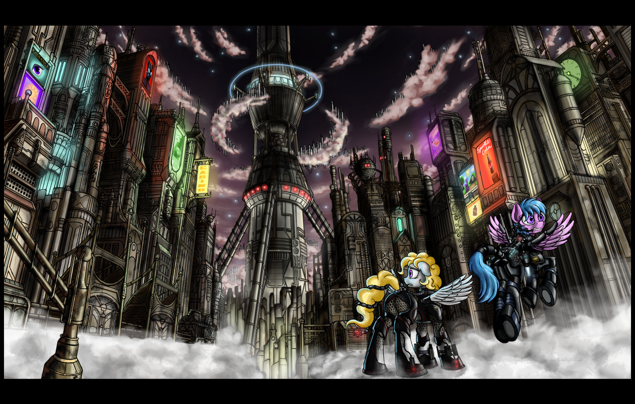
The second of the background/panel practice drawings I did. Tried to make this one a little cleaner but it's hard when you're left handed and have bad instinctive pencil technique. I did a lot of digital correction and tried to use darker colors with more reliance on shading for visual impact. Constructive criticism is invited.Related content


Comments: 16

holy fuck. this pulled my attention from a conversation. this is fucking amazing!
👍: 0 ⏩: 1

")
sushimytaco [2013-11-12 23:35:51 +0000 UTC]
*Didnt add you to my watch earlier* HAH! What a fool i am  (Wink)")
👍: 0 ⏩: 0

Hey Sketch! Where specifically do you think I should put them?
👍: 0 ⏩: 2

the light is depicted mostly with black and white. add some grey in areas that need it
👍: 0 ⏩: 0

Well, in my opinion, you could use some more of cover shades - something more between just black and white, for example in the back of the tunnel  (Smile)")
👍: 0 ⏩: 1

See, I look at these and all I can hear is this.
www.youtube.com/watch?v=BZtU2U…
I don't have much talent with drawing, especially freehand, so I can't really offer much in the way of advice. I absolutely love the atmosphere in these though. It really feels... hollow. And that's not a criticism. It fits the tone of the story perfectly.
👍: 0 ⏩: 2
Thank you, that is great praise. And I can't wait for Wasteland 2!
👍: 0 ⏩: 0

"It really feels... hollow" <-- THIS, THIS RIGHT HERE
For all the technological and architectural marvels on display here, the Hoofington portrayed within pics still manages to come off as cold, hollow, and utterly uncaring. IMO that describes perfectly why they mesh with Hoofington's overall feel so well.
The fact that they're detailed out the wazoo doesn't hurt either.
👍: 0 ⏩: 1
If it looks empty and soulless, it's because I was listening to this while making it:
www.youtube.com/watch?v=SefxmO…
Also, Fallout 1 is my favorite reference for drawing apocalyptic cityscapes, which is great because that game had fantastic art direction.
media.moddb.com/images/mods/1/…
images.wikia.com/fallout/image…
I'm glad it achieved its purpose.
👍: 0 ⏩: 0

holy shit dude that city looks like it took a month to make in that one panal
👍: 0 ⏩: 1