HOME | DD
 Obhan — Tal'Lushan Docks Model
#background #kohta #kts #model #samurai #sketchup #test
Published: 2015-03-18 09:03:24 +0000 UTC; Views: 1238; Favourites: 30; Downloads: 46
Redirect to original
Description
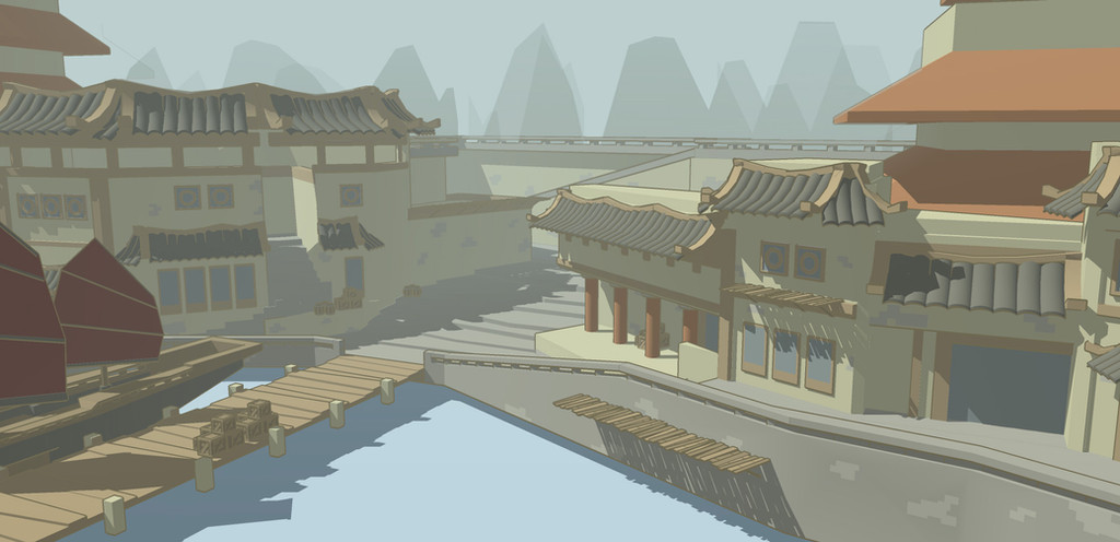
This is the latest background model I have made for the fantasy webcomic I run, Kohta the Samurai.
I’ve been using it to test new export settings, trying to find the best settings to make it blend easier into the background of a comic panel, and this is the set that I’m most keen on.
It’s using the Browns Style in SketchUp, with Profiles turned on but Edges turned off, and some Fog and background mountains added in for effect.
I think it looks pretty good, the brown lines make it blend easier into the background than the sheer black ones that I currently use. What do you guys think?
Related content


Comments: 6

this is impressive! i love the detail that went into this!
👍: 0 ⏩: 1

Well thanks again
I do love the SketchUp program, it's very easy to use and you can spend hours adding in more and more details to your models.
")
👍: 0 ⏩: 0

It does look very good. Only three qualms: the mountains are so excessively sharp that they don't really work; the shadows eat up everything they touch, and the gradients on the roof tiles and columns break the magic. But other than that, it's pretty strikingly close to a nice comic/cartoon look. Well done!
👍: 0 ⏩: 1
Cheers mate, thanks for your critique!
The mountains could do with a little roughing out, these were made quickly just to try out the test and see how the complete image would look, they're easy to fix.
The shadows are a bit deep and uniform, the fog setting in SketchUp lightens some in the background, but it might just be easier to add the shadows in Photoshop, that way they could be much more balanced. Then again the nice thick shadow blocks don't look too bad to me, they make the background a little more striking, but then again that can be a bad thing if I'm trying to make the model blend more into the background, I'll have to test this out.
And what do you mean by the gradients? Is it that they don't fit the shadows correctly? or it's that they make it too obvious it's a computer model? I can see that because they're a bit too uniform/regular. I can try simplifying them, instead of modelling each tile just have a single slanted roof, and then in Photoshop colour shade in each roof so that's more easily differentiated from the others. The problem with that is that it might add too much time in production.
👍: 0 ⏩: 1
Thanks for the insight. Took me so long to get back to you because last time I did write a reply, DA crapped out and I lost all the text. Then life went on, and on and on...
Anyways, regarding the mountains, I would just give them more horizontal amplitude, making them wider and slightly more hill-shaped. Right now, they do distract the eye because they are so harsh and pointy. Shadows, it's just the way they eat up all lines of things they fall on. The clean sharp look you have there is really nice, I don't know if fog wouldn't sort of blur (no pun intended) the pattern a bit, so I'd say it's really just a matter of having the shadows look less "blobby", less flat. Gradients, it's just another little case of pattern-breaking: flat colors everywhere, with very simple gradients on the tiles.
It's a very nice style all in all and I definitely appreciate the 3d work in there (I'm into game development so I should know when I see good environment design) and those points are brought up are more like little steps separating the picture from being great, rather than major glaring flaws.
Cheers!
👍: 0 ⏩: 1
Thanks dude, and don't worry, I've had my computer crash a couple of times into lengthy replies and it's always annoying :S
The mountains shouldn't be too hard to improve since it just requires a bit of trial and error to find out the best process to make them, the shadows on the other hand are automatically generated by the SketchUp modelling program, and whilst you can change certain things, like where the shadows fall, the angles, time of day etc, I'm not sure how customisable they are when it comes to effects and shapes, but that might just require some more messing around with the program settings. Alternatively I could just use the 3D models as a basis for background sketches/images and draw over them, but that would take a lot longer to make each individual image and removes the primary benefit of using SketchUp in the first place, which is that once a model is made you can generate dozens of different backgrounds of the same environment relatively quickly and without much hassle.
I'll keep working on modifying the visual outputs of the program, there has to be a way to make the lines and shadows look less... well computerized to be honest, and fit in more with our foreground style.
Still till then, it looks good enough
👍: 0 ⏩: 0