HOME | DD
 OMGitsSomething — [Maybe] Cover
#comic #cover #page #shapeshifters #werecat #werewolves
Published: 2017-03-12 03:40:33 +0000 UTC; Views: 1010; Favourites: 99; Downloads: 0
Redirect to original
Description
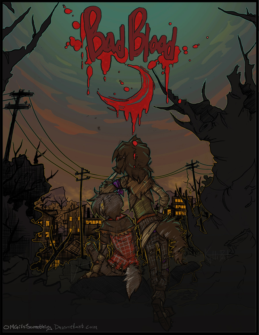
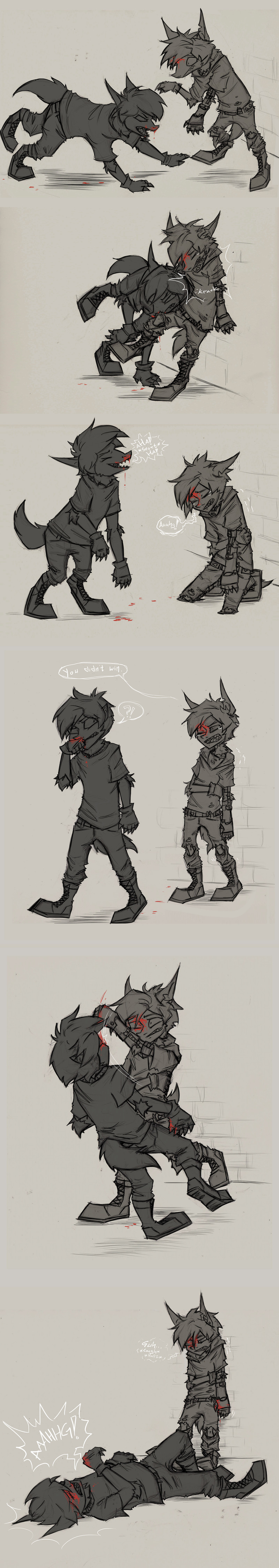
Blah, it's been over a month again since I've posted anything... But! I have actually been working on stuff. I finally found a program for organizing writing projects that actually works [and/or wasn't so full of extra crap I lost my patience trying to work with], because I'd previously just had everything accumulating in a terribly disorganized folder of notepad files that I could barely do shit with as is.And I'd gotten sick of not having a title for this project... going with "Bad Blood" for now because it does make sense for various reasons and it's better than nothing. I did this concept cover in an attempt to make up my mind, but I'm still not 100% settled on it. Also not completely dead set on this cover design, but I've got a ways to go before it's even needed. I fucking hate drawing cover pages. There's that line between "too simple" and "overdone" that's too easy to cross for cover pages. I tried doing it in a slightly simpler style than usual, I guess it works? Can't really decide if I like it or not. Thinking the blood spatter kind of gives too much of an impression that it's a horror story... which it's not.
Edit: made some changes, here's the new version>>>
Related content


Comments: 37

I love your work so much! I can never settle on title pics...
👍: 0 ⏩: 1

Thank you! Yeah, having to decide on one image to essentially represent the whole story is hard. DX
👍: 0 ⏩: 1
Yeah it is tough call. I have tried doing cover art for some of my chapters and it is tricky
👍: 0 ⏩: 0

your artwork is basically like the most beautiful thing i've ever seen tbh what the fuck
👍: 0 ⏩: 1
Thank you very much! X3
👍: 0 ⏩: 0

Looking good! Excited to read it when you do it. I've decided I'm doing my own comic in a few years (after art school), but I've got an artist doing the main art while I write and storyboard. I'll possibly help with lineart and colouring.
👍: 0 ⏩: 1
Thank you very much! I've still go a ways to go, but at least I've actually been making some progress.
I'd love to see it when you do ^^
👍: 0 ⏩: 0

oh heck, YEAH! this certainly looks good!
👍: 0 ⏩: 1
Thank you! ^^
👍: 0 ⏩: 1
No problem!
👍: 0 ⏩: 0

I think the title is awesome! I also agree with you that it fits the whole idea of the story.
👍: 0 ⏩: 1
Thank you! I do definitely like that it can apply to multiple contexts, that's the main thing that has me leaning towards going with it.
👍: 0 ⏩: 1
Then doooo it. X3
👍: 0 ⏩: 0


"Bad Blood"?
Now that is a good title for your story!
Are you making a comic soon?
")
👍: 0 ⏩: 1
Thank you!
I'm working on it, but it probably won't be that soon. I've got the first chapter pretty final, which is about 90 comic pages worth, but I'm trying to get everything else at least more sorted before starting on it.
👍: 0 ⏩: 1
 (Smile)")

Oh I really like this, but you're right about it looking like a cover for a horror story. Maybe try another version without the spatter and dripping. Although I do love the crescent moon made of blood.
👍: 0 ⏩: 1
Thank you! I've been playing around with it a bit more. Trying to test out how just cutting back on the amount of blood spatter works out along with other adjustments. I want to keep at least the moon and maybe just enough to tie in with it, because I like it and still want it to have a bit of an eerie/gritty feeling to it... just not as much as it currently has. I have a tendency to over do blood XP.
👍: 0 ⏩: 1
I hope you upload the revised one when you like it. I can't wait to see it.
Definitely keep the moon. The moon is awesome.
👍: 0 ⏩: 1
I will. Possibly tomorrow night if I get enough time to work on it more tomorrow.
👍: 0 ⏩: 0

Yes yes yesss! looks good so far, but maybe keep playing around with it until you're more satisfied
👍: 0 ⏩: 1
Thank you! :3 I am still messing with it here and there.
👍: 0 ⏩: 0


I think... of course take it with a grain of salt, that you should do it just the way you like! Or maybe try and find cover pages you like and get inspiration from! Maybe you will know better where to hit that line perfectly.
👍: 0 ⏩: 1
I do know the main things that I want to avoid, that are almost pet peeve-ish when I see them on other comic covers. It's more the fact that it's different from just drawing a literal scene, where I have a specific subject and actions as the focus, whereas here, I'm just going for an over all tone or vibe; it's far less objective and harder to pin point what I like and don't like or what makes something seem "off" when it's not a specific error.
👍: 0 ⏩: 1
Hmm... maybe you tried this already but why not draw an actual scene and call it a cover?
Actually.. thinking about this... that wouldn't be bad... like... I imagine now a Marvel-esgue cover with a superhero that is in motion on the cover.
Ohhh! I have an idea! How about give the whole scene or the "camera"/"viewers eyes'' a motion and like, is going right over the heads of your characters?
Like in those anime! At least... in Soul Eater was happening in the intro
Hmmm.. or maybe another kinda of motion like... I imagine like leafs floating through the air to your characters and the wind giving them parts that are in motion just as well!
Sorry if my ideas are bad! The more I think about something, the more I come whit them! I am very very sorry if I bother like this! I always wanted to help...
👍: 0 ⏩: 1
Just personal preference, I like more simple covers. That's actually one of the things that's bugging about this one, that I feel like I'm kind of pushing that line with the amount of background details being a bit distracting from the main focus. And that I feel like I over did that eerie/gritty vibe.
Not that your ideas are bad, and I appreciate you wanting to help. ^^
I'm just trying to go for more subtle. I don't want to imply that this is more action packed than it is. Kind of like how I'm trying to tone down the horror vibe it currently gives off, some of the content is stuff that's often horror related, but not enough that that's the impression that I want the cover giving.
I've been making adjustments to it here and there thought and think I'm getting closer to how I want it.
👍: 0 ⏩: 1
Alrighty then! I'll stop bugging you with my help and let you do the adjustements if you get closer to what do you want!
Hmmm... tone down the horror? How about adding more light or make things less dramatic? I don't see the blood as the main cause but ... What about making the blood less shiny? To tone it down? The red maybe makes it as a distraction from the figures...
👍: 0 ⏩: 1
Nah, you're not bugging me! I'm just not good a describing how I'm trying to get things to look.
I did bring up the red in the rest of it a bit after someone else pointed out that the red blood was clashing too much in the version that I first posted, but I've been messing with the colors and lighting some more. I want the characters and the title to have pretty much equal amount of focus drawn to them. I've cut the amount of blood down so it doesn't resemble that typical old horror movie style as much.
👍: 0 ⏩: 1
I did notice the mention of the blood in the comments section yes.
👍: 0 ⏩: 0

I like it. I think the bright red contrasts too much with everything, but yeah this is cool. ^^ I'm not like an expert on... anything, but maybe it'd look more dynamic with more sky? Still, this is awesome. I love the colors of the sky. <3
👍: 0 ⏩: 1
Thank you! I appreciate the input
I see what you're saying about the red. I tried toning it down but then it just seemed too muddled with everything else. I upped the red in the rest of it instead, to make it tie in more, which I think definitely looks better than before. Doing anything about the sky would take too much more work for me to want to mess with right now, too many layers to mess with DX
👍: 0 ⏩: 1
Yeah, it looks a lot better.
I love it
👍: 0 ⏩: 0