HOME | DD
 OtisBee — BASIC5 TEXTUAL
Published: 2008-11-07 18:04:38 +0000 UTC; Views: 188600; Favourites: 537; Downloads: 45352
Redirect to original
Description
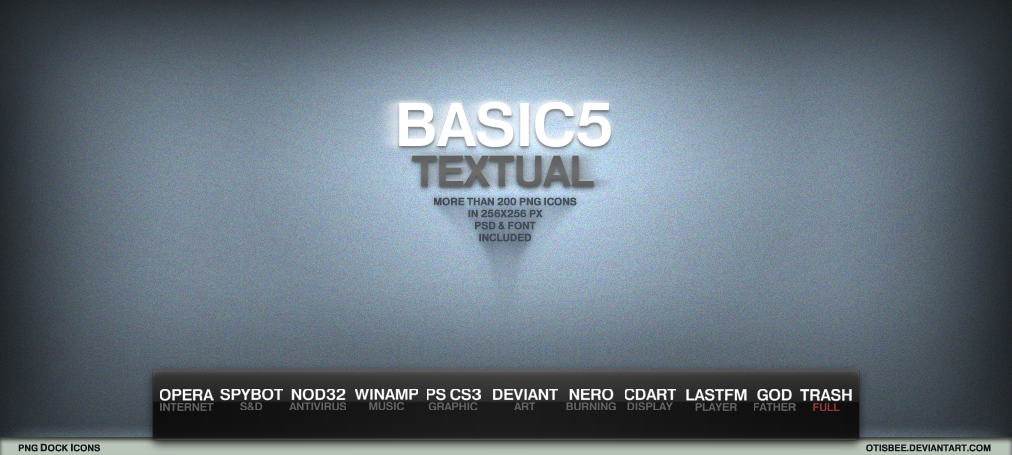
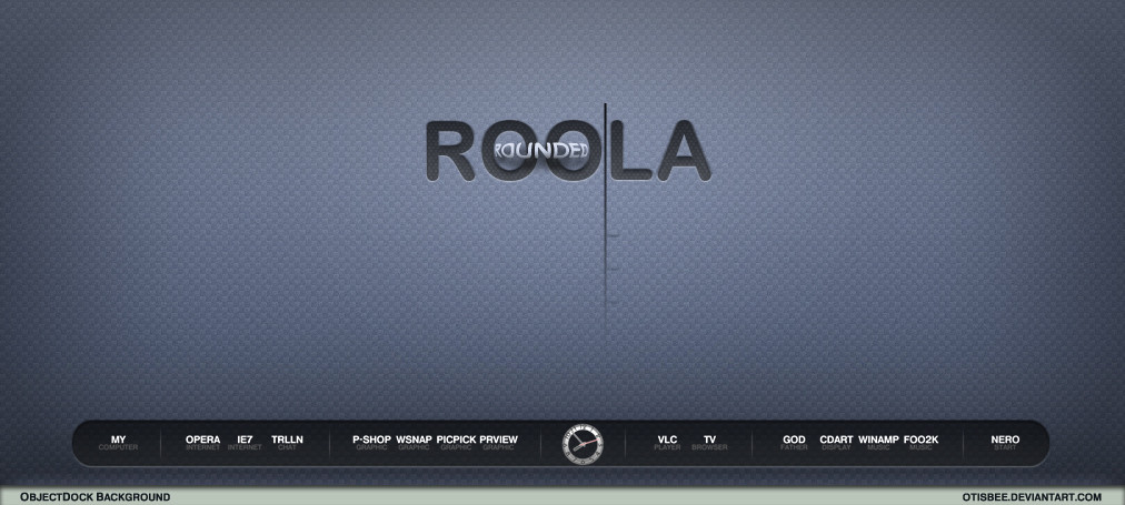
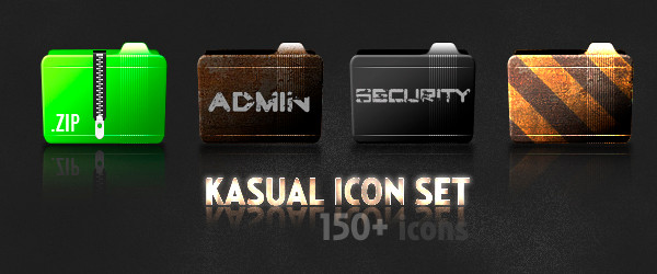
upon request by ~eos8 i am releasing here this huge pack of textual png dock icons as they can already be seen in either my ObjectDock Backgrounds or my reminiscent desktop screenshot.well, the idea of textual icons representing all sorts of different apps on your dock isn't really all that new actually. in fact i've been inspired by the amazing set of Roberto Urso's The Kobhens. only the lack of the HELVETICA font was causing me to create yet another set of my own personalized textual icons instead of still using The Kobhens.
although the pack contains well over twohundred 256x256px sized icons already, it seems most likely that there are still some missing. that's why i've added both the psd-file and the font i've used to the package. so, creating icons for your desired and yet missing apps should be just a matter of seconds.
well, i hope you like them.
Related content


Comments: 261

 (Smile)")

i'm glad you like it.
thanks for the fav.

👍: 0 ⏩: 0


 - :D")
perfect. thanks for your support and feedback, mate.
👍: 0 ⏩: 0

How do i change the text color in the psd file like you did for "Trash Full"
👍: 0 ⏩: 2
simply change the imagemode in PS from greyscale to RGB.
that should do the trick.
 (Wink) - ;)")
👍: 0 ⏩: 1
Ya thanks, I figured it out a few minutes after I posted this. Thanks for the reply.
👍: 0 ⏩: 1

NVM I didn't realize you had greyscale on. Your work is excellent. Thank you.
👍: 0 ⏩: 0

What can I say? I am very grateful for this. The exact style of icons I looked for, and almost every icon I needed is already done. You saved a lot of time for a "desktopwhore" like me.
👍: 0 ⏩: 2
great. 
thanks so much for your feedback.


👍: 0 ⏩: 0
Ah, though I can see one, and only one problem with this, but it's not a fault in design, more likely just a little "nothing is perfect" feel, is that games, or apps with longer name cannot be shorted, or we get some totally insane result. Just imagine "The Saboteur" - THSBTR
Still, I owe with a big thanks
👍: 0 ⏩: 0

thank you. i'm glad you like it.
👍: 0 ⏩: 0

What must i do to put it on the dock??
👍: 0 ⏩: 1

Thx for this!
I used this in my desktop [link]
👍: 0 ⏩: 1
you're welcome.
thanks for the friendly mention.
👍: 0 ⏩: 0

i've been asked about this some months ago.
here's what i replied: [link]
👍: 0 ⏩: 0

thx for the text icons, and expecially for the photoshop template helped me out alot ive been lookin for good text icons for awhile now and u had just what i was lookin [link]
👍: 0 ⏩: 1
great, i'm glad i could help.
thanks for your appreciation, man.
👍: 0 ⏩: 0


my pleasure.
thanks for the cute 
👍: 0 ⏩: 0

Thanks thanks thanks A LOT for these..i had been looking for them
👍: 0 ⏩: 1
you're welcome.
thx for your appreciation.
👍: 0 ⏩: 0

I am a happy boy!!!
OtisBee you are my hero.
👍: 0 ⏩: 1
haha, ...those icons in combination with the ThaImpact Dock that you faved are really great indeed.
i'm glad you like 'em. thanks for your support.
👍: 0 ⏩: 0

How do you keep space between icons without using separators?
👍: 0 ⏩: 1
maybe by using transparent icons?
i don't know.
don't let the preview image misguide you.
it has been created in PS entirely and it's not a screenshot from my dock.
👍: 0 ⏩: 0

yea man, no problem, I've seen this used in many desktop screens on deviant art
👍: 0 ⏩: 1
...and still i'm very surprised about all the attention it got.
thx again.


👍: 0 ⏩: 1
lol, theres really nothing else like it, maybe a few copy-cats but thats it? it makes my desktop look clean and elegant, real professional if you know what I mean.
👍: 0 ⏩: 1
well, if you look for "The Kobhens Iconset" here, doesn't that actually make me a copy-cat?

👍: 0 ⏩: 1
lol, depends on who drew this up first
👍: 0 ⏩: 1
then i might be judged by my own "Artist's Comments".

👍: 0 ⏩: 1


Could you post a tutorial or could you write more about your gradient backgrounds for your publications. Like for this one. Did you use gradient then add some noise. what else ?
👍: 0 ⏩: 1
hmm, ..that's not that easy at it may sound.
if i remember correctly i have used several (3 or 4) layers of the same plain blueish background over and over again while only the one at the very bottom is fully opaque wheras the other layers are only opaque on the layer styles.
the vignette effect (darker shading towards the sides) was created by "inner shadow", gradients are often colored and set to radial instead of linear and besides i slightly moved them a few steps towards the top. sometimes i tweak the transparencies of those layer styles and slightly edit their contrasts as well, but actually i don't really remember each step i made.
the text itself has got an outer glow too, i think.
well, to write a more detailed tutorial would be really tricky, because i'm using a german version of PS here and i don't know all the proper translations for most of the rather technical terms. also adding screenshots would be strange, because of that german interface.
sorry that i can't be any more specific.
👍: 0 ⏩: 0

Awesome Work
I've made an new addon based on your icon pack [link]

👍: 0 ⏩: 1

All your work is amazing, honestly dude
👍: 0 ⏩: 1
wow, ...thanks for that great compliment!
and thanks so much for your fav!
👍: 0 ⏩: 0

<= Prev | | Next =>