HOME | DD
 Peachfuzz — Burned Trees

#prismacolormarkers #traditional #traditionalart
Published: 2012-07-26 05:50:23 +0000 UTC; Views: 620; Favourites: 39; Downloads: 8
Redirect to original
Description
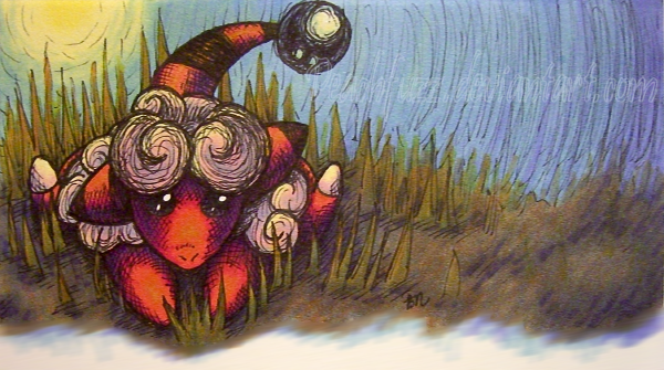
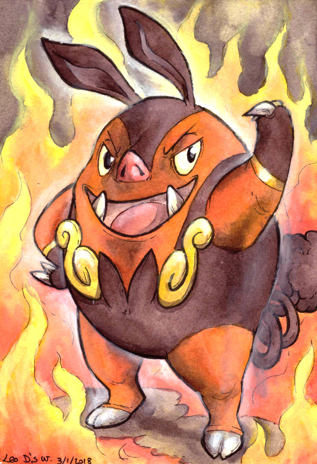
For the PoM over at . Made with Prismacolor inking pens and Prismacolor markers.I've been super busy for the past several weeks and I feel really grateful to have found time and inspiration to make this.
 I actually really like Pignite, but I found it hard to draw. I ended up tweaking a few design aspects to fit my personal taste, such as adding cloven hooves to the feet. I really like the pose and the texture of the burned tree on the right side of the piece.
 ") I achieved exactly the texture I was looking for there. The scene is supposed to look like a forest a while after a major burn, where only grass has thus far returned. I have always had a fascination with burned trees, and this Pignite seemed to demand them.
I achieved exactly the texture I was looking for there. The scene is supposed to look like a forest a while after a major burn, where only grass has thus far returned. I have always had a fascination with burned trees, and this Pignite seemed to demand them. Tepig: peachfuzz.deviantart.com/art/S…
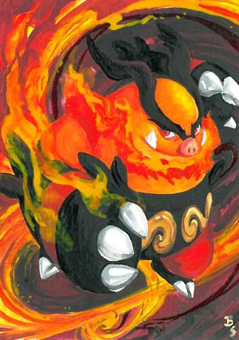
Emboar: peachfuzz.deviantart.com/art/A…
Pokemon © the Pokemon company. Artwork made by me, Peachfuzz .
Related content


Comments: 23

Awesome job, especially on the tree! I love the look of charred wood, too. The texture is just sooo cool.
Your colors are always so vivid *v*
👍: 0 ⏩: 1

He's ready for battle, or ready to burn down another forest.
👍: 0 ⏩: 1
 (Smile)")

This is just adorable!
👍: 0 ⏩: 1

Thank you so much for the sweet comment and fav.
👍: 0 ⏩: 1
You are welcome, my dear.
👍: 0 ⏩: 0

yay. okemon. man havent played that in like ages. great picture as always
👍: 0 ⏩: 0

Awesome as usual ^^
I especially love the colors
👍: 0 ⏩: 1
Thanks so much.
👍: 0 ⏩: 0

Really digging the texture of the burnt trees, they look really burnt. As someone who lives in bushfire country (well close to it, my town's had it's share of close calls here and there), I have to say I'm impressed by the charred look.
👍: 0 ⏩: 1
Thanks for the fav. I'm glad you approve of the charred texture. 
👍: 0 ⏩: 1

Thanks. 
👍: 0 ⏩: 0


Only YOU could make a Pignite look good 
I agree with your opinion on the cloven hooves. It matches pignite much better, and overall he looks a whole lot less.. derpy.. than the official design x3
Now you need to do emboar

👍: 0 ⏩: 1
Wow, thanks!
👍: 0 ⏩: 0

You're coloring style gets classier and classier all the time. Pignite looks so smug--I like it
👍: 0 ⏩: 1
Thank you, sister. I tried to avoid really vibrant purples like I've been using a lot lately, so the only purple in this one is soft Cornflower. I think it looks awesome on the sky but it didn't work out so well for shading. XD It mostly only shows on Pignite's orange, where it looks icky!
👍: 0 ⏩: 0

I like the texture of the burned trees, the hatching effect make a very good effect. and I love the distant part, the trees and grasses are drawn in paler color and it make them vague to see, and it make the good perspective effect. and the slightly pale purple color looks containing the smoke, some tree and the grasses are still smoldering.
👍: 0 ⏩: 1
Thank you, especially for noticing the pale trees and grass in the distance.
👍: 0 ⏩: 1
lately I notice to put the objects with softer color and vague outlines could express the distant objects, it may be one of the way to make the perspective effect.
👍: 0 ⏩: 0