HOME | DD
 PeekyChew — Kindlewood Town Update

Published: 2010-10-21 17:57:23 +0000 UTC; Views: 3758; Favourites: 46; Downloads: 96
Redirect to original
Description
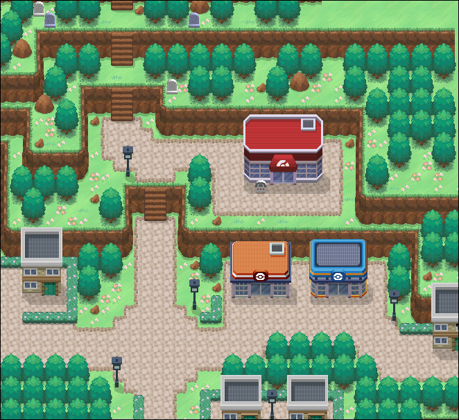
Update III: Southern entrance changed. West entrance added. Many minor tweaks.Update II: Gate houses added, rock palette changed, rearranging of tiles and new tiles added.
Update: Bases of all trees changed. All shadows changed.
V3 (disregard the bottom part): [link]
Just realised I hadn't submitted a new version of this since may! Anyway, this is Kindlewood Town, the third fire gym. To the northern side of the town is Mt. Kindle, which Ashflow Town sits on top of. To the south is Kindle Woods. To the east is a yet to be revealed route and then Shrent City.
Ashflow Town, Mt. Kindle, Kindlewood Town and Kindle Woods make up the Kindles province.
Credits: , , , , , and for all pallets, some tiles and some buildings so all private.
Related content


Comments: 26


")


Whats with the pallets? They burn my eyes. There's a total clash of style too. That tall grass does not go with anything and could not look flatter, it looks like a carpet. Red lamppost also looks flat, it's not very much in the Pokémon style. Those large trees are EXTREMELY green and completely unnatural looking, why they'd be growing so bright is one thing, but on a volcano? That Pokéball is in FRLG style, which clashes with everything else.
The mapping isn't great either, on the way to the pokeball there's no space. The player will bump into everything trying to walk around there. Really messy tree placements too. That grass isn't very nice, it's got too many obvious dark dots. But what annoys me most is the pallets. Nothing looks at all natural and does not fit any pokemon style. These are the colours of Super Mario.
👍: 0 ⏩: 1

Have a look at the third gen games. That's what I've based the saturation of the tiles from. At first I used Kymotonian's desaturated tiles, but then deviated from them to these, which no one was doing at the time. Maybe they are a little too saturated, but it's still less saturated than real life forests. And volcanic ash is a great fertiliser for trees, they shouldn't be this bright any where else!
Thanks for the advice on the grass, I'll see if there are any better alternatives.The lamppost is actually a rip from the games, but of course it didn't look flat when in 3d. How would you suggest making it better?
I'll change the Pokéball.
That'll make sense in the game, there's not supposed to be much space at that part. How's it messy? I don't like the square placement of the official games, and random just takes too long. Dark spots..? What's the point of sticking to the Pokémon style? This is a fan game, it's supposed to be unique.
👍: 0 ⏩: 1
The colours are still horrible... You're using 4th gen tiles, you cant downgrade the colours. They're way to over saturated. But real life forests obviously have much different colours to games... that's a silly comparative.
The lampost is just a bad tile, it's too skinny and small.
The space, the player will still bump into things.
The trees need some sort of formation, when's the last time you walked through a town and seen a random tree growing in the middle of it? Also trees that grow on grass can't grow on rock. I recommend changing the larger trees on the rock.
The dark spots look bad, and you said you were trying to stick with the 3rd gen style with your colours, so I don't see your point in arguing "what's the point in sticking to the pokemon style?"
👍: 0 ⏩: 1
Well, it seems you want it to look natural, but not like real life forests. Wait a minute...
Blame Game Freak, since they made it.
I said it makes sense in the game. Did you ever consider you might actually be supposed to have a hard time moving there?
There are plenty of random trees in my town. We live in different countries, so that's why you don't see that. I tried, but it looks unnatural having different trees there.
What dark spots? Obviously I didn't mean I wouldn't stick to any of it. By the way you took my comment, I shouldn't have anything to do with Pokémon in my game. Which of course doesn't make sense.
👍: 0 ⏩: 1
I was talking about the mapping, to be natural looking. But I mean, if you made the colours the same, then it wouldn't suit the game. Real life colours wouldn't work in a game and you know that as well as I do.
Well I'm simply looking at it from a playability point of view, if you think it won't be annoying to the player, then that's fine, but as I say, I'm just pointing out low playability.
And no, you're taking me waaaay too seriously, again. I'm simply pointing out that you should watch your tile choices in certain places, such as the tall grass and I think you could possibly find some better short grass. Jack's old short grass was pretty nice for this style. Or even his current grass. The one you're using is just a too harsh, might work for this terrain however, but I wouldn't use it on all your maps.
As for your note etc. I'll get back to you on PC. But I'm not an enemy, trust me, I think this got a little touchy since you're still iffy about the past, which is fine. I'll approach it elsewhere, rather than continuing it in public.
👍: 0 ⏩: 1
You're not listening again. I said that it's supposed to be like that. It doesn't matter that's it's annoying for the player, because that bit is supposed to be like that.
I tried using other long grass tiles, but they didn't fit. I should probably have mentioned that it's animated in game, so doesn't look so flat. By the short grass do you just mean the normal grass which is everywhere? That's just the standard HG/SS one, and I don't want to spend a long time changing something so trivial like that. I'm trying to get the next demo out anyway.
👍: 0 ⏩: 1
No no, I understand that. I got you.
Animated in what way though? It does look very flat in maps is all, you could even edit that grass to have more of a base. I would even consider doing so.
And yes, well I would assume that you'd only be replacing a couple tiles, but with that said it's not a major detail, but I'm a perfectionist.
👍: 0 ⏩: 0

Awesome! Kinda reminds me of Lavaridge Town.
👍: 0 ⏩: 1
Thank you
It does kind of look like that, but I also took inspiration from Mt. Chimney.
 (Smile)")
👍: 0 ⏩: 0

Hey Peeky, can i use this in my HQ ? ( Comic Stories e.e )
When i use, i give the credits and tell to you u.u
Oh, i almost forgot, I LIKED THIS TOWN, it's not a true town in pokémon, but I LIKED *----*, Mainly the Gym, is very, very, very, very, very -He understood ¬¬-, good *--*
👍: 0 ⏩: 1
")

Say thanks to PrinceLegendario for that xD
👍: 0 ⏩: 1
")

Ahh here we go, great job mate, the only change that I would make is I would put some gaps in the tall grass, so the player has a break, and it would also look more natural.
👍: 0 ⏩: 1
Thanks xD
Thanks for the advice, is it better now?
👍: 0 ⏩: 1
lol I didnt mean like that, the size was fine, I just meant some small gaps in the middle of the grass
👍: 0 ⏩: 1
Oh, ok. I'll have a go at changing it.
👍: 0 ⏩: 1
Dont worry about it to much mate, its just a small thing in an otherwise outstanding map.
👍: 0 ⏩: 0