HOME | DD
 Phobos-Romulus — Metroid 1
Published: 2010-02-16 05:48:46 +0000 UTC; Views: 12057; Favourites: 219; Downloads: 364
Redirect to original
Description
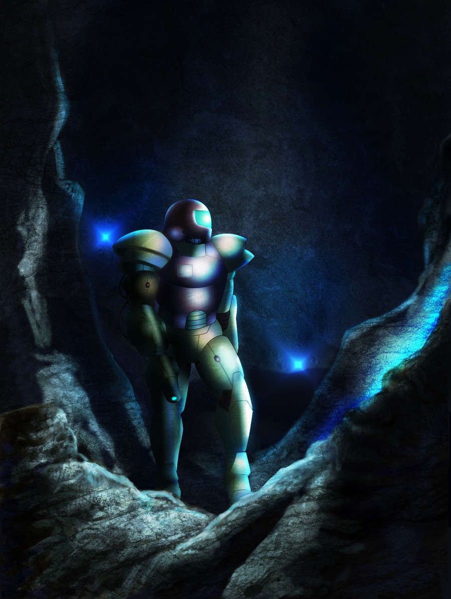
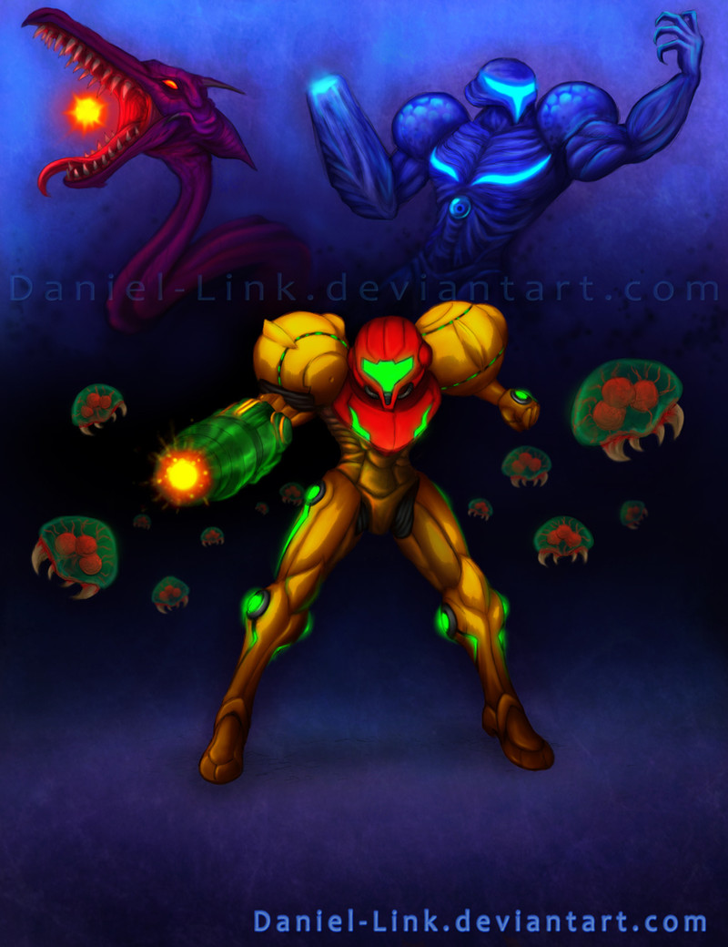
Been on a Metroid fix, so here's another for the contest.Wanted to create another atmospheric picture of Metroid 1.
EDIT: Edited the lighting, did some fixups here and there.
Related content


Comments: 66

I could never get into the Prime series, the 2D ones were so original, then Metroid is just another FPS. I'm sure they're better than most FPS games, and don't get me wrong, I love FPS games, just not for Metroid.
👍: 0 ⏩: 1

I agree with that too, the 2D games seem more metroidy I guess ha ha.
👍: 0 ⏩: 0

Awesome work, but a couple of things. The power suit isnt really supposed to be bulky lookin, and the emblem goes on the left side of samus (its suppoesed to be a green v-ish shape) but otherwise, i love it! ^^
👍: 0 ⏩: 1
I based this deisgn off of some official artwork from Metroid 1, where her armor wasn't as streamlined and curvy. Her old design also had some kind of mechanical panel on her right side too.
[link]
👍: 0 ⏩: 1
Ah... that suit looks so... different, especially the helmet.
👍: 0 ⏩: 1
I almost like the old one better. The newer suit plays too much off of her gender. This older suit made it look more like a man could be inside, which made it more of a surprise at the end.
👍: 0 ⏩: 1
Hmm... true true. I'd like to see somebody make the power suit of the 80s look more up to date :>
👍: 0 ⏩: 0


Thanks, I really appreciate it!
👍: 0 ⏩: 0

This looks really good. Is it mixed media or did you do it all digitally? The rock areas look like pastel..
👍: 0 ⏩: 1
All digital. The rock were just airbrushed, and then I put a texture above it set to overlay.
👍: 0 ⏩: 1
I see, looks good. Good luck in the contest!
 - :D")
👍: 0 ⏩: 1

Awesome! The lighting is much better. Although I think I would tone down the rock texture just a tad. But it looks great!
👍: 0 ⏩: 1