HOME | DD
 ProjectComment — Quick Comments
Published: 2016-07-07 15:30:28 +0000 UTC; Views: 74415; Favourites: 159; Downloads: 0
Redirect to original
Description
body div#devskin0 hr { }
Welcome to ProjectComment 's Quick Comments!
If you would like quick feedback on something specific (e.g. a quick answer to a burning question) this is the place for you to do so!
To take part, please reply to this journal with…
- Your quick, specific question (see examples below).
- Your artwork (linked or posted via thumbcode )
Our members and admins will do our best to answer your questions, but we cannot guarantee answers. Answers may vary in length, depending on your questions.
Example Questions
- I know something is wrong with the chin of the person I'm painting, but I don't know what it is exactly and how to fix it. Help please!
- I finished this piece, but now I'm not sure about the colours. Can someone tell me if they work together?
- I don’t think the composition of my photograph is quite right. Is there a way I can crop it to improve it?
- Specific questions about words and grammar, e.g. "Is the use of word x appropriate here?"
- Specific questions about clarity, e.g. "Is what I'm trying to say with my poem clear?"
- Specific questions about flow, e.g. "Is the reading flow disrupted anywhere?"
Related content
Comments: 6315

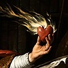
I see, thanks! I've applied that suggestion toward the next page, which also has fire in it for a panel; I'll be posting it later today if you want to see.
Although, I see you've watched me, so you'll see it anyway... 
👍: 0 ⏩: 1

👍: 0 ⏩: 0

Hello
This time i wanted to try mixing colors with coloring pencils to make new ones (colors of hair, skin color of the boy on the right, girl's eye color) and shadowing. I can see it look a bit like it's dirty even though i tried to push pencils quite hard to paper to max colors better. It may look a bit different from reality (less intense) because of the lighting.
I'm asking for some tips and an opinion on those elements in this pic so i could also maybe improve in the future.
👍: 0 ⏩: 1
A tip for keeping things from getting too muddy - start by laying down the lightest color you plan on using, and then add the shading by going over the top with the next darkest color, and so on and so on. Using ink for lineart and erasing the pencil sketch underneath helps as well, because graphite will smear all over your colors and be next to impossible to get rid of, especially with the lighter colors. Another thing to consider is the hardness of your pencils - not all brands are created equal. If you're mixing brands, using a harder one on top of a softer one, because the softer ones like Prismacolor have a very waxy texture, generally won't work very well, especially if the softer one was laid down in a very saturated, complete layer. I don't know if you did that here, but I figured it would be helpful in the future.
Hope this helped!
👍: 0 ⏩: 1
I used Faber Castel eco allegro.pl/oferta/kredki-olowk… . They aren't quite easy when it comes to mixing colors since they aren't as soft as more professional and expensive ones. Or maybe i did something wrong
")
Thanks a lot for an advice^^
👍: 0 ⏩: 1
Ah, yeah I'm afraid I don't have much experience with those.
You're welcome!
👍: 0 ⏩: 1
Hello there!~
Markus x Simon — I drew it recently. Pls, give me feedback under my pic. I don’t like these colors, but I don’t know how to make them more contrast and more vibrant. Also I don't like my style. Characters look like plastic freaks, right? I regularly watch speedpints on YouTube, but that doesn't help. What should I do?
👍: 0 ⏩: 0

Hey everyone! So I drew this a few days ago and while part of me likes how it came out, at the same time something about it really bothers me and I can’t tell what that is. I’ve been a little sick lately and still am now and had to finish this to post this week so I don’t know if that had/has anything to do with it. Do you notice anything particularly wrong with this and if so how could I fix it? Thanks in advance!
www.deviantart.com/chelsealtoo…
👍: 0 ⏩: 0

I've thought up my own Fairy Tail guild. I call it "Dragon Wing." I tried making a guild emblem, but I don't think the result is all that good. It's supposed to be, well, the wing of a dragon, but the wing looks crappy, and barely like a D. Any advice as to how I can make it more like what I'm aiming for?
👍: 0 ⏩: 1

I think you coud make it look less crapy by using a vector program. One I use sometimes is called expression2, but it's a old one and I think you might be able to find better ones by gooling it... I don't know how you do your works now, but for future works I'd also recommend you use a rogram with layers, so you can make a sketch on one layer and trace it on another. When doing a sketch I woud recommend you start with siluetes in simple shapes (like you said the wing is supposed to be shaped like the letter D so you can do a half circle) and then add detail onto those shapes (maybe try using guide lines and such, it's really helpfull).
👍: 0 ⏩: 1
I took your advice, and using a different program, i created this rework.
Is it suitable, or does it need more work?
👍: 0 ⏩: 1
I think you've improved it! ")
👍: 0 ⏩: 1
Yeah, It was hard to help the shakiness. I used that sketch5.1 program thingy i found by googling "draw." The touchpad on my chromebook is a bit small, so it was a bit hard to draw.
Either way, I'm glad I managed to improve it enough.
Maybe I should see if I can edit it onto my Fairy Tail OCs.
Oh, and if you want to find it, just google "draw," and it should be the third result down.
👍: 1 ⏩: 0

Hey I would like some suggestions on the shading on this. I want it to feel dramatic but unsure how to go about it.
👍: 0 ⏩: 1

My tip/critique/help on this is knowing when something is a soft shadow or a hard shadow! Generally when seeing this piece it looks like half of it is harsh shadows and the other bottom half is soft shadowing. Soft/harsh shadows are based on what kind of mood you want or the environment! I know this is kind of a "summery" of what you could do, but there are a lot of videos to teach you how to do shadows. The first half (the face/neck) looks pretty dramatic, it could use some soft shadows on the chin and there could be more shadowing on the hair/dress etc. (Some parts on the sward too to give a more depth look helps as well)
Hope this comment helps! <3
👍: 0 ⏩: 1
That blue gradient is supposed to be part of her dress
👍: 0 ⏩: 1
I see, then I suggest adding shading to it!
👍: 0 ⏩: 0

I really struggled with this one. I tried to add more shadows to avoid over saturation. Any advice on how to make it better?
👍: 0 ⏩: 1
To be fair, I'm not sure if you actually painted this, used images, or did painting and images.
You wanted it to be darker as you said it was over saturated, Which ever you did (Painting, photoshop images, or both) I think knowing how light is being hit on objects helps! Not only with light but also with shading to avoid confusion. I know it might be harsh, but I was quite lost on what the image was trying to show me as it is too dark and over saturated on some parts as well. Looking on how light works, the way textures hit light and shadows really help with creating stronger values so it doesn't get lost within the image. Adding shadows and light also could help a little on how far away something is, the farther away the more depth it would have. Scaling can be quite difficult, and I understand if this part of the critique or help is a bit extra but I'm also giving my views on it. Laying out stuff before working on the final piece also helps a lot! (sketches/image gathering/etc)
👍: 0 ⏩: 0

Hello, how do I make the line art look smoother and the background better using autodesk sketchbook? It's my first time using my new drawing tablet.
Thanks!! :3
👍: 0 ⏩: 1
To make background better, work on several layers  (Smile)")
If I recall correctly, some apps only allow a few layers until you pay them to get full version - well, if it's possible to pay, it's really worth it, believe me
 (Wink)")
As for lineart, you can use brush settings that make nice-looking lines. Good idea is to use hard and opaque brushes, with line that thins out at the ends. Do you use pressure-sensitive stylus? If you do, make sure to set the minimum width of the brush to a smallest value, so that it becomes a very thin line when you apply little pressure. The example line that you see when setting up brush settings should look something like this: help.autodesk.com/cloudhelp/EN… (you can look through the preset brushes that are named like "ink", "pen", "liner" or something like that, and maybe set its opacity and flow close to maximum if they aren't. I'm sure there is such a lineart brush. I haven't used Autodesk Sketchbook in ages so I can't name the exact one
Here's some detailed explanation about brushes
knowledge.autodesk.com/support…
knowledge.autodesk.com/support…
Also, a nice method for coloring quickly:
1) Make a new layer below lineart layer. Use hard brush to accurately fill an area of your object with flat color (main color of your object). For example all furry parts, or jacket, or pants.
2) Lock the layer opacity (there must be a lock-looking icon somewhere on the layer list, or in layer properties)
3) Now you can only paint on the areas of this layer where there's already paint, and not outside the filled area - profit! Now choose a big, maybe textured brush, it can be with soft edge too, and start to lay shadows on the shaded side of your object. It's fast and it will look very neat and volumous if the brush is big
4) Optionally: make yet another layer on top of previous one (this will not be locked to the area) and add some little highlights and deep shadows where you feel they are needed. To add contrast. You can paint small details too, like little sticking out hairs or creases on fabric or such.
And that's that! You do this to all elements of your drawing. And you can merge layers once you've finished some object, not to run out of memory
Hope some of this helps you
👍: 0 ⏩: 1
Ahhh thanks for helping me!!! It means a lot to get so much information!! 😃👍
👍: 0 ⏩: 1
Oh you're welcome
👍: 0 ⏩: 0
Is there anything wrong or bad in this sketch?? It's an entry for a contest so I need to make it's the best I can!! Plz help me
👍: 0 ⏩: 2

Hey!
I remember trying to help with this!
👍: 0 ⏩: 1
Yeah, but I don't have time to fix them so
👍: 0 ⏩: 1

I think the body has some issues with proportions.
- arms too long and look kinda flat. I changed the shoulders placement, and made arms shorter (elbow is on the waist level and forearm and upper arm are same length)
- I've built the hips and legs under the skirt, it's best to do that to be sure legs come out in the right place
I tried to show all that on a sketch, hope it's clear how things go
👍: 0 ⏩: 0

So I really struggle with drawing/shading glass bottles so how can I improve that? ><
👍: 0 ⏩: 2
Try something like this tutorial, I think it looks much like what you aim for
Refs from Google are useful too, but sometimes it's better to read tuts before you analyze photos, to know what to look for - glass is a very confusing material for sure!
I think your lacks those shadows of the glass itself, and maybe overlayed reflections too. And the liquid can use some detalization, especially the surface. That's if I compare your drawing to this tutorial steps
Good luck!
The chibi herself looks super-cute
👍: 0 ⏩: 1
Ahh thankyou so much! ^^
This is really helpful actually, I think the tutorials will help more initially
so thanks for that ^^ I tried to look at references first but I got
SO CONFUSED so i gave up.
And yeah, I really didnt know where to put shadows, because I got
confused because of the liquid inside and then I didn't really understand
how to draw the liquid because of the glass haha
Thanks again for your help and also for the nice comment
👍: 0 ⏩: 1
Oh you're welcome! It looks like a nice tutorial, if it helps you that's great
👍: 0 ⏩: 1
Yeah you're right, its so difficult but I guess I just need to keep practicing ^-^
rip half transparency it makes every so much harder QwQ
👍: 0 ⏩: 0

No matter how much I look at this picture, something seems off with the shoulders and I can't seem to identify why it does. Is there something wrong with the shoulder anatomy in this picture?
👍: 0 ⏩: 3

When you laugh and move the shoulders up, they get close to the neck and head . Maybe narrower shoulders look better.
👍: 0 ⏩: 0
Hi! ^^
As long as you were going for the 'one shoulder is shrugged a little' look I think it looks great! Good job ;u;
👍: 0 ⏩: 0

Hm... it doesn't look off for me.
👍: 0 ⏩: 0

I've been trying to do sprite edits for Danganronpa OCs, but I'm having a hard time emulating the style of Danganronpa. Is there anything I can do to make it look more fitting to the DR style?
👍: 0 ⏩: 2
I haven't seen the fandom before, but I looked up the Google pics to get the main idea
To me it looks like the faces (eye shape and main proportions of the face) and the hairdos match the original quite well. A problem I see here is the clothes design. First, the color schemes. The original seems to use quite narrow palettes for a character, many blacks or grays, and even the brightest colors are usually subtle, not oversaturated hues.
Main designs:
vignette.wikia.nocookie.net/da…
ae01.alicdn.com/kf/HTB1poK0QFX…
Some badges: see how most of them use the close hues that don't create contrast with each other? Some images go with something like complementary pairs, but one color in the pair is usually pale (pink+deep blue, light blue+orange, etc)
images.goodsmile.info/cgm/imag…
Also there are many subtle matching in color details on the set of clothes.
Which leads me to the second thing I noticed. The series and arts seem to pay great attention to clothes, giving everyone several layers of them with lots of details, nuances and tiny accessories. Your image, in the contrary, shows very simple clothes with only one color on each part. This seems like something worth looking into, doesn't it?
And here's the most stark fanart design, and if you say that it still matches the style you aim for, then I say that even this artist tries to make elements unified in color sense, by tints and by repeating hues on different details (tho in all honesty I can't say if this looks like a good stylization to me
www.etsy.com/pl/listing/632415…
All in all, I suggest you look into color theory materials (like here www.worqx.com/color/combinatio… ) to get ideas for matching palettes (your aim for this fandom, in my eyes, is analogous colors and complimentary pairs). And do some study on anime style clothes designs to make your outfits more detailed.
I also see that your anatomy has some little issues, like arms on the first pic being too long compared to the torso, or the crotch being too high. But most of it looks okay by anime standards
Hope this helps!
👍: 0 ⏩: 1
I recommend using a reference.
👍: 0 ⏩: 0

A Day in the Life of Israel Dickinshttp://fav.me/dd28hck
The alarm clock started to go off. It's that time again. I got up forcefully and turned it off. Then I yawned and did my morning stretch. Gotta keep your bones from closing out on you, right? Then I put on my usual attire: light blue shirt, white undershirt with a black sword, beige pants, and black shoes. I even ruffled my hair so that it all goes up. Like flames. Now I, Israel Dickins, was ready to start my day!
I exited my room and quickly head downstairs. If I was one of the last ones to get up, I'll have to wash the dishes. It's not fun, that's for sure. When I was in the kitchen, the lovely ladies, including my sister, Avery, were cooking breakfast. "Morning, Israel," they all greeted.
"Hello," I replied back. "What can I do?"
"You can clean out the trash can," Palutena, one of the working females, replied. Yeah. This mansion has characters from the Super Smash Bros. series. Unreal, right? It's also frickin' awesome! "The suit is in the futon r I feel like the intro is a bit rough. How can I spice it up? If I can?
👍: 0 ⏩: 1
Maybe add a dream sequence at the beginning that shows his motivations and the things he cares about, and right when the dream is at the climax, his alarm clock goes off.
The concept and wording is very nice! You write well.
👍: 0 ⏩: 1
Ooh. A dream sequence. Excellent idea.
Thank you for the compliments
👍: 0 ⏩: 1
Of course! I wish you luck on the story ^ ^
👍: 0 ⏩: 0

Ello! I'm really having trouble with this piece, I think the anatomy and colours might be off.
But, I'm not 100% sure what's wrong with them. Anyhow, cheers!
👍: 0 ⏩: 1

i dont personally see anything wrong with the color pallete, they both look really nice!!
for the anatomy though, in the second picture, id recommend bending the wings at an elbow point, they look sorta stiff atm ^^"
the pieces are really pretty atm tho!!! if you hadnt said so i wouldnt've believed that the second was made in mspaint kfjsdgdfg
👍: 0 ⏩: 1
<= Prev | | Next =>