HOME | DD
 ProjectComment — Quick Comments
Published: 2016-07-07 15:30:28 +0000 UTC; Views: 74415; Favourites: 159; Downloads: 0
Redirect to original
Description
body div#devskin0 hr { }
Welcome to ProjectComment 's Quick Comments!
If you would like quick feedback on something specific (e.g. a quick answer to a burning question) this is the place for you to do so!
To take part, please reply to this journal with…
- Your quick, specific question (see examples below).
- Your artwork (linked or posted via thumbcode )
Our members and admins will do our best to answer your questions, but we cannot guarantee answers. Answers may vary in length, depending on your questions.
Example Questions
- I know something is wrong with the chin of the person I'm painting, but I don't know what it is exactly and how to fix it. Help please!
- I finished this piece, but now I'm not sure about the colours. Can someone tell me if they work together?
- I don’t think the composition of my photograph is quite right. Is there a way I can crop it to improve it?
- Specific questions about words and grammar, e.g. "Is the use of word x appropriate here?"
- Specific questions about clarity, e.g. "Is what I'm trying to say with my poem clear?"
- Specific questions about flow, e.g. "Is the reading flow disrupted anywhere?"
Related content
Comments: 6315

I don't want to make them bigger because I don't want them to draw too much attention, I just worry that their texture doesn't fit the rest of the picture. They look too round and bubbly to me.
👍: 0 ⏩: 1
I think if you don't want to make them bigger, then you really need another kind of flowers, ones of fitting size. Cause I think it's important not to make things sizes look wrong in comparison, when combining images. If you worry about rounded texture (I really don't think there has to be such worry, because all plant life looks natural, imo) then you may pick flowers that are both small in height and sharp in shape
👍: 0 ⏩: 1
I think I really should do that...
👍: 0 ⏩: 0

Wanting constructive criticism on these pieces:
Not too sure if the colours look alright.
(Though, if anything else looks off, please feel free to tell!)
Anyhow, cheers!
👍: 0 ⏩: 1

I think they're both really pretty, the only thing I would suggest is to maybe make the text a little more obvious in the first one because it's pretty hard to see unless you zoom in (unless that was the effect you were going for). And in the second one, your clouds blend into the background a little, especially the middle one, try making the ones in front darker to make them seem like they're closer, and the ones in the back lighter to make them seem like they're further away. Other than that I like them, they both convey a lot of emotion
👍: 0 ⏩: 1
Cheers for the criticism, mate!
👍: 0 ⏩: 0

Need a review on this
I want to know what everyone really feels!
👍: 0 ⏩: 1
That's a pretty general question, but I think the one on the left looks interesting because the colour combination is a bit unusual. The figure's colour scheme clashes with the background, but in a good way. The one on the right looks fun but a bit more "normal".
👍: 0 ⏩: 1
The question is why both receive Favourites Too much difference 100 Favourites on the left, this is the first 100 Favourites in my life After the work
After the work Even if the improvement is good, A lot less people like it, just like the right
👍: 0 ⏩: 1
Well, if it was easy to say why some things become popular and others get ignored, all marketing departments would be unemployed ")
👍: 0 ⏩: 1
It’s all fan art, just different games, even if they are not fans, they will join, I have not paid or put it on other networks.
👍: 0 ⏩: 0

👍: 0 ⏩: 1
The picture is very small, could you post a bigger version?
👍: 0 ⏩: 1
👍: 0 ⏩: 0

👍: 0 ⏩: 0

This is my first time doing a digital art piece and maybe it's obvious that I gave up halfway. But what do you think I did right, and what I did wrong? For this one, I'm not looking for specific comments on bad anatomy and other things along those lines, I'd much prefer opinions on techniques, colours, composition - and those kinds of related stuff. Thanks in advance!
👍: 0 ⏩: 1

A digital technique comment for ya, since I read the description on the original: Digital lets you break apart your construction into separate files if you start running into layer overload or memory constraints. If you have a solid sketch or layout to start with, try working the major characters (tiger, elephant, foreground, etc) as separate files with the layout as a layer at the bottom of the stack. Then work the elephant, and the next, and the next. When done with one topic, export that as a single layer (usually flats) into the next part, and so on. Save the shading for last. Treat your stack like a multiplane camera and do one plane at a time.
Hope this helps!
👍: 0 ⏩: 1
That sounds obvious now, can't believe I didn't think of that. Thanks for that tip! It was starting to get ridiculous trying to find the right layer.
👍: 0 ⏩: 0

Need a review on this> this is my first time doing this type of art, does anyone have any advice that could help me improve?
👍: 0 ⏩: 2

From my experience of swimming and diving:
It should be darker at the bottom and lighter towards the top - unless it is meant to be very deep underwater where sunlight doesn't penetrate.
Also, some coral reefs or other things to make it look a bit more 3D - looks too flat at the moment.
And more detail to the fish - they look a bit too much like cut out of paper (although that is pretty).
Hope this helps.
 (Wink)")
👍: 0 ⏩: 0
I think you should ask some more specific questions since this is a section for those.
Or you could upload to one of the main galleries, like this folder: www.deviantart.com/projectcomm…
But to give you a quick answer: I think the drawing needs more work on colors first of all (they don't work together well, and you don't use global illumination effects - meaning, that your objects don't give colored reflexes on each other ) and on shading (your shades don't show volumes and shape well enough, and you don't use colored shadows when shading the main subject, only same green hue as the main tone). As a result the green sea creature falls out of the picture. The background looks nice, both the colors (I like the cyan-darkblue-pink combination) and the sketchy style you used when drawing those sharks.
👍: 0 ⏩: 0
Although this is one of my favourite pictures, I know that there is room for improvement
What would you have done differently?
Thank you for your feedback, folks.
👍: 0 ⏩: 1

The picture looks like you've run out of paper, so I think you could improve on composition. Make sure you have enough room for what you have planned. If you look up the rule of thirds on wiki or google, you have an easy guideline for composition. Another idea is to lightly sketch out a frame on your paper within you'll draw. If you come across a problem like you have now, where her head is so close to the top and her shoes fall off, then you can erase the line and still make it work.
That being said. I like the colors and the overal feel of the picture.
👍: 0 ⏩: 1

How can I re-access (and re-read) comments & replies to gallery submissions that I removed from my notification page’s Correspondence stack?
👍: 0 ⏩: 1

Have you tried www.deviantart.com/corresponde… ?
👍: 0 ⏩: 2
Which menu has a click for that? In the All Notifications menu, there's a "Correspondence" item, but that calls up /notifications/#view =correspondence.
Where to look please?
👍: 0 ⏩: 1
It's under "More" next to Submit.
👍: 0 ⏩: 1
Duh - this is why I don't go hunting snakes. My ankles would be bleeding 20 feet from the car!
👍: 0 ⏩: 1
")
Hello!
If you would like an answer, please include a specific question. Example questions are:
- I know something is wrong with the chin of the person I'm painting, but I don't know what it is exactly and how to fix it?
- I finished this piece, but now I'm not sure about the colours. Can someone tell me if they work together?
- I don’t think the composition of my photograph is quite right. Is there a way I can crop it to improve it?
On the other hand, if you'd like more general feedback, you may be more interested in submitting to our gallery (requires constructive commenting) or our favourites (no comments required).
Let me know if you have any questions! I'm happy to help.
👍: 0 ⏩: 0

How and where do I receive tips on improving my comments? I will try to get to critiquing at the end of the day each day.
👍: 0 ⏩: 2
We have
Comment AdviceWelcome to ProjectComment's Comment Advice!
If you would like comments on your comments, answers to commenting questions, tips to handling commenting situations, suggestions on helping others better, or anything related to comments and commenting, seek advice here from members of the group!
To take part, please reply to this journal with...
A specific question about comments/commenting (see examples below).
A link to your comment, if applicable (right click the time stamp of your comment and copy the link location).If you would like to ask a question, please try to answer a question in return. Questions can be found in replies to this journal.
Our members and admins will do our best to offer advice within 24 hours. Answers may vary in length, depending on your questions.
Example Questions
How can I give a better comment? I really tried in this example [link], but I feel something is missing.
I want to receive suggestio, and you are always welcome to note the group.
👍: 0 ⏩: 0
ProjectComment has some journals dedicated to the art of commenting, which may have the tips you are looking for. For example, these three may help you:
How to Write an Artist's (or Author's) CommentsNearly all of us, if not every single one of us, have come across a deviation that just has a disappointing '...'. Conversely, some of us have even come across a massive wall of text.
Whether we are the people who ask ourselves, "Is that it?", or whether we are the people who ask ourselves, "What can I say?", this guide will hopefully provide you with some insight in how to go about writing a good description for your deviations, a.k.a. your Artist's (or Author's) Comments.
IIIXII has already written a beautiful guide here. He mentions a great point and that is that your artists comments are the only thing that might motivate a reader or viewer to comment your work
How many of us want constructive comments, critiques and, most importantly, feedback on our pieces?
Thus, is it only fair that if we want something back, we have to give something as well?
Background
#01 Constructively Comment in 5 Quick Steps!ProjectComment is a Group of many projects centred around comments, but, more importantly, constructive comments. Every week, one admin from ProjectComment will write an informative article on commenting that will hopefully be useful to you! Please help support us by 
This article will list five easy ways to make your comment constructive. What many people do not realise is that a constructive comment does not have to be as long or as indepth as a critique, and that you don't need to be an awesome commenter or an awesome artist to write a constructive comment. You probably won't have to spend more than 5-10 minutes writing a constructive comment, and it could still be helpful to the artist.
Here are the steps that you can take to make your comment more constructive:
State the things you like about the piece.
Try and state one thi
#03 How to Format your CommentsProjectComment is a Group of many projects centred around comments, but, more importantly, constructive comments. Every week, one admin from ProjectComment will write an informative article on commenting that will hopefully be useful to you! Please help support us by the article and contribute your thoughts and opinions on the matter.
This article aims to show you how to format your constructive comments, and why you should format them in the first place. 'Formatting' in this case means making your comment more readable with a few simple steps.
Many of us simply write down the good and bad things we notice about an artwork, along with ways to improve the bad ones, which can lead to a unstructurized outcome, which makes understanding the comment and following the advice given harder.
Why should I format my comments?
Have a productive day!

👍: 0 ⏩: 0
This is a simple linoprint of a megalithic stone circle, like you get in Ireland and western parts of Britain and France. Apart from making it more elaborate, what else would improve it?
👍: 0 ⏩: 0

i've been wondering lately what would it be like if the imagimons were added in super smash bros, like what moveset they would or gimmicks? one idea i have is that they're a four way tag-team with an attack that switches the characters. what do YOU guys think what moveset they would have if they were in super smash bros?
👍: 0 ⏩: 0

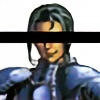
The the face looks a bit odd to me. I'm not exactly sure what's wrong, but compared to the rest of the illustration it seems fuzzy or undefined. Does anyone have any tips on how to fix it?
👍: 0 ⏩: 2
Hi  (Smile)")
- add a bit detail to the ear (it sticks out as wrong because it has no hole inside, use a deep shadow to mark it)
- far ear will not be visible from this angle
- give more volume to hair, cause now the hair on the forehead sticks to the cranium, like it has no volume at all
- check the mouth position, by drawing the middle line of the face. I think it's moves too much to the left (girl's left) side of the face, compared to eyes and base of the nose position
- Add a shadow under the lower lip to mark some lip volume
- try to make the eyebrows more realistic - now they are overly thin and don't seem to be placed right
I hope this will help. I think it's a good attempt at volumous face.
Sidenote: I love the colors of your picture so very much
👍: 0 ⏩: 1
Ah! I see. Thank you for the advice!
👍: 0 ⏩: 1
You're welcome!
👍: 0 ⏩: 0

The eyes feel a bit too high as well as too close to each other. The fuzziness might be due to the fact that the face has blend shading whereas the rest of the image has cell shading instead so it might look better if you chose to stick with one or the other for the entire image.
👍: 0 ⏩: 1
Ohh thank you! Yeah I'll try to be more consistent in the future
👍: 0 ⏩: 0

I tried to draw water and get the effect the they're jumping out of the water and there's droplets everywhere making them super sparkly.
I don't really like the underwater part of it I tried adding textures and looking at references but it doesn't quite work... Any tips on how to improve the underwater part?
👍: 0 ⏩: 1
As light moves through water, it is refracted, distorting and bending the shape of an object. However, in the art, the shape is continued without much distortion throughout
Here is a deviation I found that shows this effect
The shading itself looks fine, so that's all I would recommend.
Also, I love the color scheme
👍: 0 ⏩: 1
oh I see what you mean! Thank you!
👍: 0 ⏩: 0

I'm not used to working without line art and I think it shows. I can't figure out what's bothering me about it, maybe it's the shape/position of the eyes or the position of the nose. It could be that it looks too flat, though I wouldn't know how to fix that. I had about 10 layers of shading on it and 3 highlight layers. Maybe it's a lack of texture?
👍: 0 ⏩: 1

Actually, I think the issue might be more of a lack of definition. Not to toot my own horn (I was actually gonna post this with my own question, because I think it's lacking a little definition too, specifically regarding shading the inner face) but I think looking at it might help.
Notice how different the values are, and even when we're looking at two dark areas like the shirt and the background, there is a small streak of light to separate it? Or how, even though the hair has solid clumps, there are smaller strands breaking away from it? I think either or both of those things might give the head a bit more clarity. :3
👍: 0 ⏩: 0

Kakashi Hatake half anbu/half sharingan
I can't figure out why this bugs me. The hair seems off, but the face seems too thin? Any thoughts?
👍: 0 ⏩: 1
<= Prev | | Next =>