HOME | DD
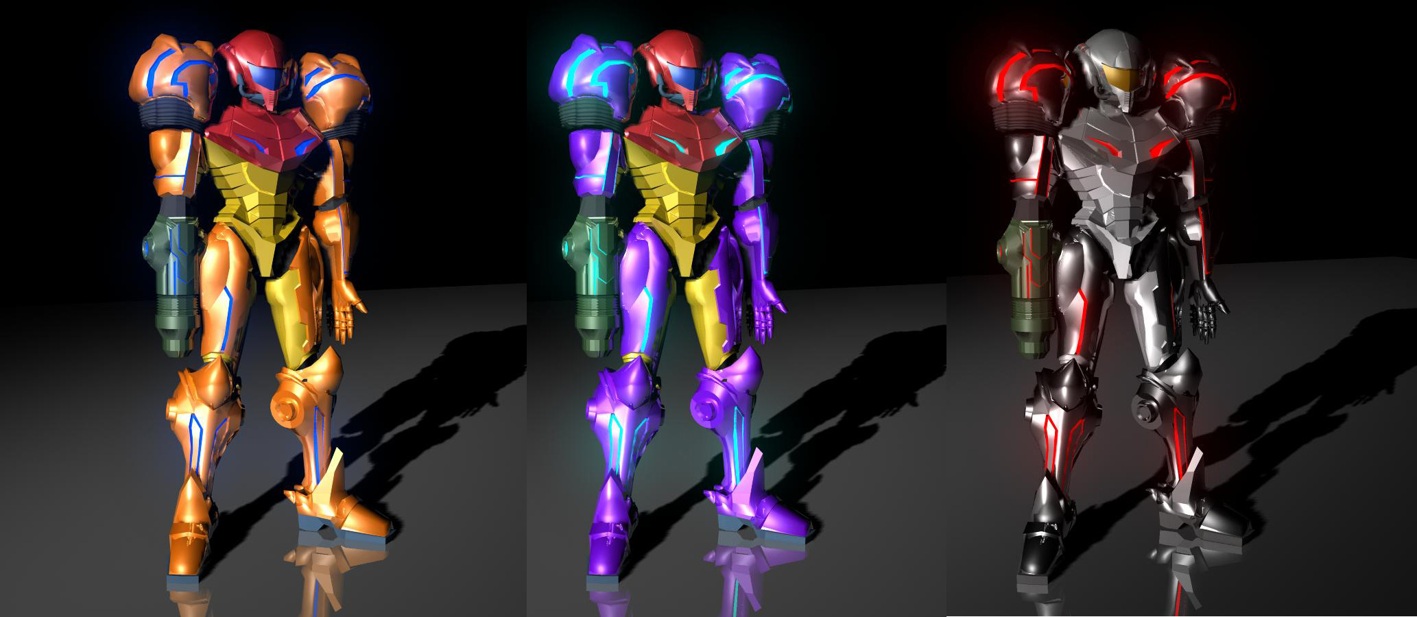
 Puckducker — Three Flavours of Samus
Published: 2004-10-26 03:09:14 +0000 UTC; Views: 3285; Favourites: 44; Downloads: 593
Redirect to original
Description
Damn....I'm goodRelated content


Comments: 21


hey..
thats reallllyyyyy goood,
i was wondering, What program u used to make them....
and if they are made using 3DS Max could u post up the model?
thanks...
good pics!
👍: 0 ⏩: 0


I really like this. The models are a tiny bit choppy but still very nice. I especially like the third one.
👍: 0 ⏩: 0


Ok, i am a Samus expert and i would just like to say, nice job. Althoguh on the first suit, the visor and all the lights in here suit should be green, and the disk should be smoother and stick out farther. On the last suit(i wont say the name, just so i dont spoil it) The Visor should be a semi-intense orange(like a bright pumpkin) and the lights should be A normal orange(like a carrot) Also the way the armcannon is configure in your pic, the glowing lines should be orange and there should be no light on the sides of them. My reveiw is done. Good job!
👍: 0 ⏩: 0

Awesome job! I'm a Naruto fan and a Metroid fan as well!But really, damn... how did you make these? Oh try making one of the regular Power Suit or Fusion Suit. Heh heh... Varia, Gravity, and Phazon.
👍: 0 ⏩: 0


sucker for Metroid/samus here
you should have used the metroid prime model
other than that, quite impressive. Only a Metroid Expert really has any right critiquing this.
It's definately far from Retro calibur, but its a start, a profressor would be very impressed except for the fact that its not your idea.
keep on truckin'
👍: 0 ⏩: 0

I did just notice you were working on [link] not metroid, and instead of fixing the stomach, fix the.. to be honest much much more... I guess it would be better to see the concept
👍: 0 ⏩: 1

Hey, thanks for the comments. Not too harsh at all. I just posted that as soon as I finished a render on it, so I was quite impressed with how it turned out. Hey, if you can't impress yourself you won't be impressing too many other people.
Anyways, I wasn't working from the Metroid Prime or Smash Bros, models as refrence. I was working more from the Super Metroid model of Samus (as well as the Metriod II, but they are almost identicle) [link=[link]
[link=[link]
That's pretty much what the stomache looks like on that model, so I was quite happy with it. Other things need improving, yeah, but I'm done with her for now and I was quite happy with how she turned out. But thanks for the critique anyways!

👍: 0 ⏩: 1
anytime, and you have a point about impessing yourself.. thats never a bad thing, good luck on future projects
👍: 0 ⏩: 1
And to you.....your stuff is quite good. A fair bit better than anything I've done I should say.
👍: 0 ⏩: 1
now now, lets not compare work, its a different style, different genre, and a different artist with a different background. I appreciate the comment though and I will bid you a wonderfull evening.
👍: 0 ⏩: 0
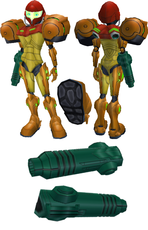
the good thing about being cocky about your artwork is that you provoke people to find as many things wrong as possible and point them out.. for that, I commend you. As for the model. pretty good so far, but I wouldnt call it finished. The texture work is sloppy and and your trying to get good harsh details from hardened normals... not a bad idea but its not working to your advantage in my opinion. [link] I dont know what concept you are working off of but the stomach is off. There isnt that much detail in it. The ingame model for Metroid is all about the textures. Bump, spec, and I would suggest Normal maps for that deep deffinition. like I said it is comming a long very well, but you do need to put more time in. BTW, what is your polycount? and what size texture map are you using? Its hard to really judge the model without seeing a wireframe.. I hope I wasnt to harsh, remember modesty is the best policy. someone is always better than you. Take care
-static
👍: 0 ⏩: 0


Its awesome. Not perfect though.
Here are some of my critques.
Shouldn't the visor and lights be green? The 2 tips on the shoulder should be pointy and more disk like.
Give the bottom of her boot some padding.
The black elbow pads should be smoother and maybe some ripples like the gills of her shoulder pad.
Smooth out the shoulder pads a bit. They look kind of banged up. If this is intended then forget what I said.
👍: 0 ⏩: 0