HOME | DD
 Pyek — Artistic Journal Skins: for Beginners: Pt II

Published: 2012-04-23 05:05:17 +0000 UTC; Views: 12490; Favourites: 675; Downloads: 125
Redirect to original
Description
Edit 13/12: Revised and updated-looking tut says almost the same exact things as it did before! Now with woodland creatures!Thanks so much to everyone who has commented on and favorited these tuts. It really means the world when I know it's all been useful to someone.
-------------------------------
My goal is to explain in laymen terms what I learned trying to wriggle my way through CSS when I first started. I am not by any means an expert on the subject of dA journal skins.
That said, if you want a tutorial on fancy CSS, this isn't the tutorial for you. These tutorials will focus more on using a simple background image to make an artistic-looking journal, and just shifting basic essential CSS around to suit--nothing very advanced. It is, as it says, for beginners who are, in fact, beginning. c:
I hope someone will find this useful. Please comment if anything is unclear or you have additional questions or comments.
Complimentary Tutorials...
Applying your custom CSS to your dA journal
-------------------------------
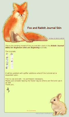
Do you like the journal skin example used in this Tutorial? Or just want to see it in action? See it here , or install it to your journal here .
-------------------------------
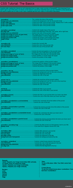
For easy Copy & Pasting, here is the CSS as seen in the tut above <3
Remember, some of your specs won't match up if you are using different images. Adjustments will be necessary.
.journalbox {
background:transparent;
border:none;
}
.journaltop {
background-color:transparent;
background-image:url( ____TOP____ );
background-repeat:no-repeat;
margin:0px auto 0px auto;
width:580px;
height:376px;
text-align:left;
font-size:0px;
}
.journaltop h2 {
padding:215px 0 0 220px;
width:480px;
color:#681507;
font-size:25px;
}
.journalbox h2 a {
color:#681507;
}
.journaltop span{
float:right;
margin:72px 33px 0px 0px;
color:#681507;
font-size:9px;
font-weight:normal;
}
.journaltop img {
display:none;
}
.journaltext {
background-color:transparent;
background-image:url( ____MIDDLE____ );
background-repeat:repeat-y;
margin:-10px auto -40px auto;
padding:10px 37px 0px 30px;
width:525px;
text-align:left;
color:#681507;
font-size:14px;
}
.journaltext a {
color:#f25b1e;
font-weight:normal;
}
.journaltext a:hover {
color:#f2b91e;
}
.journalbottom {
background-color:transparent;
background-image:url( ____BOTTOM____ );
background-repeat:no-repeat;
margin:0 auto -200px auto;
padding:150px 0px 0px 12px;
width:580px;
height:280px;
text-align:center;
font-size:10px;
}
.journalbottom a {
color:#f25b1e;
padding:40px 0 0 0;
}
.journalbottom a:hover {
color:#f2b91e;
text-decoration:none;
}
Related content
Comments: 244

Quite good tutorial. I ran into a couple of bumps, but I managed to figure it out. Thanks a lot!
Oh, and if you want to see the journal, [link] .
👍: 0 ⏩: 1

//late reply!
Thanks for sharing, your journal looks fantastic! I'm really glad this tut was useful to you! c:
👍: 0 ⏩: 0

[link] - Thank you, thank you so much for this tutorial! 
👍: 0 ⏩: 1

Wow that came out amazing!! Really nice work! I'm glad the tut helped, thanks for sharing! c:
👍: 0 ⏩: 1

You're most welcome, and thank you again!
👍: 0 ⏩: 0

I had coded so much in my life.....but the one thing I don't get is why the "comments" link/word won't be out of the way of the text
Like this only if you add more text:
[link]
👍: 0 ⏩: 1

Adding a property such as padding-top:50px; to the selector .journalbottom should push "Comments" down and away from the bottom of your text body. If you want to move it left or right as well, use padding:--px --px --px --px; instead, and insert your chosen values for each direction.
👍: 0 ⏩: 0

hi 
👍: 0 ⏩: 1

You can use deviantart, I use sta.sh sometimes. Just upload it, then download the deviation image. That URL is your direct link.
👍: 0 ⏩: 1

Thank you so, so much for this amazing and easy to follow tutorial! Thanks to your help I was able to make my own journal skin finally! C:
Here's a link if you're curious; [link]
Again thank you ;u;
👍: 0 ⏩: 1

It looks fantastic! I'm very glad my tut could help you out! Thanks for commenting, and for the link. I really do love to see what people create. c:
👍: 0 ⏩: 1

Thanks so much for the compliment <3 You did a great job on the tut C: Not too wordy and easy to follow!
👍: 0 ⏩: 0

THIS IS BRILLIANT! I have just understood something I couldn't understand no matter how many tutorials on here I've read! Thanks so much!
👍: 0 ⏩: 1

Glad to be of service! 
👍: 0 ⏩: 1

thanks again! and you're welcome :3 it worked fine the other day, but then I realized that the images were too big for the main page of the group and both text and image where slipping off the page and basically cut, then I suddenly realized that the images are also not aligned well although they did the other day O_O
the journal is on this group: [link] and when you press the link to see it on the journals page you can see it has the weird alignment problem (omg I'm being confusing aren't I?)
would you mind taking a look at my CSS coding to see where the problem might lie?
//I'm such a noob and I keep on bothering people with it sorry ;A;
👍: 0 ⏩: 1

The skin isn't cutting off on the main page on my screen, but I do have a wide-wide screen. :'D On shorter screens, some journals do cut off. If your journal doesn't exceed 580 pixels wide, then it should work fine even on square monitors. The problem then, though, is that it looks way too narrow on wide screens. This is why I typically go for about 600 pixels in width, since most computers these days are wide screens but keeping it on the small side is still playing it safe. Yours looks a bit bigger than that, do you recall what width you used?
The reason your edges aren't lining up neatly is because of the repeating center. If you want fancy and changing edges like you have, then it is usually best to give the skin a set height and use a scroll box for the main text area. If you want a repeating center, the uncertain length of each post makes the fancy edges very difficult to line up well enough where they don't misalign.
So I don't think the problem is necessarily in your coding, but feel free to note it to me anyway if you want me to take a look at it. I certainly don't mind. c:
👍: 0 ⏩: 1

haha I'm used to wide canvases because of drawing I used about a 750px for width 
funniest thing is, since I thought just the same thing you said I did set the center to no-repeat, but than that happened I also added later to the coding "overflow:scroll;" in the .journaltext xD was that wrong? :'D
I would LOVE it if you reviewed my CSS although I'm bothering you ;u; I mean if I don't get commenting from somebody who understands how will I ever improve? hehe *I'll note it in a sec* and thanks again for all the help :3
👍: 0 ⏩: 1

Got your note and I'm noting you back with suggestions. ^^
Please, it's fine! I like helping, you're not bothering me in the least. c:
👍: 0 ⏩: 1

I saw it, thank you SO SO much <3
I still feel like it's a bit of a bother but thanks for being patient and kind about it~! 8D
👍: 0 ⏩: 1

No trouble at all! Glad I could help~
👍: 0 ⏩: 1

glad I could get help from you!
👍: 0 ⏩: 0

This is the journal I made using your tutorial. I swear I would have never been able to do this without your help! Your tutorial was so simple and easy to understand!!
The only question I have is this; there seems to be too much space on the bottom (Between the comments link and the actual comments) and to the right (between the journal and the share buttons and what not). Did I do something wrong in the coding that caused this?
Thank you so much!!!
👍: 0 ⏩: 1

Thanks so much for the link, I love seeing what others make! 
The space at the bottom looks lies it's probably just padding more margin adjustment. The issue could be in a couple different locations so it's hard for me to say. If it's giving you any trouble getting rid of it, please feel free to note me your CSS and I can take a quick look at it for you. I wouldn't mind at all, and it's much easier to help if I can see the coding. c:
👍: 0 ⏩: 0

Thank You for this Tutorial, But I have a question:
Why does my Journal Have a Gap In It?
Here's the link if your interested in looking at it
[link]
Thank-You
👍: 0 ⏩: 1

Hi there! Maybe you've fixed it (i did take a long time to respond :'D) because I don't see a gap! I do see that your time stamp under your title and your comments link are both hanging off the left side though. This may be intentional? But it looks great! Very cute and Halloweeny. ^_^
👍: 0 ⏩: 1

Thank you c:
And yeah, i did fix it ^^
👍: 0 ⏩: 0

**************Awesome**********
Now I just wish I could draw beautiful cute things 
👍: 0 ⏩: 1

Wow, you're very welcome! xD Thanks so much for taking the time to comment, it's really wonderful to know when I've been able to help someone with these~ <3
If you make a skin, maybe send me a link, I would love to see what you come up with! x3
👍: 0 ⏩: 0

I made a few mistakes, but it will be working soon! I've got a question though, not about the tut, but how can I add text like the credits (E.G. Journal skin made by =NikkiiQ ), do you know the CSS coding for that too ^^?
👍: 0 ⏩: 1

Hello! To add a credit, you need to add a footer.
First, add a set of commands in your CSS that put your credits where you want them by adjusting margins and padding. It may look something like this:
.credits {
color:#---;
font-size:-px;
float:left;
margin:--px --px --px --px;
width:--px;
}
Then in your 'Skin Footer' area, add:
👍: 0 ⏩: 1


👍: 0 ⏩: 1

I'm very glad this is useful to you. Thank you for taking the time to comment and let me know. <3
👍: 0 ⏩: 1

One suggestion that I found useful for me -- after typing in each small section of code, hit Preview, and if you've made any mistakes typing stuff in, there'll be a little message at the top of the preview box. This way, if there's a mistake, you only have to review one small section to find it. For people who know nothing about CSS (like me!) this makes it much easier to find mistakes. Other people may want to try this.
👍: 0 ⏩: 0

Also my journal seems to be glitching out, the middle has started to repeat sideways and the title and date are going through my middle.
👍: 0 ⏩: 1

If the middle is repeating sideways check and make sure that you have your repeat command as either background-repeat:repeat-y; (the "y" makes sure it only repeats vertically not not horizontally), or background-repeat:no-repeat; if you are using a scrollbar.
The title and date going through the middle is most often a margin or padding error. Try adjusting those commands to move it around to where you want it to be. If you're lost on that part, it may be easier to note me your CSS so I can tell you exactly what the problem is. I'd be happy to take a look at it for you.
👍: 0 ⏩: 1

Sorry if I missed it in this but do you have a tutorial on how to make journals with the box and the text a little scroller but everything else static like this one?: [link] Or is that in part 3?
👍: 0 ⏩: 1

Hello!
No you didn't miss anything, that's not included in any of my tutorials. But it's very easy, I'll just tell you how to do it!
You just need to add the height of your center background image instead of setting it to repeat.Within .journaltext{ . . .
1. background-repeat:repeat-y; should be changed to background-repeat:no-repeat;
2. Add the command height:---px;. Enter the pixel height of your center background image
3. Add the command overflow:auto;You may or may not have to decrease the width specified in .journaltext{ as well to accommodate the scrollbar so it's not hanging off the side. Just some adjust&check work.
👍: 0 ⏩: 0

Your tutorials are VERY helpfull, it beggins from zero, so it is perfect ^^. Thank you so much for share it with us. I can't wait to see the third one D:
BTW I'm going to do my own journal skin soon (I think) but I still don't understand what is padding for or how to know what numbers to put on it xS
👍: 0 ⏩: 1

Thanks! I'm very glad you find them useful.
There is a lot of guesswork in padding. You'll have to try a number, preview it and then probably adjust it a few times before it's just right. Padding pixels are just like image pixels. Deviantart user icons, for example, are 50 pixels. So if you pad something 50 pixels, you can sort of imagine how much it will nudge it - about an icon's length.
An example of what padding would be for could be a textbox feature. If you have 0 padding, then the words in your textbox will hug very closely to the edge of the box and it might look crowded. Putting in something like 10 pixels gives the text just a touch of cushion away from the border edge.
I hope that makes sense. If it doesn't let me know and I'll try and think of a better way to explain. ^-^;
👍: 0 ⏩: 1

Thank you so much, I think I understand it better. I'll try to do my first journal skin soon enough, I'll show you if you want ^^
Thank you so much for everything
👍: 0 ⏩: 1

Yes I would love to see what you make when you're all through! c:
My pleasure!
👍: 0 ⏩: 1

Yay! Well, when I finish it I'll show you, thank you so much
👍: 0 ⏩: 0

I'm having a problem with attaching the top image to the middle image; I tried the two solutions you gave to someone, and they haven't helped :S
👍: 0 ⏩: 1

if you want to note your css over to me, I'll be happy to take a look at it.
👍: 0 ⏩: 0

aw man, i cant seem to figure this out...though it does look like a nice tutorial...wish I could understand it better T_T
👍: 0 ⏩: 1
<= Prev | | Next =>


