HOME | DD
 Qlockwork-II — It's A Hard Life: Part 98

#pokemon #nuzlocke
Published: 2017-04-17 13:37:28 +0000 UTC; Views: 2566; Favourites: 18; Downloads: 32
Redirect to original
Description
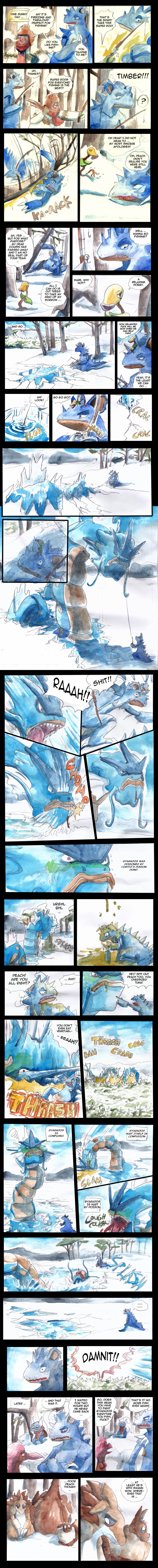
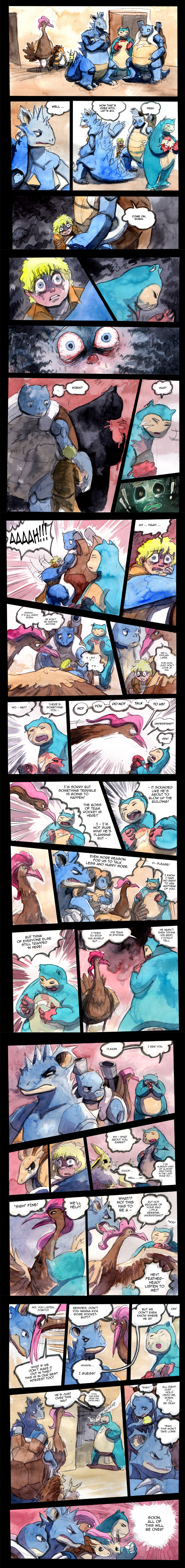
All right, we're 44 pages into the chapter and things might finally start to happen. Remember when I could cram in 2 entire chapter in the same amount of pages? Good times. x)Related content


Comments: 13

👍: 1 ⏩: 0

It might be for story purpose only but for Puck to stay a wartortle at this point of the game is worrysome
👍: 1 ⏩: 0

i just read this entire series in one day and I've been blown away by the quality of it awesome job Qlock and too bad we're nearing the end of the story.
👍: 0 ⏩: 0


Still in love. And amazing colors as always.
Someone asked you above, I am also curious as to how you achieve this "noise" effect with the nuances?
Funny thing about that panel with Robin: we don't see her hand, so we're outside the window. Yet we can see the reflection of the nearby buildings behind her, like it were from the inside.
")
👍: 0 ⏩: 1

Always have two layers of the page. The one underneath is lighter and I run it through the 'cutout' filter. Cheap short-cut to smooth out some areas where my colouring is too sharp and sloppy. And at the same time get some nice looking effects. I never do this to any other art I make, but time is of the essence with comics. x)
👍: 0 ⏩: 1
Oh waw, I was not expecting it to be a digital effect!
What layer modes are you using?
👍: 0 ⏩: 1
well, unless I'm misunderstanding what you mean with 'noise' effect, then yes. xD It's not very complicated. Top layer is in the 'multiply' mode and the bottom one is just normal. It makes thing a bit too dark and muddy though so I usually just merge them and raise the brightness and contrast until it looks acceptable.
👍: 0 ⏩: 0

You've been going at crazy speeds with this. O:
And hey, the story is pretty complex at this point, it's natural to have longer chapters. You don't hear us complaining, since it will likely give a more satisfying ending!
👍: 0 ⏩: 1
Well, I have a lot of free time not when I'm done with my studies and also unemployed. xD Might as well use it for something.
And yes. It is only natural. A good pay-off needs a good build-up. And slower pacing is often needed. I'm only jokingly whining about it. x)
👍: 0 ⏩: 0

uuuuuuugh its about to go dooooown.
im friggin losing it.
👍: 0 ⏩: 0

... do you adjust the contrast in any particular way when you're editing these? these watercolours are so solid and vibrant (those first few panels with the fire OMG), i would never be able to achieve effects like these with traditional media only
also things are heating up

👍: 0 ⏩: 1
There is some meddling yeah. It's definitely possible to get this vibrant colours though paint alone, but I'd have to spend more time on each page and probably also buy better paper. xD So for convenience sake I take a few cheap short-cuts. Though, some of the effects are thanks to the 'cutout' filter. Underneath the main layer I always a have a lighter version of the page that gets the cutout-treatment. It generally helps to smooth out some areas where my initial colouring might be too sharp and sloppy. It's not a thing I do to any other art I make though.
👍: 0 ⏩: 0