HOME | DD
 Raven30412 — few logotypes

Published: 2006-10-10 21:49:56 +0000 UTC; Views: 55620; Favourites: 363; Downloads: 0
Redirect to original
Description
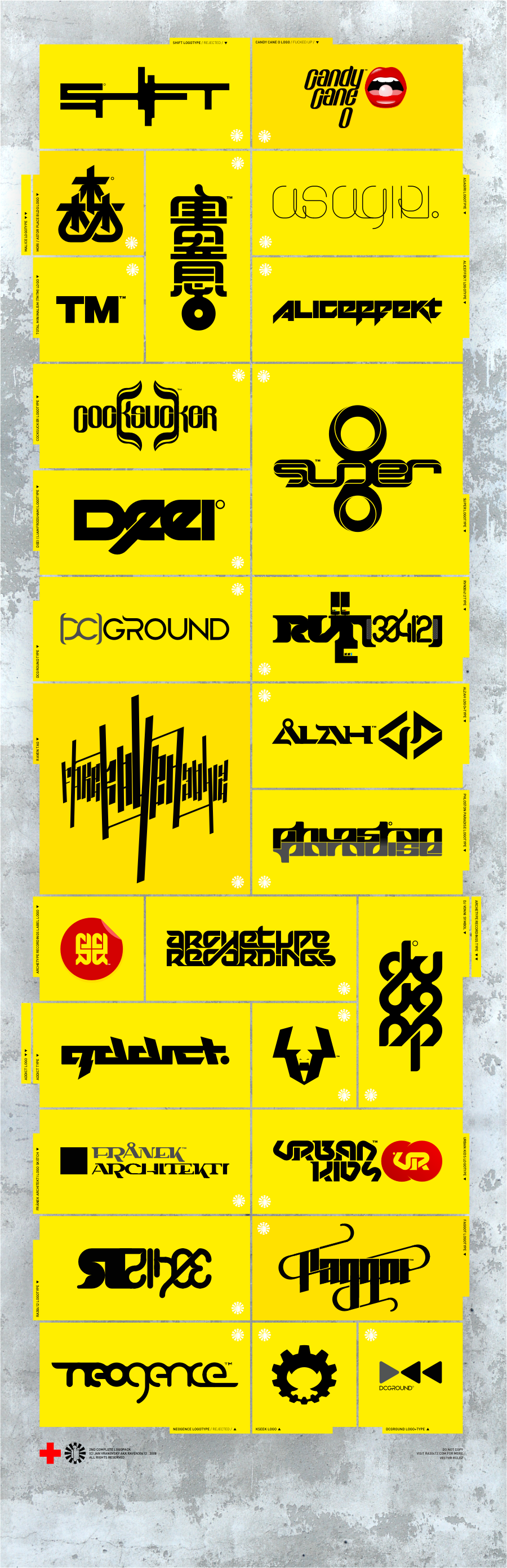
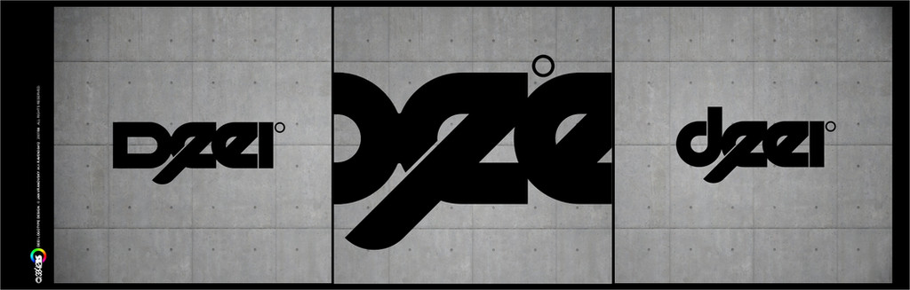
i have almost no time for design since my uni started, so here's just a small glance back at some of logotypes I made. the newest one, ikaruga logotype is fresh new work for guy with sick illustrations and stuff ([link] ), then there are some you know allready and some you dont...I'll probably submit something similar with logos soon.
Related content


Comments: 80


Can you tell me how you do these? I really like the 3rd one down on the left...
👍: 0 ⏩: 1

thanks... they are all pure vectors, and built on quite basic geometry, nothing complicated.
👍: 0 ⏩: 0

everything is done in CorelDRAW 12.
👍: 0 ⏩: 0

men all your logos are very very similar thats can´t be good
👍: 0 ⏩: 2
mmm i dont said for the color i said for the forms for the figures
👍: 0 ⏩: 0


wow! amazing
can you recommend a site to find font like this?
👍: 0 ⏩: 1
I create logotypes by my own, they aren't existing fonts, except of few older ones...
if you want some thougn, try myfont.com or acidfonts
👍: 0 ⏩: 0


 (Smile)")
👍: 0 ⏩: 0


thank you! yea i like the first pretty much too.
👍: 0 ⏩: 0

man, how do u make these logotypes? directly in illustrator or u draw a sketch first or what?
👍: 0 ⏩: 1
directly in corel draw. no sketchs. maybe except of my taf, I made few sketchs of that one before the vector.
👍: 0 ⏩: 1
coolness ")
👍: 0 ⏩: 1

👍: 0 ⏩: 0

I love them all but love the bottom right one the best!!
👍: 0 ⏩: 1
👍: 0 ⏩: 0

I have to agree most of these are very hard to read the name of the company, product, or individual.
👍: 0 ⏩: 1
I guess it's becouse thats the way I (and people who asked me for design) like it. easy-to-read logotypes are boring in my opinion. I know that in many cases it's fundamental to make them that way, but all of these are rather logos or signes then logotypes, made for individuals or myself, not as a promotion of some official brand.
I am not a graphic designer, I have never studied anything even close to graph. design or typograpghy before and logos nor graph. design is not my work, it's only fun for me. It's the same as making doodles into a sketchbook. That's giving me total freedom, which is of great importance for developing my own style. I dont see any reason why should I inhibit my designes by making them easy to read, becouse the only point why am I making them is that it's great fun.
👍: 0 ⏩: 0


i like the mk one the best
the rest of them are kind of hard to read but i like them all
👍: 0 ⏩: 1
why the mk one? I think it's the most boring one there, made in real rush...
👍: 0 ⏩: 1
i think it's because it's easy to read. all the others one are really good but it's just that they're a bit hard to read. as someone above me said, they're more like symbol logos than logos that are supposed to be read
keep the good work up!
 (Wink)")
👍: 0 ⏩: 1
thats cos well-readable logotypes are boring in my opinion
👍: 0 ⏩: 1
I do like non-readable logos, don't get me wrong. It's just that at this moment, the mk one catches my eye more easily.
No problem!
👍: 0 ⏩: 0


Beautiful, as always. Especially ikaruga and the sofa one. really, really nice. Some are tough to read, but I figure if they are recognisable, then what does it matter... not much.
👍: 0 ⏩: 0


👍: 0 ⏩: 0

diky!
fakt? snad ho to potesi
👍: 0 ⏩: 1

lol myslel jsem si ze to budes myslet takle ale nemyslel jsem to tak 
👍: 0 ⏩: 1
misa je ale fakt peknej kluk
👍: 0 ⏩: 1


| Next =>