HOME | DD

Raven30412 β€” zz type

Published: 2009-03-01 21:21:07 +0000 UTC; Views: 40587; Favourites: 295; Downloads: 939
Redirect to original
Description 
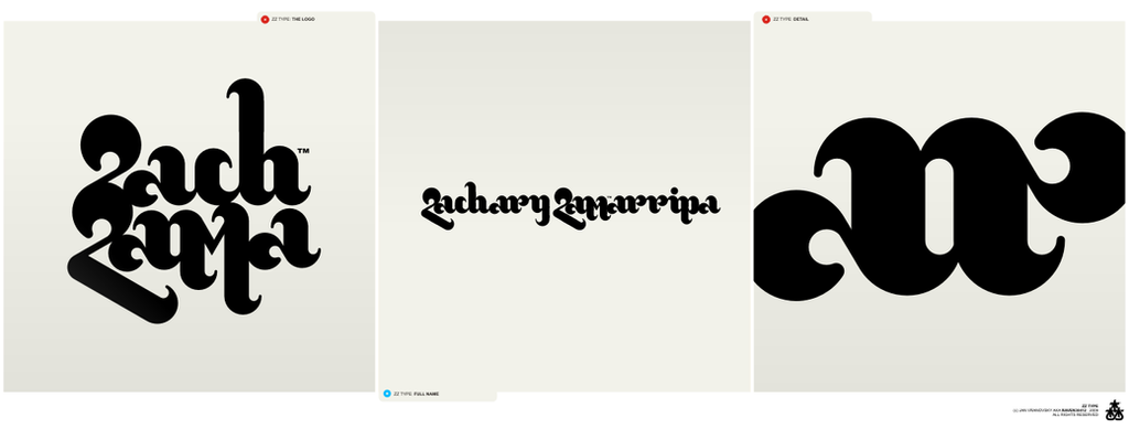
I'm working on many projects at the moment, so after a little break, many new uploads are comming. This is the first one.

It's not-really-finished logotype / type concept I've created for a client. He rejected this version though. Since I think it's kind of interesting type treatment, and cos I'd really like to finish it, I'm offering it as a base of new logotype, for half the price I usually ask for.

So, if you like it and want it as your own logotype, note me and I'll gladly re-design and finish it for you.
Related content
Comments: 66

M00dii [2011-01-01 16:42:17 +0000 UTC]

amazing! make sure you complete it!

πŸ‘: 0 ⏩: 0

coreper [2010-09-14 08:12:11 +0000 UTC]

i just love that font

πŸ‘: 0 ⏩: 0

ashleyklaus [2010-08-11 01:11:53 +0000 UTC]

This is really gorgeous...

πŸ‘: 0 ⏩: 1

Raven30412 In reply to ashleyklaus [2010-08-11 02:30:35 +0000 UTC]

thank you

πŸ‘: 0 ⏩: 0

por-que-tan-serio [2010-04-07 00:33:37 +0000 UTC]

totally like that! looks really interesting

πŸ‘: 0 ⏩: 0

extasishidrante [2009-04-10 18:25:11 +0000 UTC]

Muy buen trabajo...

πŸ‘: 0 ⏩: 0

supafly-tnt [2009-03-26 10:15:44 +0000 UTC]

Cool type, very fluid.

πŸ‘: 0 ⏩: 0

StreetlightScholars [2009-03-25 20:28:55 +0000 UTC]

Shame he didn't want it, it's beautiful. Maybe not the quickest to read though

πŸ‘: 0 ⏩: 1

Raven30412 In reply to StreetlightScholars [2009-03-25 20:47:29 +0000 UTC]

thanks... yes, it's not. that wasn't the issue though, it's the overall style the client didn't like.
it would be more readable if I could finish it, this was only the 1st sketch.

πŸ‘: 0 ⏩: 1

StreetlightScholars In reply to Raven30412 [2009-03-25 20:54:48 +0000 UTC]

Well, very nice work. Good thing you uploaded it, I see a lot of people think you did a good job on it.

πŸ‘: 0 ⏩: 1

Raven30412 In reply to StreetlightScholars [2009-03-25 20:58:40 +0000 UTC]

I like it too, perhaps I'll have a chance to use it for something else and finish it in future...

πŸ‘: 0 ⏩: 1

StreetlightScholars In reply to Raven30412 [2009-03-25 21:01:43 +0000 UTC]

Im sure it could be adapted. You should use it for something if you can. Get it out there in some real branding

πŸ‘: 0 ⏩: 1

Raven30412 In reply to StreetlightScholars [2009-03-25 21:40:22 +0000 UTC]

yep. I'm waiting for a customer that would like it. It's kind of extreme type so I guess it will take a while...

πŸ‘: 0 ⏩: 1

StreetlightScholars In reply to Raven30412 [2009-03-26 08:36:41 +0000 UTC]

Good luck!

πŸ‘: 0 ⏩: 0

ositaka [2009-03-10 21:32:00 +0000 UTC]

If you don't fine anyone to buy it, go ahead and create a new font... you can always sell it in the right sites!

Is really a great one!

πŸ‘: 0 ⏩: 0

Dian3 [2009-03-09 15:19:21 +0000 UTC]

this is really great!

πŸ‘: 0 ⏩: 0

yuriquetto [2009-03-06 02:23:39 +0000 UTC]

πŸ‘: 0 ⏩: 0

denull [2009-03-05 10:19:32 +0000 UTC]

nice typography mate ! it very 70s

πŸ‘: 0 ⏩: 1

Raven30412 In reply to denull [2009-03-05 23:04:53 +0000 UTC]

thanks yeah it is

πŸ‘: 0 ⏩: 0

and1art [2009-03-05 08:09:23 +0000 UTC]

nice type, man!

πŸ‘: 0 ⏩: 0

76dragons [2009-03-04 11:09:03 +0000 UTC]

wonderfull type aproach^^

πŸ‘: 0 ⏩: 0

redcell1 [2009-03-04 03:44:21 +0000 UTC]

damn pretty dope.

I would note you but I admit I dont think I have enough

πŸ‘: 0 ⏩: 0

salvad0r [2009-03-03 16:45:05 +0000 UTC]

no se lee! morfologicamente esta bueno, pero no es claro

πŸ‘: 0 ⏩: 1

Raven30412 In reply to salvad0r [2009-03-03 17:02:42 +0000 UTC]

too bad I don't speak spanish I think I get the "morfologicamente esta bueno" part, but not the rest

πŸ‘: 0 ⏩: 0

StreetlightScholars [2009-03-03 14:22:46 +0000 UTC]

Very nice Raven

πŸ‘: 0 ⏩: 0

Sokail-t3h-noobie [2009-03-03 11:22:46 +0000 UTC]

I'll be damned! This is exactly what I had in mind for the last two years, only I never had the time nor the ability to render it on paper...! Congratulations my friend! Any comment would fail its purpose...!

πŸ‘: 0 ⏩: 1

Raven30412 In reply to Sokail-t3h-noobie [2009-03-03 17:20:24 +0000 UTC]

thanks a lot

πŸ‘: 0 ⏩: 0

theRGB [2009-03-03 02:31:52 +0000 UTC]

This is my favorite one from you! Awesome!

πŸ‘: 0 ⏩: 1

Raven30412 In reply to theRGB [2009-03-03 03:14:04 +0000 UTC]

thanks a lot mate

πŸ‘: 0 ⏩: 0

Bluesigma [2009-03-02 23:28:56 +0000 UTC]

siiiick

πŸ‘: 0 ⏩: 0

Rodier [2009-03-02 19:42:32 +0000 UTC]

not so sure about the c.
but i love it man.

πŸ‘: 0 ⏩: 1

Raven30412 In reply to Rodier [2009-03-02 19:54:24 +0000 UTC]

thanks mate... yeah, more letters need some work, M is weird as well for example. It's rejected concept, and so it's not completed...

πŸ‘: 0 ⏩: 1

Rodier In reply to Raven30412 [2009-03-02 21:54:20 +0000 UTC]

well u have a great type for your own then

πŸ‘: 0 ⏩: 0

nuarted [2009-03-02 13:57:10 +0000 UTC]

niiice)

πŸ‘: 0 ⏩: 0

Bheeshoom [2009-03-02 13:42:43 +0000 UTC]

...

πŸ‘: 0 ⏩: 0

Nikeos [2009-03-02 12:59:18 +0000 UTC]

I think it's great, the typography is unique - the problem is, and maybe it's the reason for the rejection - it's hard to say what it says... I know it has two Z because you wrote it in the topic... and that's it.
Typography is awesome, again.

πŸ‘: 0 ⏩: 1

Raven30412 In reply to Nikeos [2009-03-02 15:36:47 +0000 UTC]

it says "zach zama". actually, the readability wasn't really the issue, it's the overall style the client didn't like.

πŸ‘: 0 ⏩: 0

meggert [2009-03-02 11:50:29 +0000 UTC]

great curves

πŸ‘: 0 ⏩: 0

aeroVolce [2009-03-02 08:05:15 +0000 UTC]

Cool typography mate. Great fluidity.

πŸ‘: 0 ⏩: 0

marzini [2009-03-02 05:19:15 +0000 UTC]

damm really preatty and fluid love it! your client is a nubb heheehe and if you was talking serious i would like a lot to have a marzini hhehehe
cheers

πŸ‘: 0 ⏩: 1

marzini In reply to marzini [2009-03-06 13:18:15 +0000 UTC]

thank you 4 tha answer!

πŸ‘: 0 ⏩: 0

HBRIII [2009-03-02 04:00:11 +0000 UTC]

Very clean and elegant. What was your inspiration?

πŸ‘: 0 ⏩: 1

Raven30412 In reply to HBRIII [2009-03-03 03:13:13 +0000 UTC]

thanks. nothing particular, I just wanted to create fluid, organic font with a bit of oldschool retro feel. Everything else is result of experimenting.

πŸ‘: 0 ⏩: 0

sams-mao [2009-03-02 03:45:14 +0000 UTC]

nice curvy typo dude...

πŸ‘: 0 ⏩: 0

fernandasabaudo [2009-03-02 03:28:13 +0000 UTC]

very niice design ^^

πŸ‘: 0 ⏩: 0

smev [2009-03-01 23:25:05 +0000 UTC]

very cool
its like a modern blackletter

πŸ‘: 0 ⏩: 0

schakalwal [2009-03-01 23:17:29 +0000 UTC]

interesting

πŸ‘: 0 ⏩: 0

sulexes [2009-03-01 22:55:07 +0000 UTC]

very intresting indeed.

πŸ‘: 0 ⏩: 0

Nunosk8 [2009-03-01 22:51:44 +0000 UTC]

Nice nice! fav of course

πŸ‘: 0 ⏩: 0

Silence-sk [2009-03-01 22:33:14 +0000 UTC]

krΓ‘sna typografia
jednoducho ďaľőia pecka z tvojeje diene

πŸ‘: 0 ⏩: 1


| Next =>